Text Field
Text Field enters and edits one line of text using the native field, keyboard, autofill, selection, and accessibility behaviour of each platform.
Complete example
<firstlight:text-field
    label="Email"
    placeholder="[email protected]"
    helper="Used for appointment updates."
    keyboard="email"
    content-type="email"
    autocapitalize="none"
    :autocorrect="false"
    clearable
    native:model.blur="email"
/>
Props
| API | Accepted type | Purpose |
|---|---|---|
value / native:model |
string |
Published PHP value; omission defaults to ''. |
label |
string |
Visible label and accessibility-name fallback. |
placeholder |
string |
Short example; never a replacement for a label. |
helper |
string |
Supporting guidance below the field. |
error |
string |
Validation feedback that replaces helper text. |
required |
bool |
Communicates required metadata without performing validation. |
disabled |
bool |
Prevents focus, editing, and every action. |
read-only |
bool |
Allows native selection and copy while preventing edits and changes. |
keyboard |
enum string | text, email, phone, url, number, or decimal. |
content-type |
enum string | name, username, email, password, new-password, or one-time-code. |
secure |
bool |
Masks display without changing the stored string. |
autocapitalize |
enum string | none, sentences, words, or characters; omission keeps platform policy. |
autocorrect |
bool |
Explicitly enables or disables platform autocorrection. |
submit-label |
enum string | done, go, next, search, or send; omission keeps the platform default. |
leading-icon |
string |
Shared decorative leading icon fallback. |
leading-icon-ios |
`IosSymbol | string` |
leading-icon-android |
`AndroidSymbol | string` |
trailing-icon |
string |
Shared decorative or authored-action icon fallback. |
trailing-icon-ios |
`IosSymbol | string` |
trailing-icon-android |
`AndroidSymbol | string` |
trailing-a11y-label |
string |
Required accessible name when trailing-icon has @press. |
clearable |
bool |
Adds a native clear action while editable text is non-empty. The clear accessibility label is package chrome; see Localize chrome. |
revealable |
bool |
Adds native show/hide password state; requires secure. Show and hide accessibility labels are package chrome; see Localize chrome. |
a11y-label |
string |
Explicit accessible name when no visible label is appropriate. |
a11y-hint |
string |
Additional VoiceOver and TalkBack guidance. |
class |
string |
External EDGE layout for the complete field. |
Events and synchronisation
@change receives the current string. @submit flushes any pending change,
then receives the same current string. An authored interactive trailing icon
uses standard @press and receives no text argument.
Plain native:model and .live publish while editing. .blur and .lazy
publish on focus loss or submit. .debounce.500ms publishes after the quiet
period and flushes on blur or submit; durations below 50 ms are rejected.
Native typing, selection, cursor position, and marked-text composition remain
local while focused so PHP acknowledgements do not cause keyboard jumps.
Icons and trailing actions
The shared icon is the fallback; the active platform override wins. Blade uses
the exact -ios and -android suffixes above, and typed Android symbols retain
their filled or outlined variant on the wire. Decorative icons are silent.
An authored trailing action requires all of trailing-icon,
trailing-a11y-label, and @press. clearable and revealable instead own
their platform-native icon and localized accessibility state. These semantic
actions are mutually exclusive and cannot share the trailing slot with an
authored action.
Clearing retains focus and immediately publishes '' through @change, even
under blur or debounce sync. Revealing changes presentation only and never
publishes the password value.
Validation and accessibility
Contract exceptions still reject invalid types, unsupported enums, incomplete
trailing actions, and conflicting affordances before publication. User
validation is separate: screens that use ValidatesFields auto-bind the first
MessageBag message for the field's native:model or error-for name. An
authored error wins. required is display metadata and does not run Laravel
rules. See Validate fields.
Error text replaces helper text without replacing the field's accessible name
or value. Decorative icons stay hidden from assistive technology. Icon actions
are separate native accessibility nodes with a minimum 44-point target on iOS
and 48-dp target on Android. A visible label or explicit a11y-label is
required during development.
Platform behaviour
iOS uses an Apple SwiftUI TextField or SecureField composition with system
field treatment, SF Symbols, Dynamic Type, native keyboard and autofill hints,
and Apple spacing. Android uses Material 3 OutlinedTextField, Material label
and supporting/error slots, TextFieldValue selection and composition,
keyboard/IME options, and Compose autofill content types.
Screenshots
| Platform | Light | Dark |
|---|---|---|
| iOS | 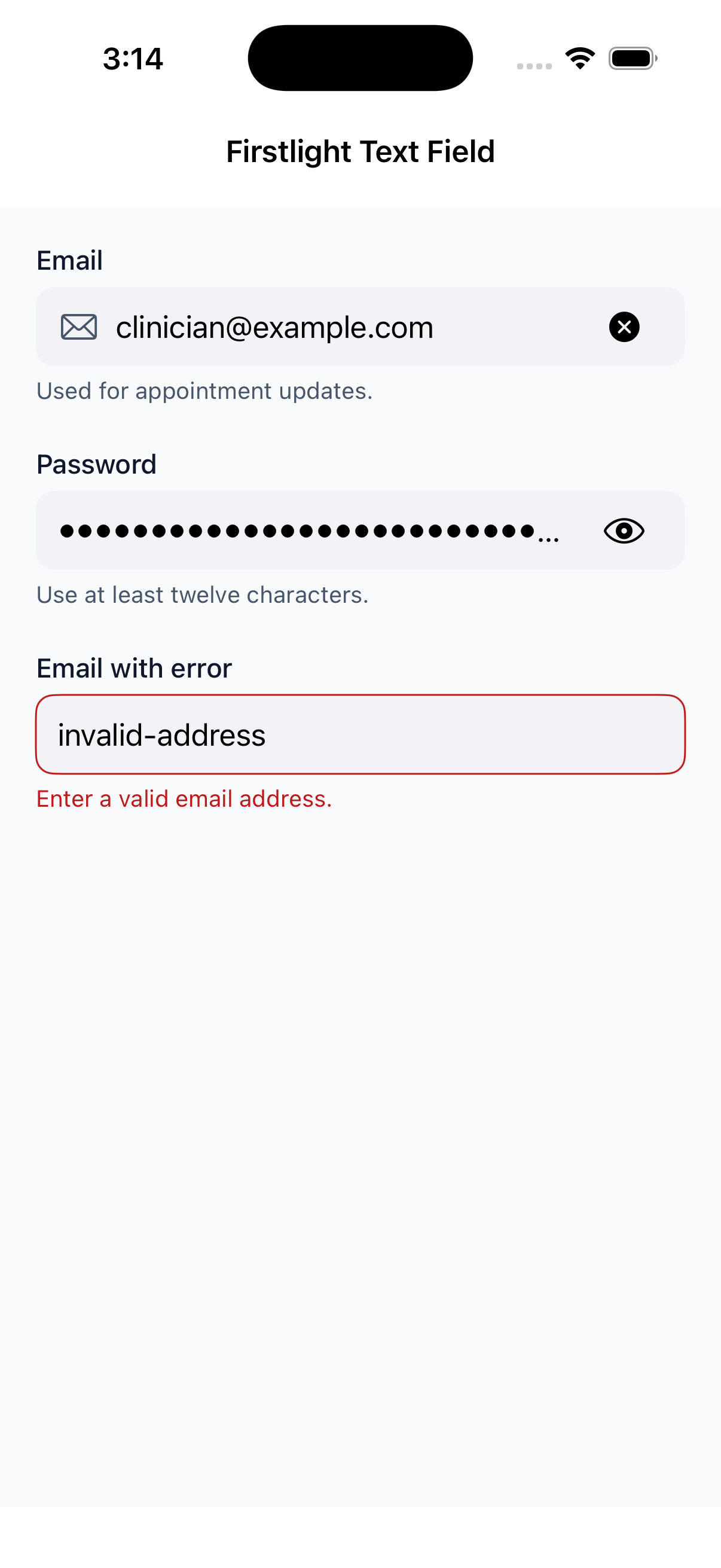 |
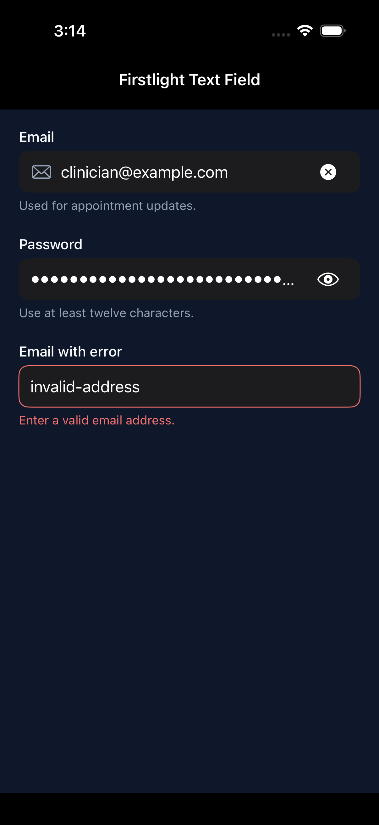 |
| Android | 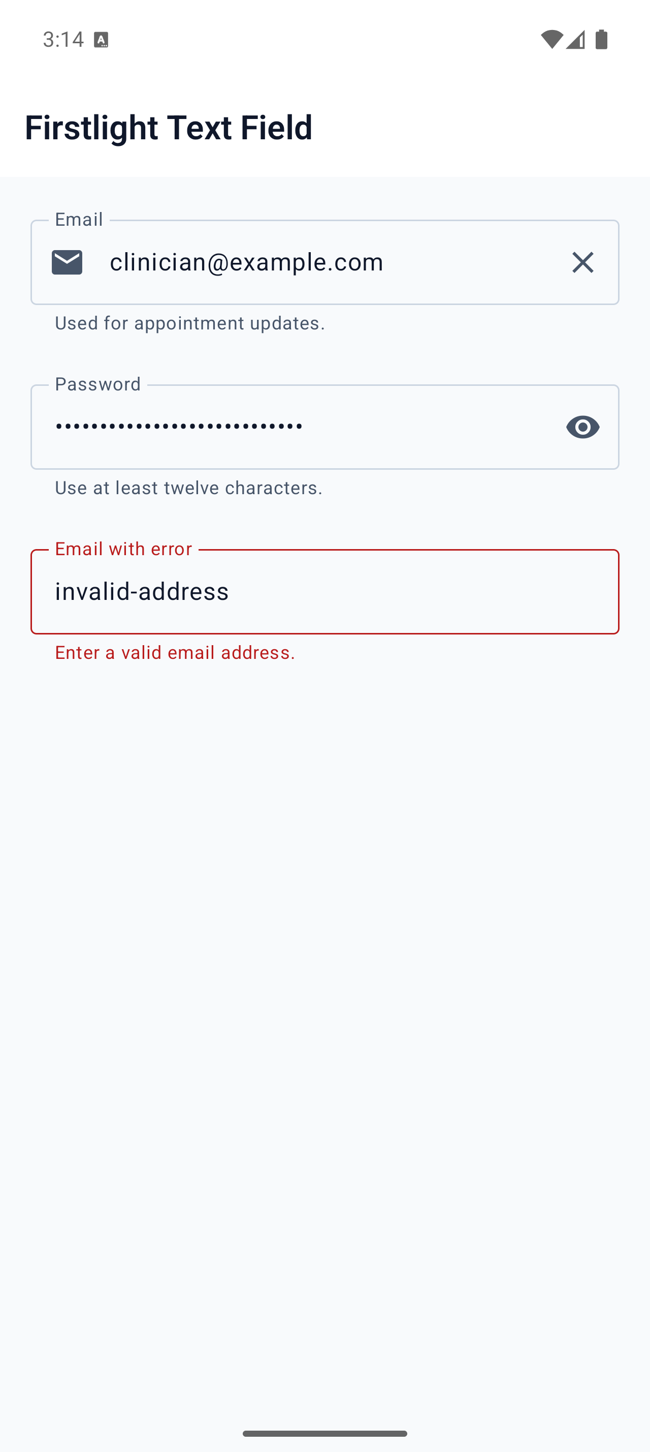 |
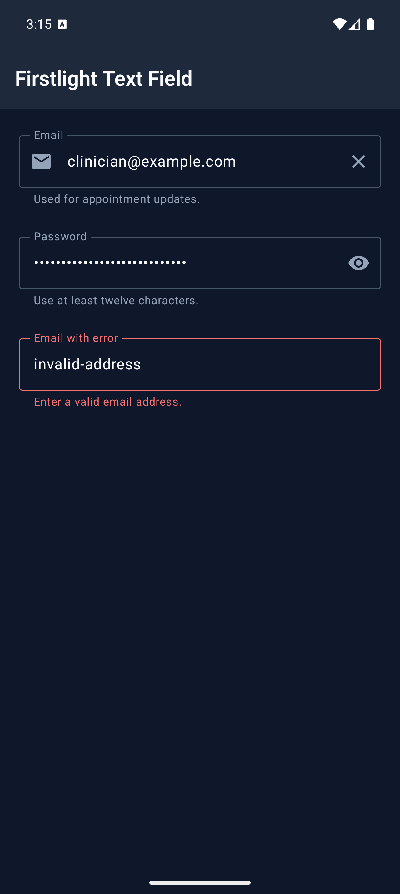 |