Media
Media captures exactly one image or one document into Laravel Storage and
binds a MediaValue on your native component. Use it when you need a form
field with preview, clear, optional crop, and the same error slot as other
Firstlight fields.
Complete example
<?php

namespace App\NativeComponents;

use FirstlightUI\Media\MediaStorage;
use FirstlightUI\Media\MediaValue;
use Illuminate\View\View;
use Native\Mobile\Edge\NativeComponent;

class Profile extends NativeComponent
{
    public ?MediaValue $avatar = null;

    /** @var array<string, string> */
    protected array $rules = [
        'avatar' => 'required|image|max:2048',
    ];

    public function avatarChosen(string $tempPath): void
    {
        $previous = $this->avatar;
        $this->avatar = MediaStorage::commit(
            $tempPath,
            'mobile_public',
            'avatars',
        );
        MediaStorage::delete($previous);
    }

    public function avatarCleared(): void
    {
        MediaStorage::delete($this->avatar);
        $this->avatar = null;
    }

    public function render(): View
    {
        return view('native.profile');
    }
}
<firstlight:media
    mode="image"
    label="Profile photo"
    helper="Square crop required"
    aspect="1:1"
    disk="mobile_public"
    directory="avatars"
    native:model="avatar"
    @change="avatarChosen"
    @clear="avatarCleared"
/>
Props
| API | Accepted type | Purpose |
|---|---|---|
mode |
image | document |
Required. Image allows camera/library and crop; document uses the system file picker only. |
value |
MediaValue | null |
Committed value. Empty is null. |
native:model |
a ?MediaValue component property |
Synchronises the accepted value. native:model.live is also accepted. |
label |
string |
Visible field label. |
helper |
string |
Supporting text below the control. |
error |
string |
Validation text; shown instead of helper when non-empty. |
required |
bool |
Marks the field as required visually and for assistive technology. |
disabled |
bool |
Prevents pick and clear while retaining the accepted value. |
disk |
string |
Laravel Storage disk. Defaults to mobile_public. |
directory |
string |
Directory prefix under the disk. Defaults to media. |
aspect |
ratio string such as 1:1 |
Image only. Implies required crop to that aspect. |
crop |
optional | required |
Image only. Freeform crop when aspect is omitted. |
a11y-label |
string |
Explicit accessible name when needed. |
a11y-hint |
string |
Additional VoiceOver and TalkBack guidance. |
class |
string |
External EDGE layout utilities. |
Document mode rejects crop and aspect. Unsupported attributes such as
multiple and video are rejected before publication.
Crop rules
- Neither
cropnoraspect→ store without a crop sheet. aspect→ required crop locked to that aspect.crop="optional"without aspect → freeform crop; Skip is allowed.crop="required"without aspect → freeform crop; Confirm is required.
Clear, Skip, Confirm, Cancel, Crop, zoom, and source-chooser copy are package chrome; see Localize chrome.
Events
@change receives the temporary absolute file path after the user confirms a
pick (and crop when required). Commit with MediaStorage::commit before
assigning MediaValue.
@clear fires when the user clears a present value. Delete the previous
object with MediaStorage::delete and set the model to null.
MediaValue
new MediaValue(
    disk: 'mobile_public',
    path: 'avatars/a.jpg',
    mime: 'image/jpeg',
    size: 1200,
    width: 100,
    height: 100,
);
Display with Storage::disk($value->disk)->url($value->path).
Validation
Media participates in Validate fields. Public
MediaValue properties are adapted to Laravel UploadedFile values so stock
image, file, mimes, max, and dimensions rules work. null fails
required. Authored error wins over the MessageBag binder.
Accessibility
The field exposes a labelled control with helper or error text. Crop sheets include Confirm, Cancel, optional Skip, and explicit zoom in/out controls meeting 44-point (iOS) and 48-dp (Android) minima. Zoom is not pinch-only.
Platform behaviour
iOS uses PhotosPicker, camera capture, and fileImporter with a Firstlight SwiftUI crop sheet. Android uses Material 3 field chrome and a Firstlight Compose crop dialog. Geometry and system pickers stay platform-native; crop semantics stay shared.
Compatibility
Media supports the versions listed in the current compatibility reference. The host application must compile both Firstlight-owned native renderers declared by the package manifest.
Screenshots
| Platform | Light | Dark |
|---|---|---|
| iOS | 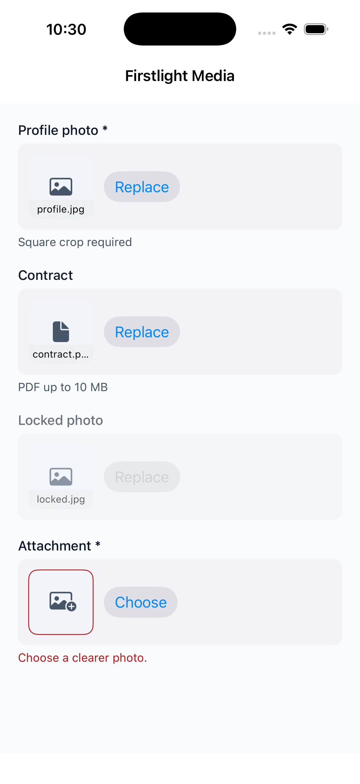 |
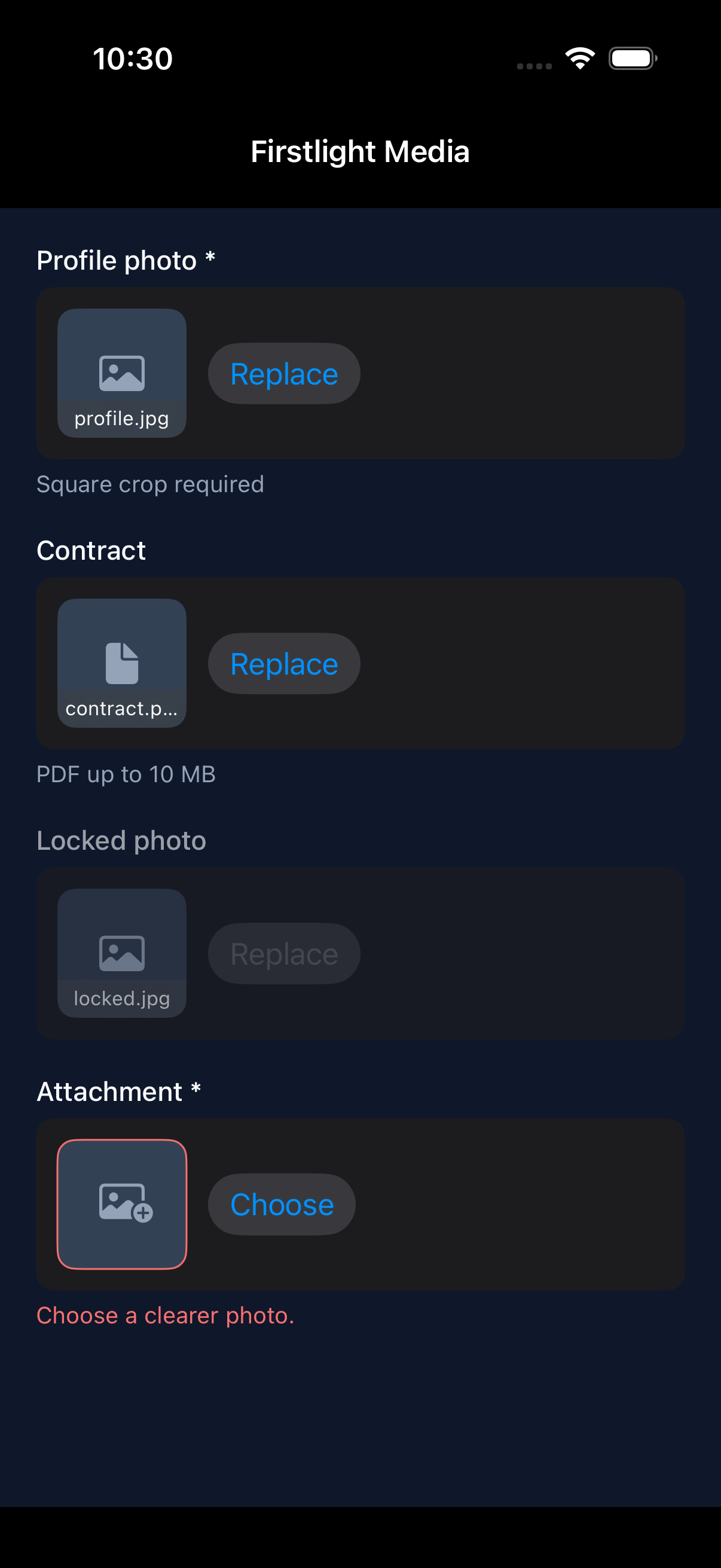 |
| Android | 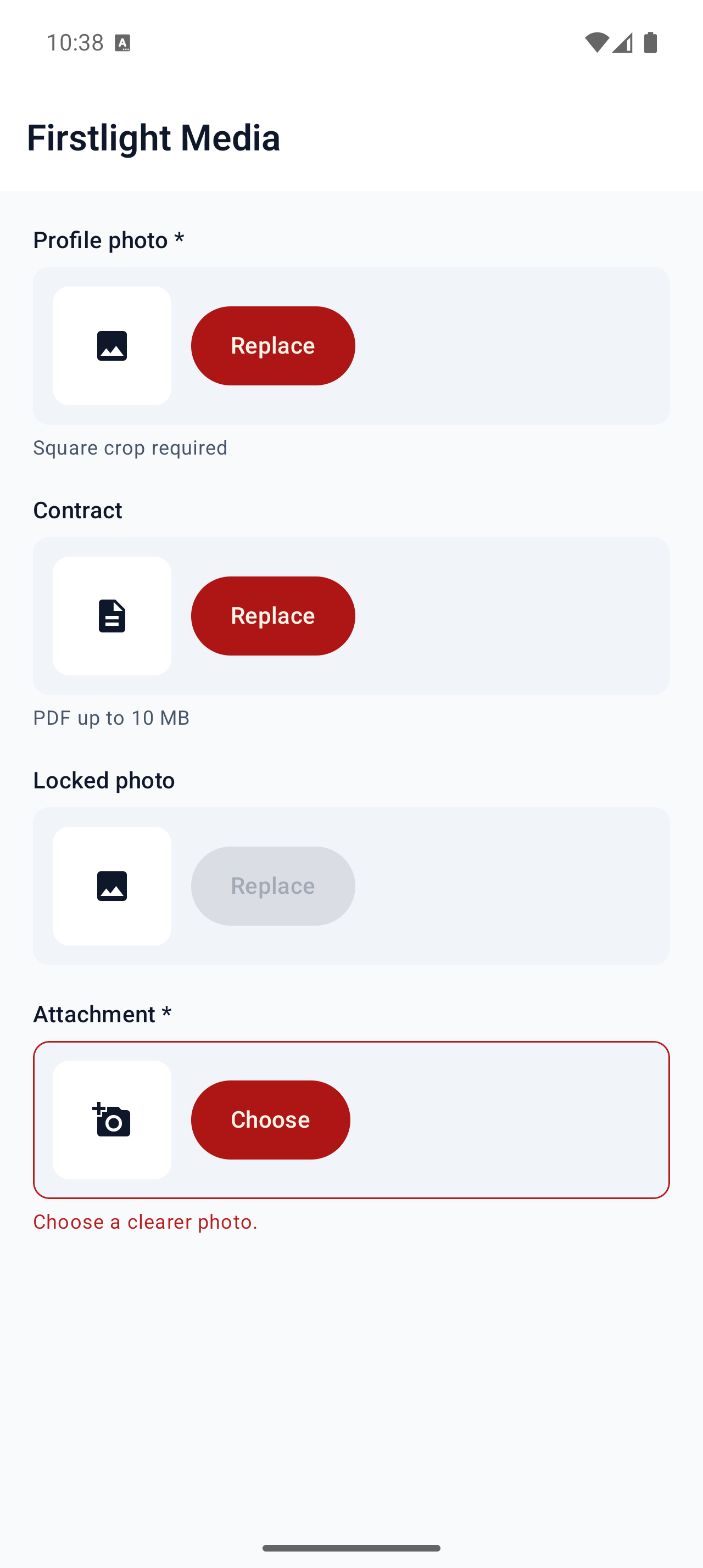 |
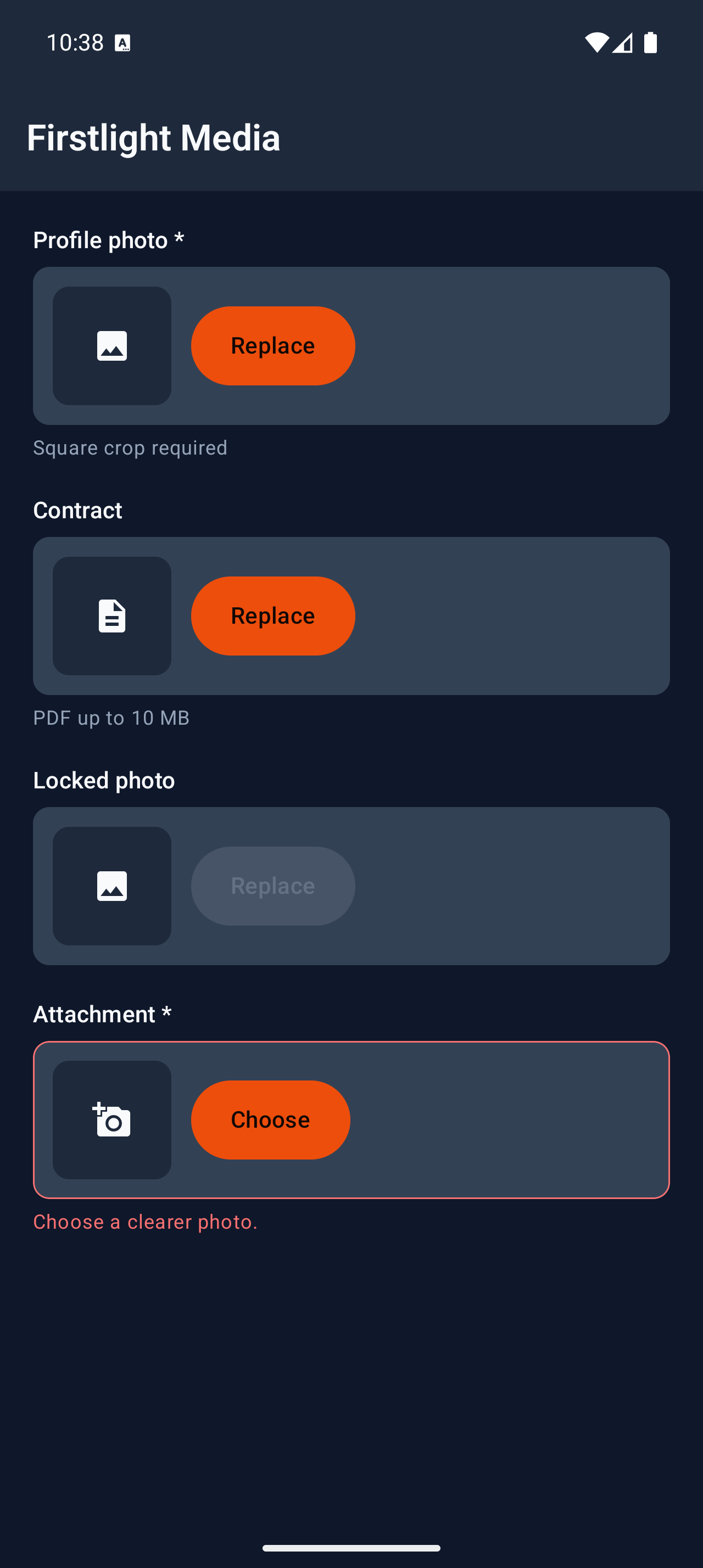 |