Text Area
Text Area enters and edits plain multiline text using each platform's native selection, composition, focus, scrolling, autocapitalization, and autocorrection behaviour.
Complete example
<firstlight:text-area
    label="Clinical notes"
    placeholder="Add relevant history and observations"
    helper="Do not include information that is not required."
    :required="true"
    :min-lines="4"
    :max-lines="10"
    autocapitalize="sentences"
    native:model.debounce.500ms="notes"
/>
Props
| API | Accepted type | Purpose |
|---|---|---|
value / native:model |
string |
Published PHP value; omission defaults to ''. |
label |
string |
Visible label and accessibility-name fallback. |
placeholder |
string |
Short empty-state guidance; never replaces a label. |
helper |
string |
Supporting guidance below the field. |
error |
string |
Validation feedback that replaces helper text. |
required |
bool |
Communicates required metadata without performing validation. |
disabled |
bool |
Prevents focus and editing. |
read-only |
bool |
Keeps native selection, copy, and scrolling while preventing edits. |
min-lines |
positive int |
Minimum visible lines; defaults to 3. |
max-lines |
positive int |
Maximum visible lines before native scrolling; defaults to 8. |
autocapitalize |
enum string | none, sentences, words, or characters; omission keeps platform policy. |
autocorrect |
bool |
Explicitly enables or disables platform autocorrection. |
a11y-label |
string |
Explicit accessible name when no visible label is appropriate. |
a11y-hint |
string |
Additional VoiceOver or TalkBack guidance. |
class |
string |
External EDGE layout for the complete field. |
max-lines must be greater than or equal to min-lines. Public Blade examples
use kebab-case. The PHP element also accepts minLines, maxLines, and
readOnly aliases.
Events and synchronisation
@change receives the complete current string, including newline characters.
Plain native:model and .live publish while editing. .blur and .lazy
publish on focus loss. .debounce.500ms publishes after the quiet period and
flushes on blur. Durations below 50 milliseconds are rejected.
Typing, selection, cursor position, marked text or IME composition, focus,
keyboard, and scroll position remain native while focused. PHP acknowledgements
therefore do not replace the active buffer. Different server publications wait
for safe reconciliation, while unfocused programmatic updates replace the
displayed string without emitting @change.
Text Area intentionally has no @submit, @press, icons, secure mode,
single-line keyboard or content hints, clear/reveal affordances, loading state,
prefix, suffix, or styling escape props.
Validation and accessibility
Contract exceptions still reject invalid types, unordered line bounds, and
unsupported sync modes before publication. User validation is separate:
screens that use ValidatesFields auto-bind the first MessageBag message for
the field's native:model or error-for name. An authored error wins.
required is display metadata and does not run Laravel rules. See
Validate fields.
A visible label or explicit a11y-label is required during development.
Error text replaces helper text while preserving the current accessible name
and value. Disabled and read-only states remain distinct. Native type scaling,
light and dark appearance, increased contrast, Reduced Motion, and RTL remain
platform-owned.
Platform behaviour
iOS uses a genuine SwiftUI TextEditor in Apple-native field composition.
Android uses Material 3 OutlinedTextField with TextFieldValue, multiline
line bounds, supporting and error slots, and Compose selection and composition.
Screenshots
| Platform | Light | Dark |
|---|---|---|
| iOS | 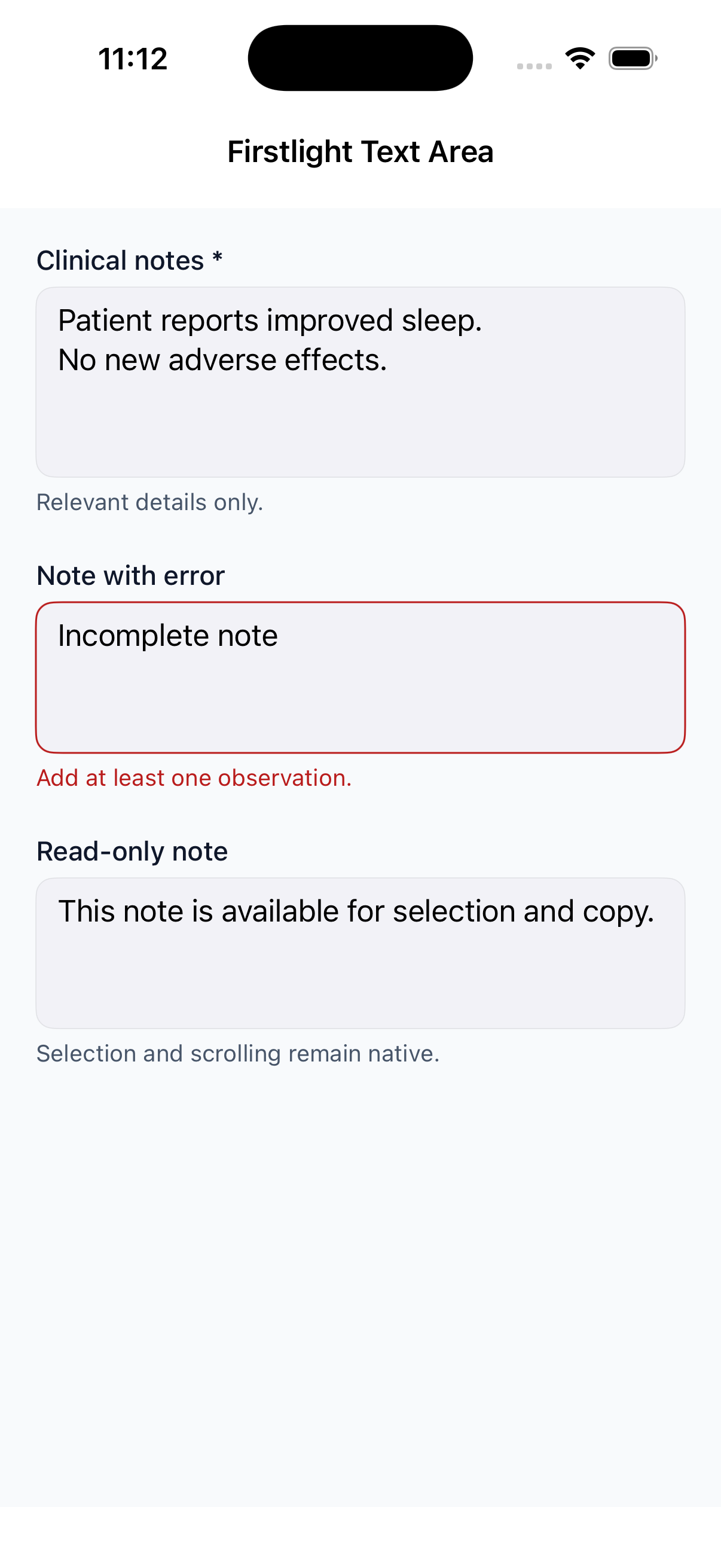 |
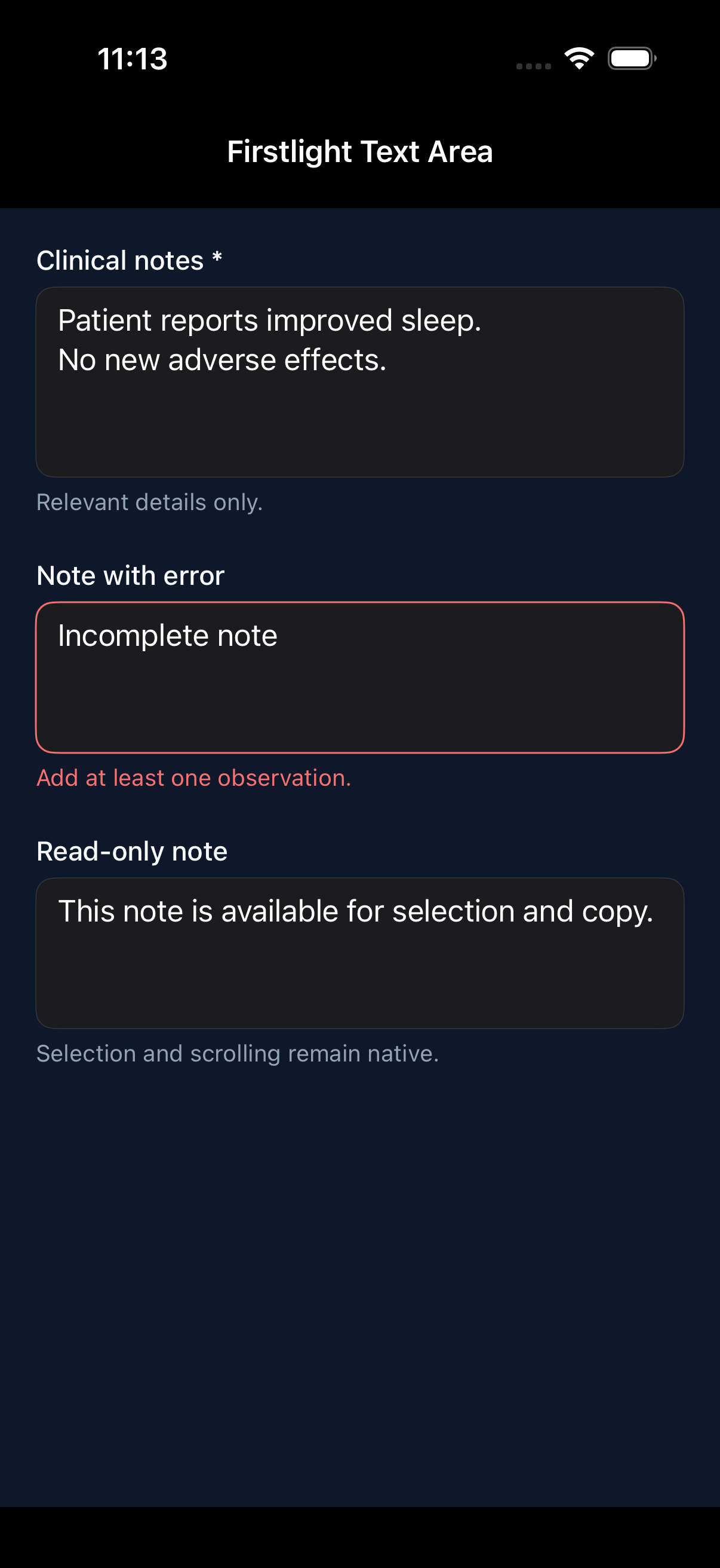 |
| Android | 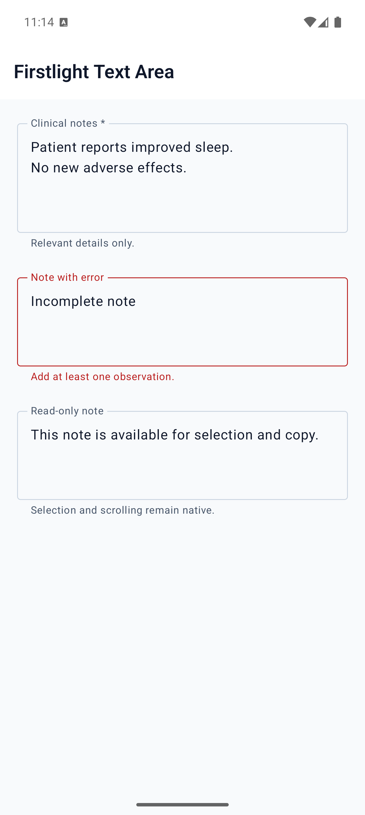 |
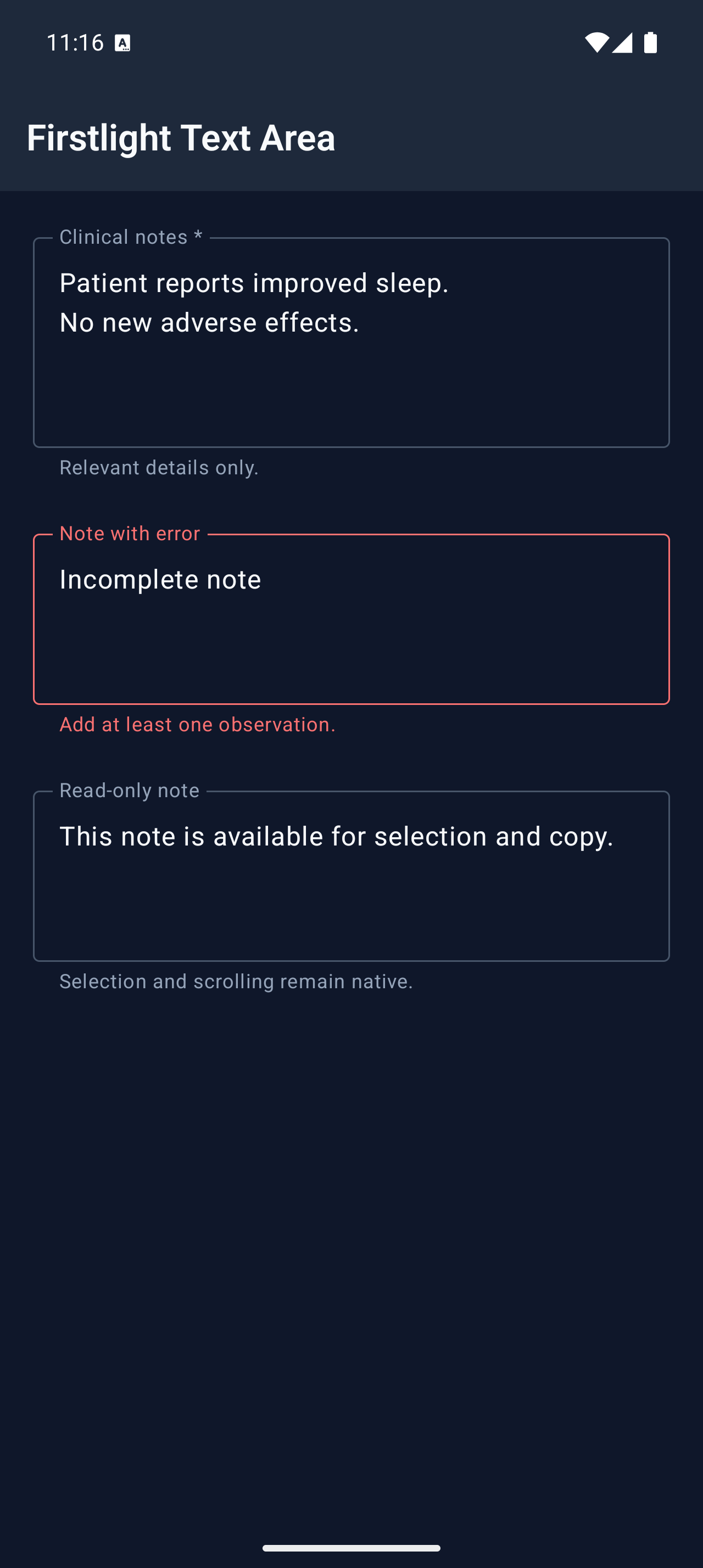 |