Firstlight

Component catalogue

Every Firstlight control.

Each control renders with SwiftUI on iOS and Jetpack Compose on Android. The screenshots show both platforms in light and dark mode.

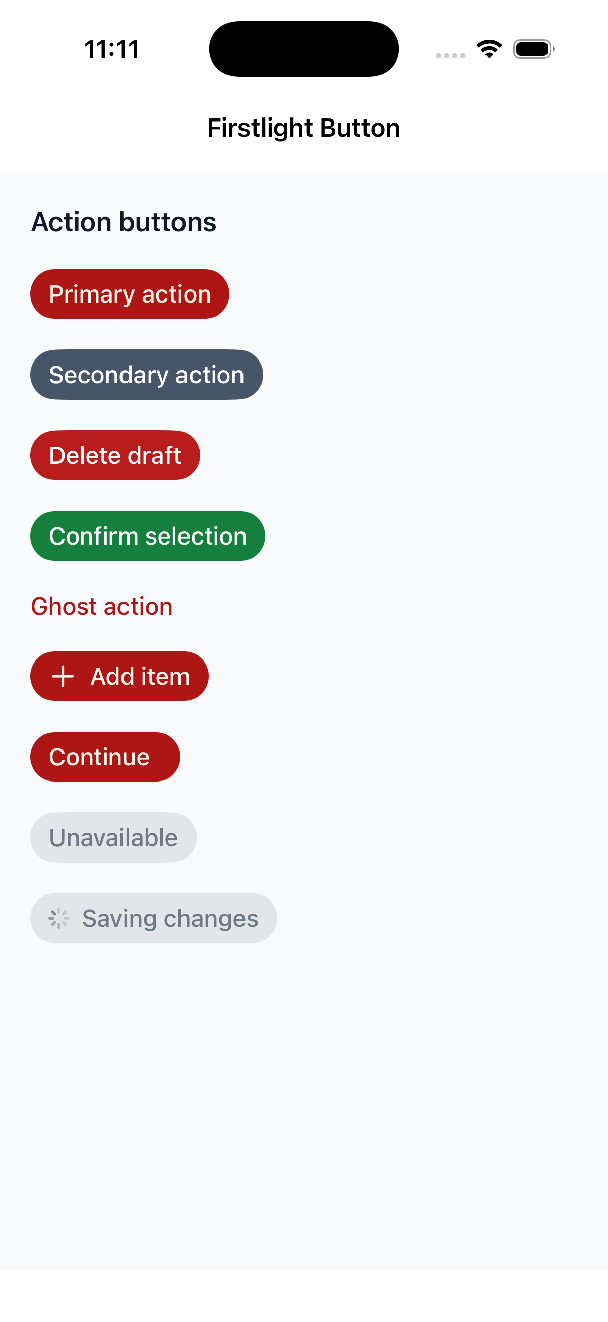
Button

Available
firstlight:button

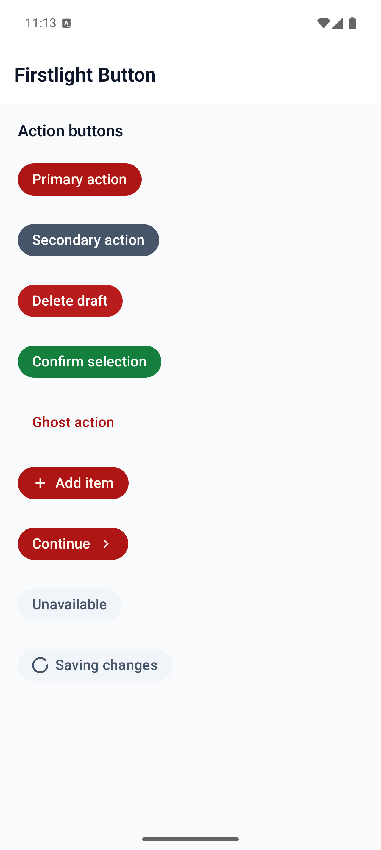
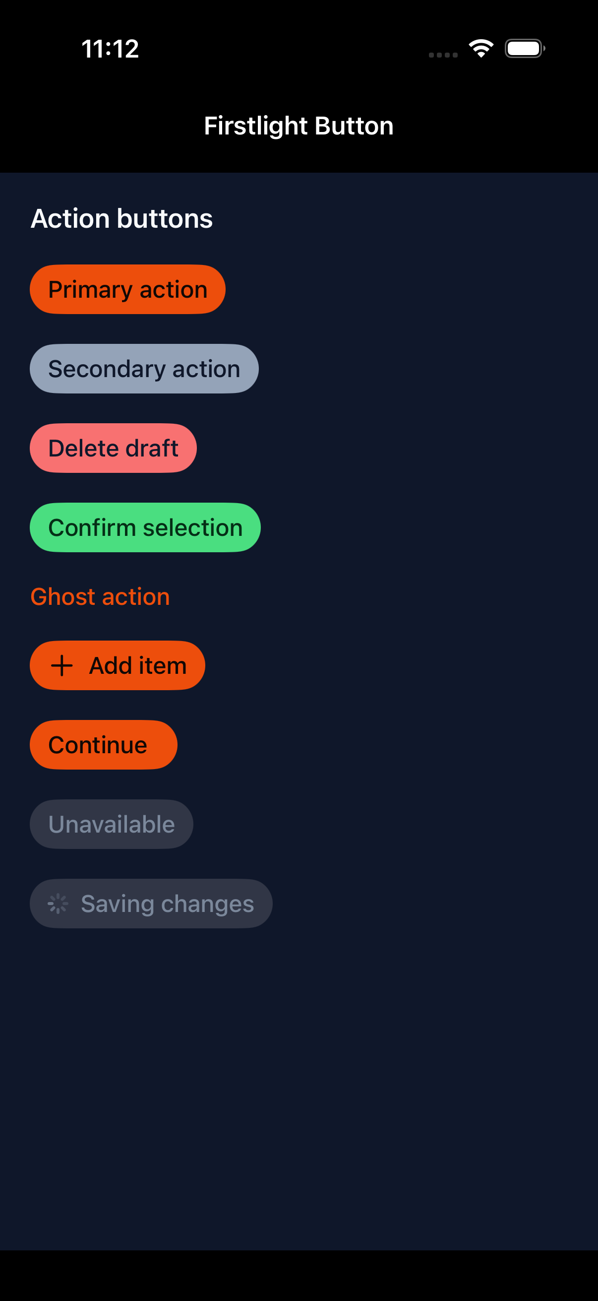
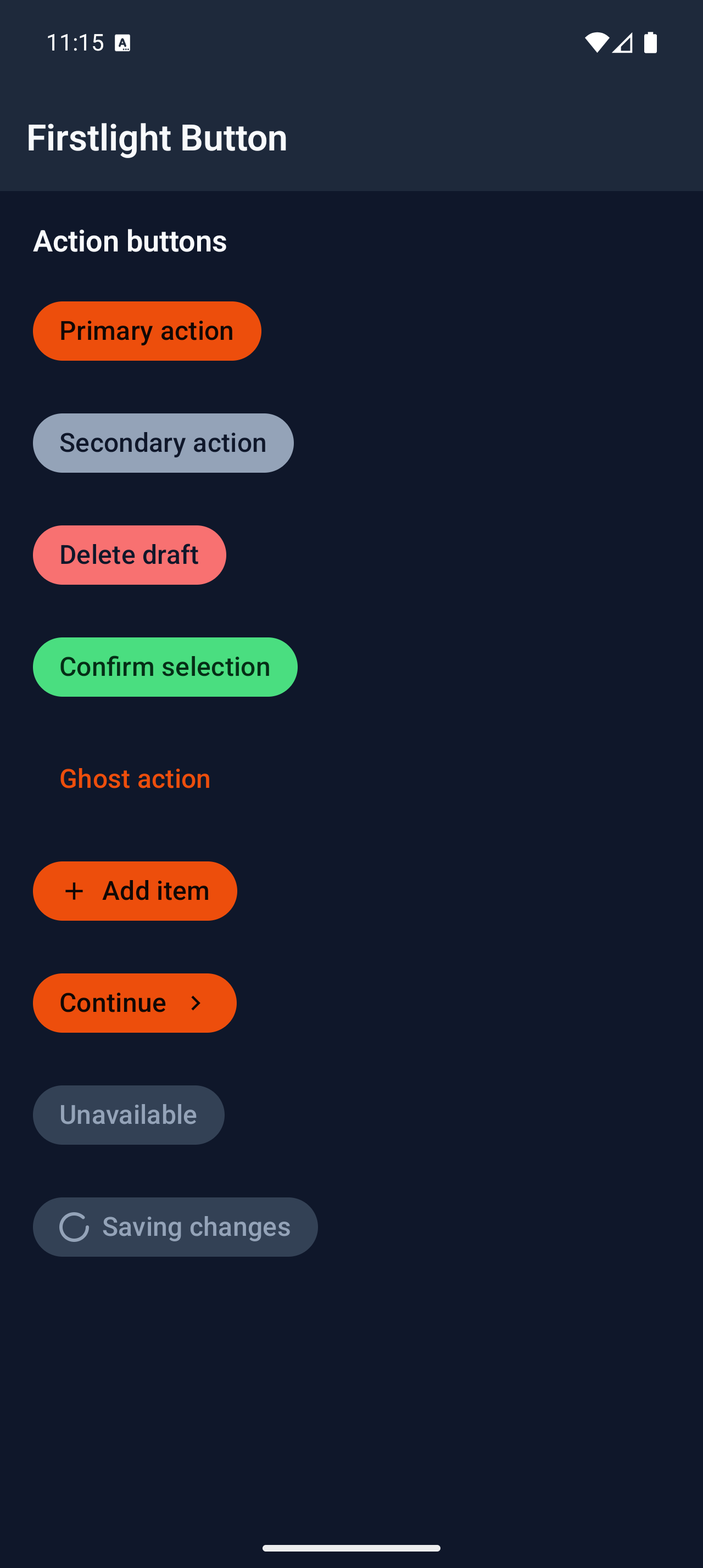
Run one labelled action with a native button.
Read the docs
iOS Native
Firstlight Button rendered on iOS
Android Native
Firstlight Button rendered on Android

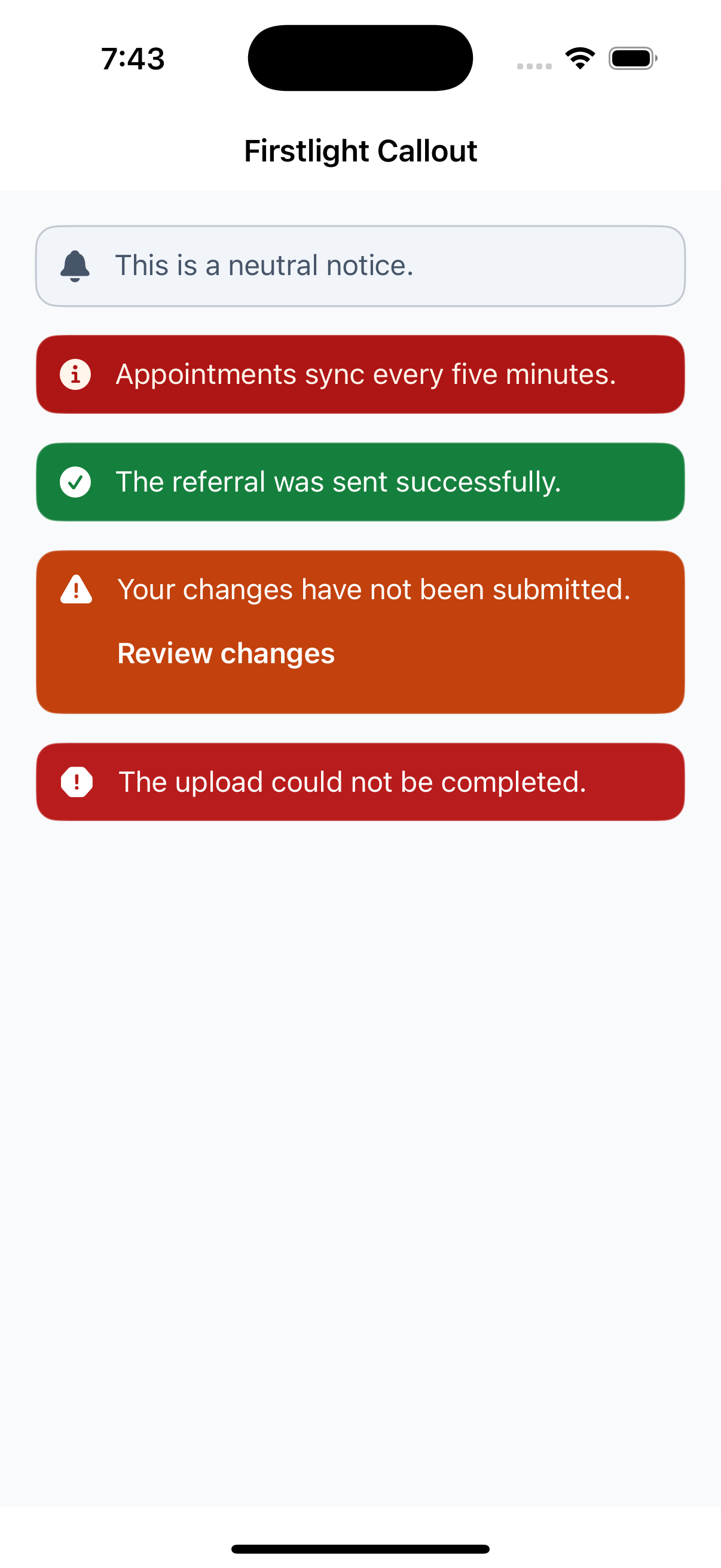
Callout

Available
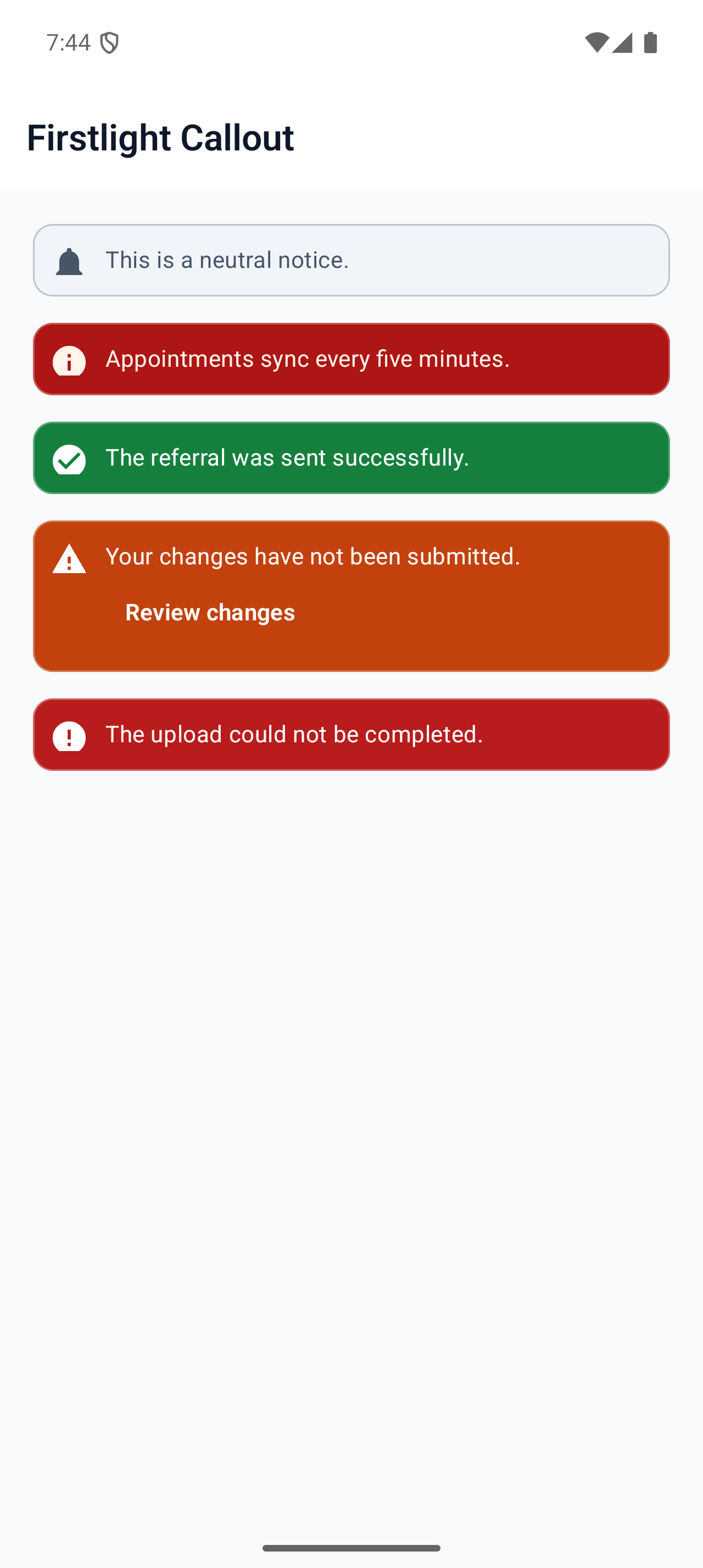
firstlight:callout

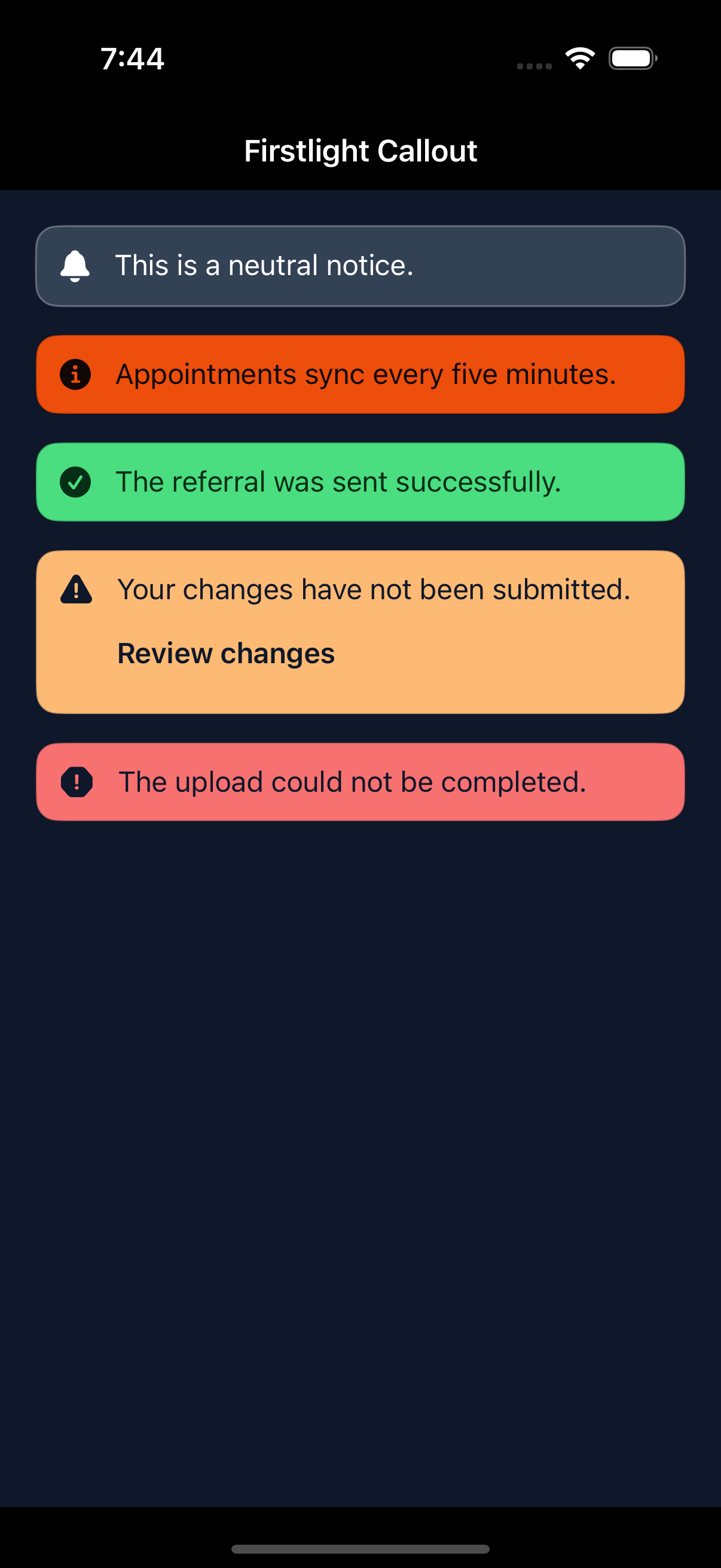
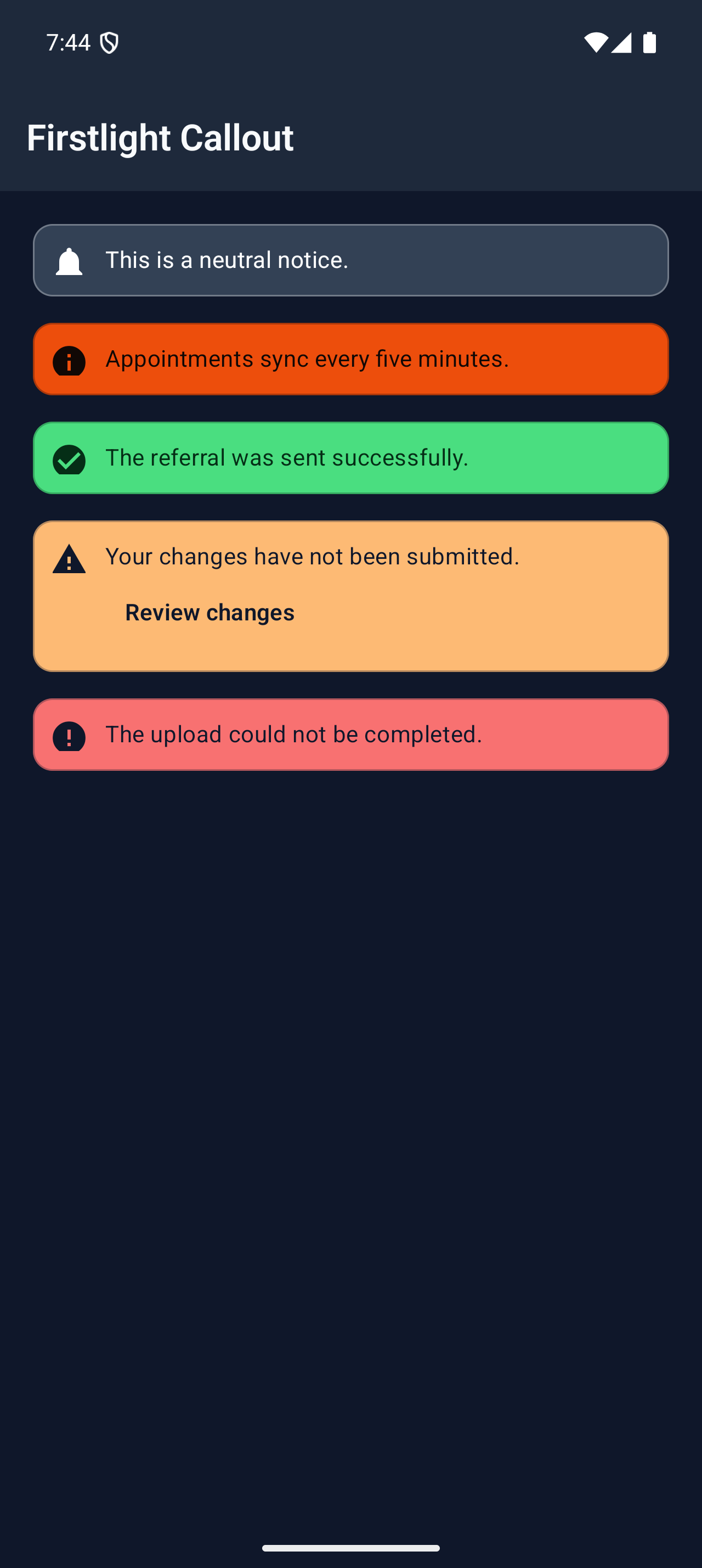
Keep an important semantic message visible in the page layout with an optional labelled action.
Read the docs
iOS Native
Firstlight Callout rendered on iOS
Android Native
Firstlight Callout rendered on Android

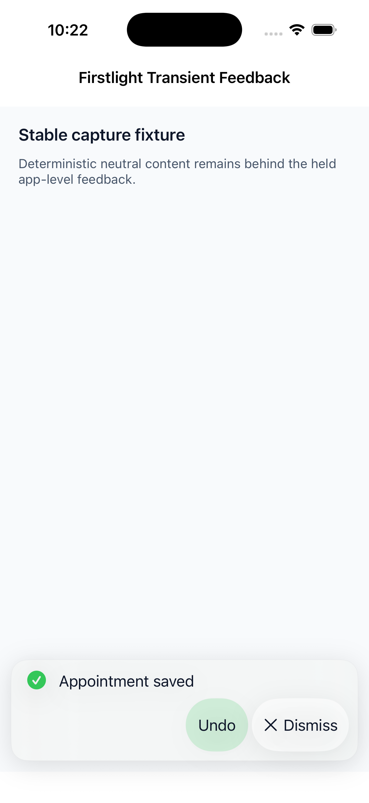
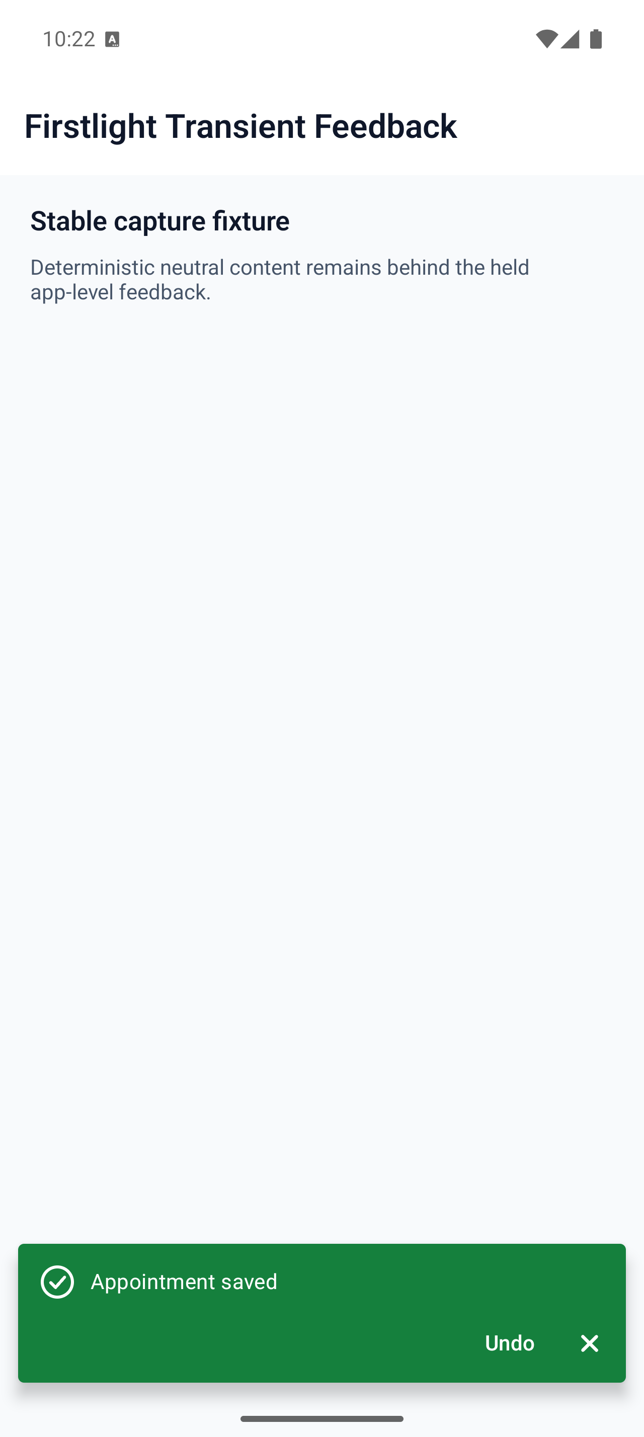
Transient Feedback

Available
Feedback::success()

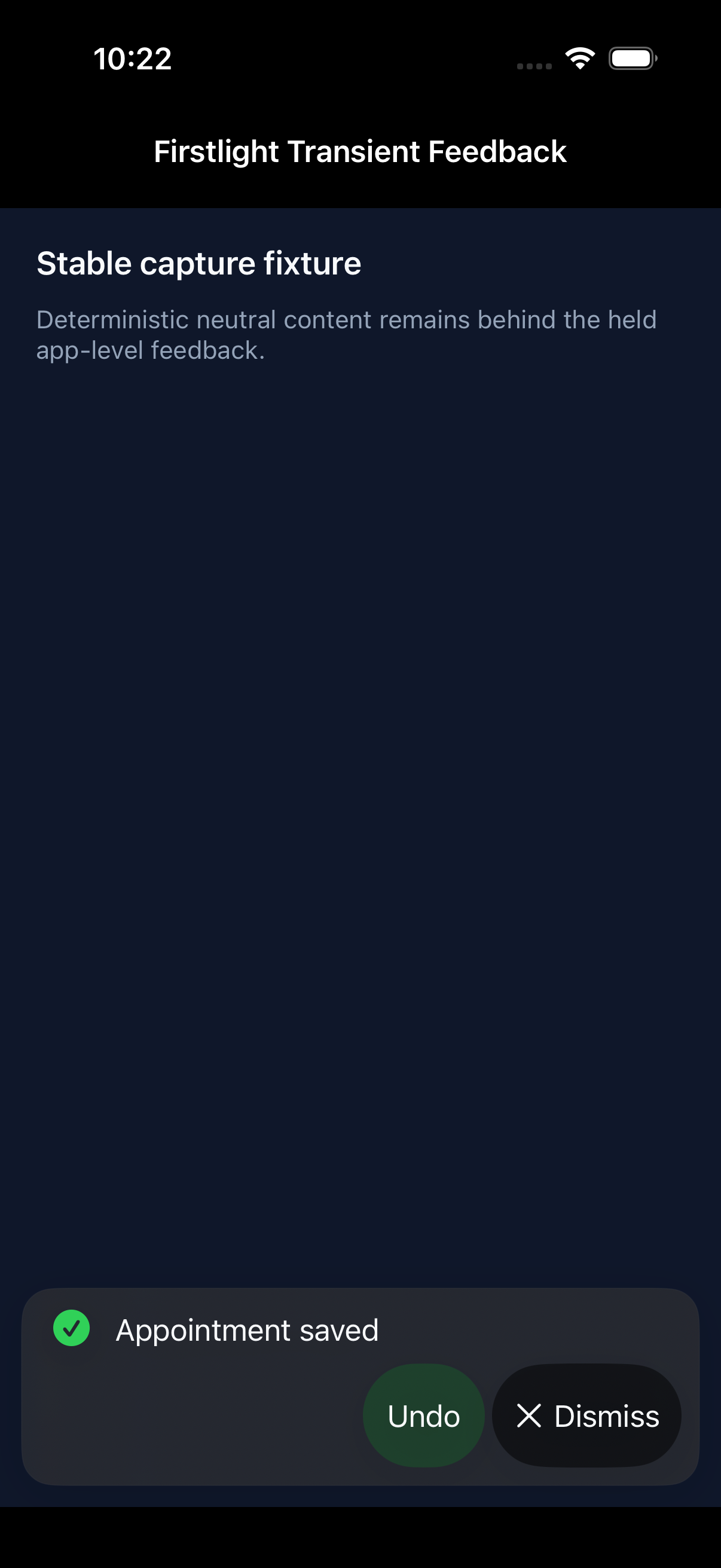
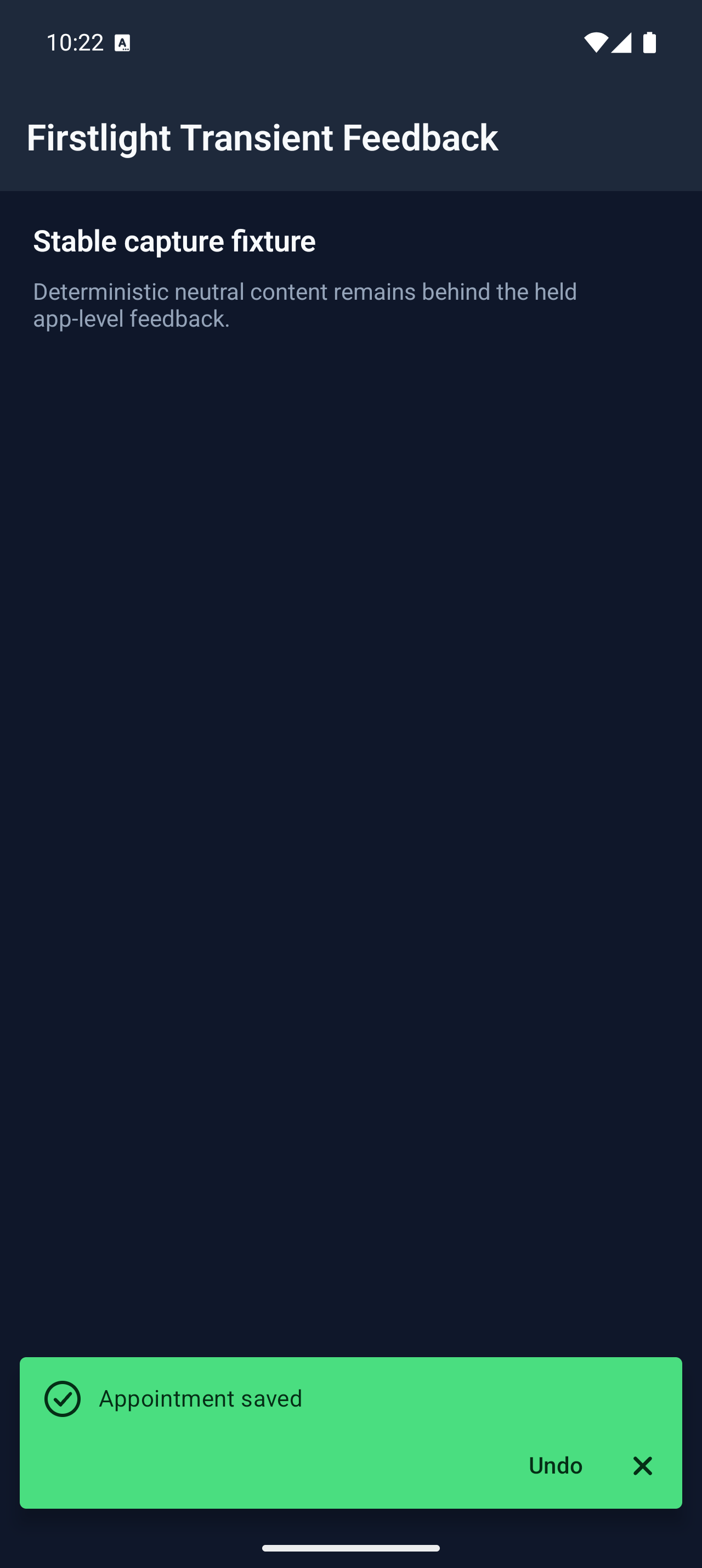
Publish brief app-level outcomes as queued native feedback that persists across normal screen navigation.
Read the docs
iOS Native
Firstlight Transient Feedback rendered on iOS
Android Native
Firstlight Transient Feedback rendered on Android

Badge

Available
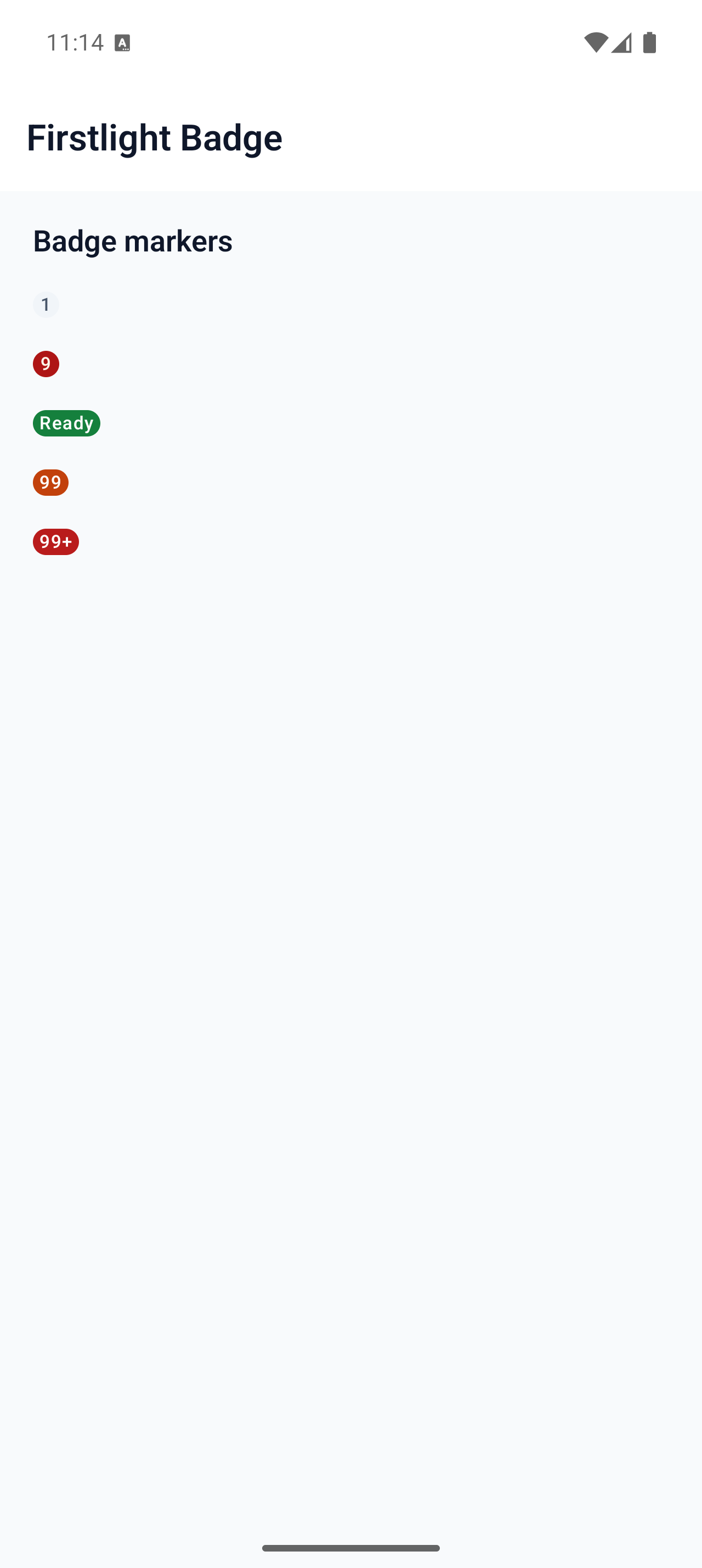
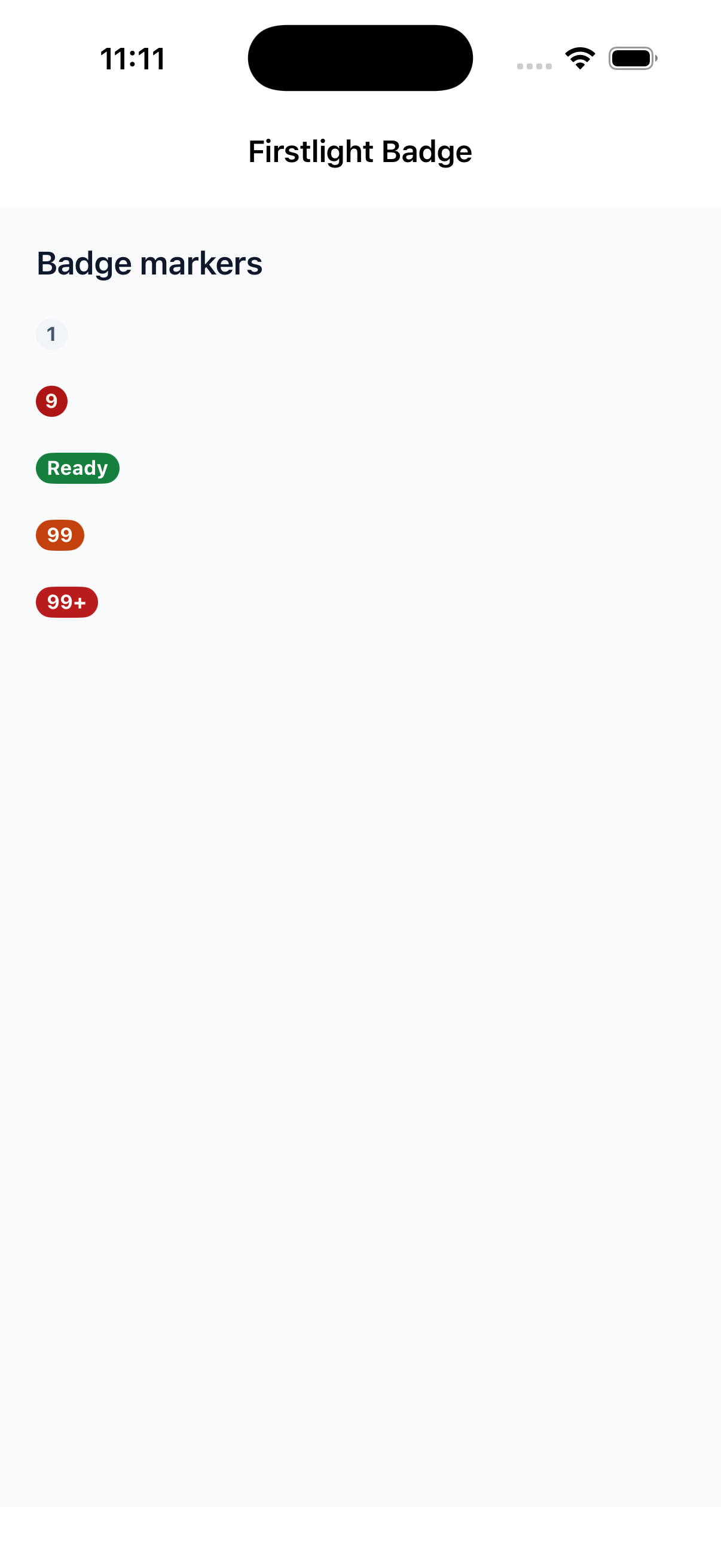
firstlight:badge

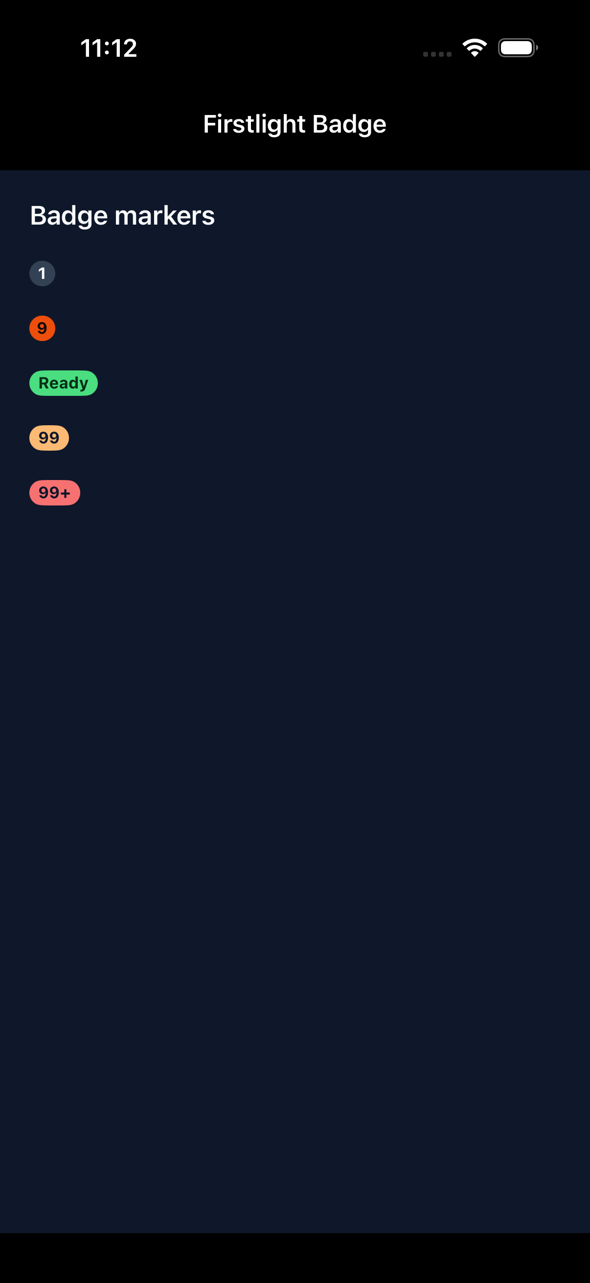
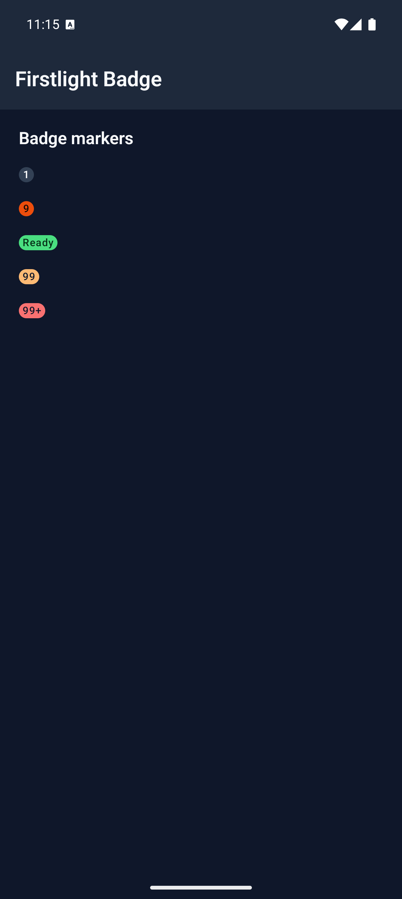
Show a compact, display-only count or short marker.
Read the docs
iOS Native
Firstlight Badge rendered on iOS
Android Native
Firstlight Badge rendered on Android

Checkbox

Available
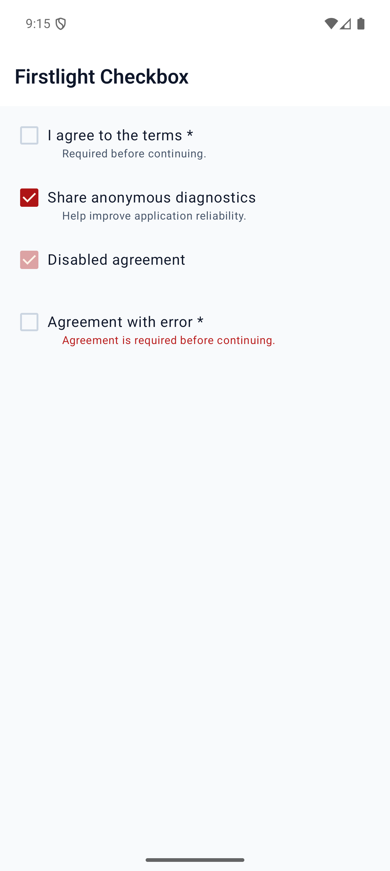
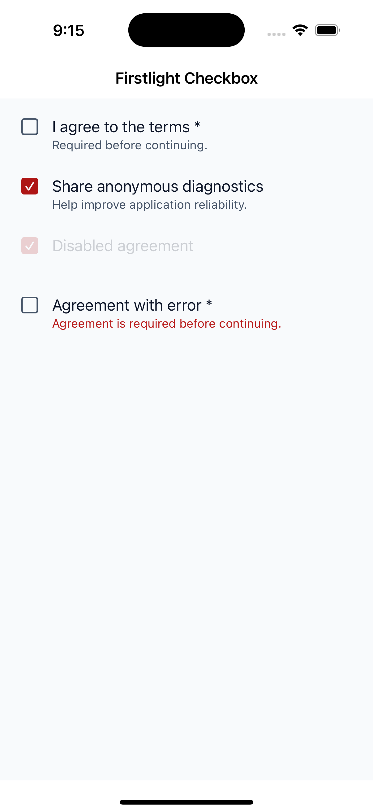
firstlight:checkbox

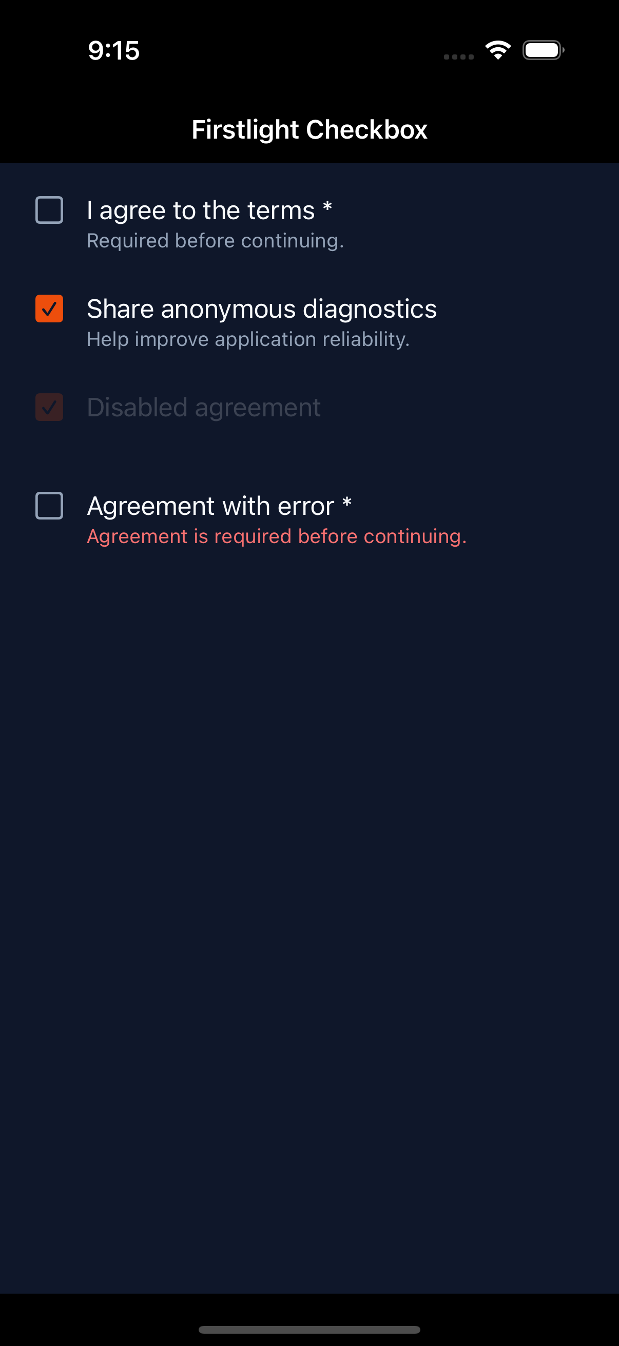
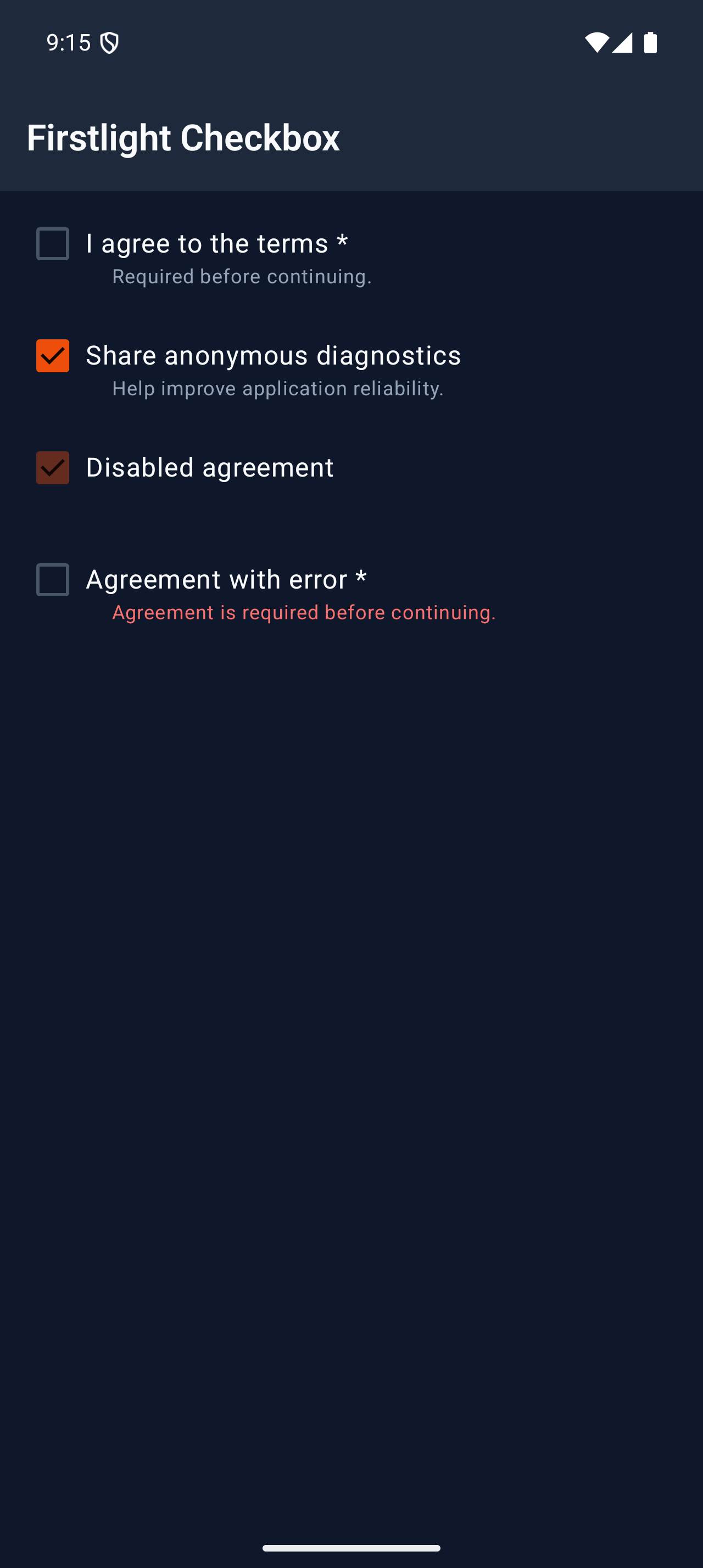
Toggle one Boolean value in a form or checklist, with the state kept in PHP.
Read the docs
iOS Native
Firstlight Checkbox rendered on iOS
Android Native
Firstlight Checkbox rendered on Android

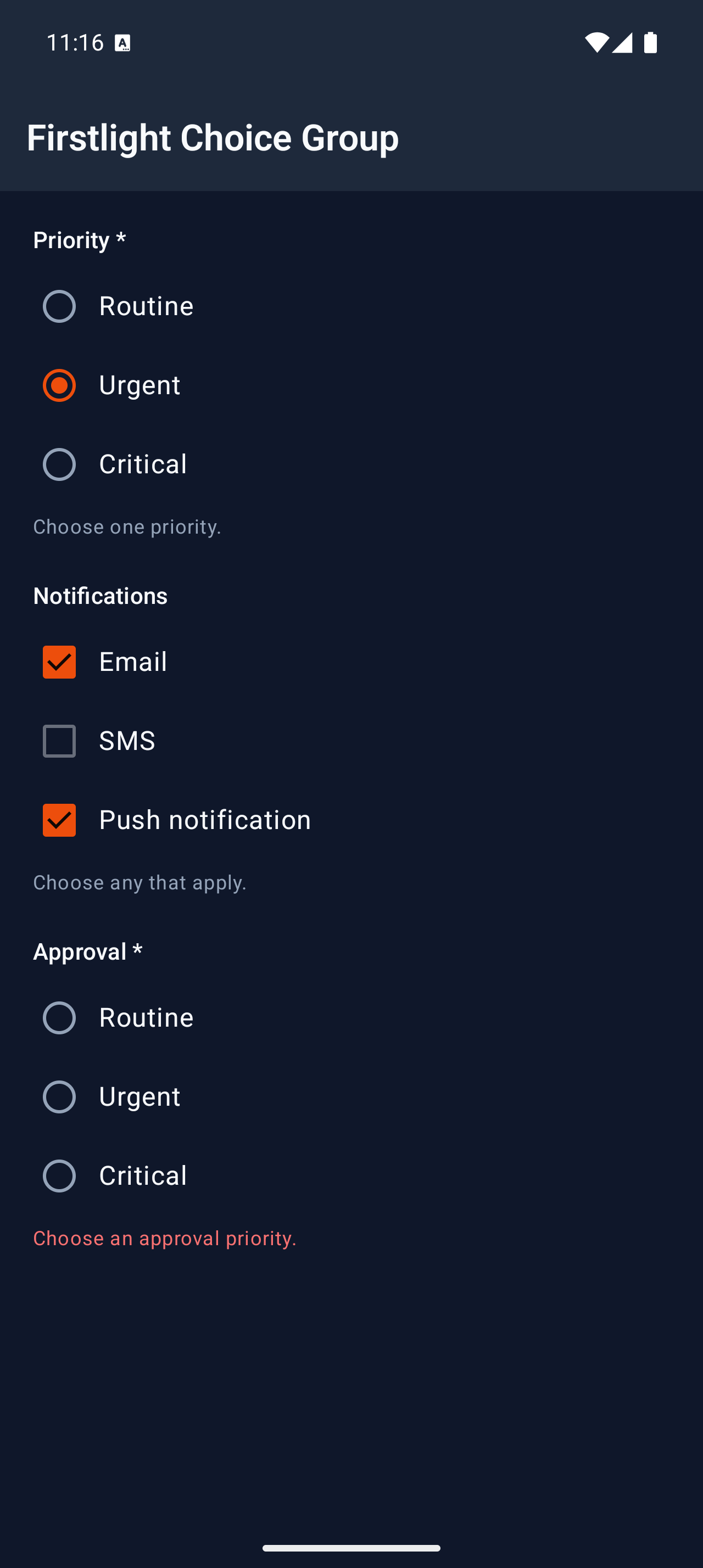
Choice Group

Available
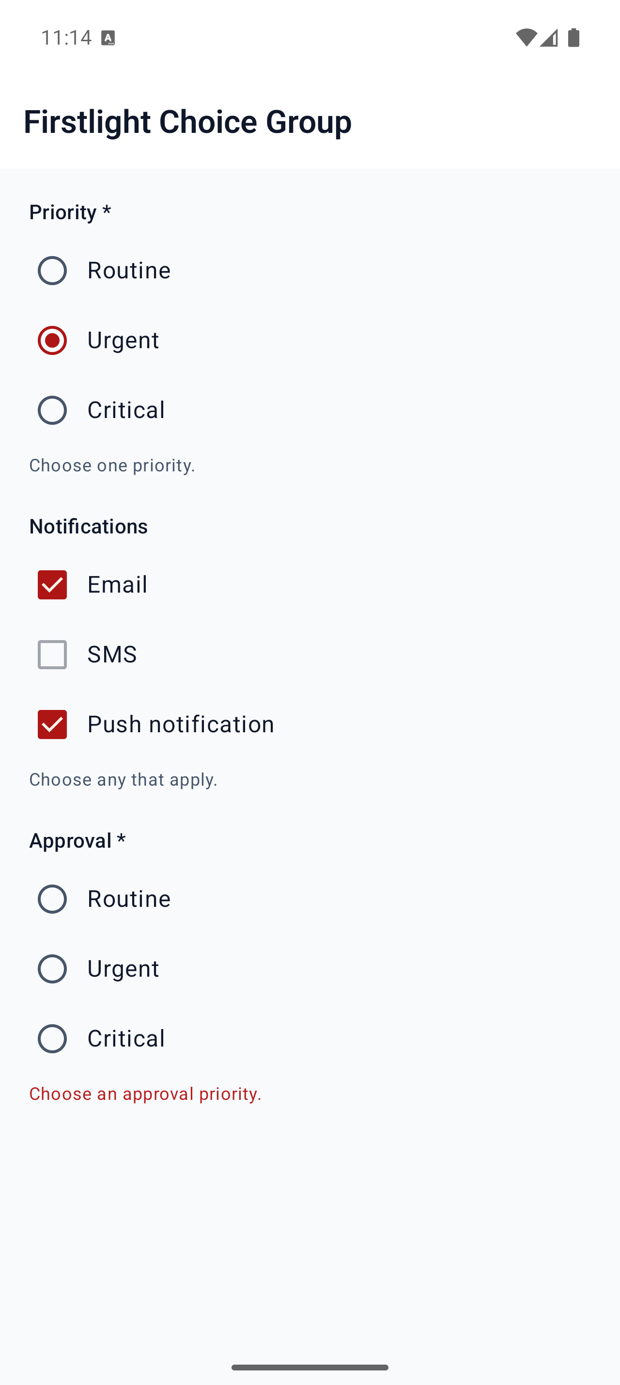
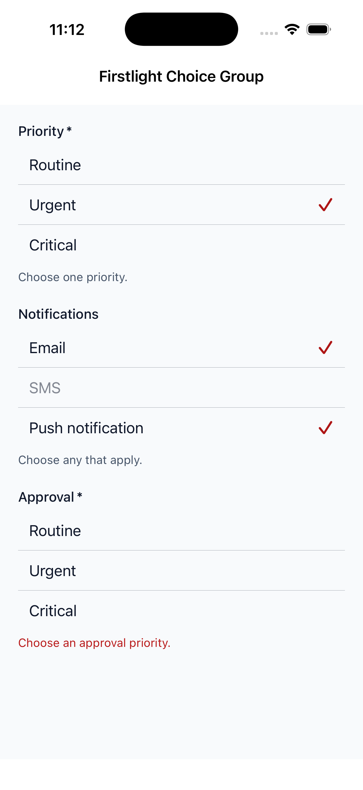
firstlight:choice-group

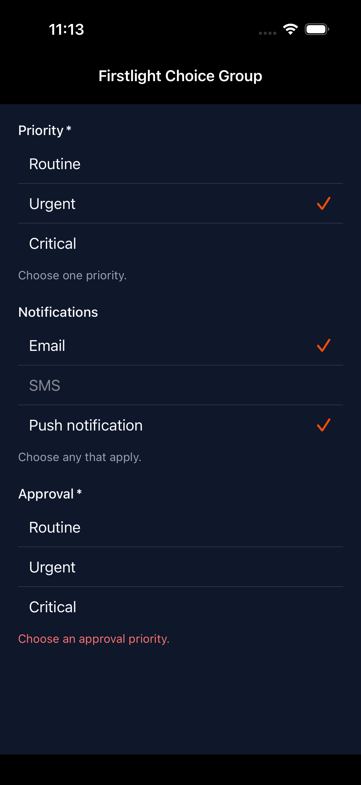
Show a visible list of labelled options for selecting one value or several values.
Read the docs
iOS Native
Firstlight Choice Group rendered on iOS
Android Native
Firstlight Choice Group rendered on Android
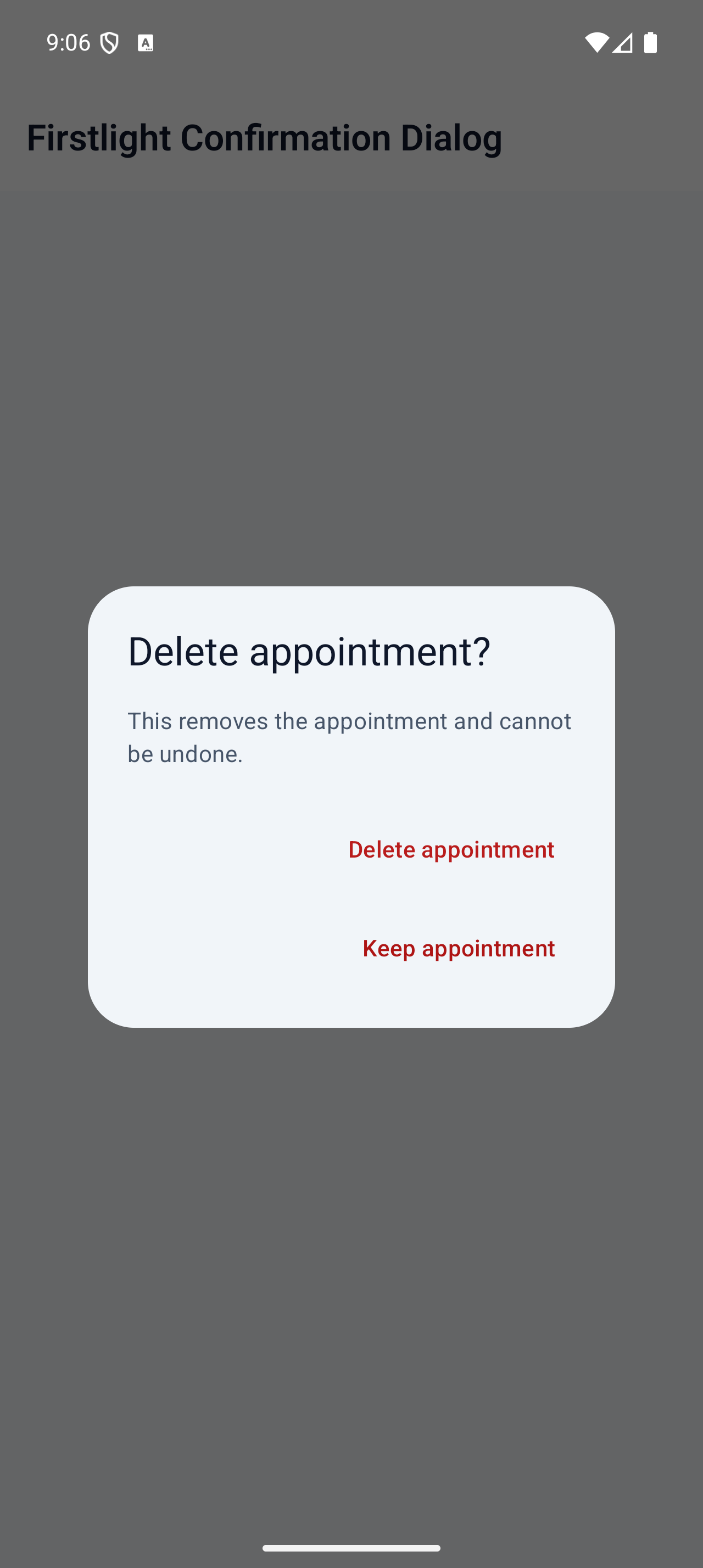
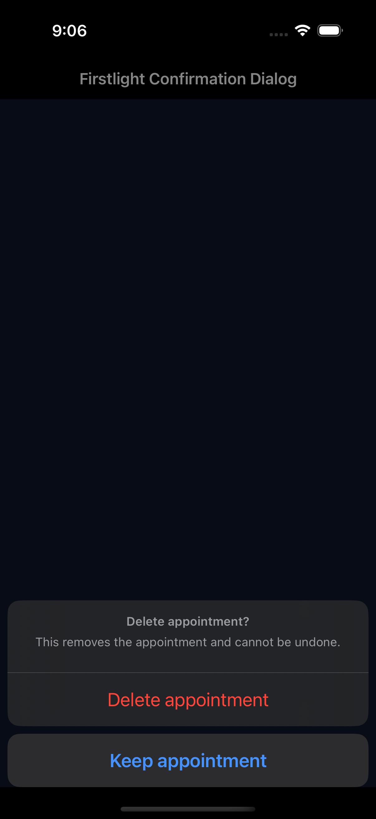
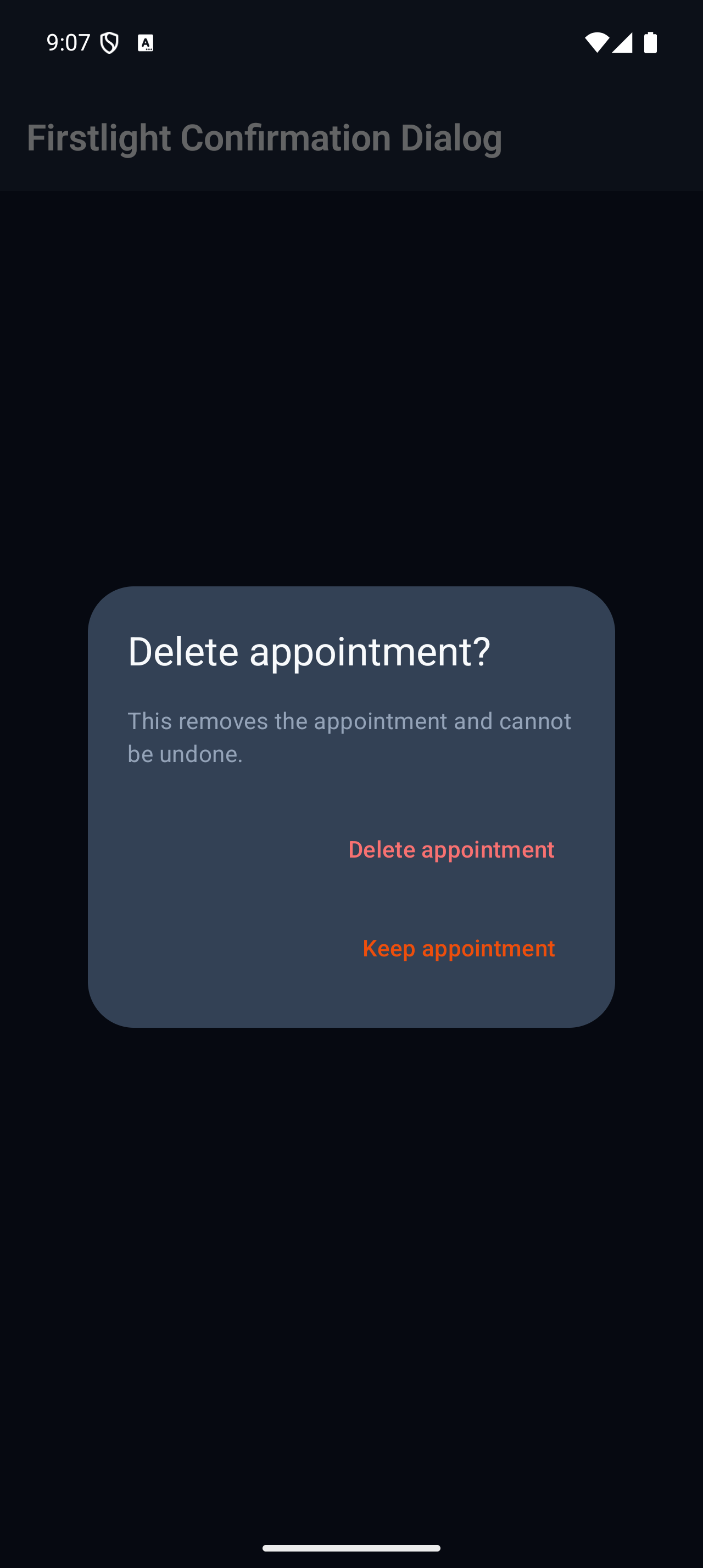
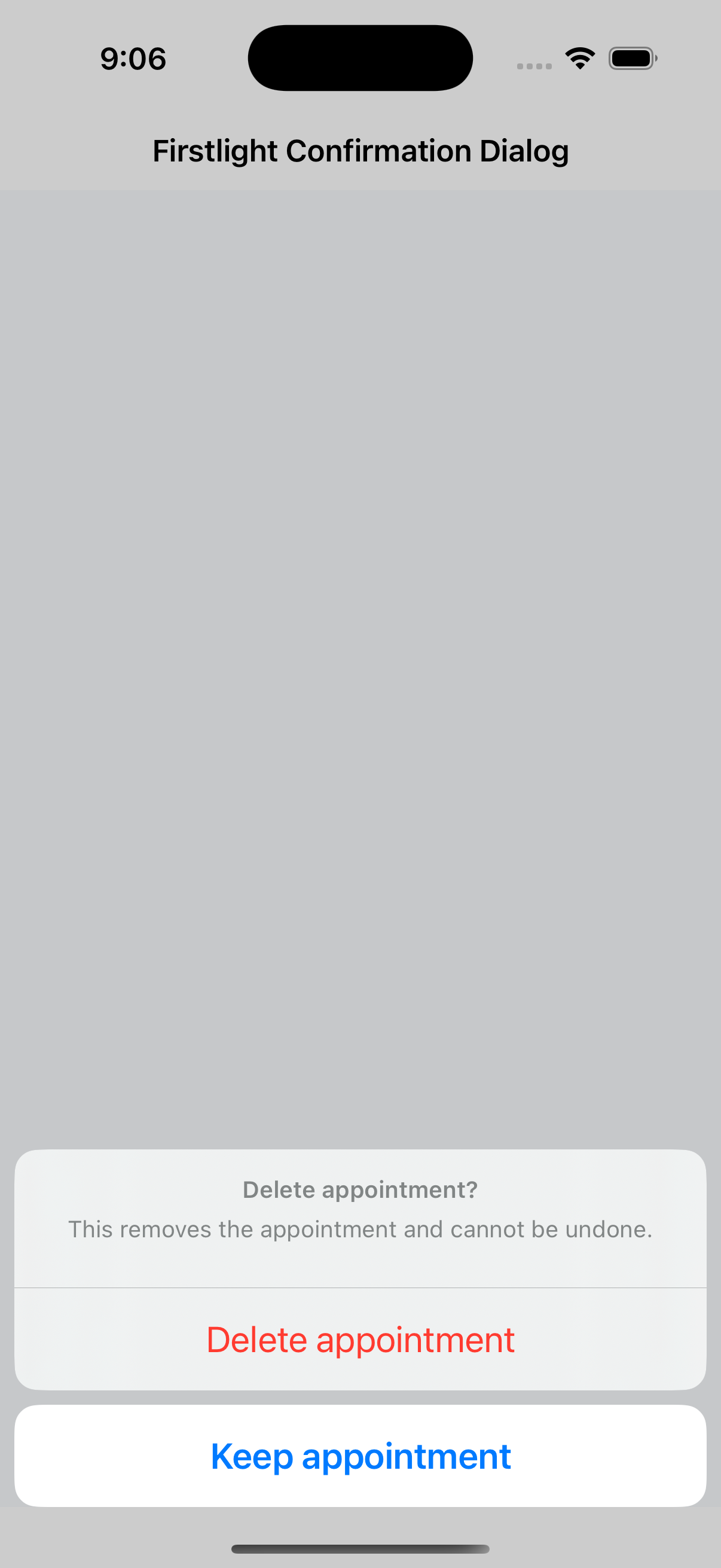
firstlight:confirmation-dialog

Ask for one native confirmation with explicit cancellation and destructive action semantics.
Read the docs
iOS Native
Firstlight Confirmation Dialog rendered on iOS
Android Native
Firstlight Confirmation Dialog rendered on Android

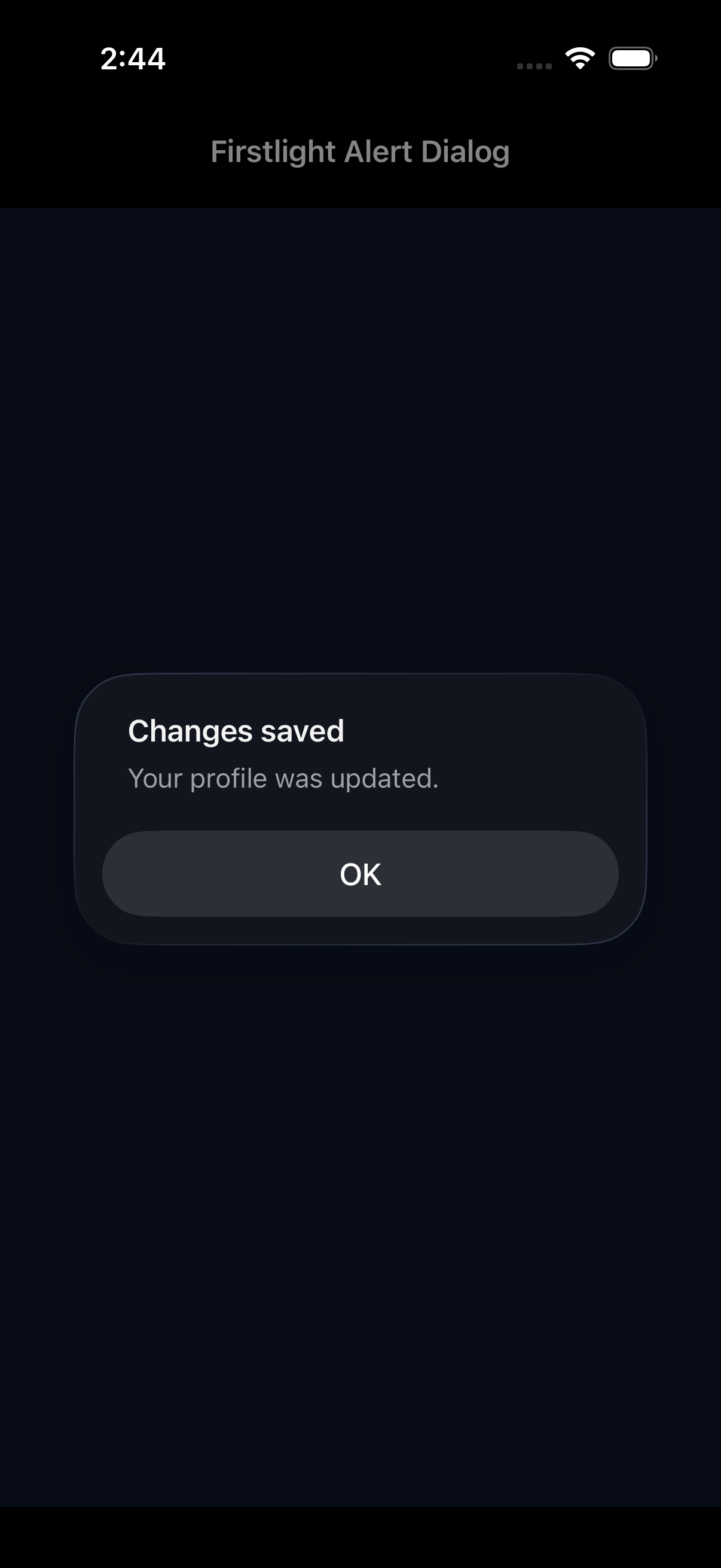
Alert Dialog

Available
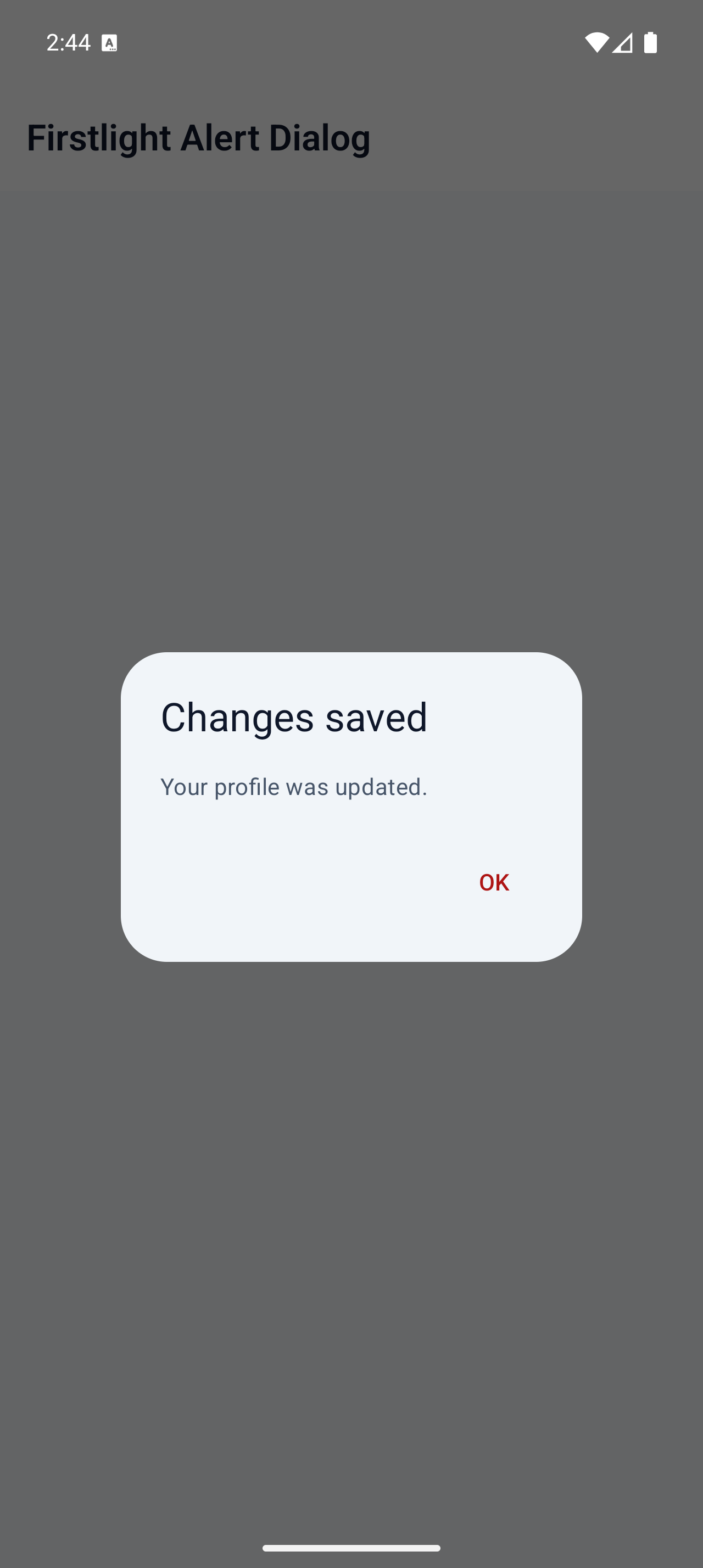
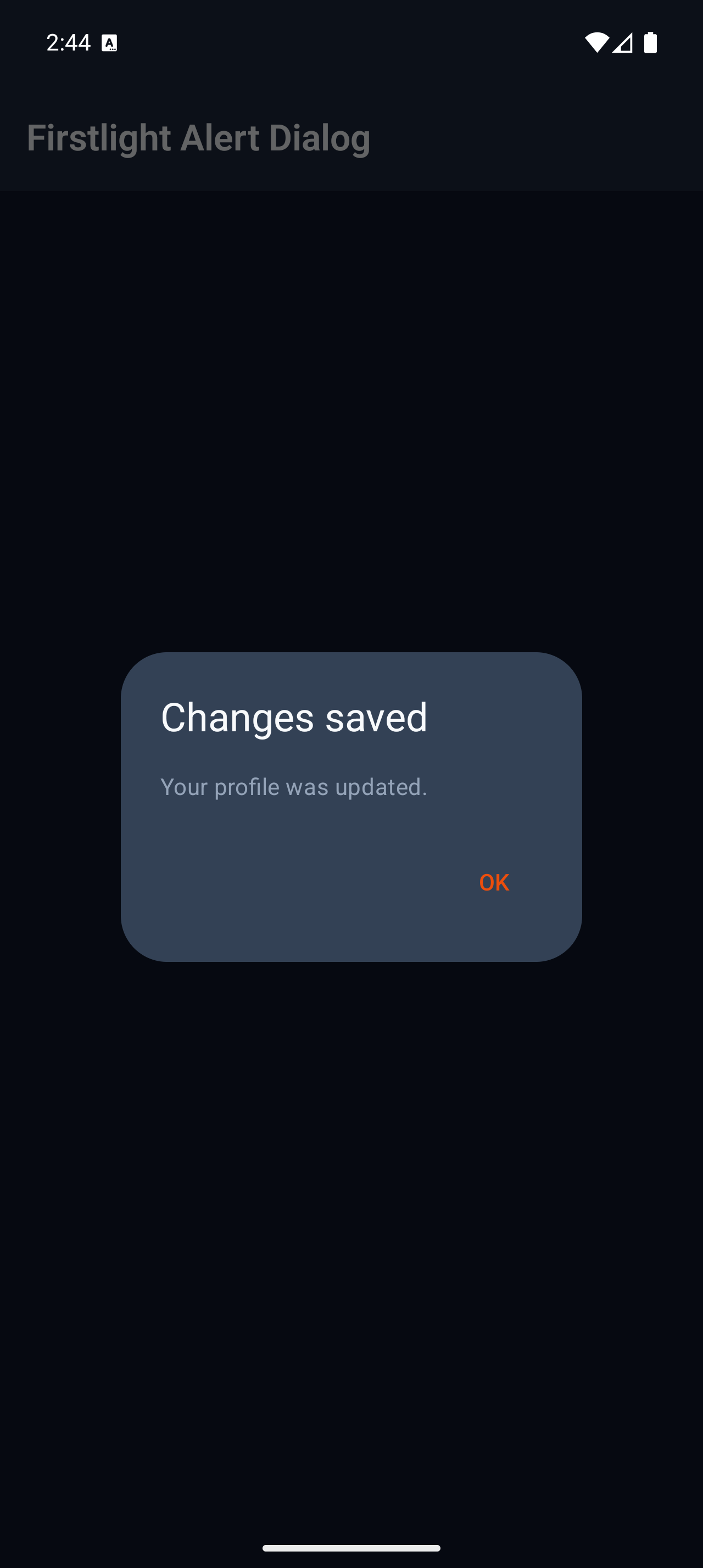
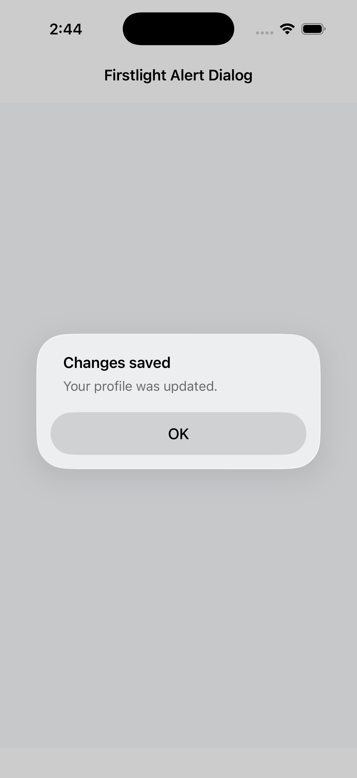
firstlight:alert-dialog

Present one native acknowledgement with a single action and server-controlled dismissal.
Read the docs
iOS Native
Firstlight Alert Dialog rendered on iOS
Android Native
Firstlight Alert Dialog rendered on Android

Modal

Available
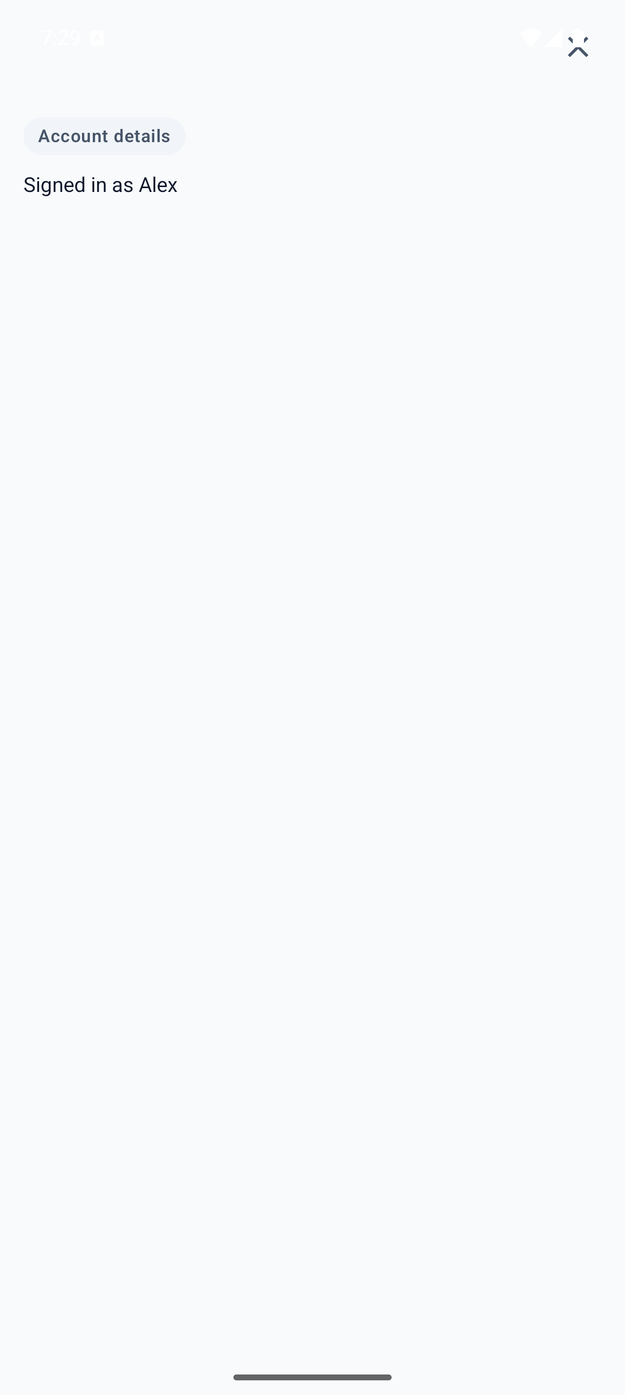
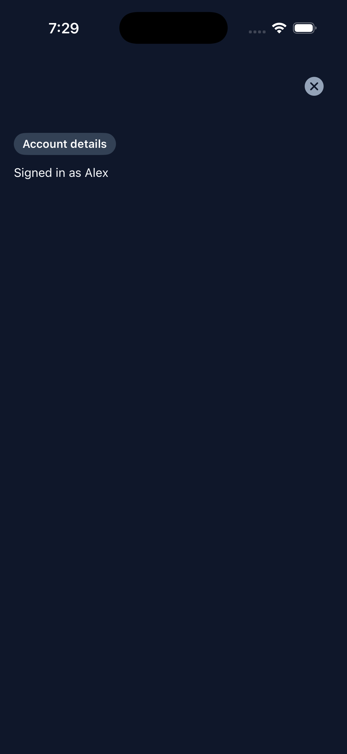
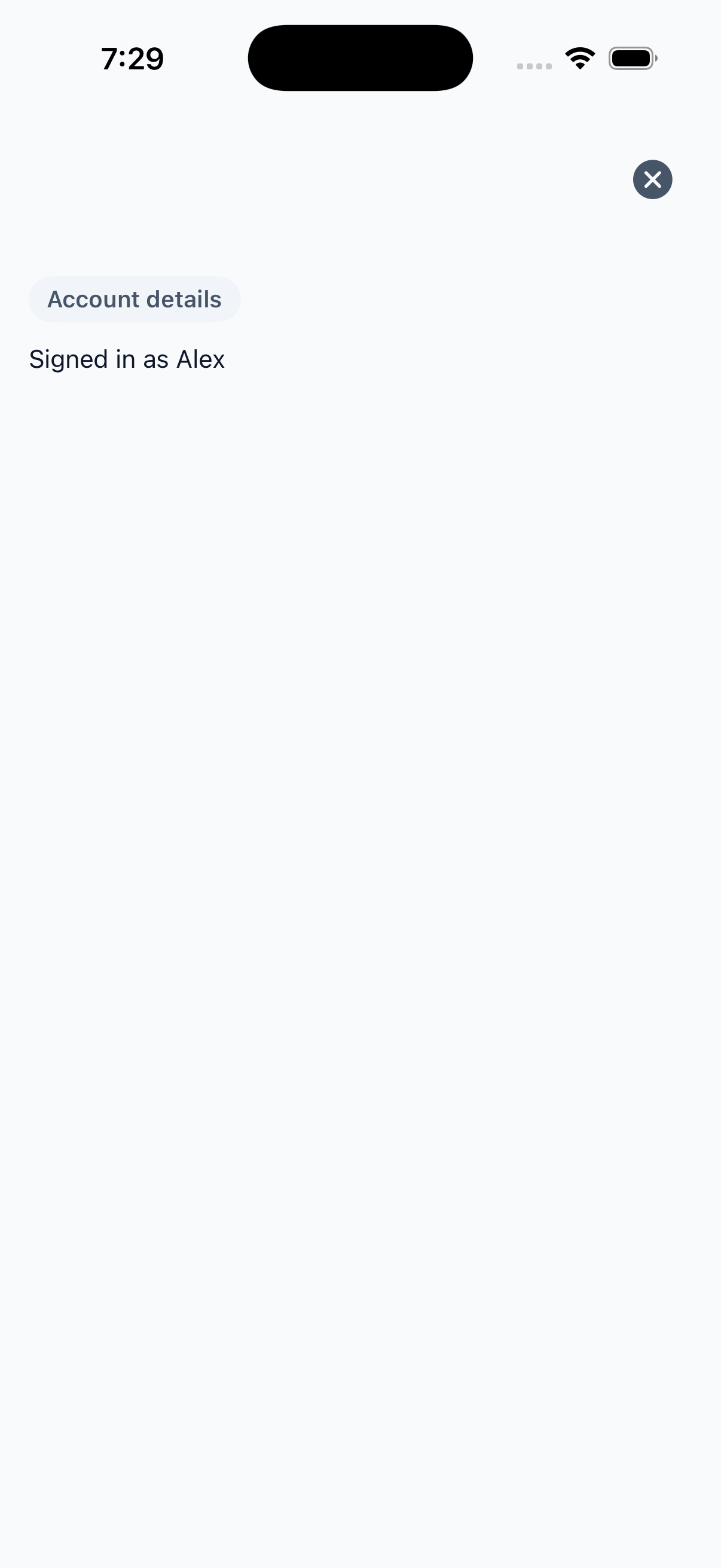
firstlight:modal

Present authored content in a full-screen native overlay with server-controlled dismissal.
Read the docs
iOS Native
Firstlight Modal rendered on iOS
Android Native
Firstlight Modal rendered on Android

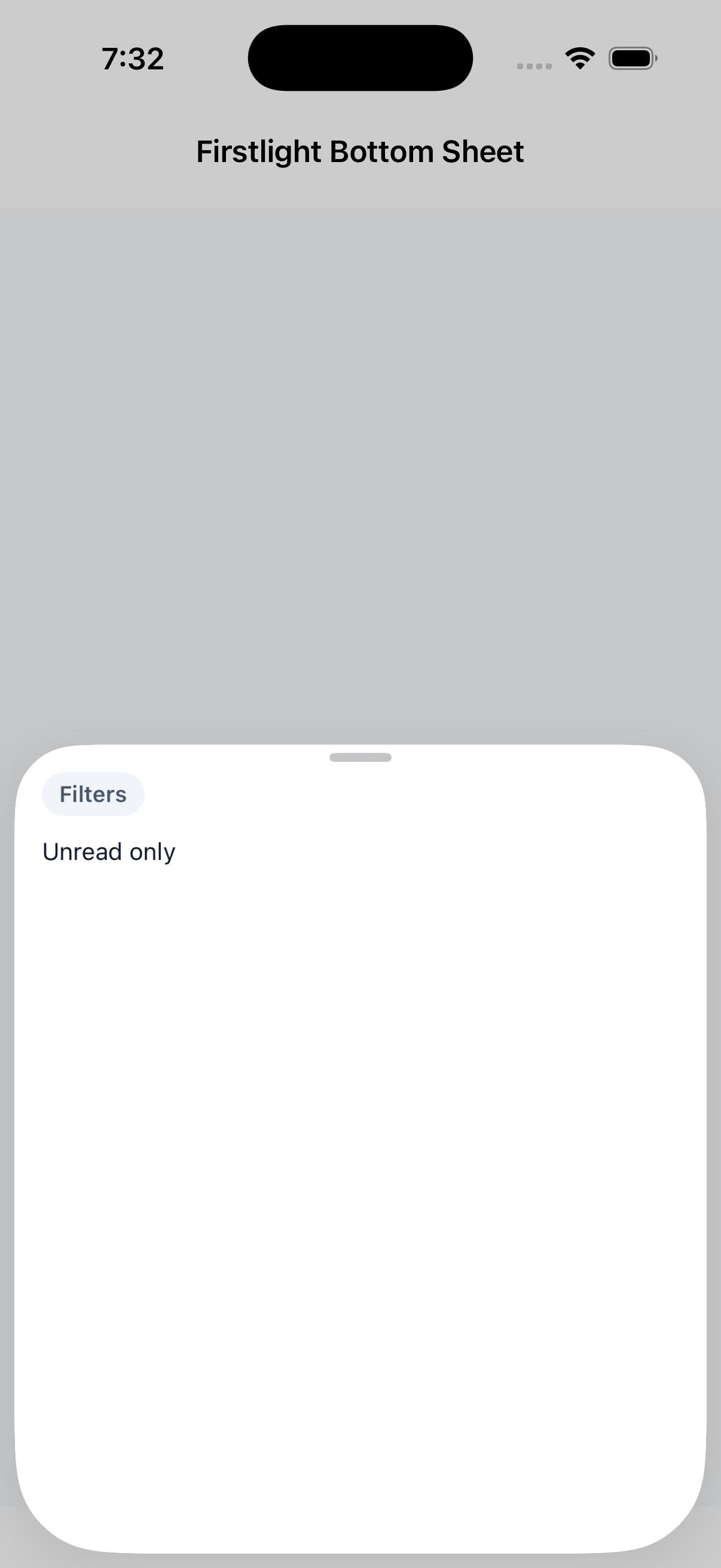
Bottom Sheet

Available
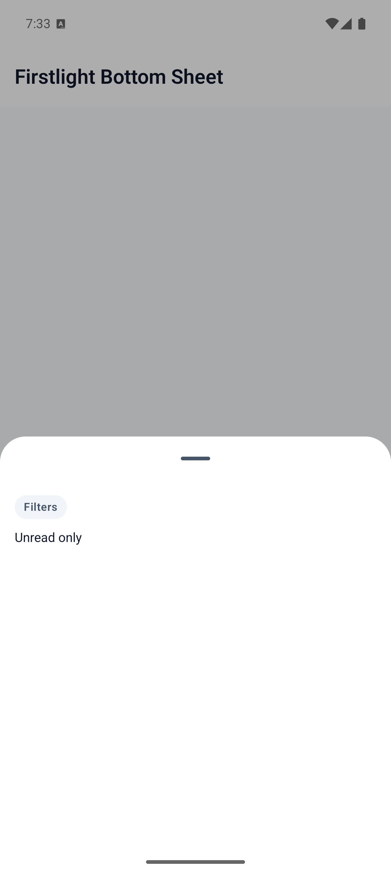
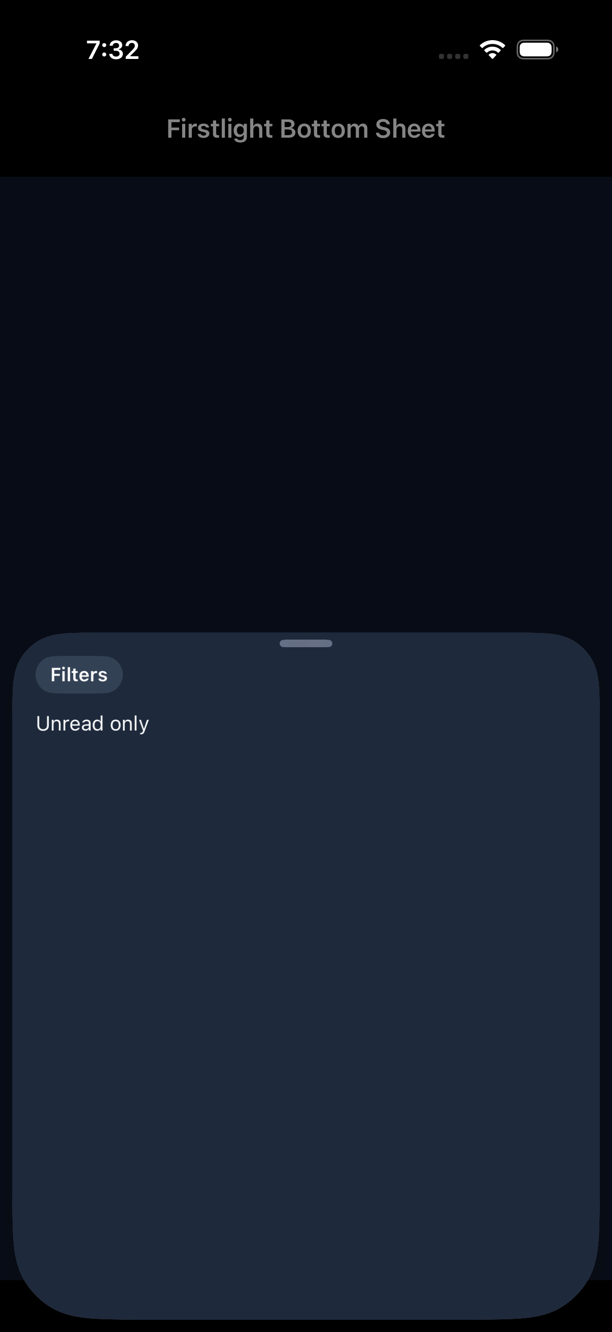
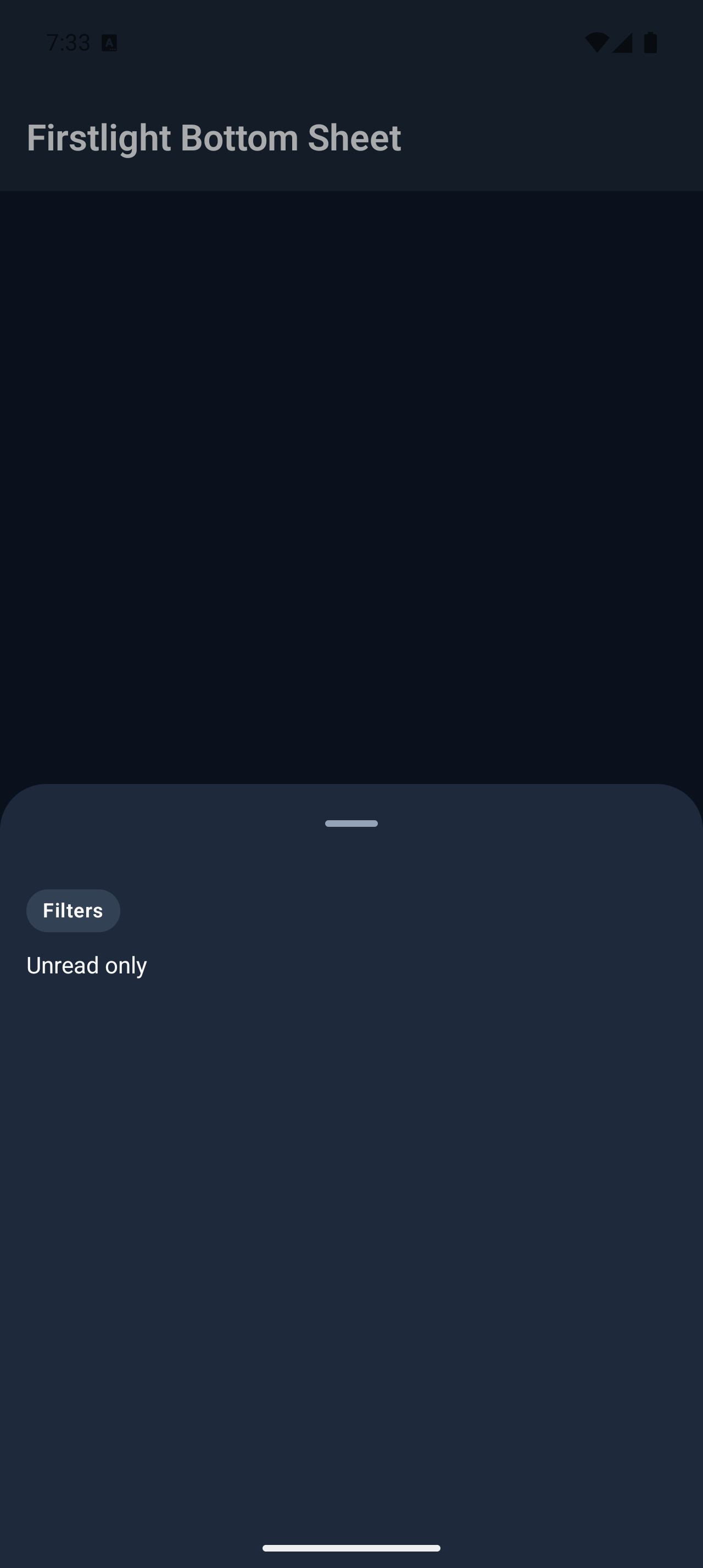
firstlight:bottom-sheet

Present authored content in a native bottom sheet with server-controlled dismissal.
Read the docs
iOS Native
Firstlight Bottom Sheet rendered on iOS
Android Native
Firstlight Bottom Sheet rendered on Android

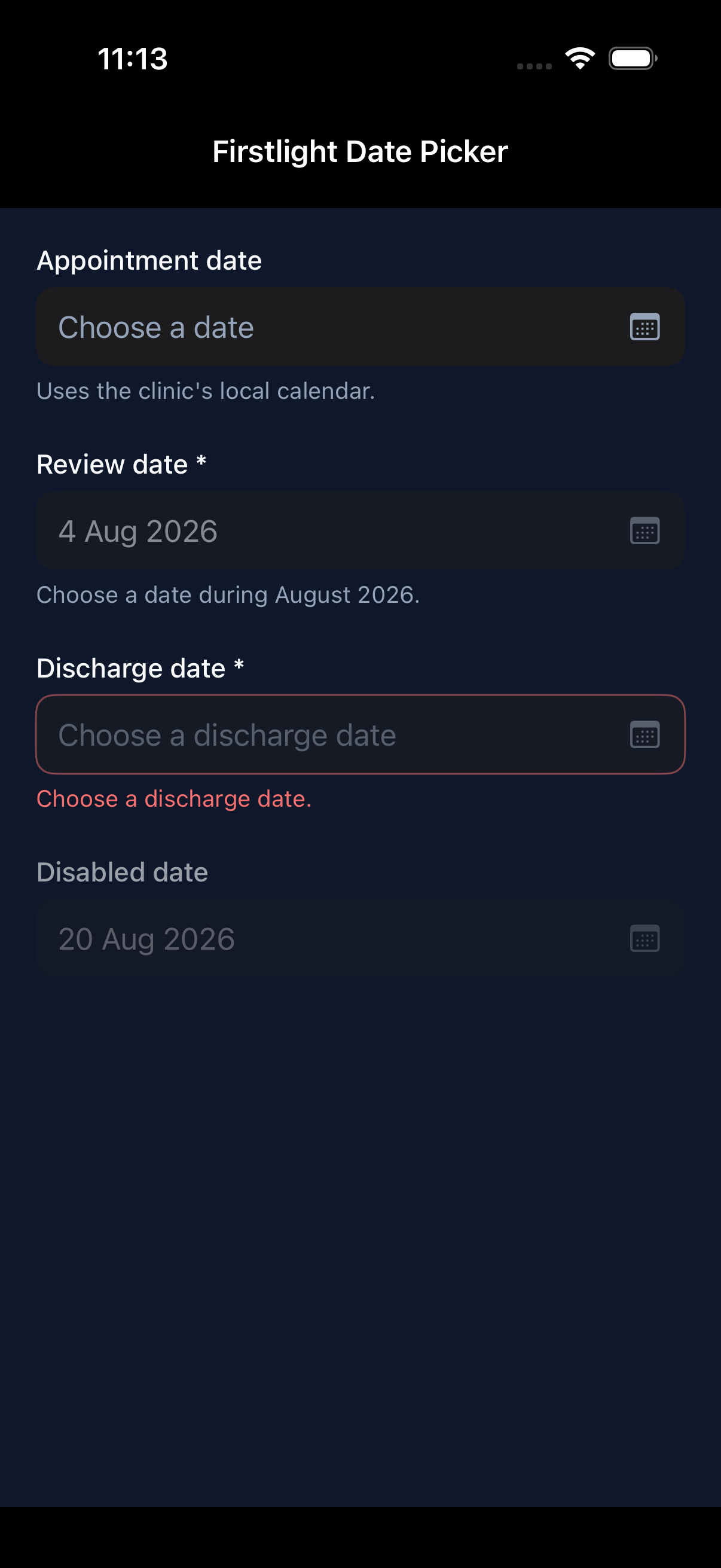
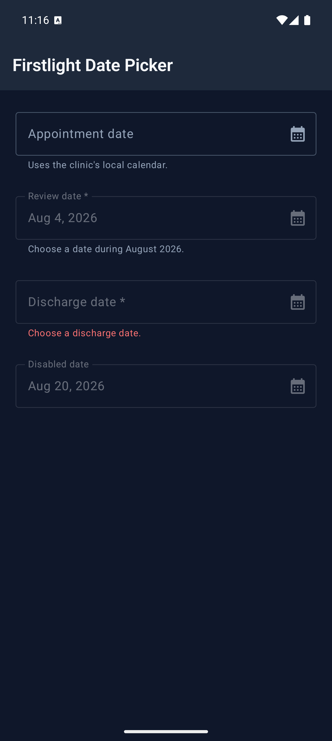
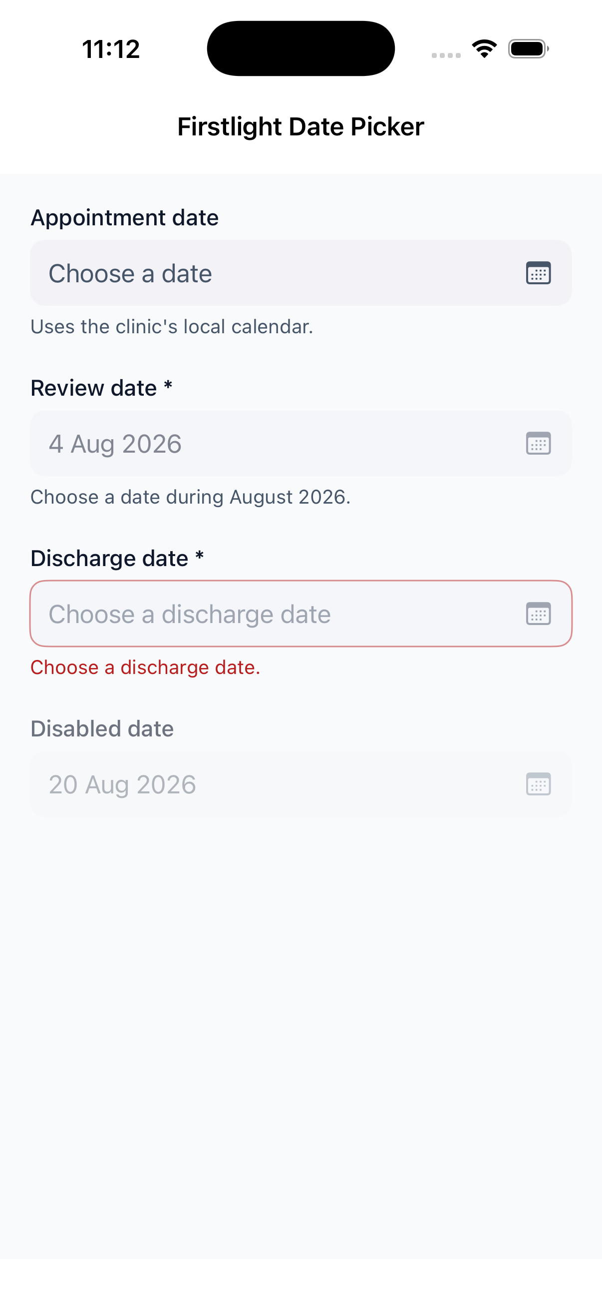
Date Picker

Available
firstlight:date-picker

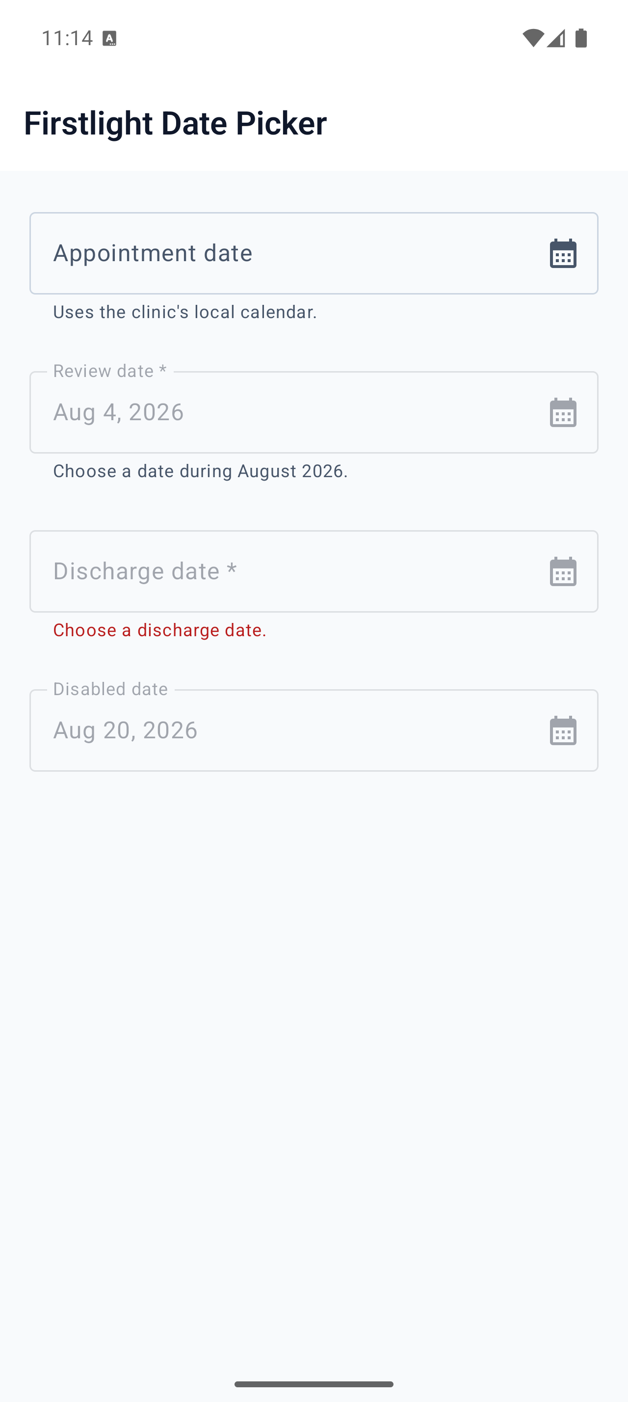
Choose an optional calendar date with each platform’s native, server-authoritative picker.
Read the docs
iOS Native
Firstlight Date Picker rendered on iOS
Android Native
Firstlight Date Picker rendered on Android

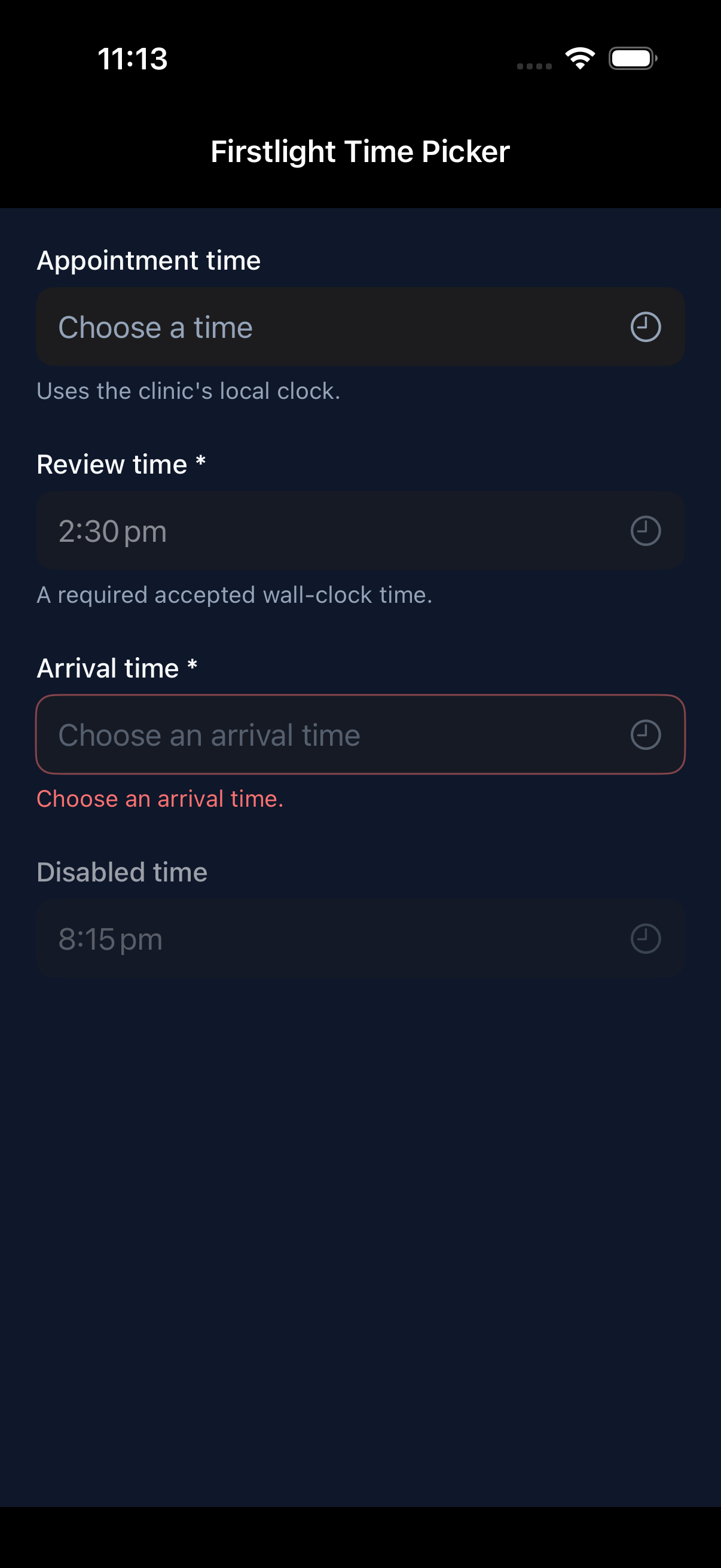
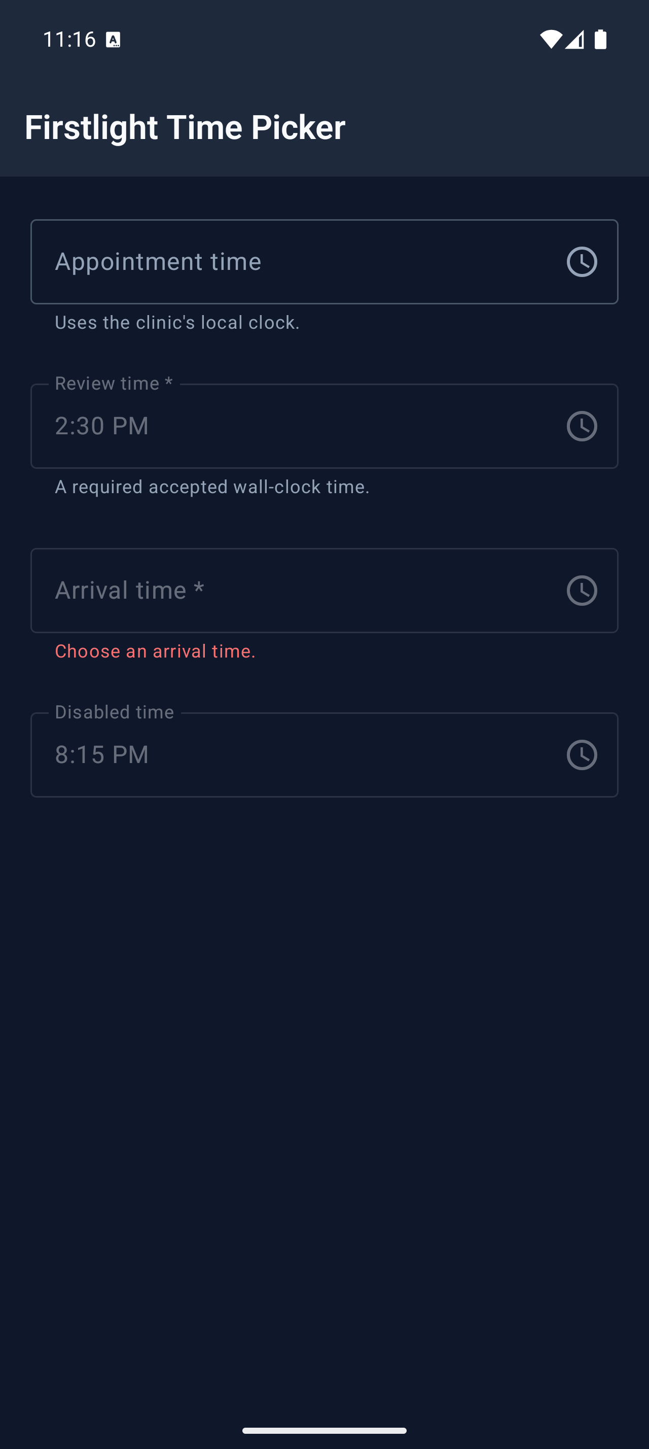
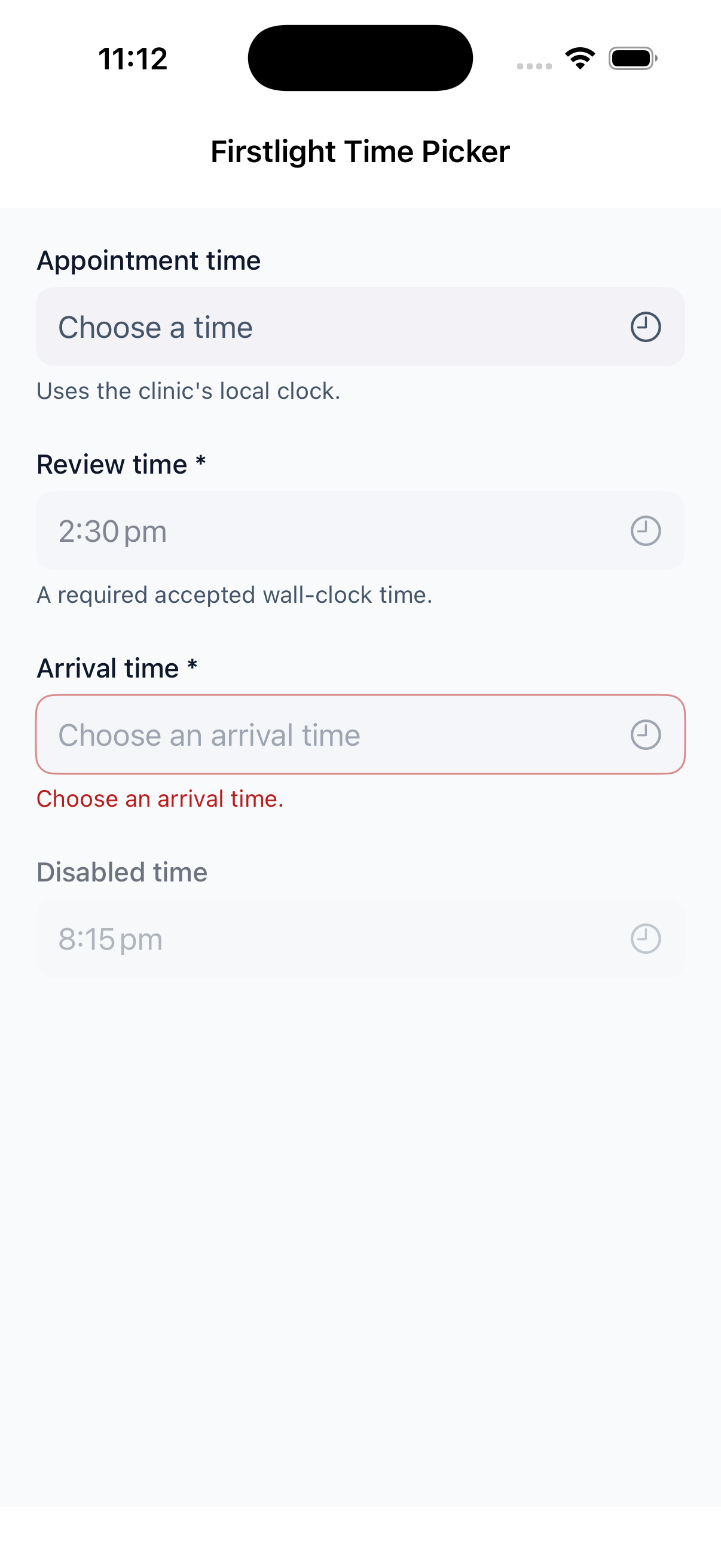
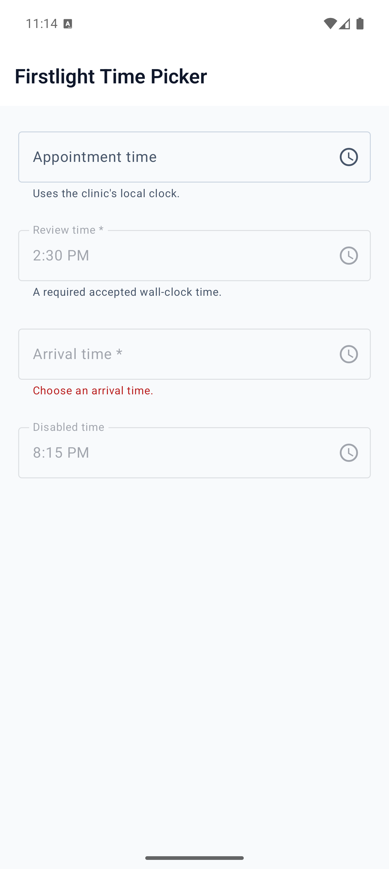
Time Picker

Available
firstlight:time-picker

Choose an optional wall-clock time while keeping the model value exact and server-authoritative.
Read the docs
iOS Native
Firstlight Time Picker rendered on iOS
Android Native
Firstlight Time Picker rendered on Android

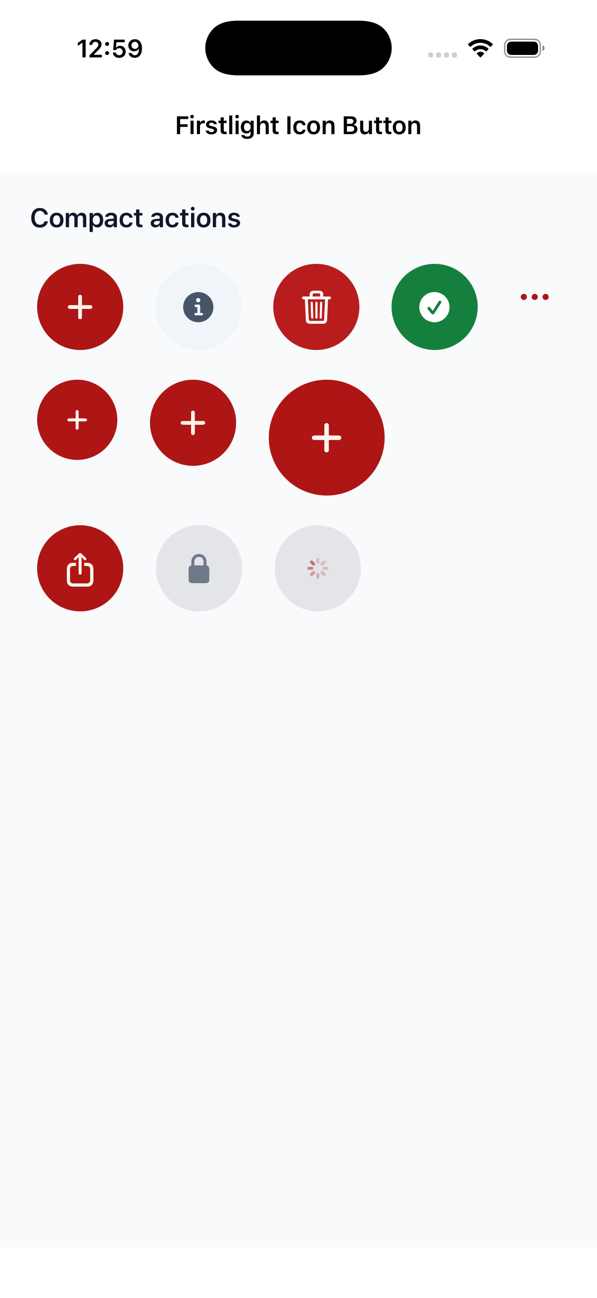
Icon Button

Available
firstlight:icon-button

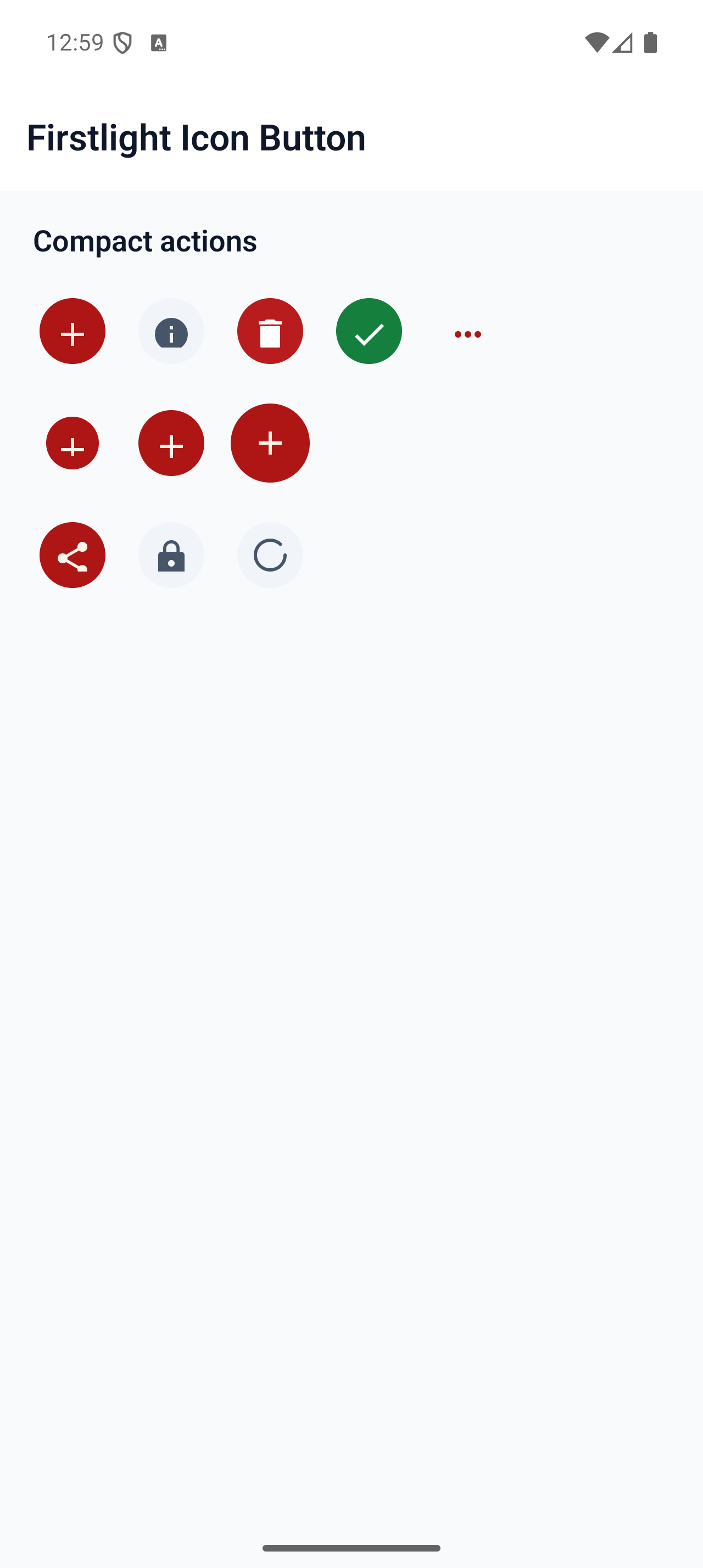
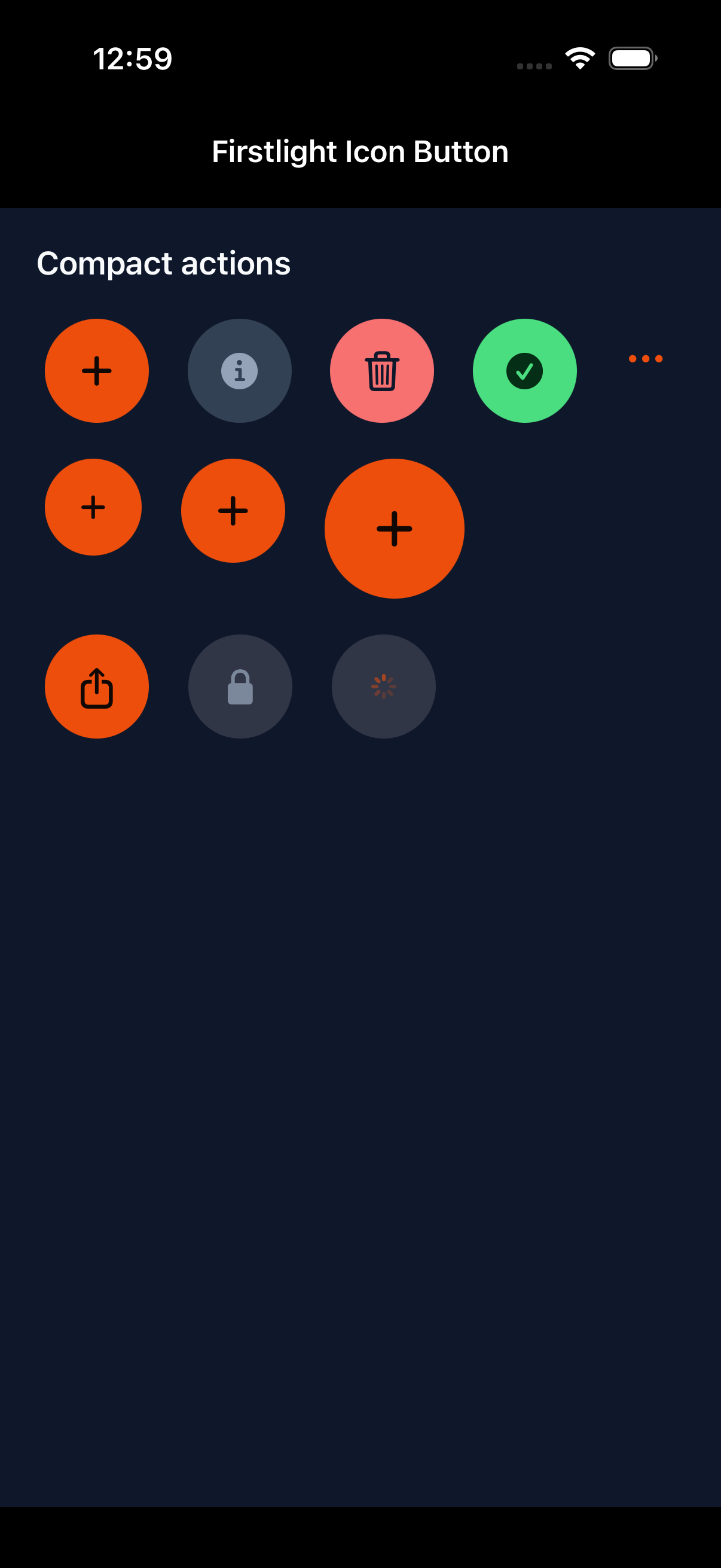
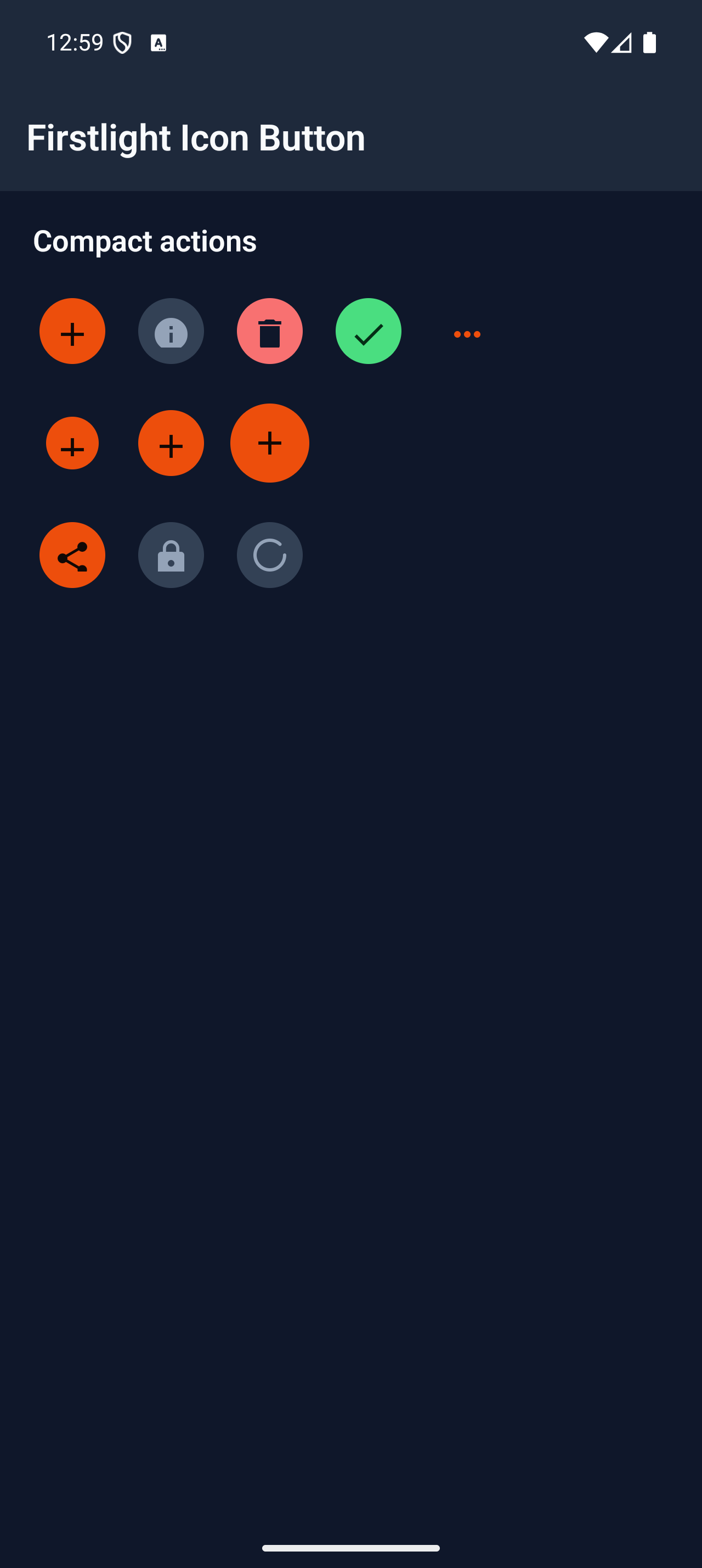
Trigger one compact, accessible action through native SwiftUI and Material icon buttons.
Read the docs
iOS Native
Firstlight Icon Button rendered on iOS
Android Native
Firstlight Icon Button rendered on Android

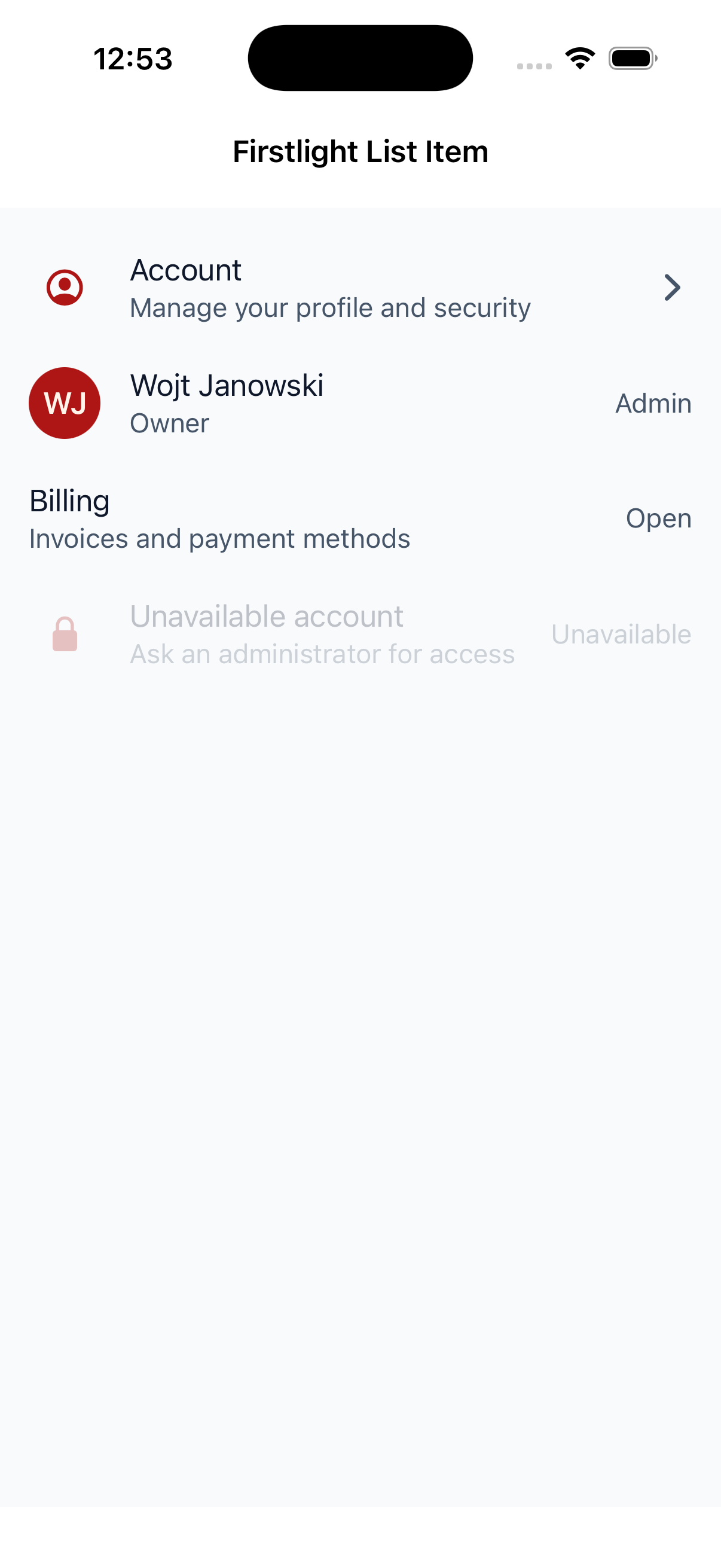
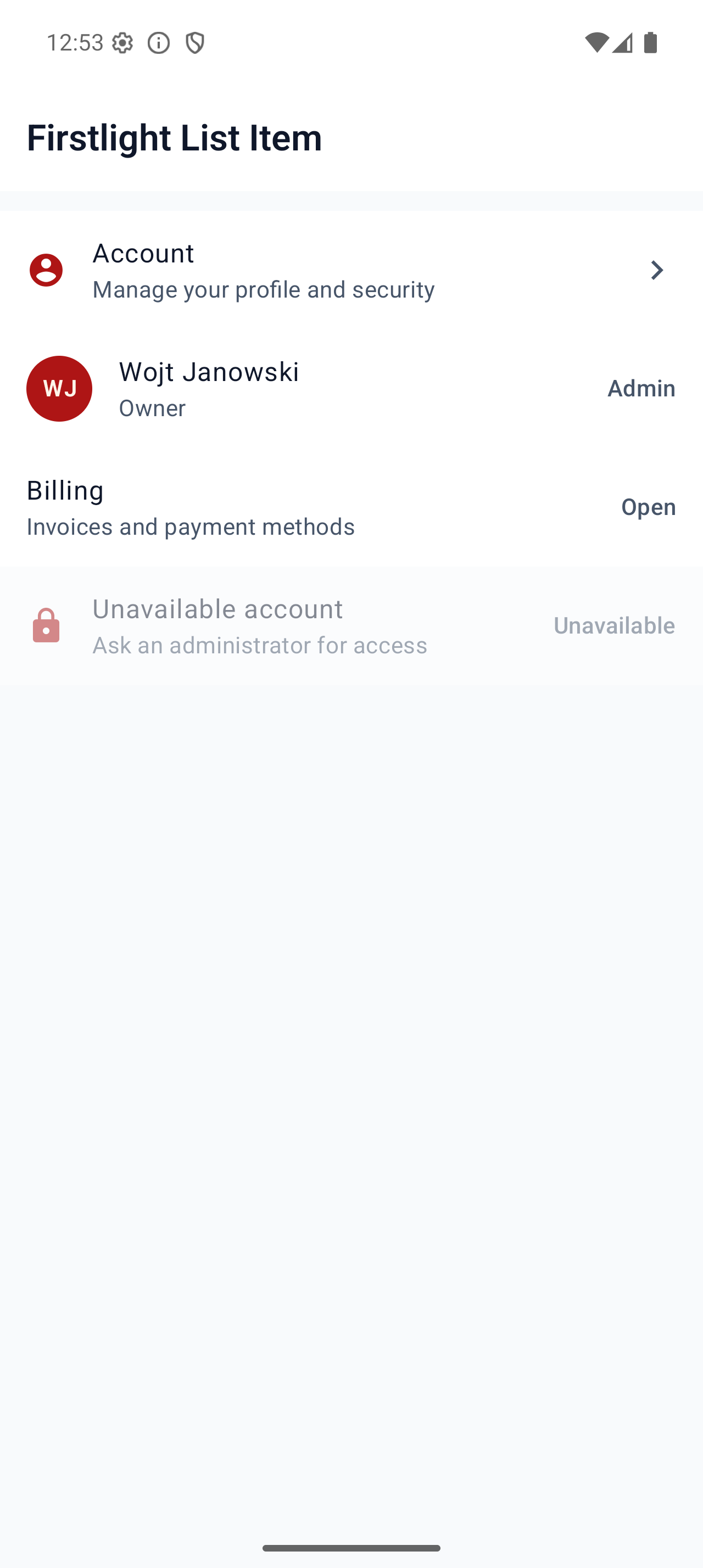
List Item

Available
firstlight:list-item

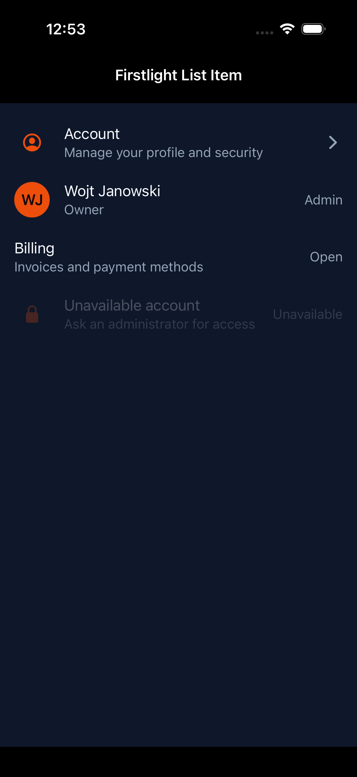
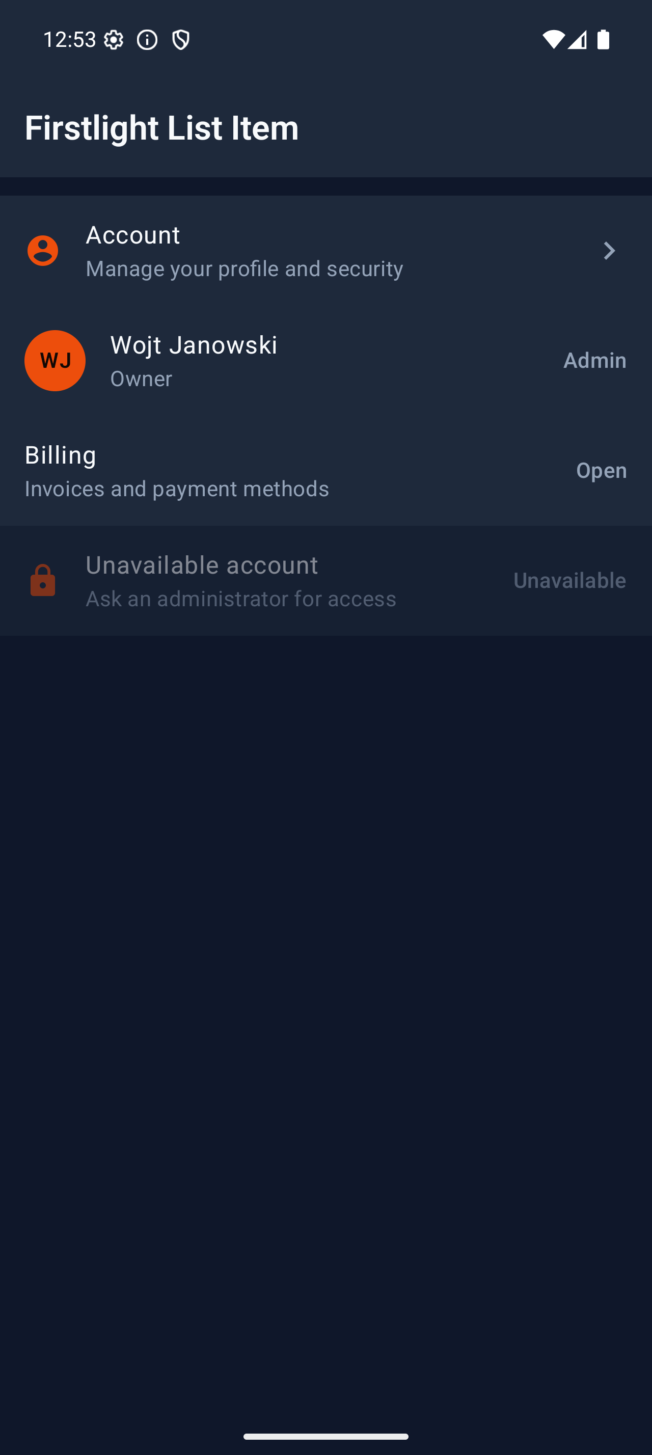
Present one tappable application row with supporting text, leading identity, and a trailing affordance.
Read the docs
iOS Native
Firstlight List Item rendered on iOS
Android Native
Firstlight List Item rendered on Android

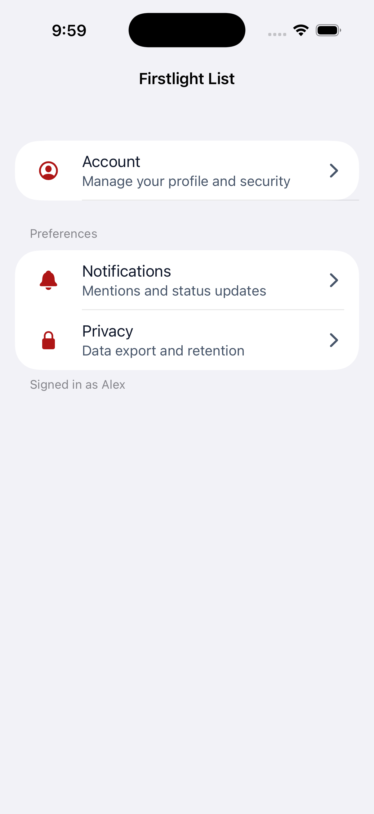
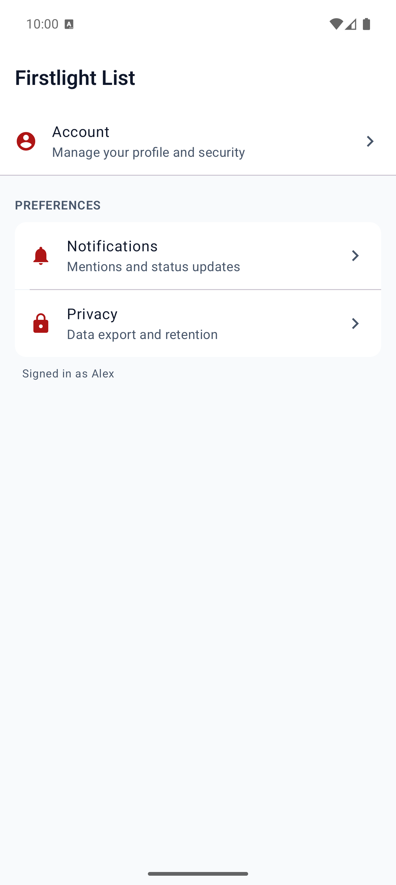
List

Available
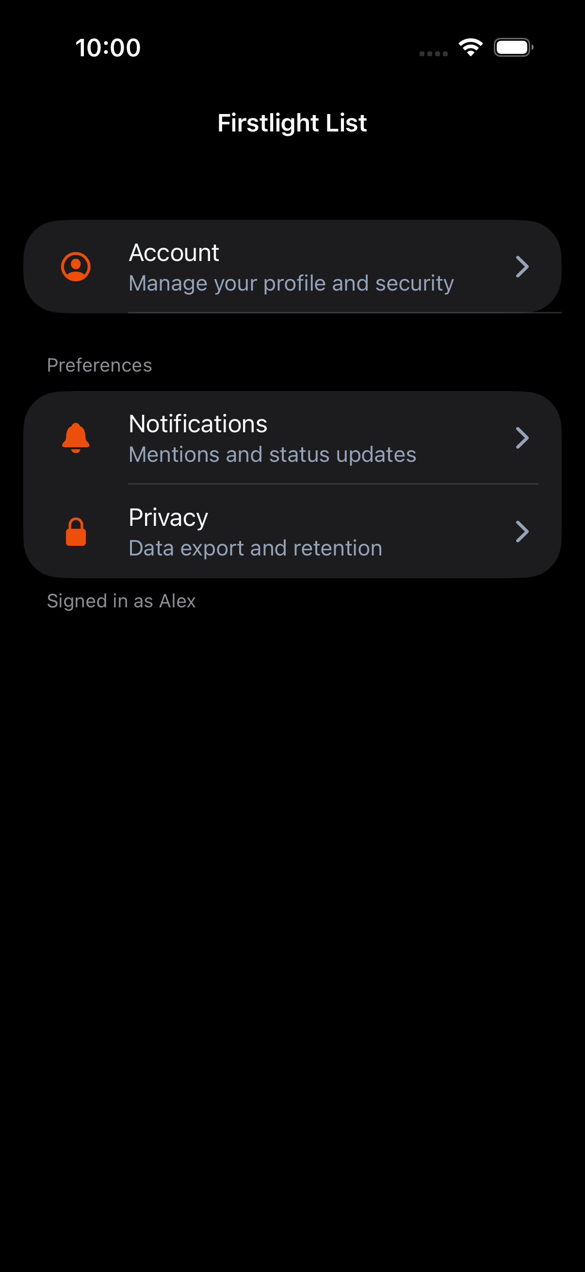
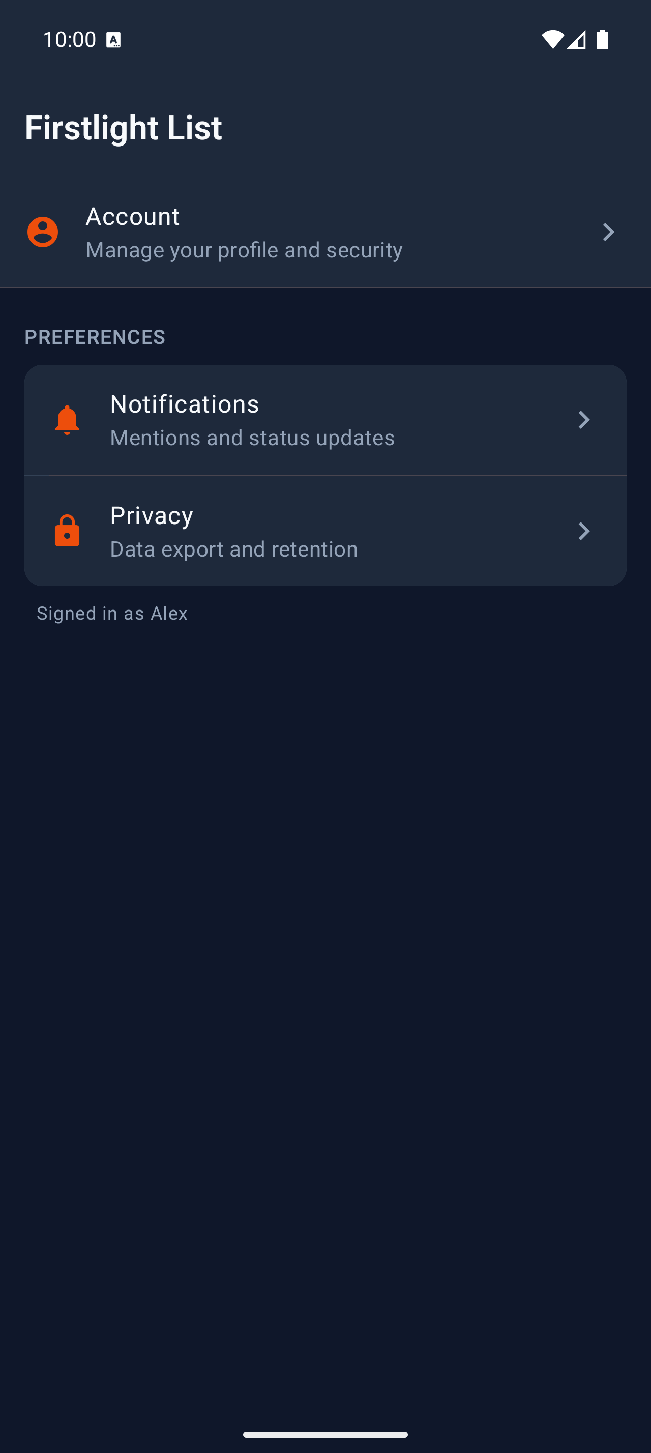
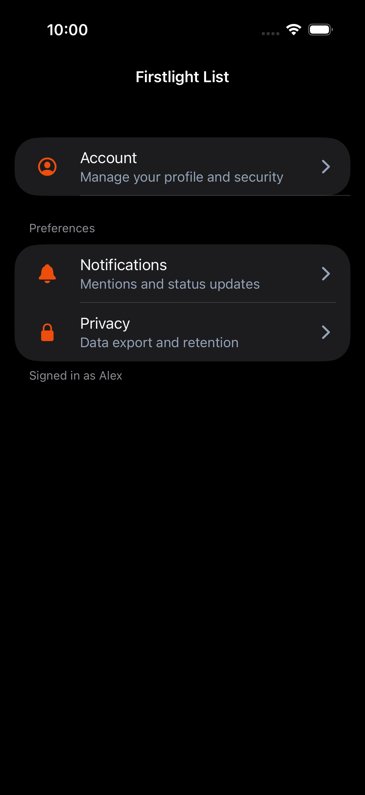
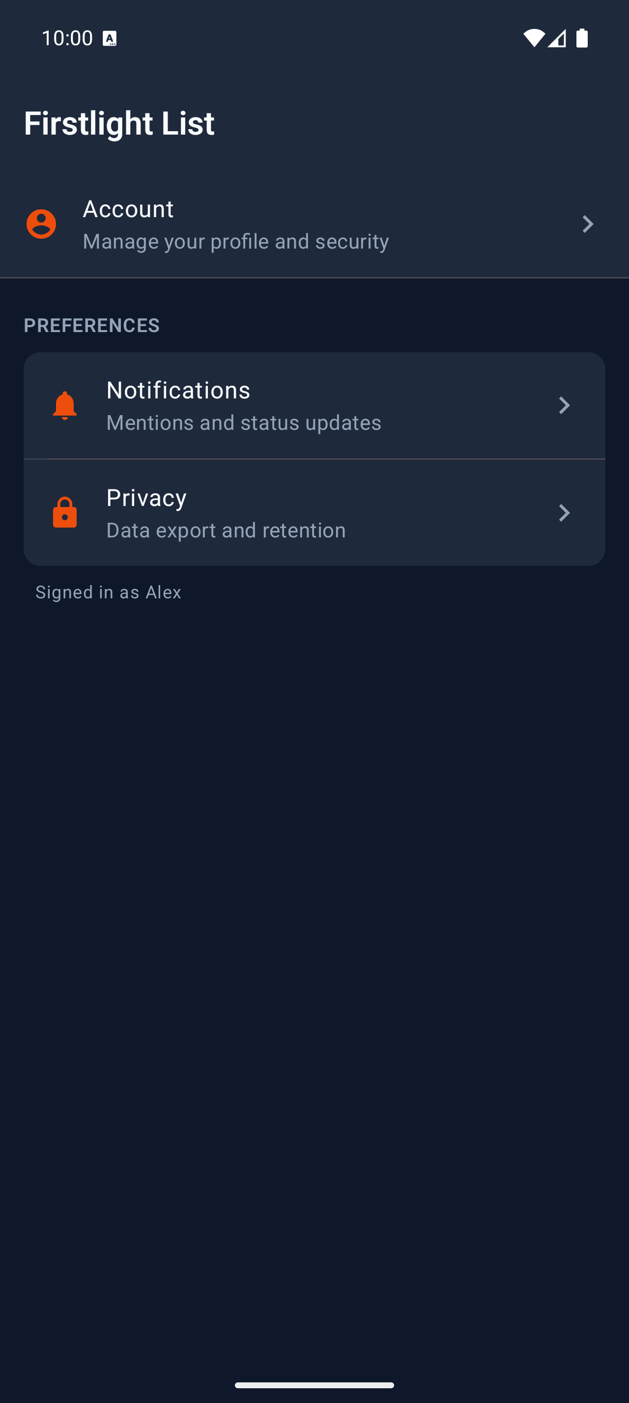
firstlight:list

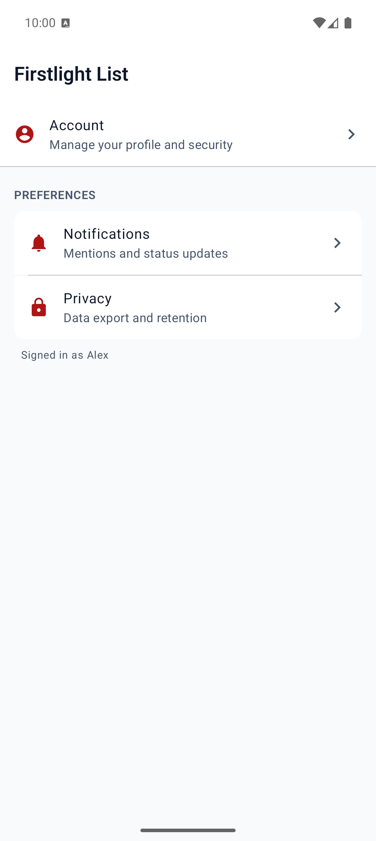
Compose finite vertical collections of List Item rows with optional grouped sections and refresh or pagination hooks.
Read the docs
iOS Native
Firstlight List rendered on iOS
Android Native
Firstlight List rendered on Android

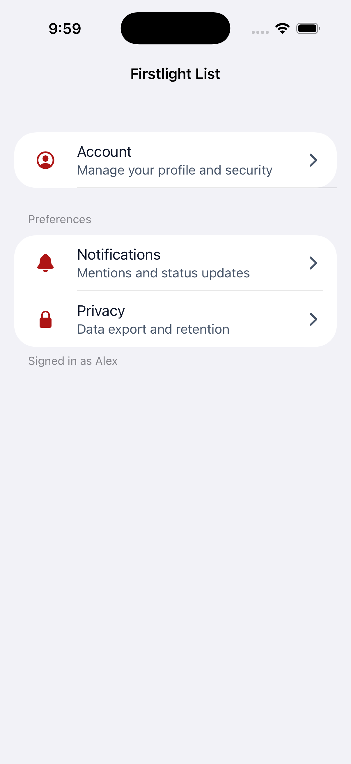
List Section

Available
firstlight:list-section

Group List Item rows with optional headers and footers inside a parent List.
Read the docs
iOS Native
Firstlight List Section rendered on iOS
Android Native
Firstlight List Section rendered on Android

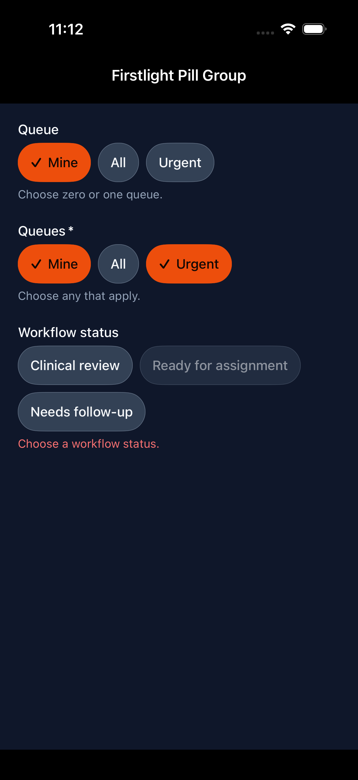
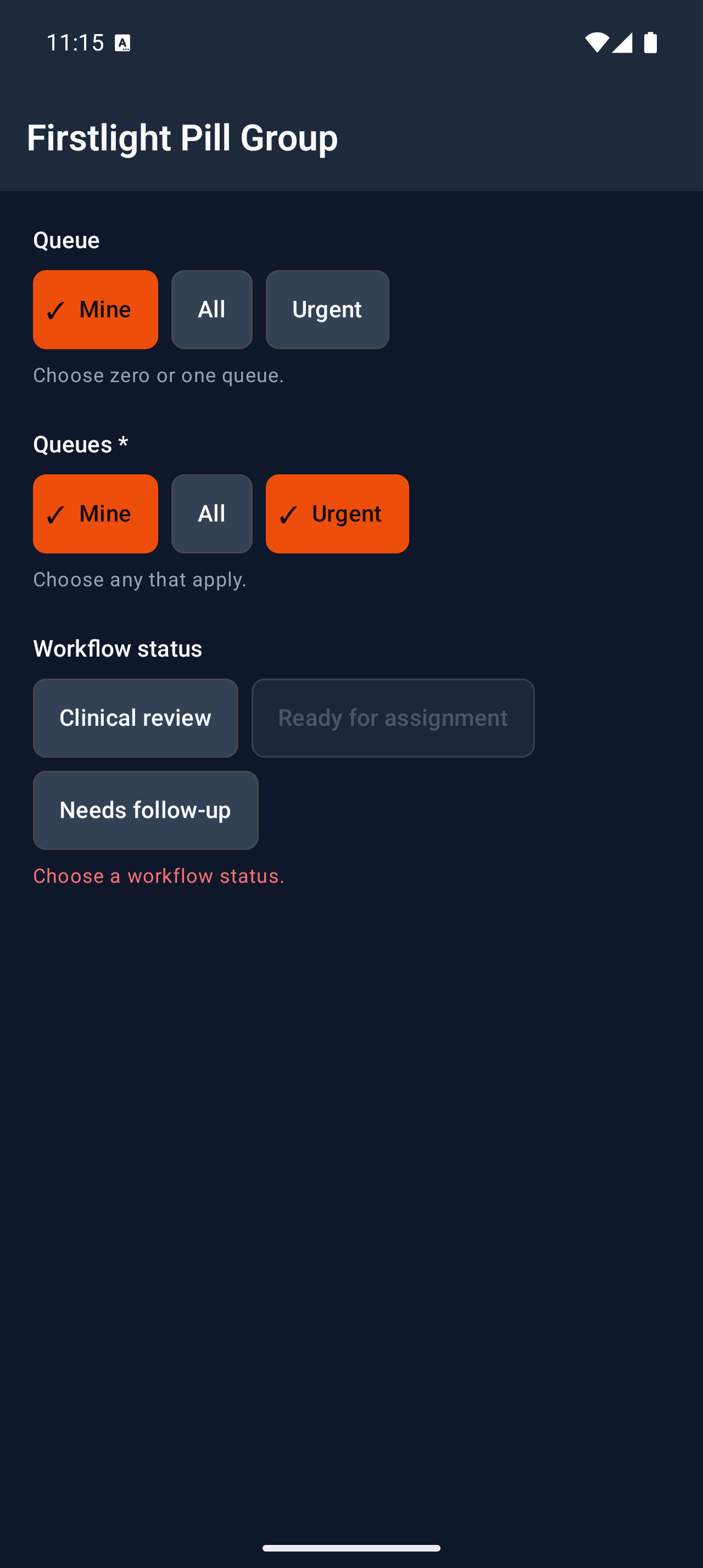
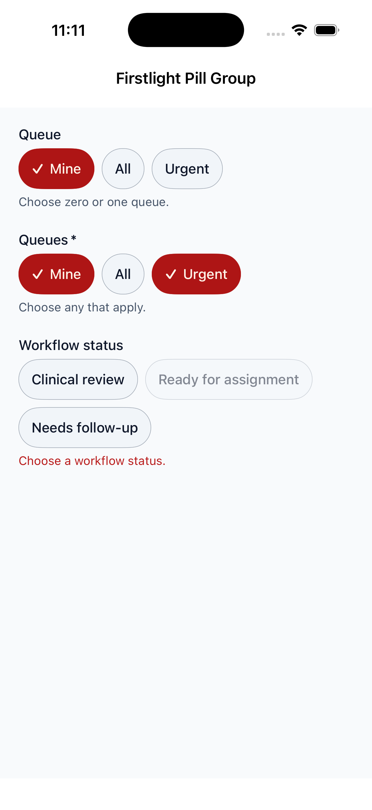
Pill Group

Available
firstlight:pill-group

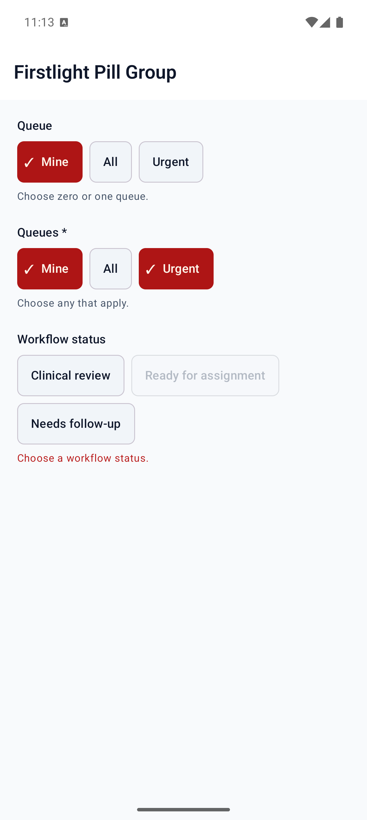
Offer compact, individually shaped options for single or multiple selection.
Read the docs
iOS Native
Firstlight Pill Group rendered on iOS
Android Native
Firstlight Pill Group rendered on Android

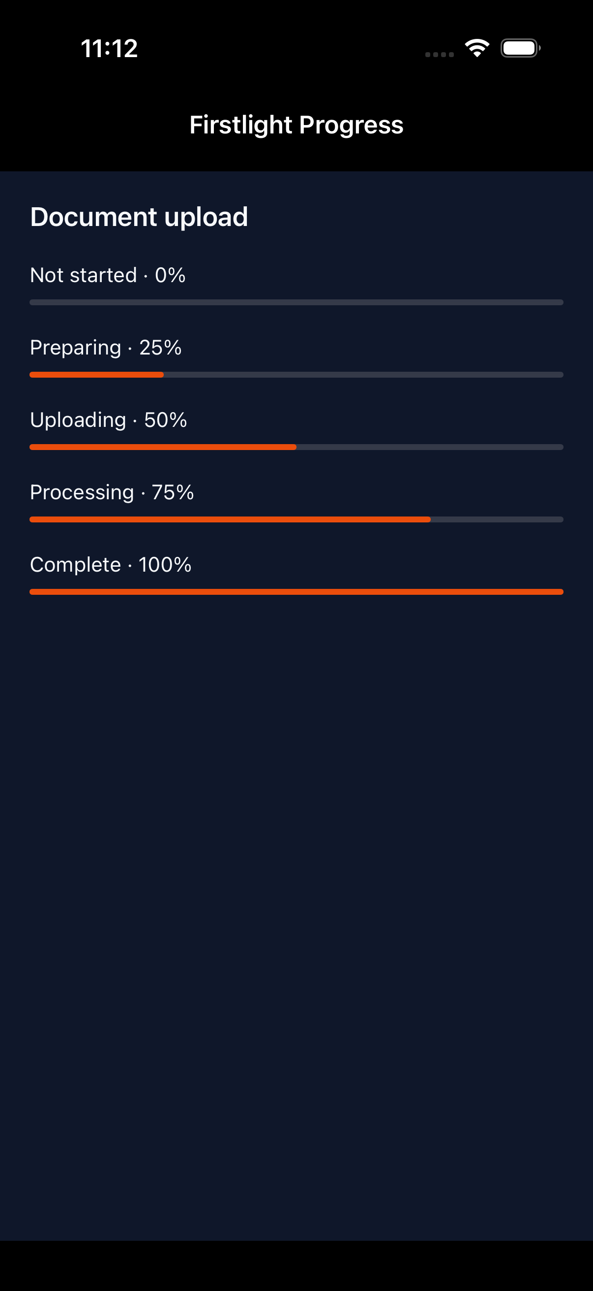
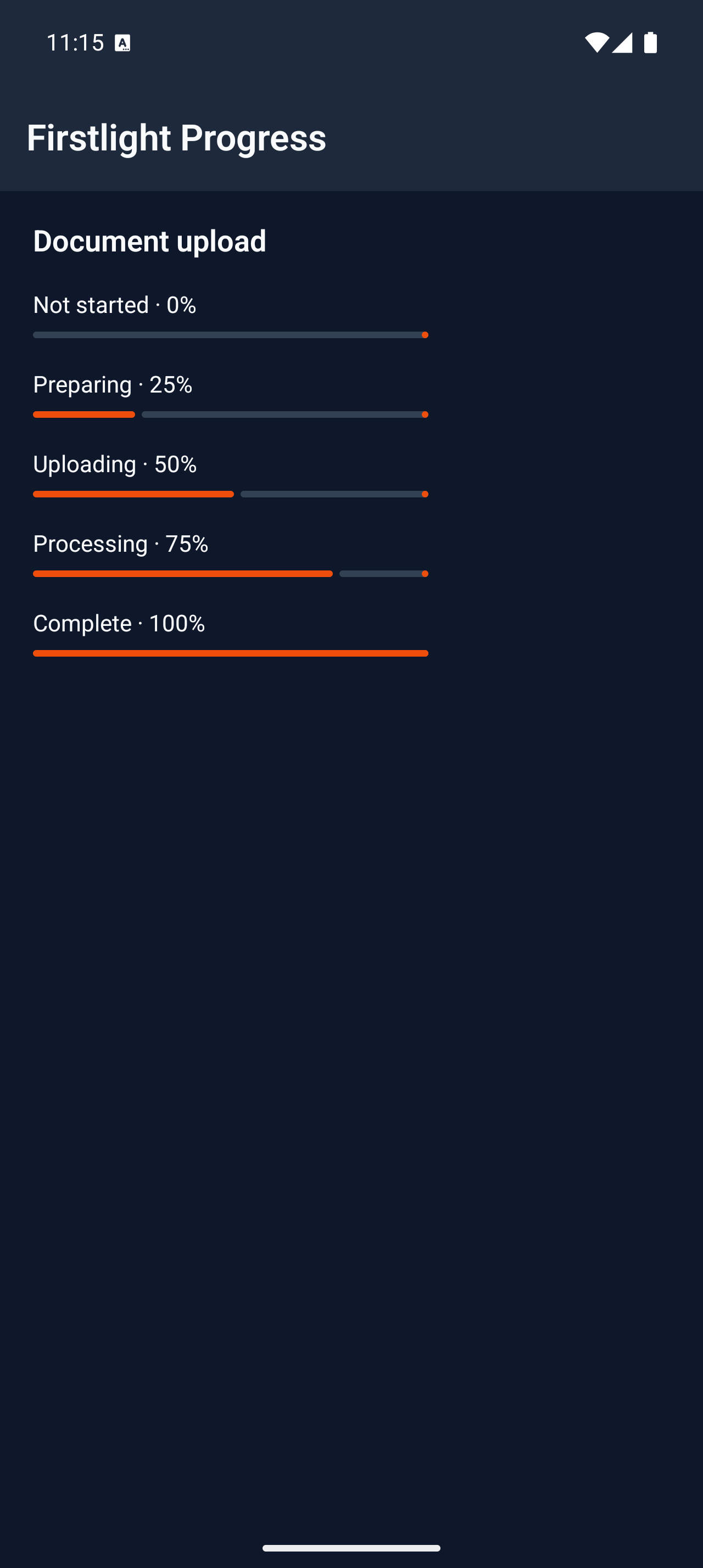
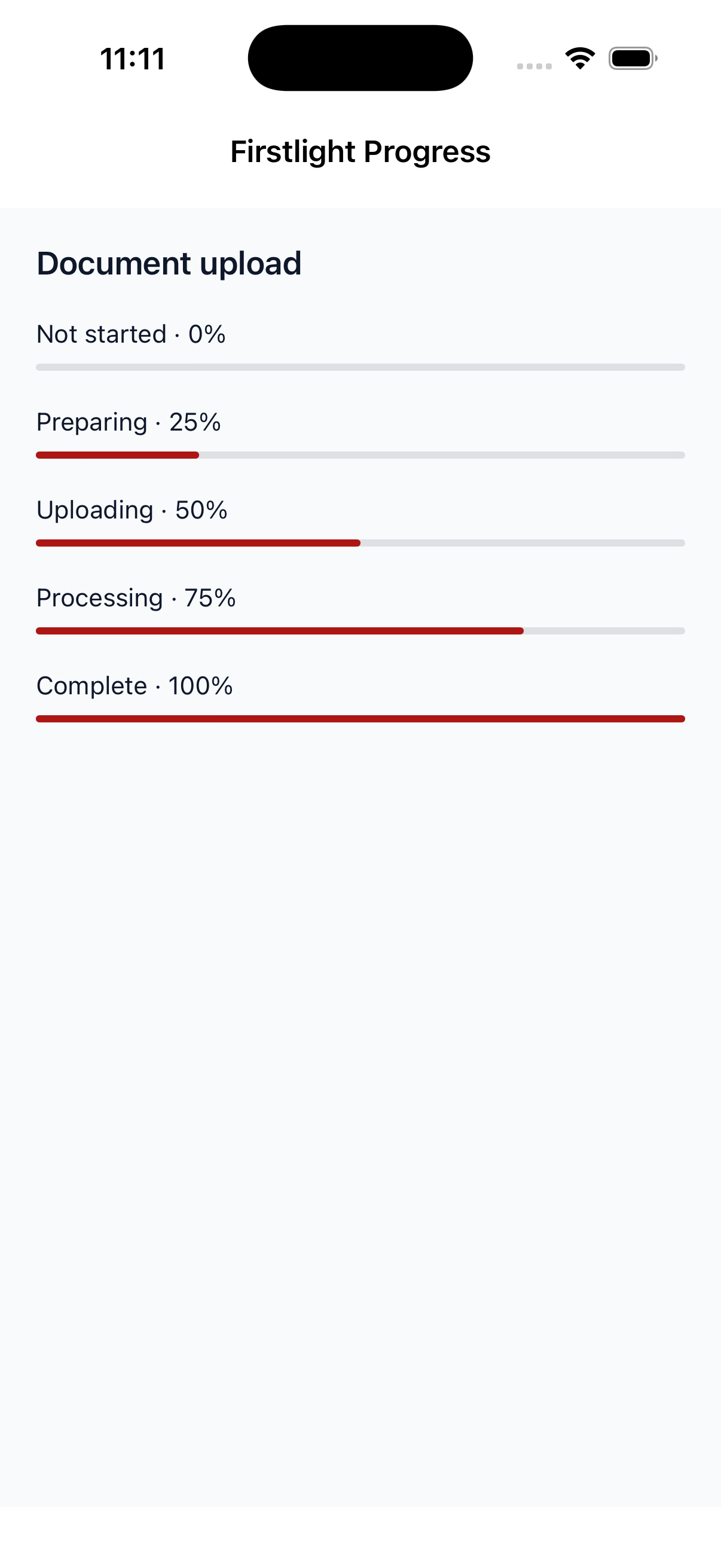
Progress

Available
firstlight:progress

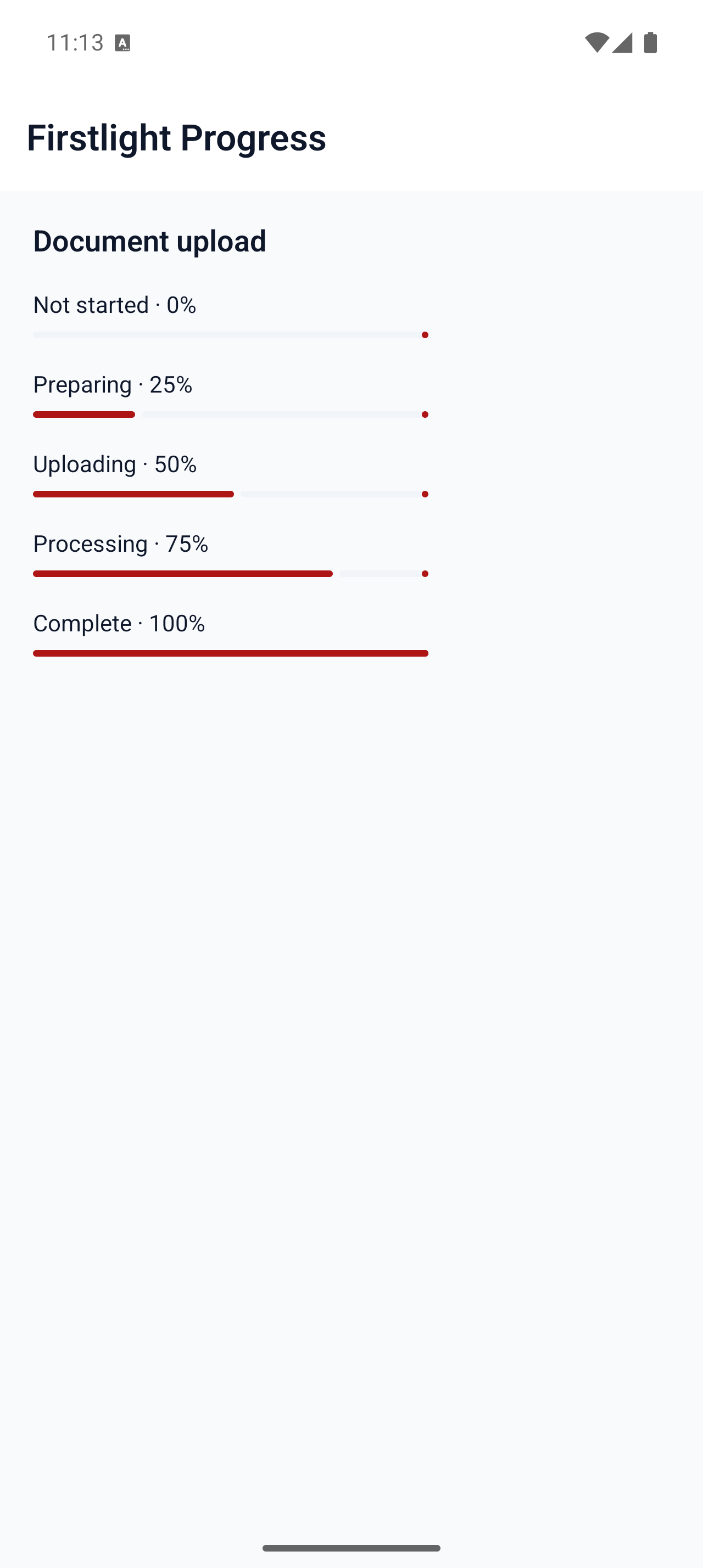
Communicate determinate completion or indeterminate work with the native platform indicator.
Read the docs
iOS Native
Firstlight Progress rendered on iOS
Android Native
Firstlight Progress rendered on Android

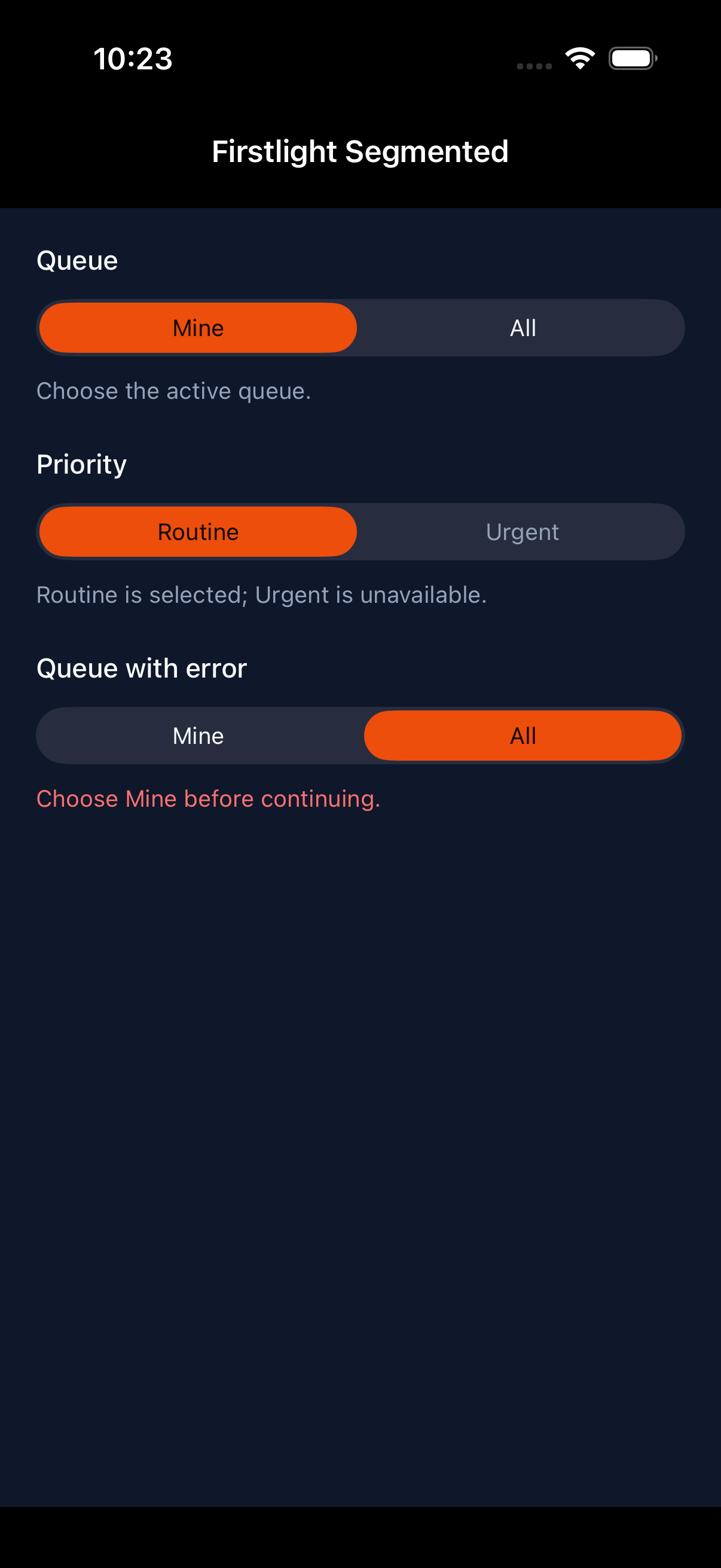
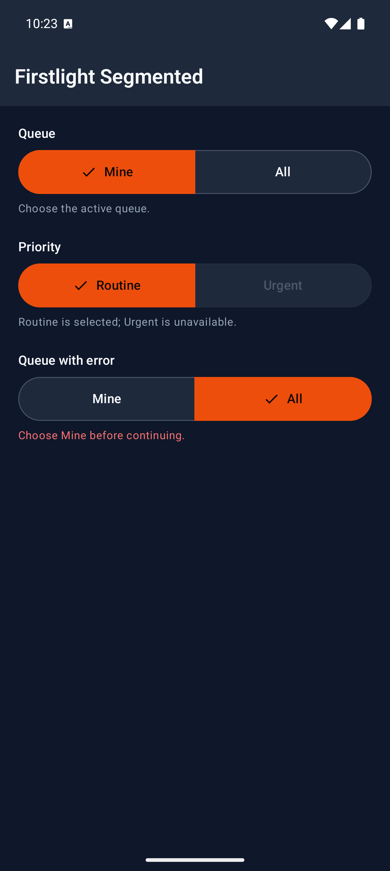
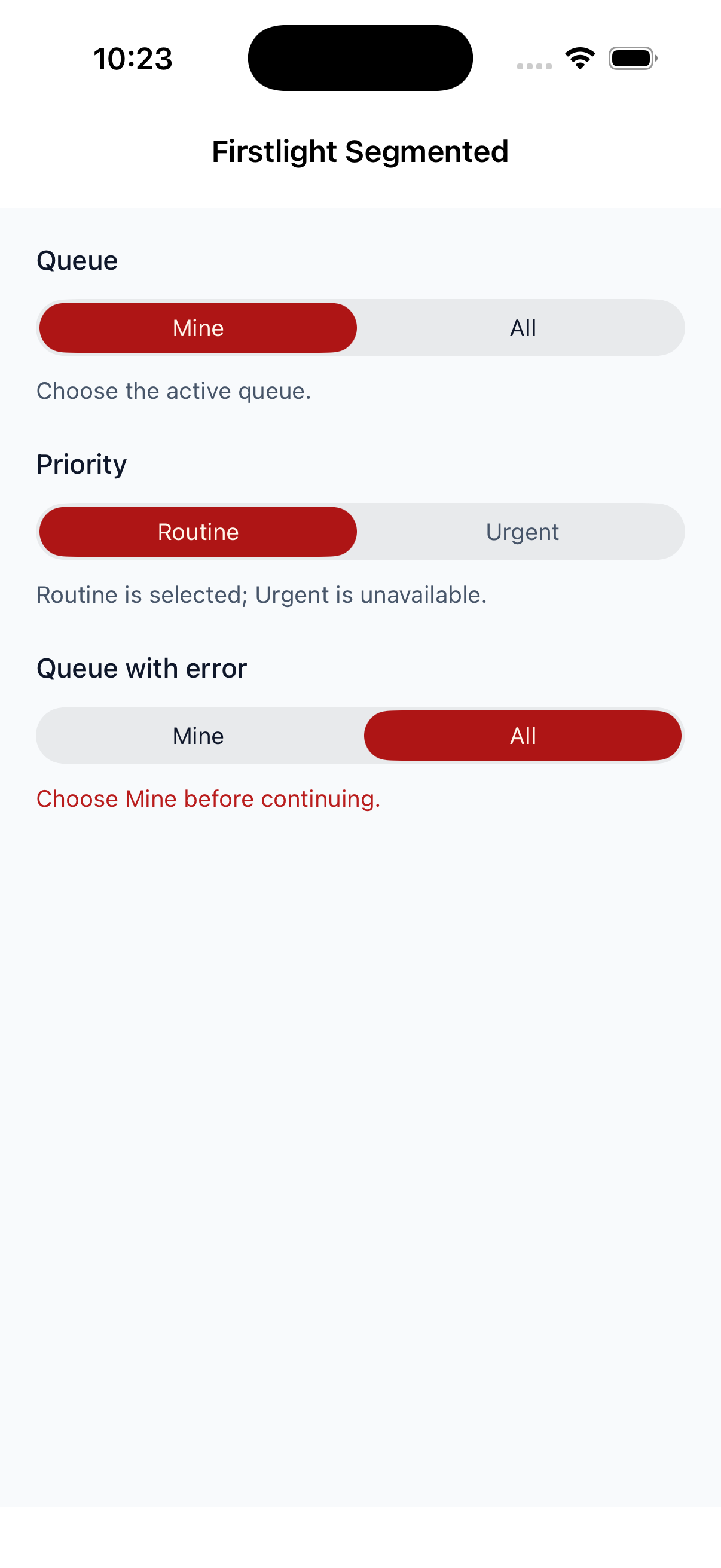
Segmented

Available
firstlight:segmented

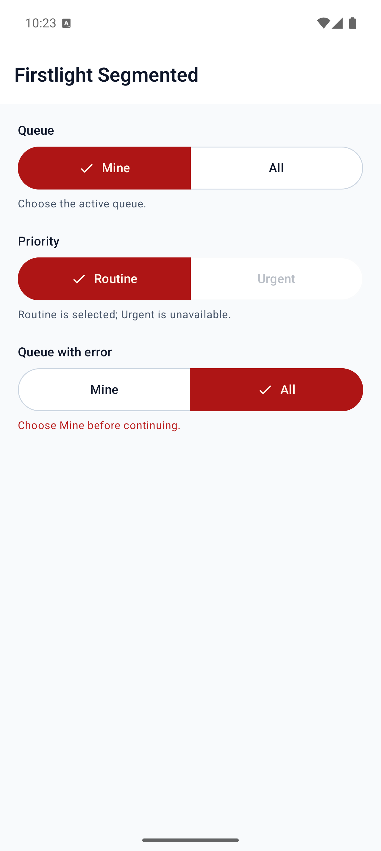
Pick one of a few mutually exclusive choices with a native segmented control.
Read the docs
iOS Native
Firstlight Segmented rendered on iOS
Android Native
Firstlight Segmented rendered on Android

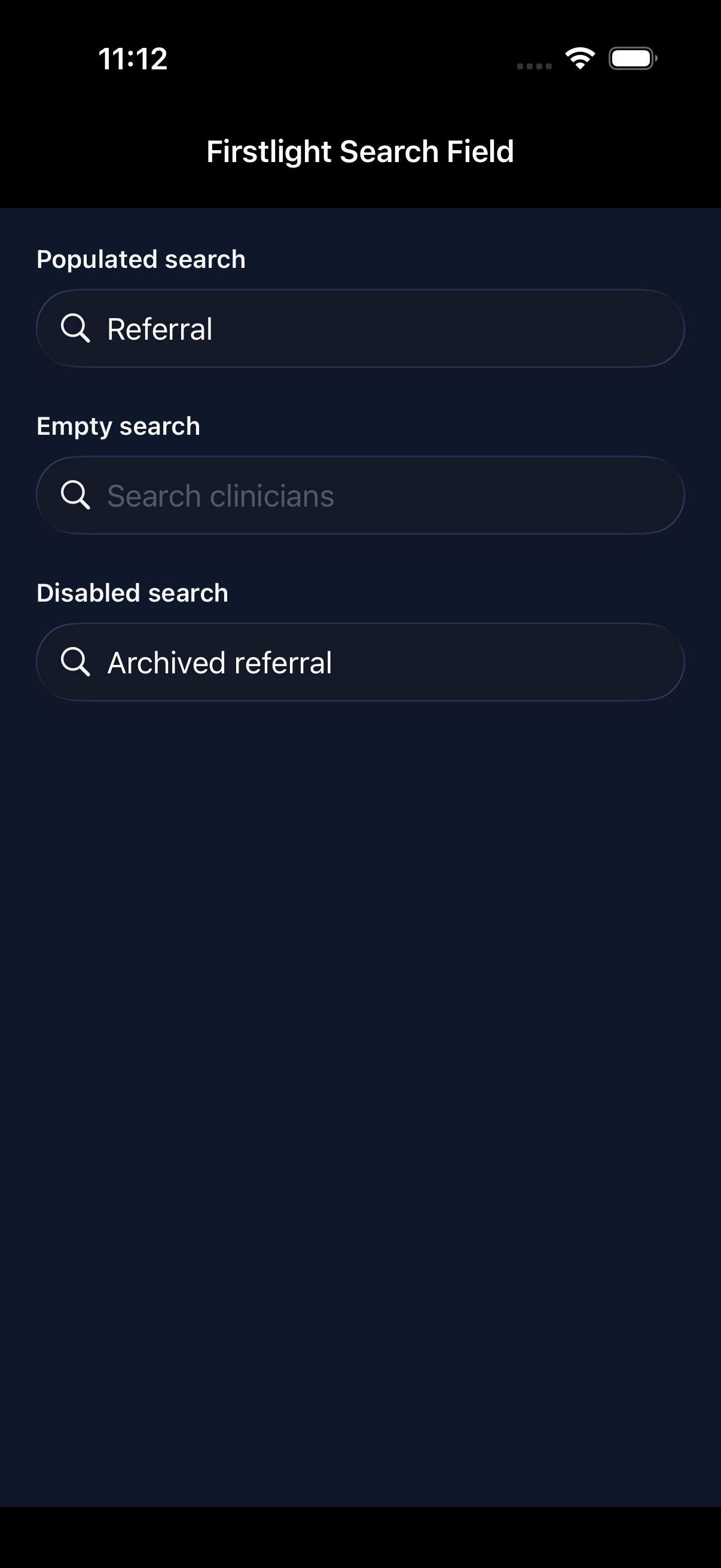
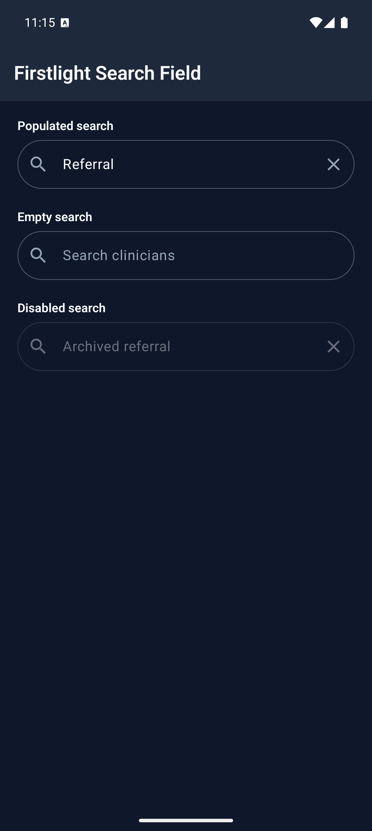
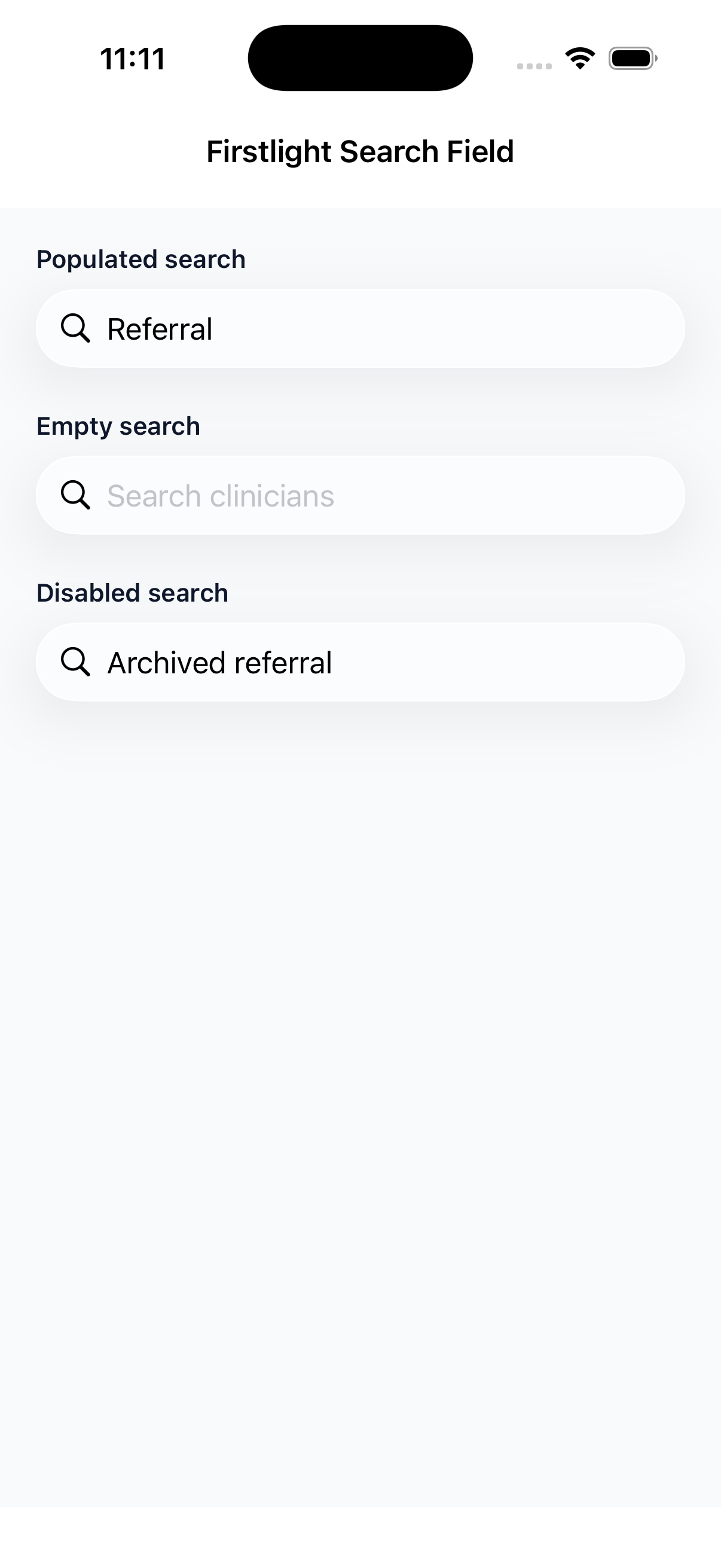
Search Field

Available
firstlight:search-field

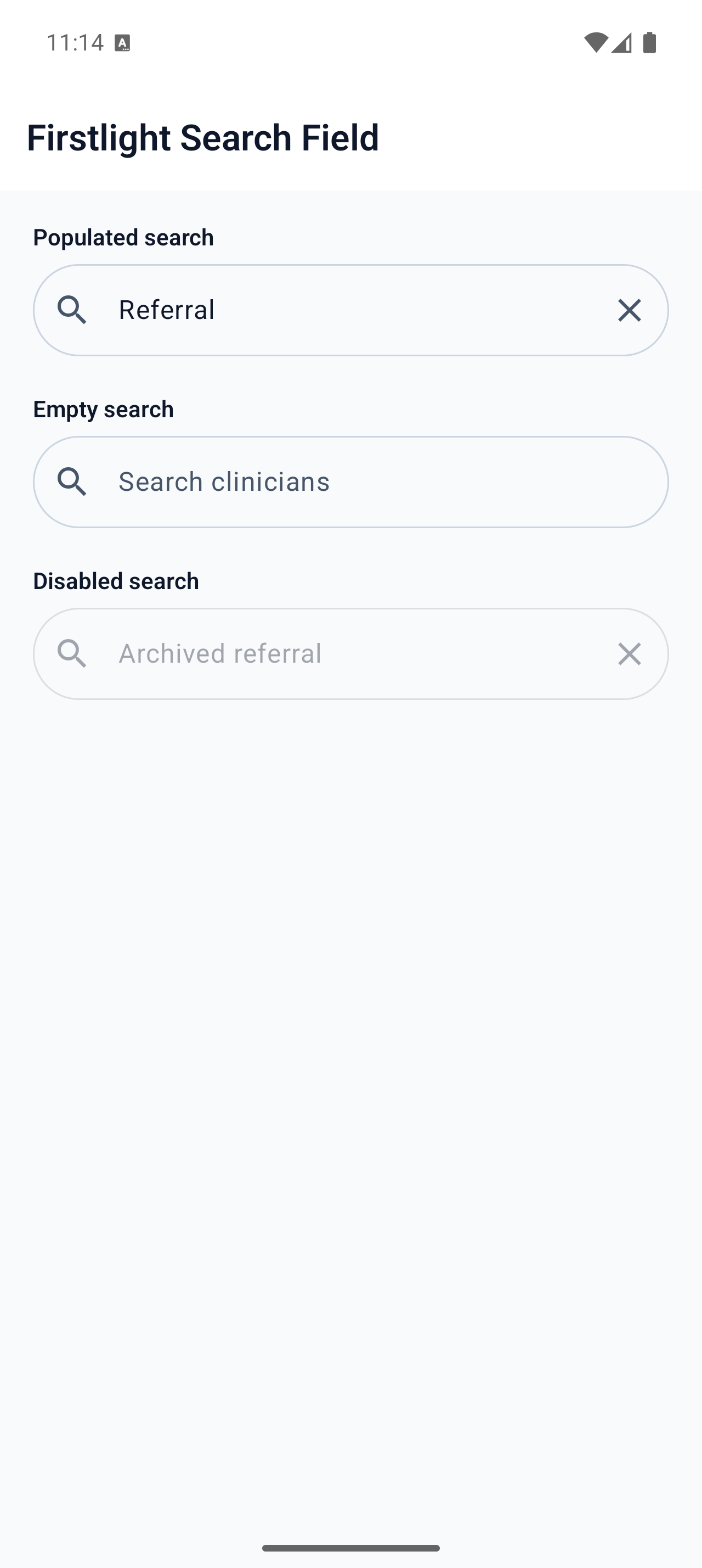
Enter and submit one query with native search, clear, focus, keyboard, and selection behaviour.
Read the docs
iOS Native
Firstlight Search Field rendered on iOS
Android Native
Firstlight Search Field rendered on Android

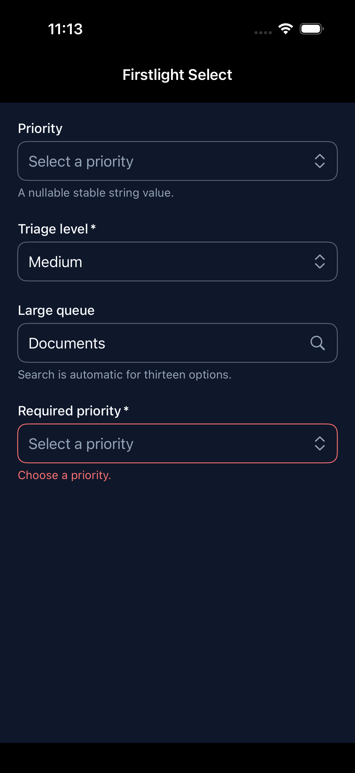
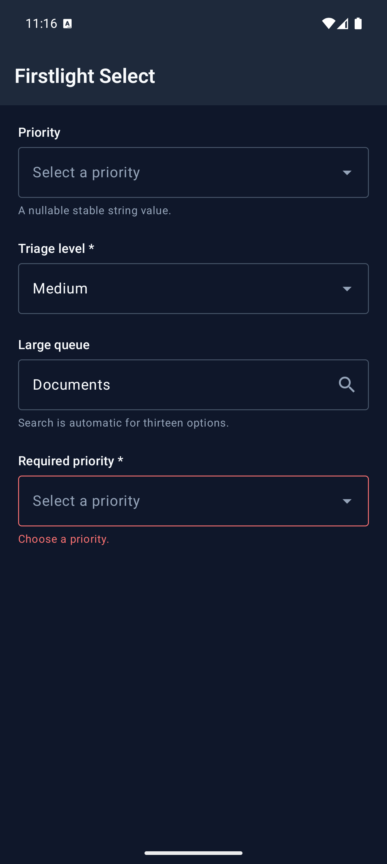
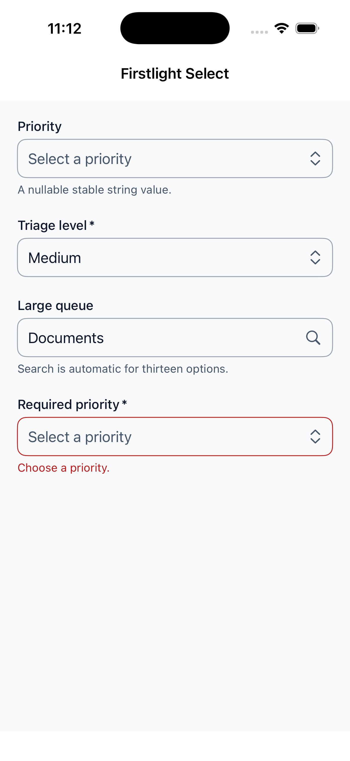
Select

Available
firstlight:select

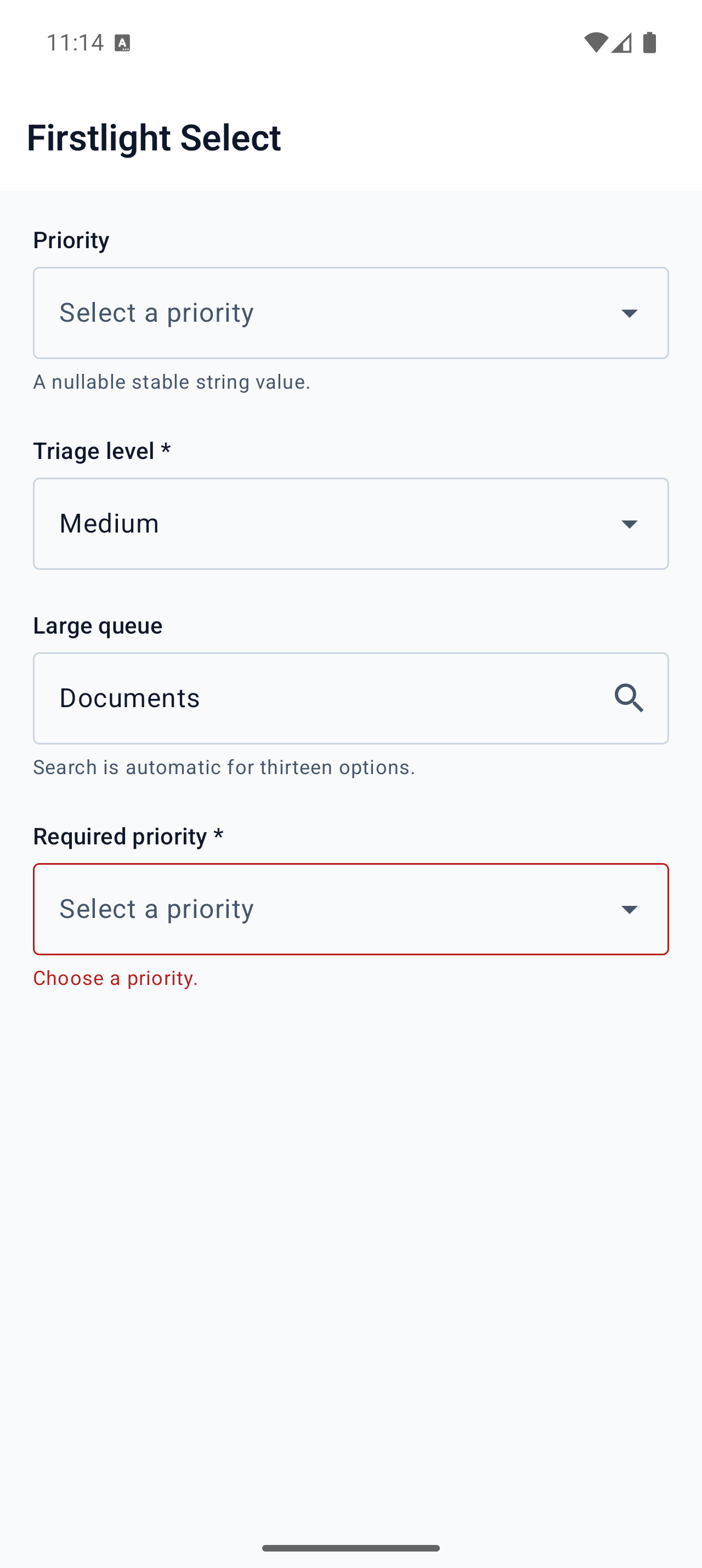
Choose one stable string or integer value from a collapsed native selection field.
Read the docs
iOS Native
Firstlight Select rendered on iOS
Android Native
Firstlight Select rendered on Android

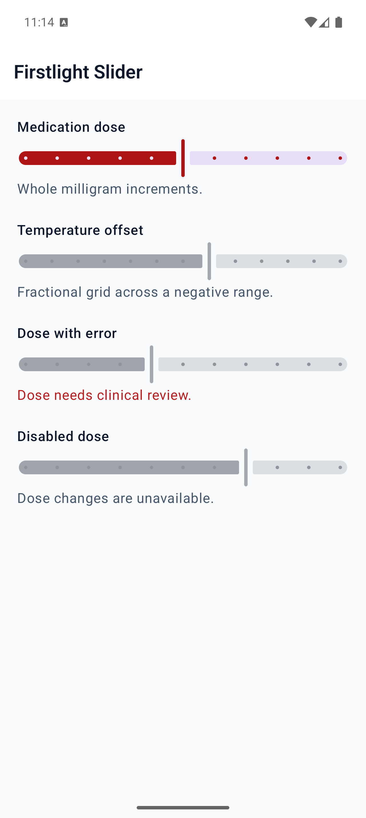
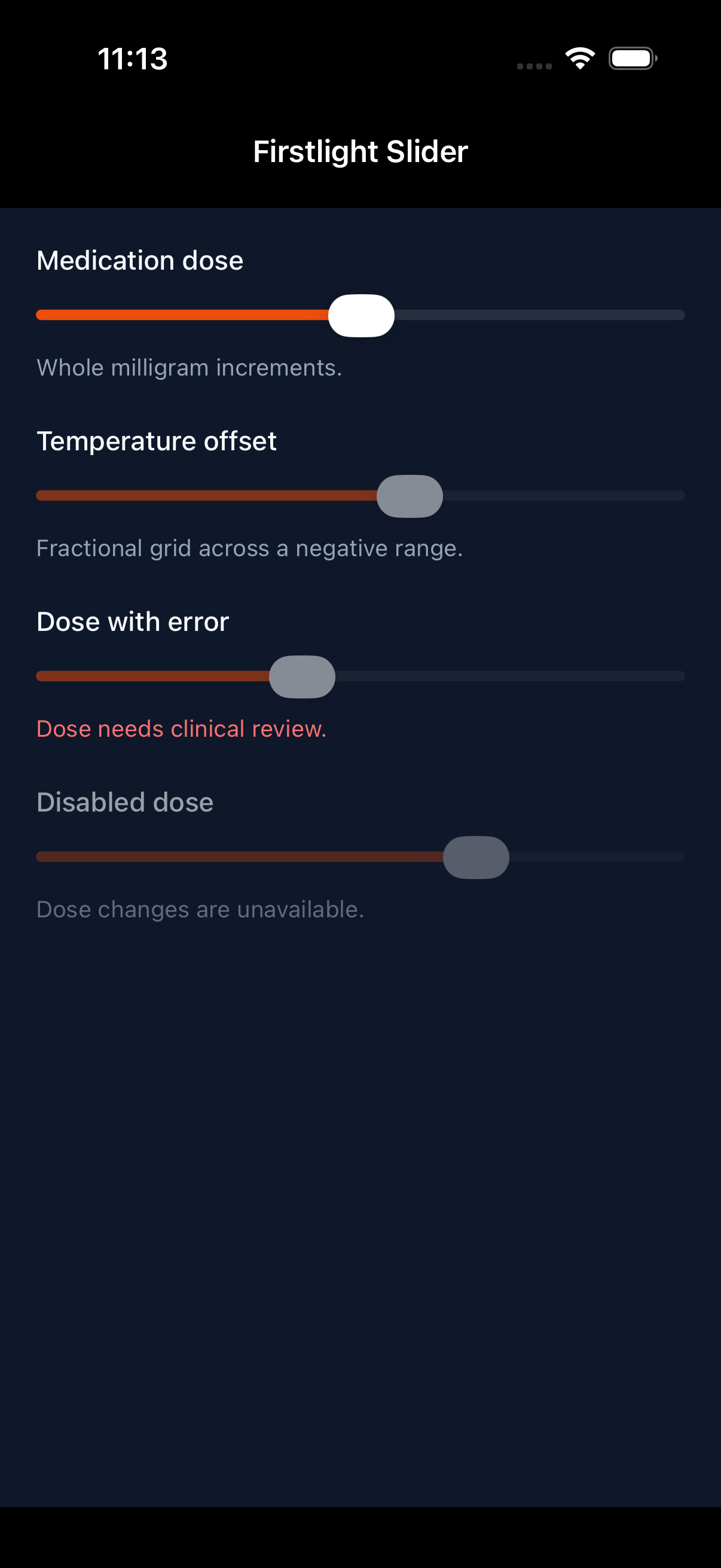
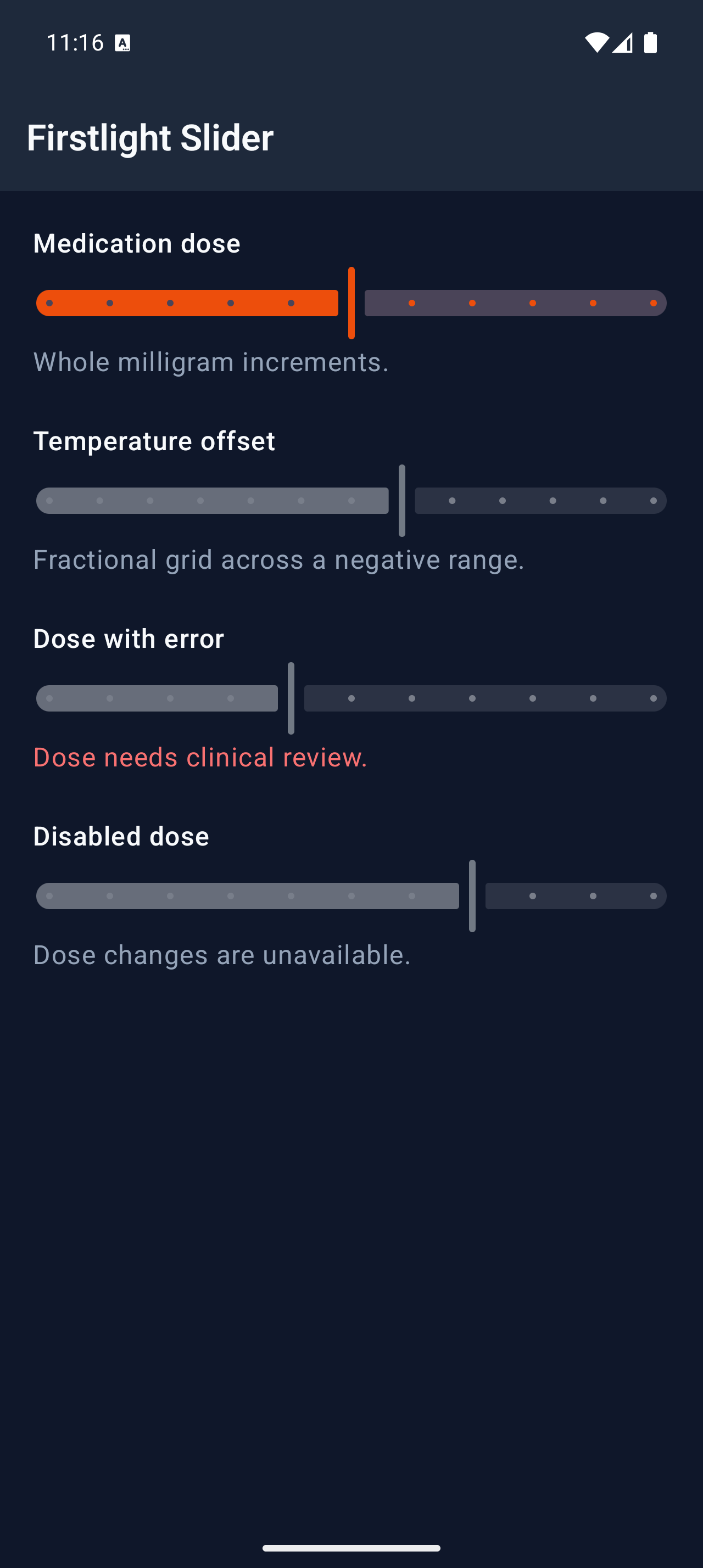
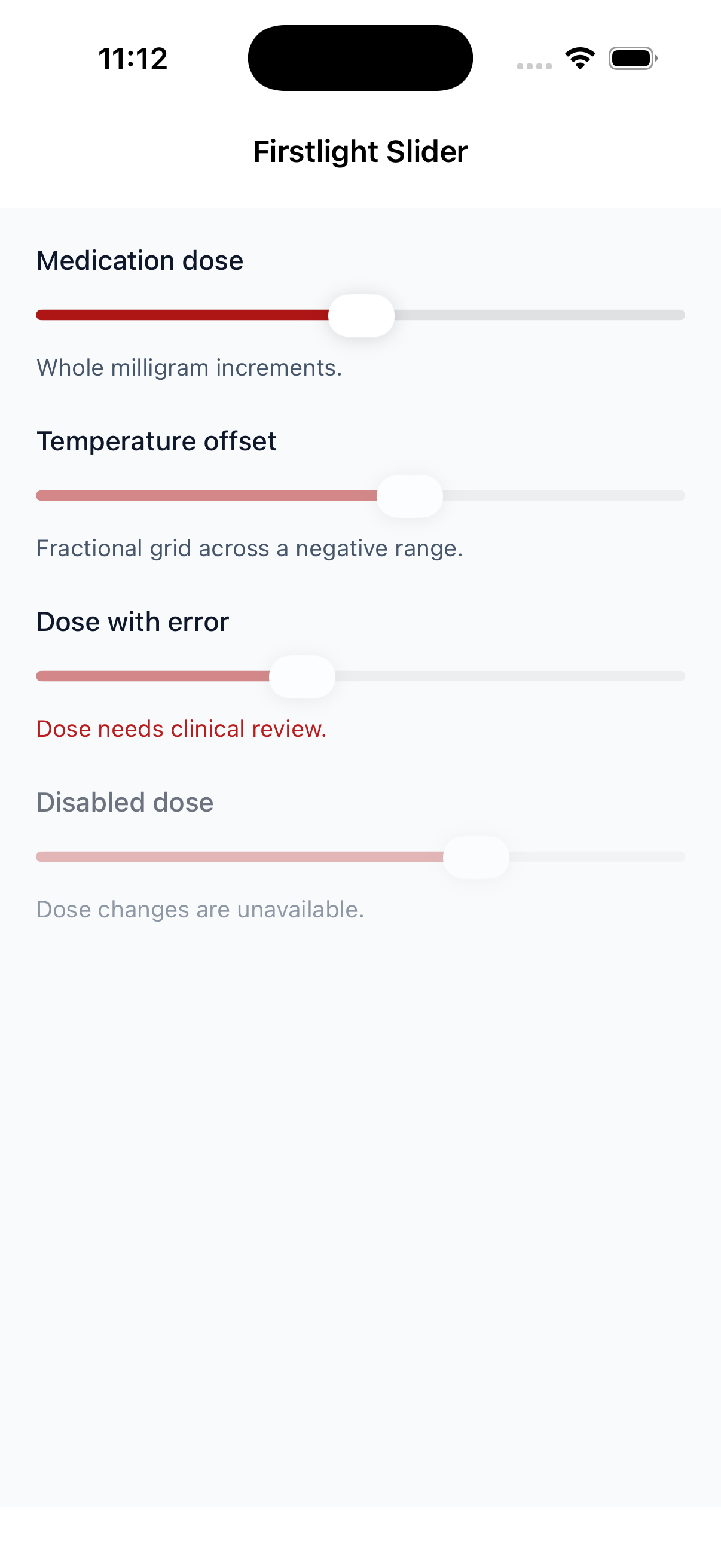
Slider

Available
firstlight:slider

Select one value from an exact numeric grid using each platform’s native slider.
Read the docs
iOS Native
Firstlight Slider rendered on iOS
Android Native
Firstlight Slider rendered on Android

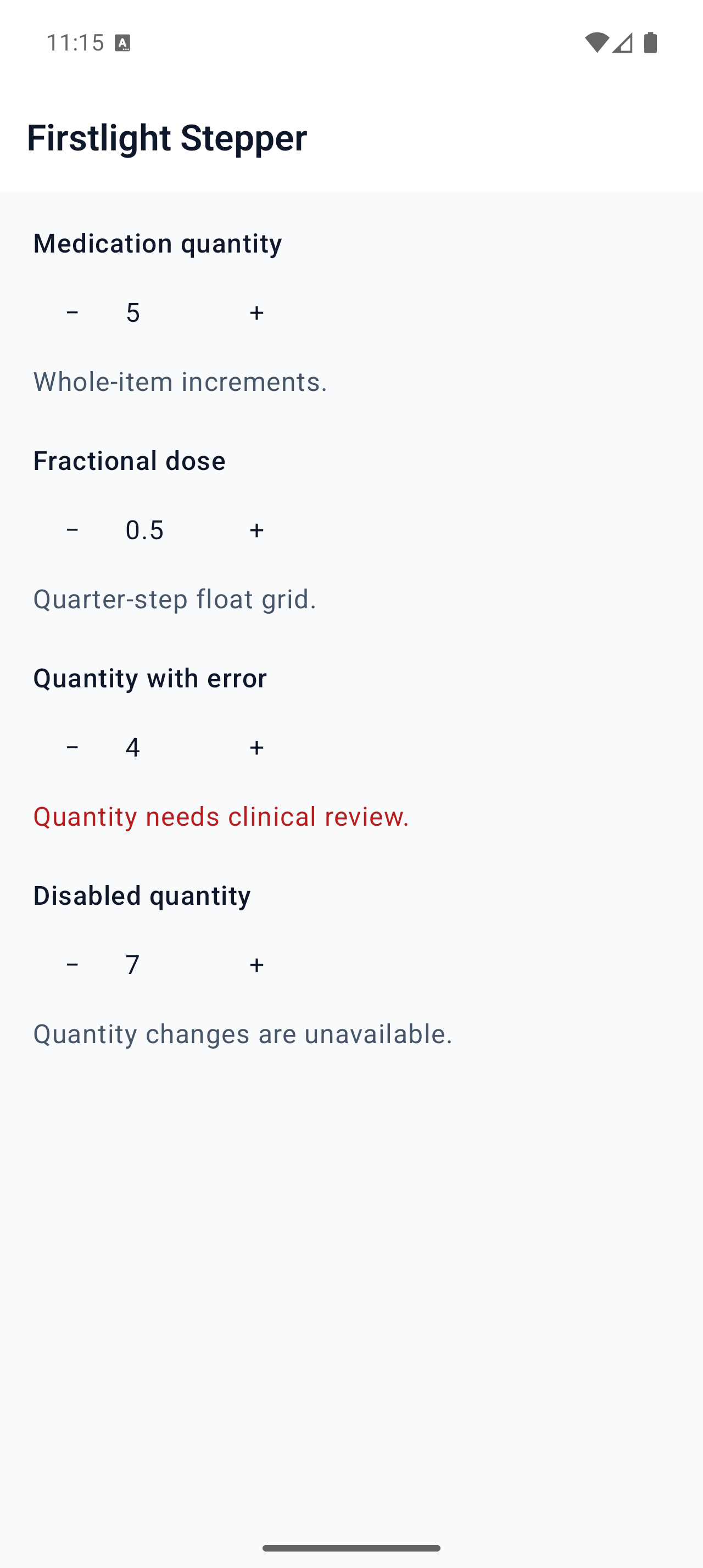
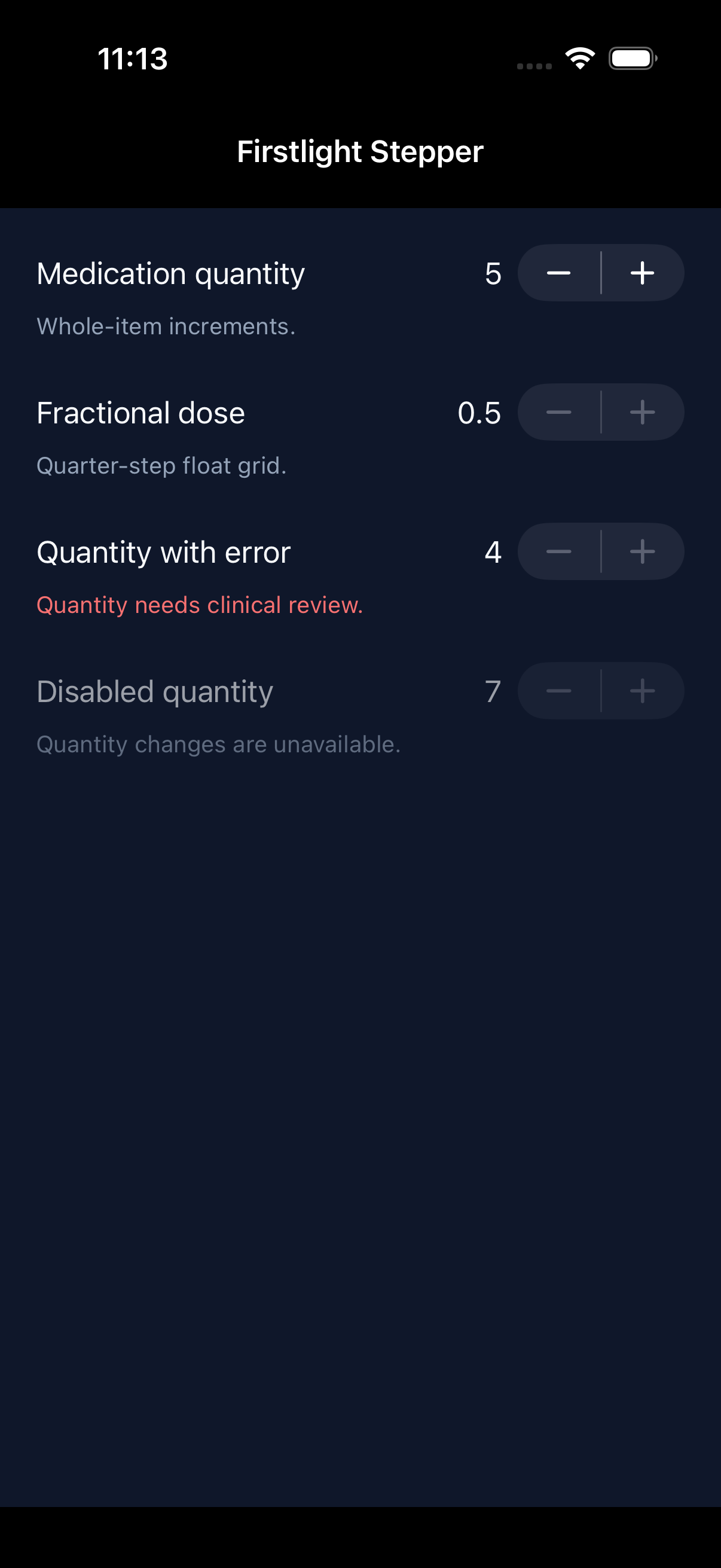
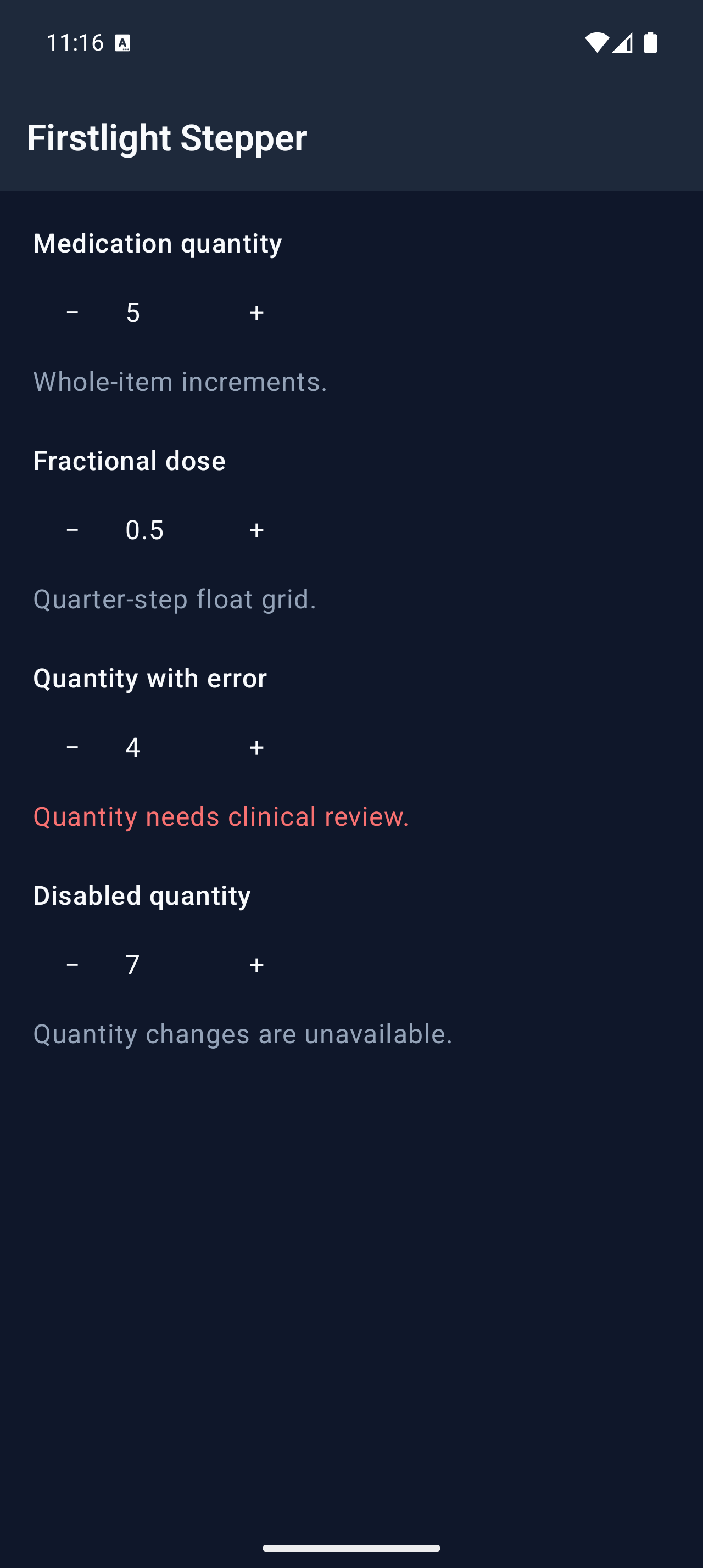
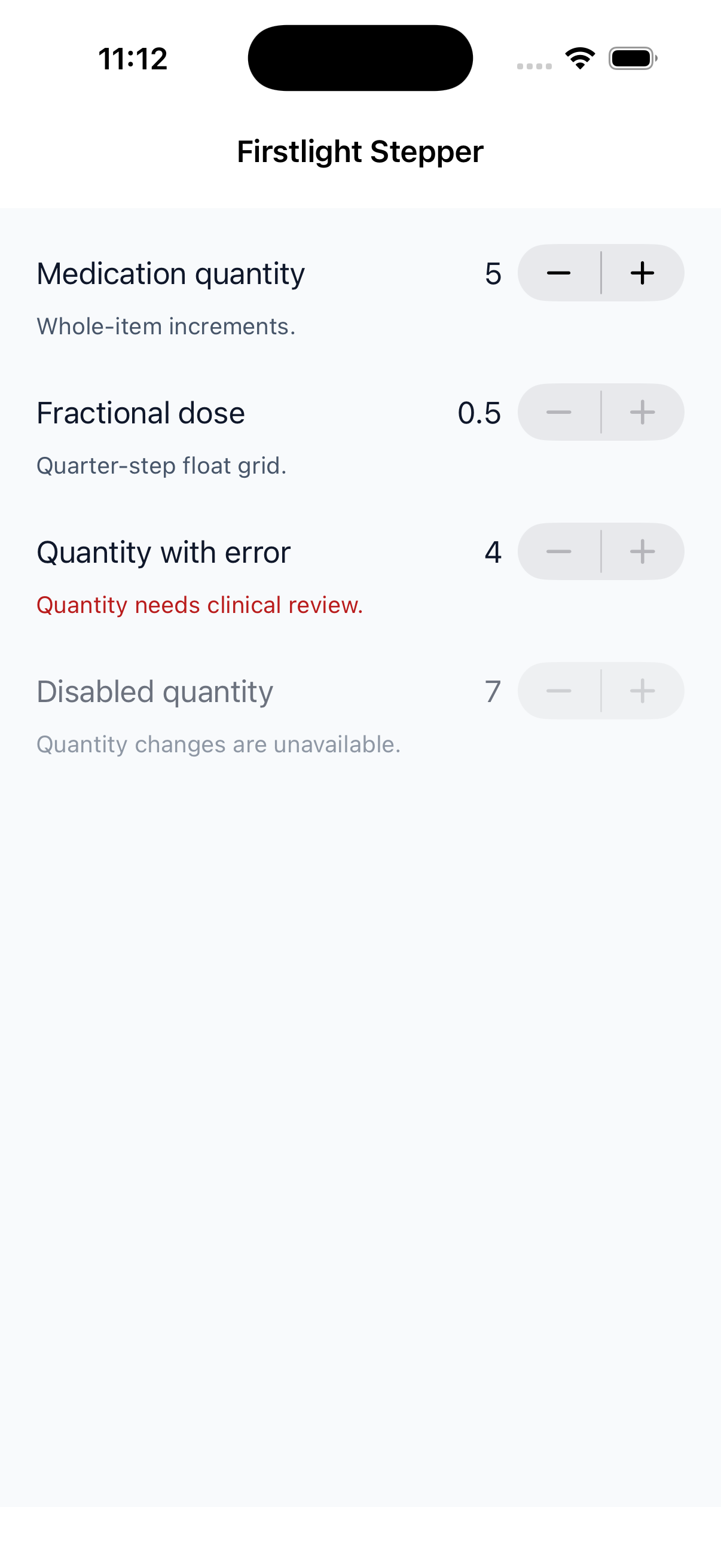
Stepper

Available
firstlight:stepper

Move an accepted numeric value through a bounded range one exact step at a time.
Read the docs
iOS Native
Firstlight Stepper rendered on iOS
Android Native
Firstlight Stepper rendered on Android

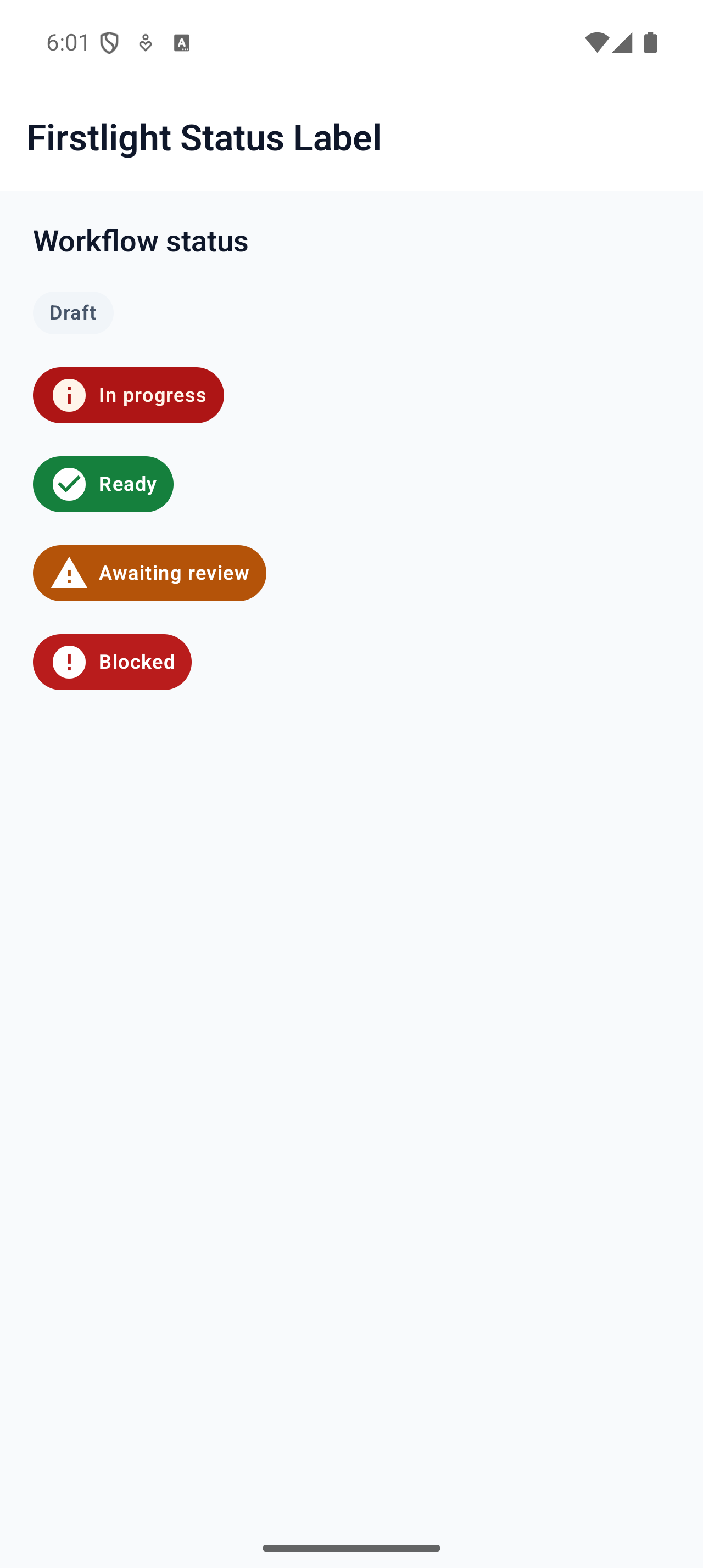
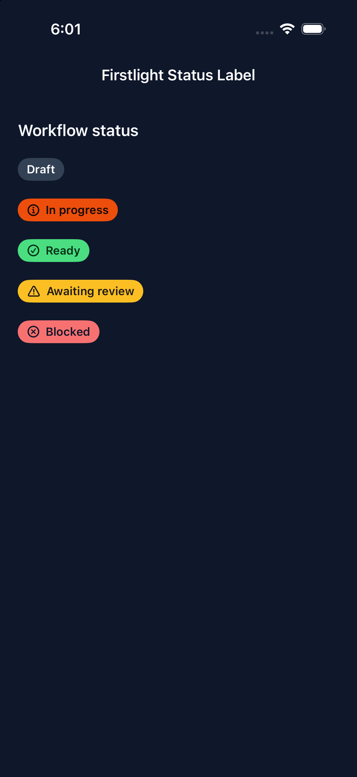
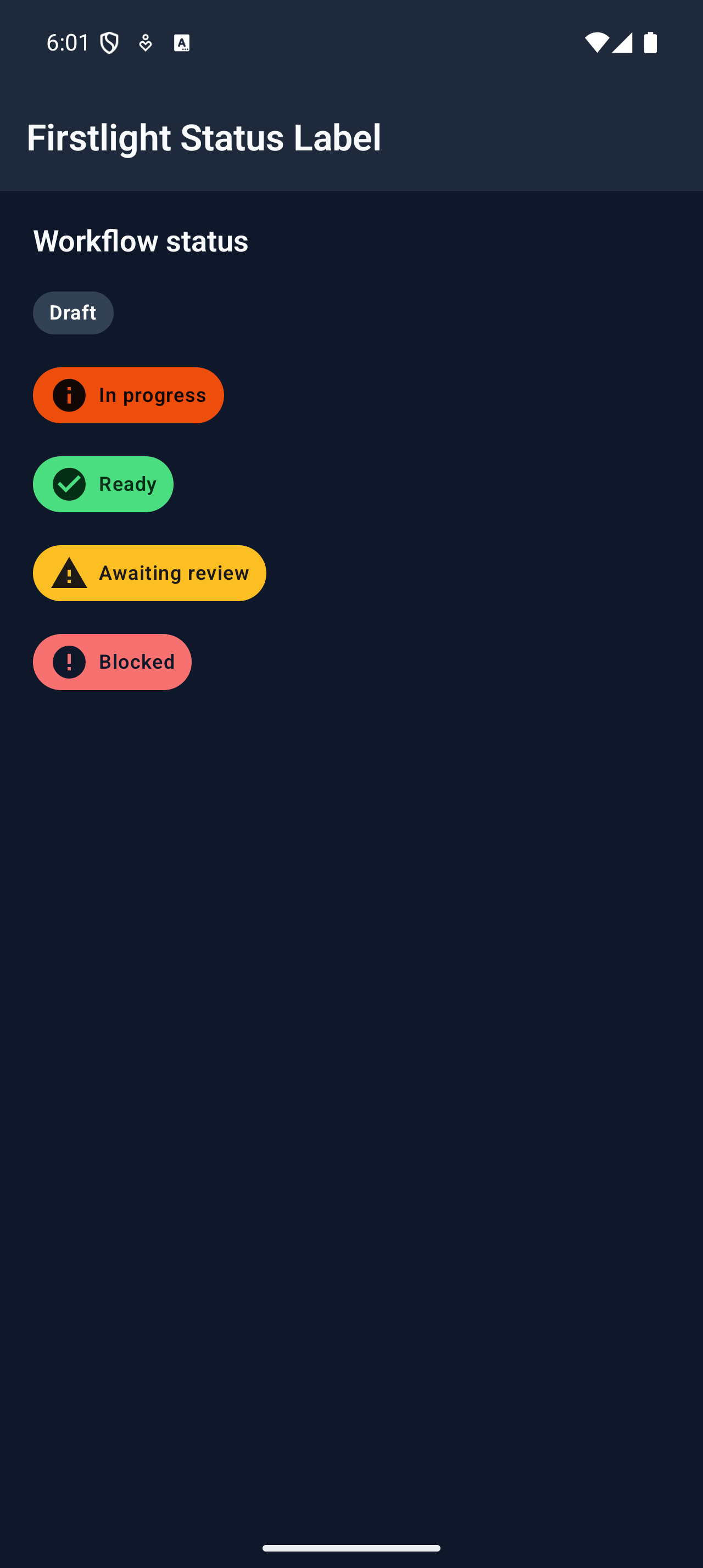
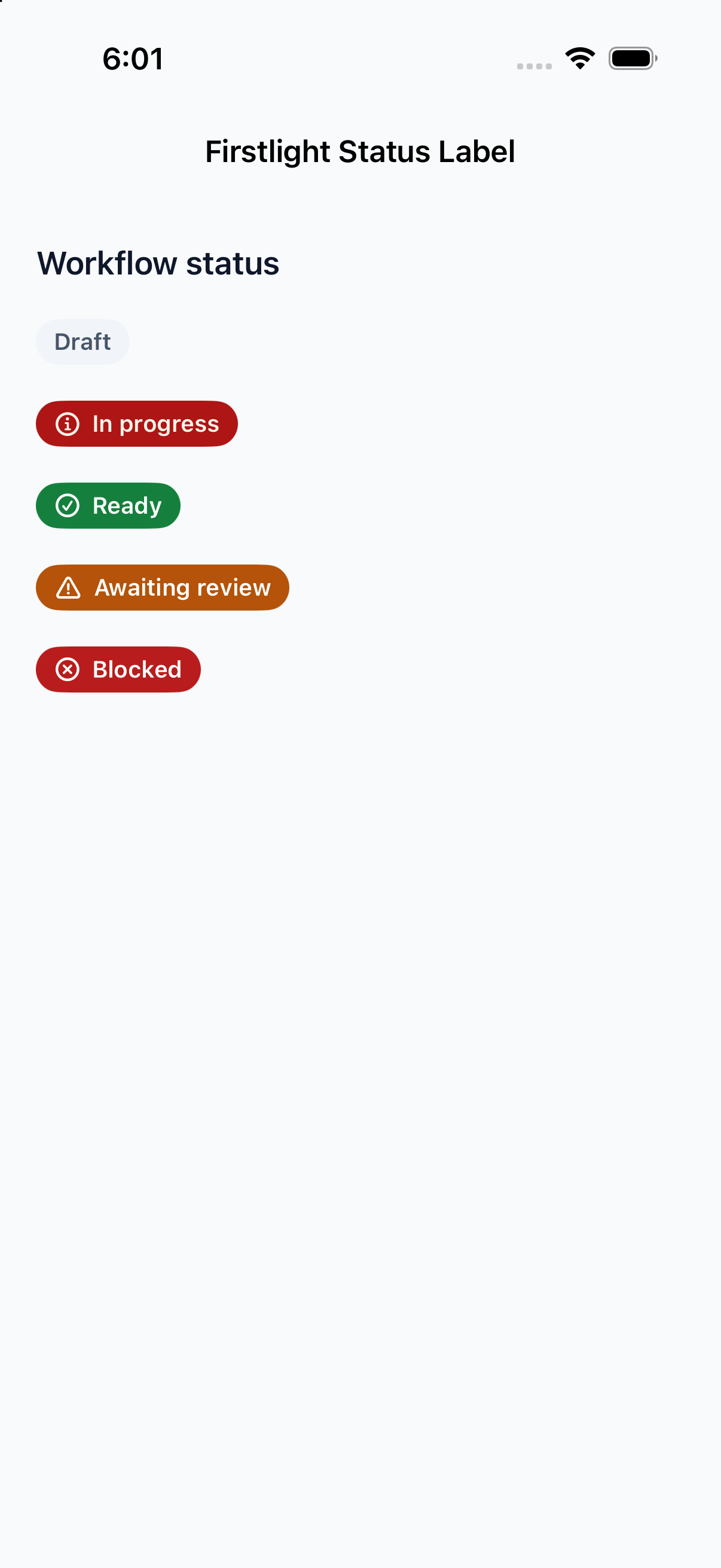
Status Label

Available
firstlight:status-label

Show short, display-only status text in a coloured native capsule.
Read the docs
iOS Native
Firstlight Status Label rendered on iOS
Android Native
Firstlight Status Label rendered on Android

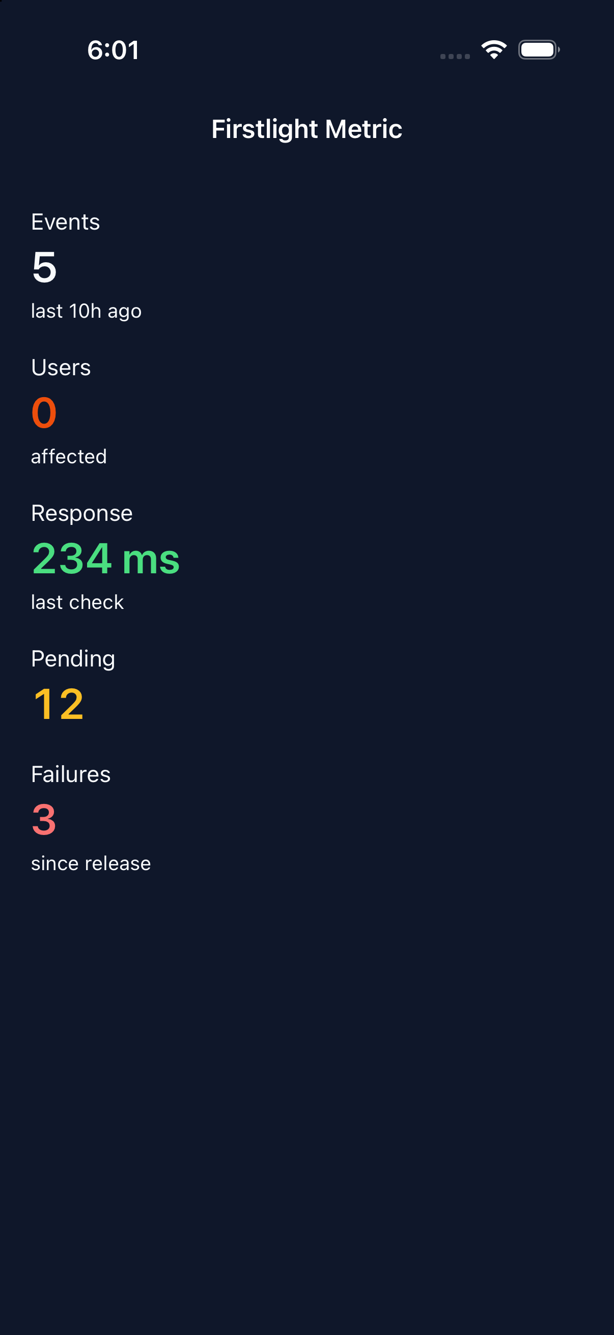
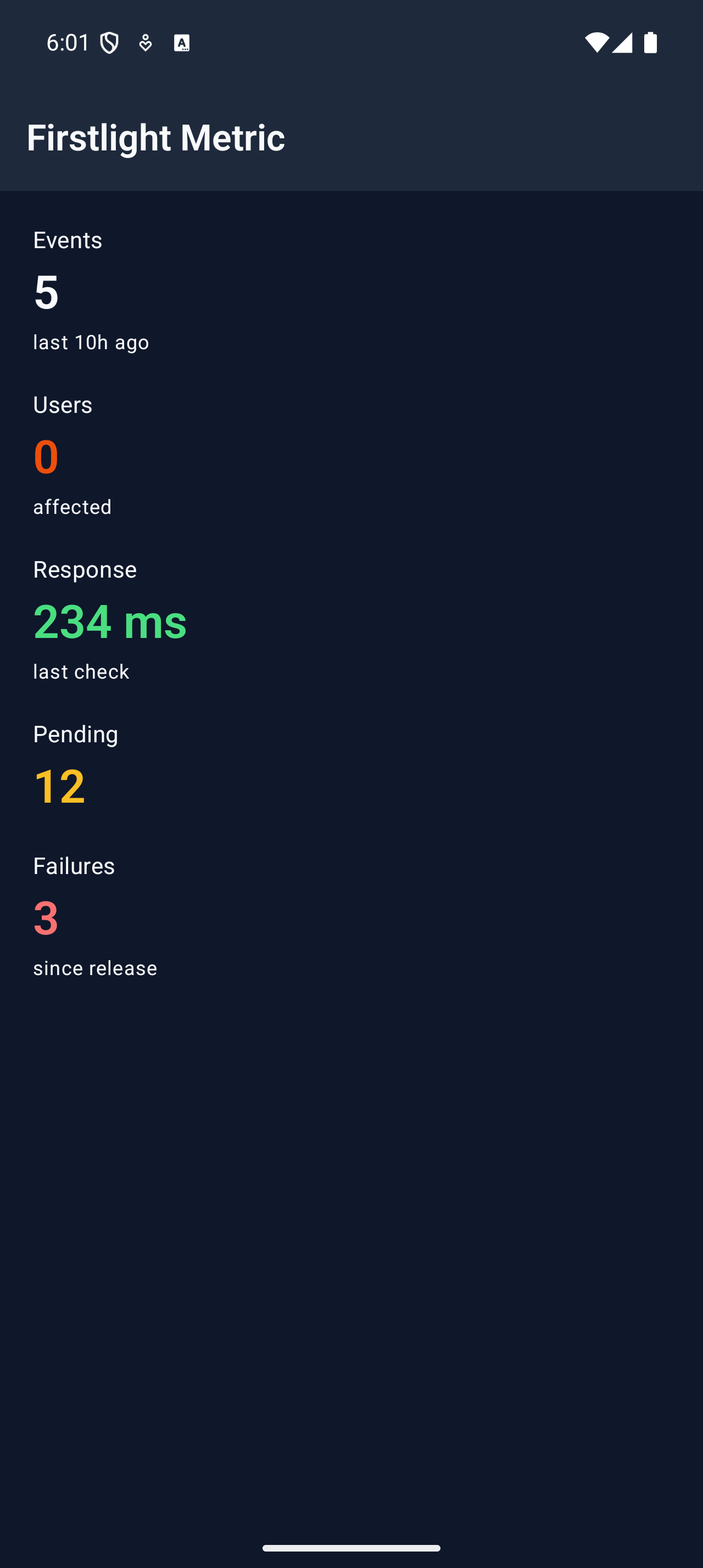
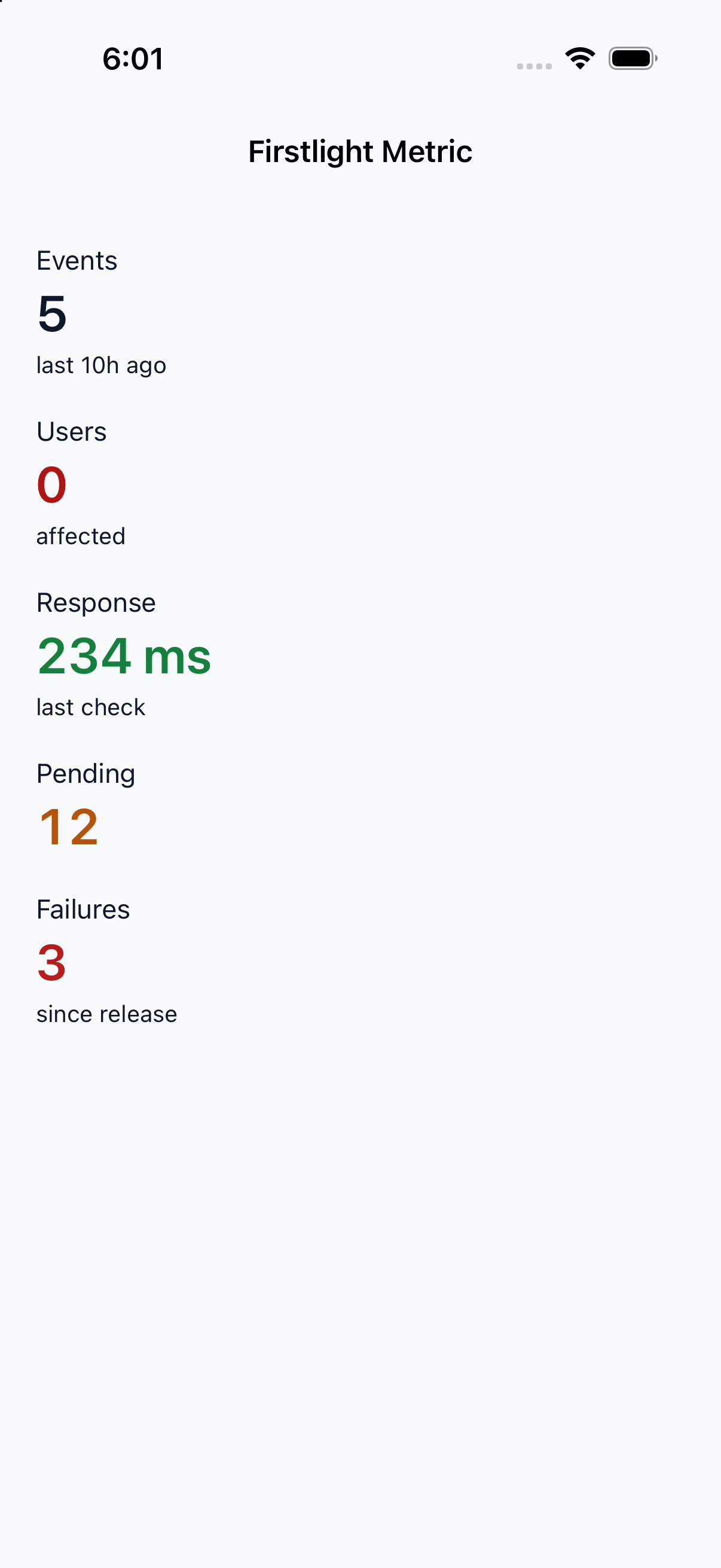
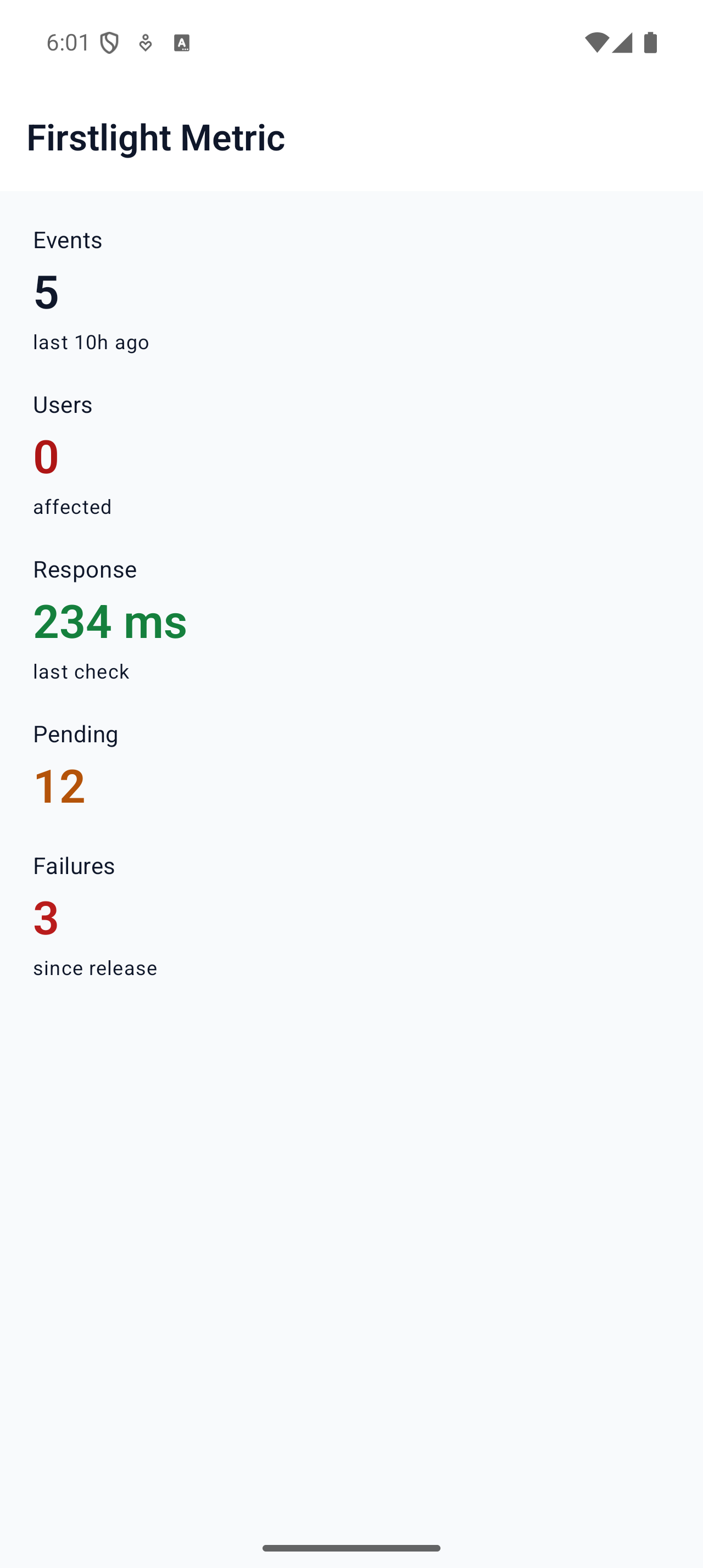
Metric

Available
firstlight:metric

Display one labelled value with tabular figures, an optional detail, and a single accessible description.
Read the docs
iOS Native
Firstlight Metric rendered on iOS
Android Native
Firstlight Metric rendered on Android

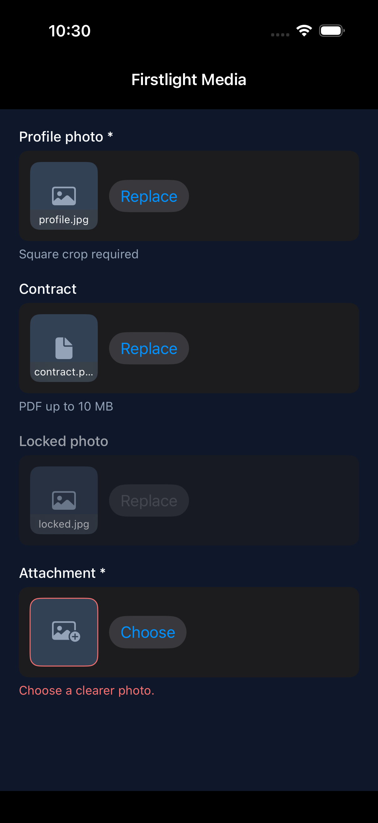
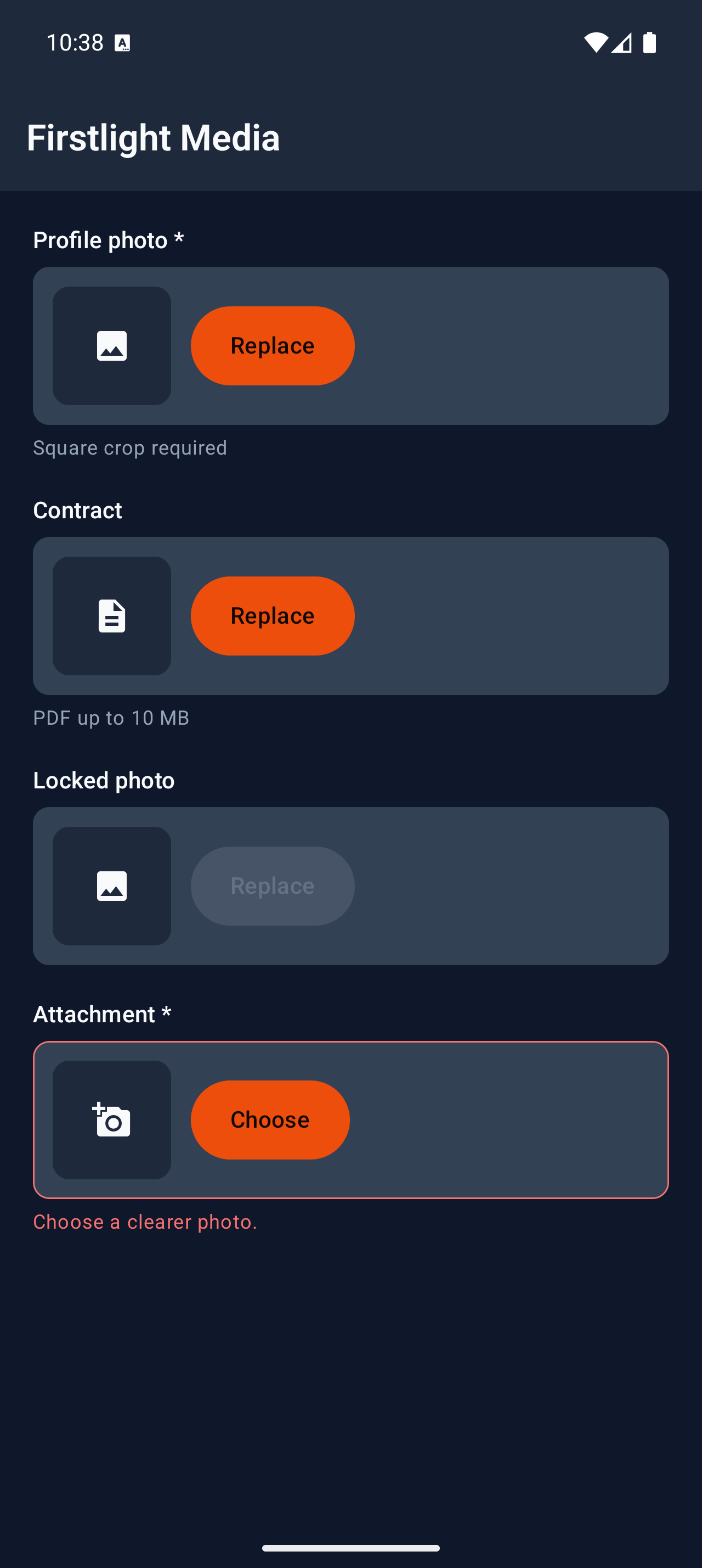
Media

Available
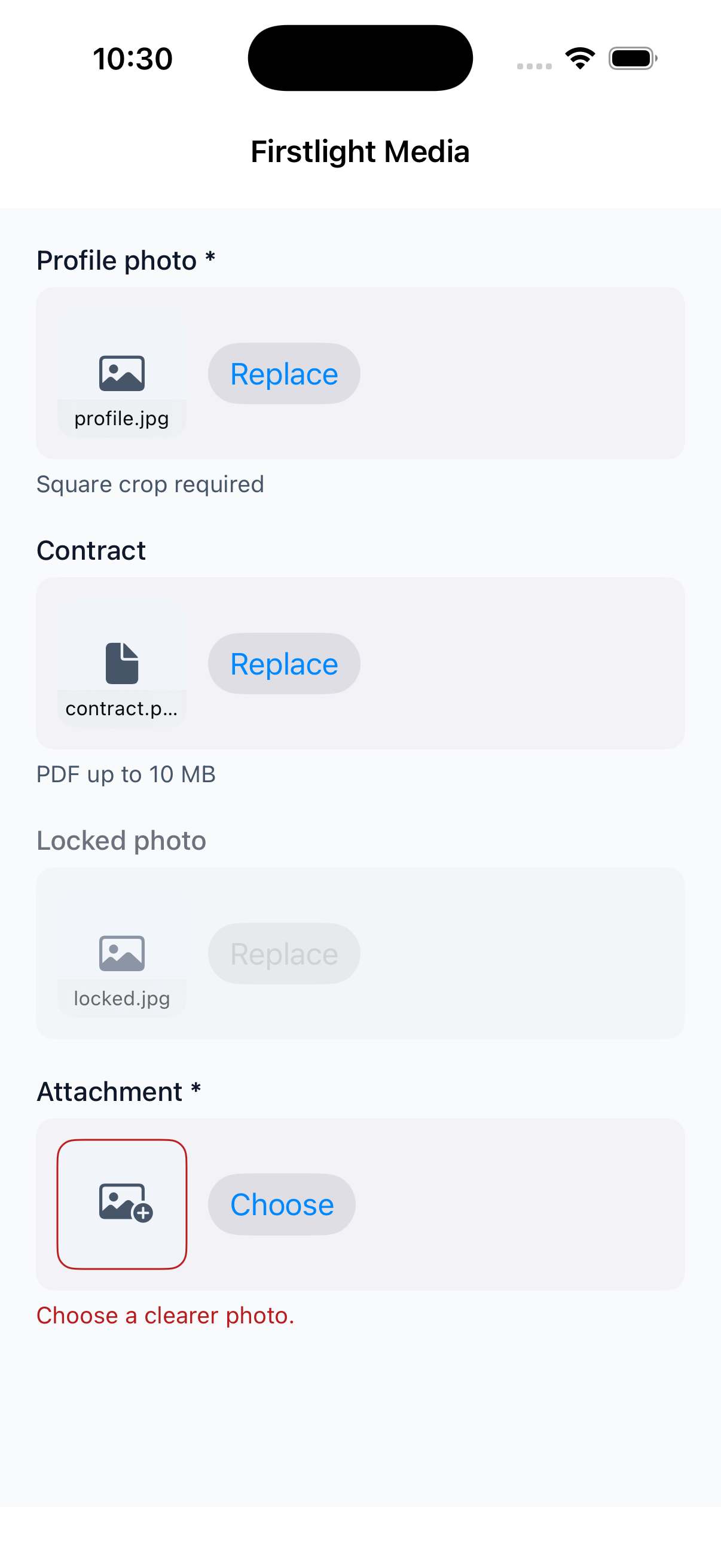
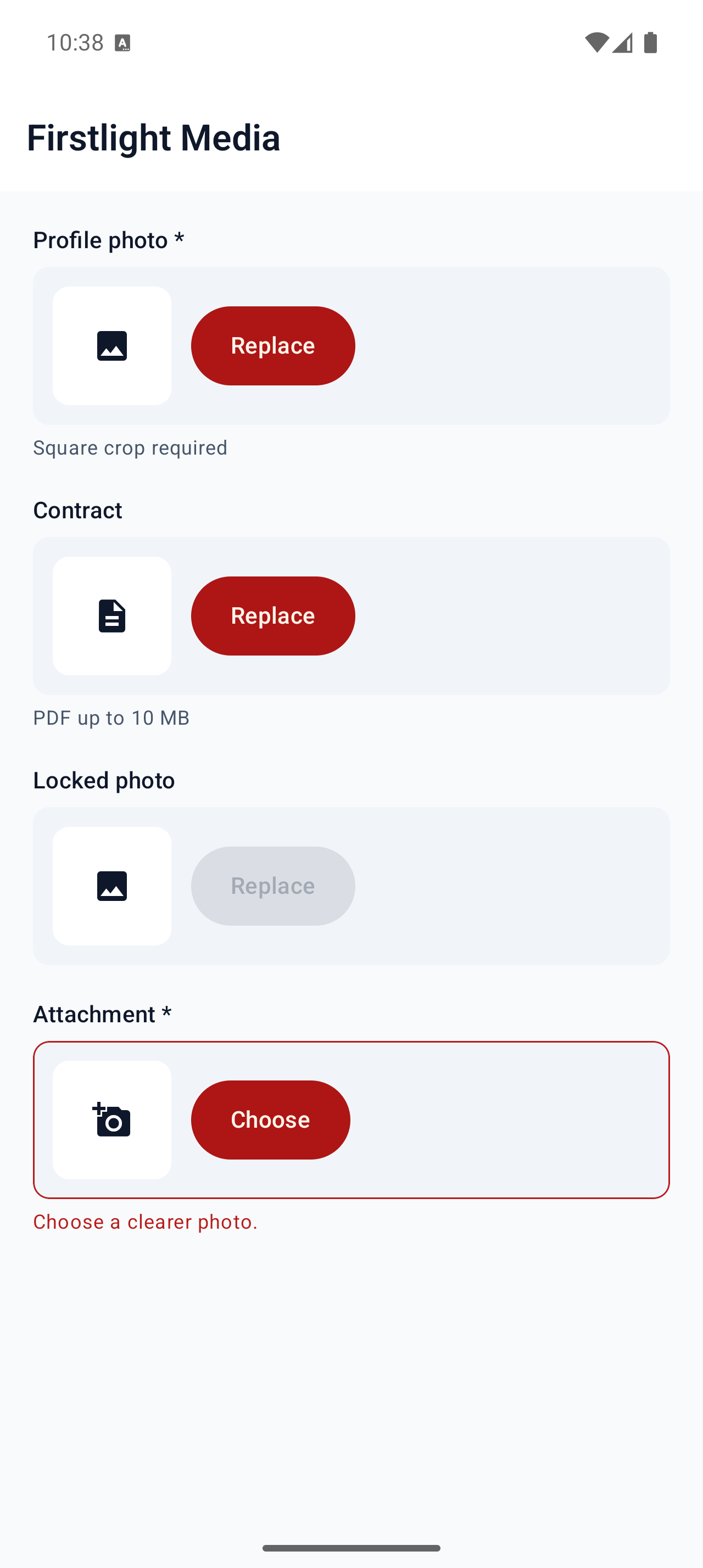
firstlight:media

Capture one image or document into Laravel Storage with camera, library, or file picking and optional crop.
Read the docs
iOS Native
Firstlight Media rendered on iOS
Android Native
Firstlight Media rendered on Android

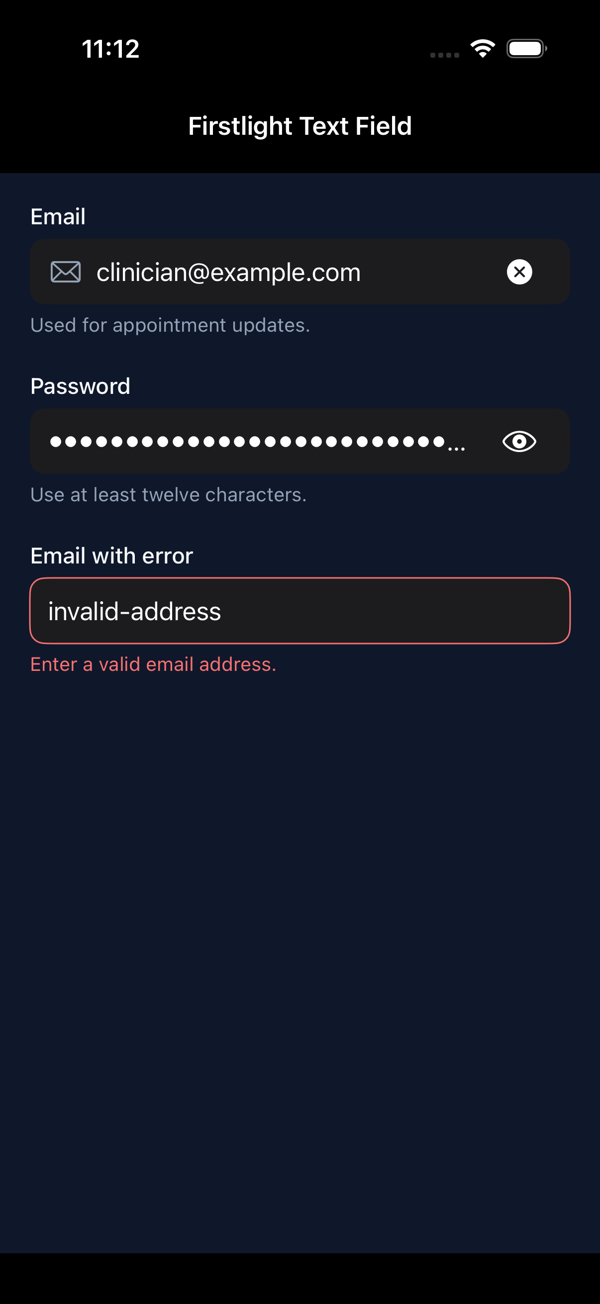
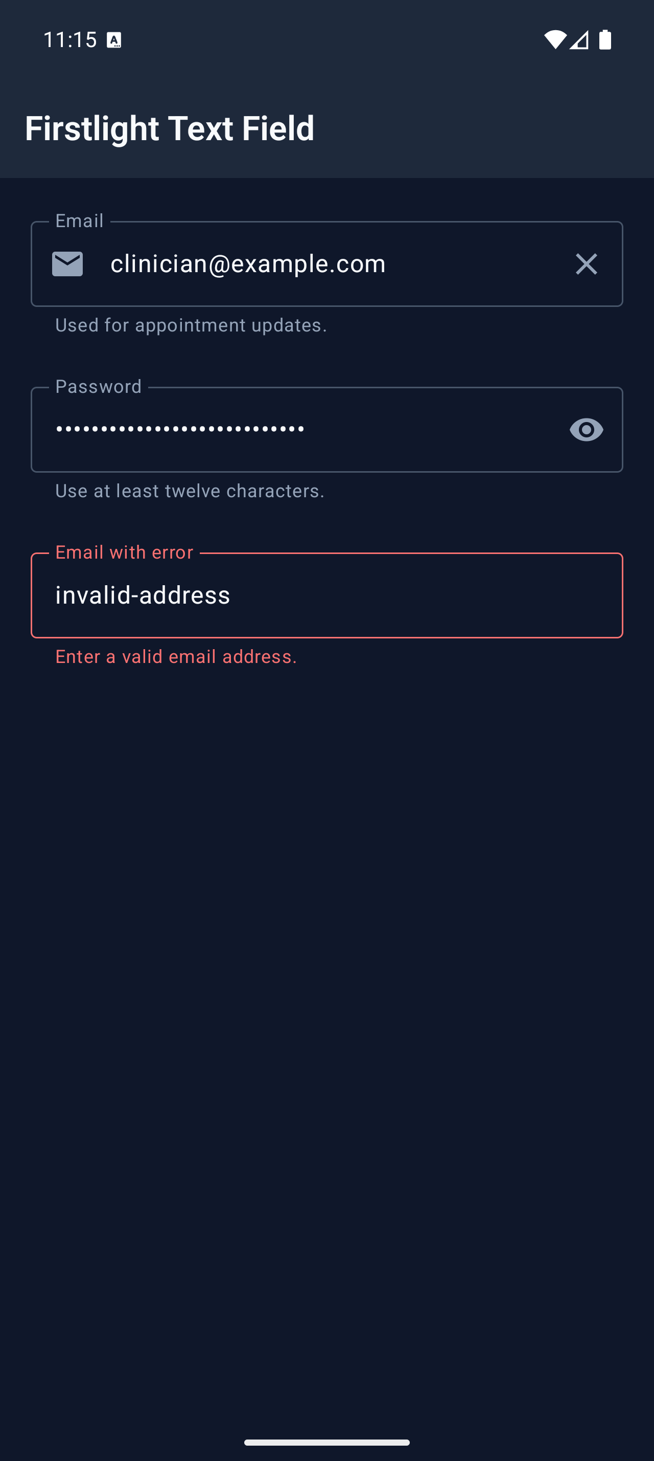
Text Field

Available
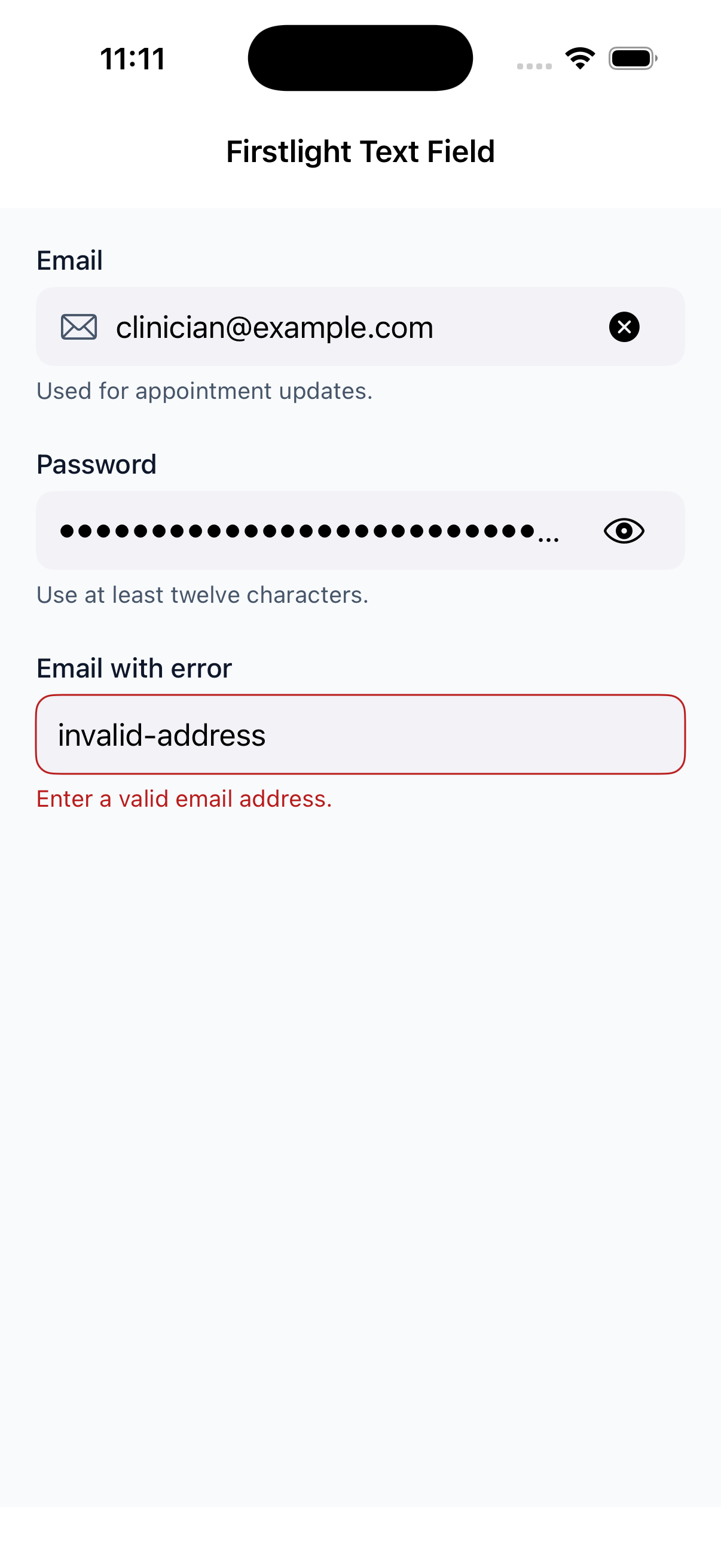
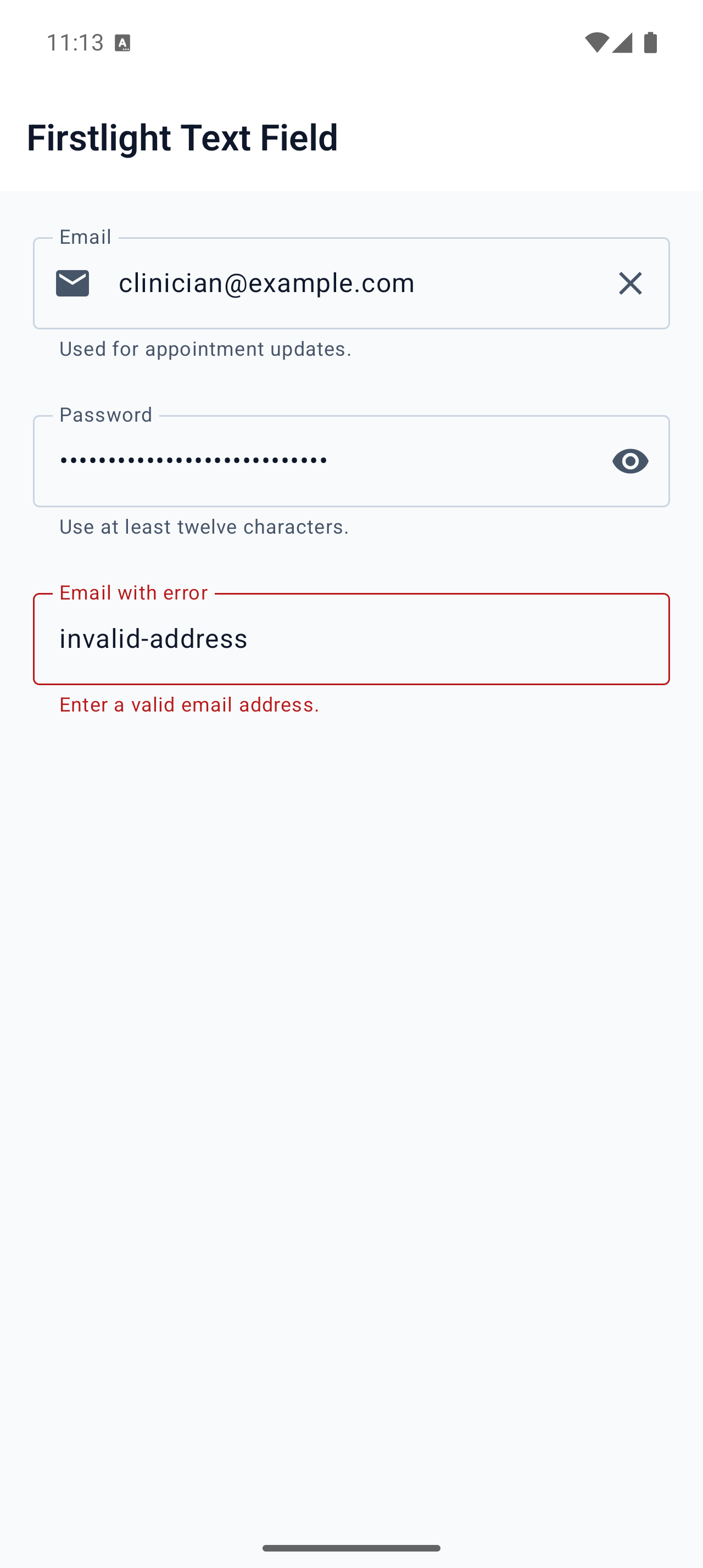
firstlight:text-field

Edit one line of text with each platform’s native keyboard, autofill, selection, and accessibility behaviour.
Read the docs
iOS Native
Firstlight Text Field rendered on iOS
Android Native
Firstlight Text Field rendered on Android

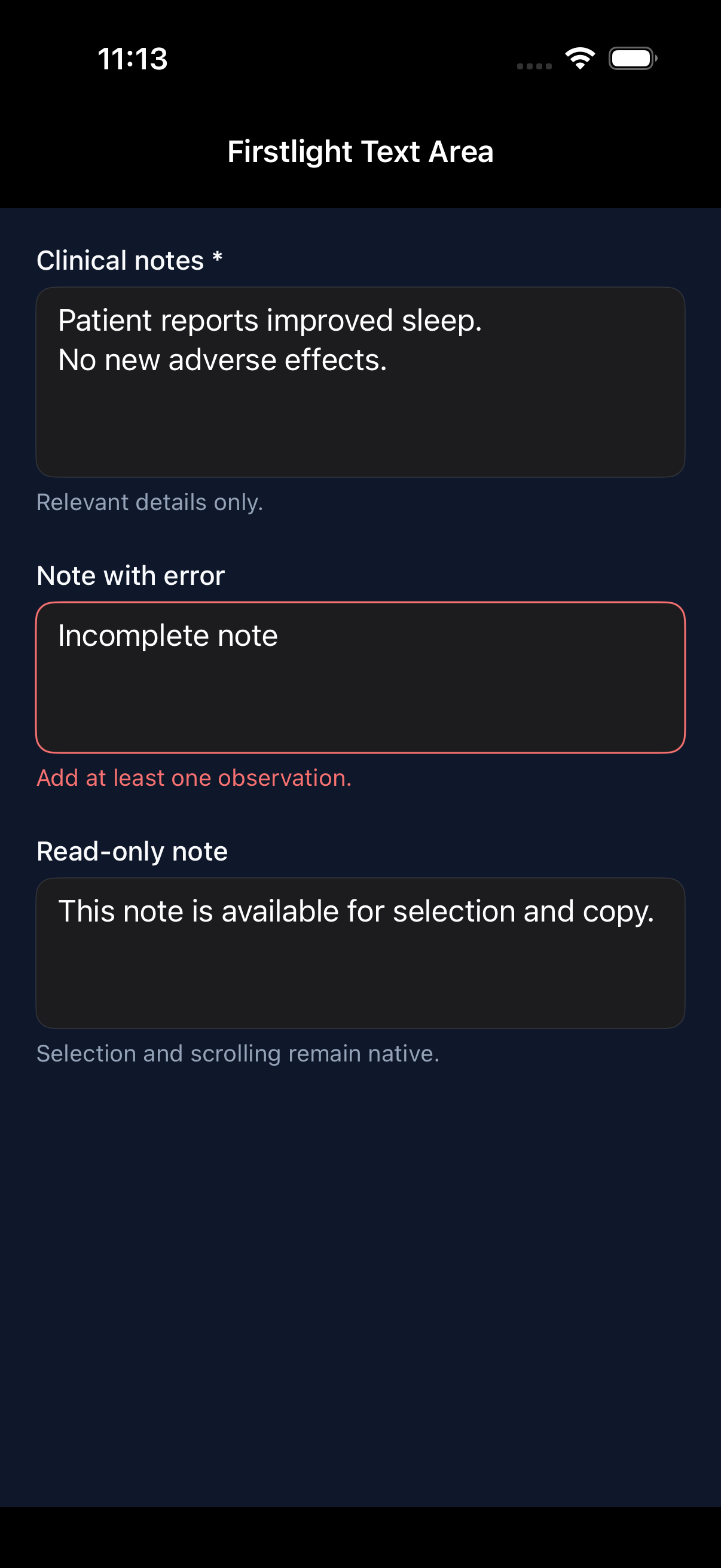
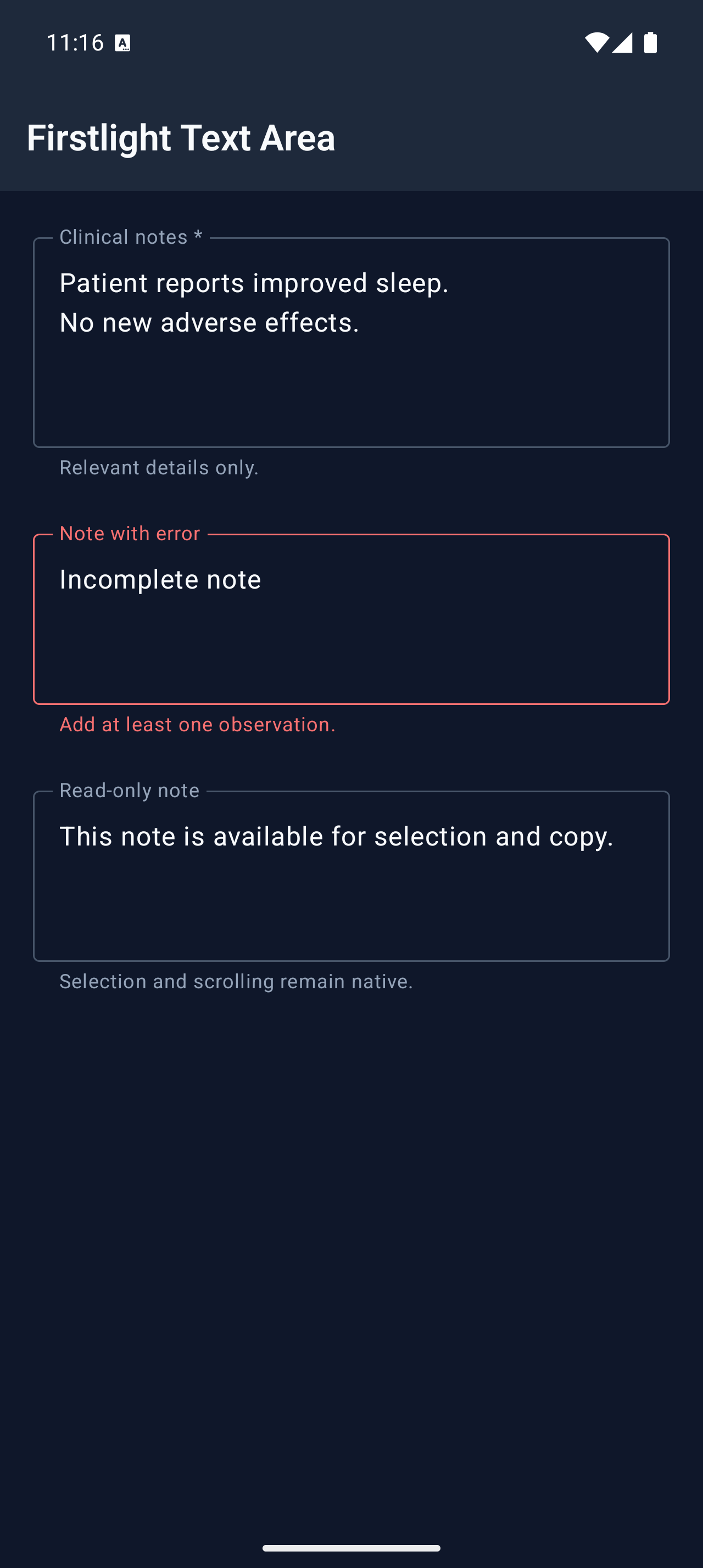
Text Area

Available
firstlight:text-area

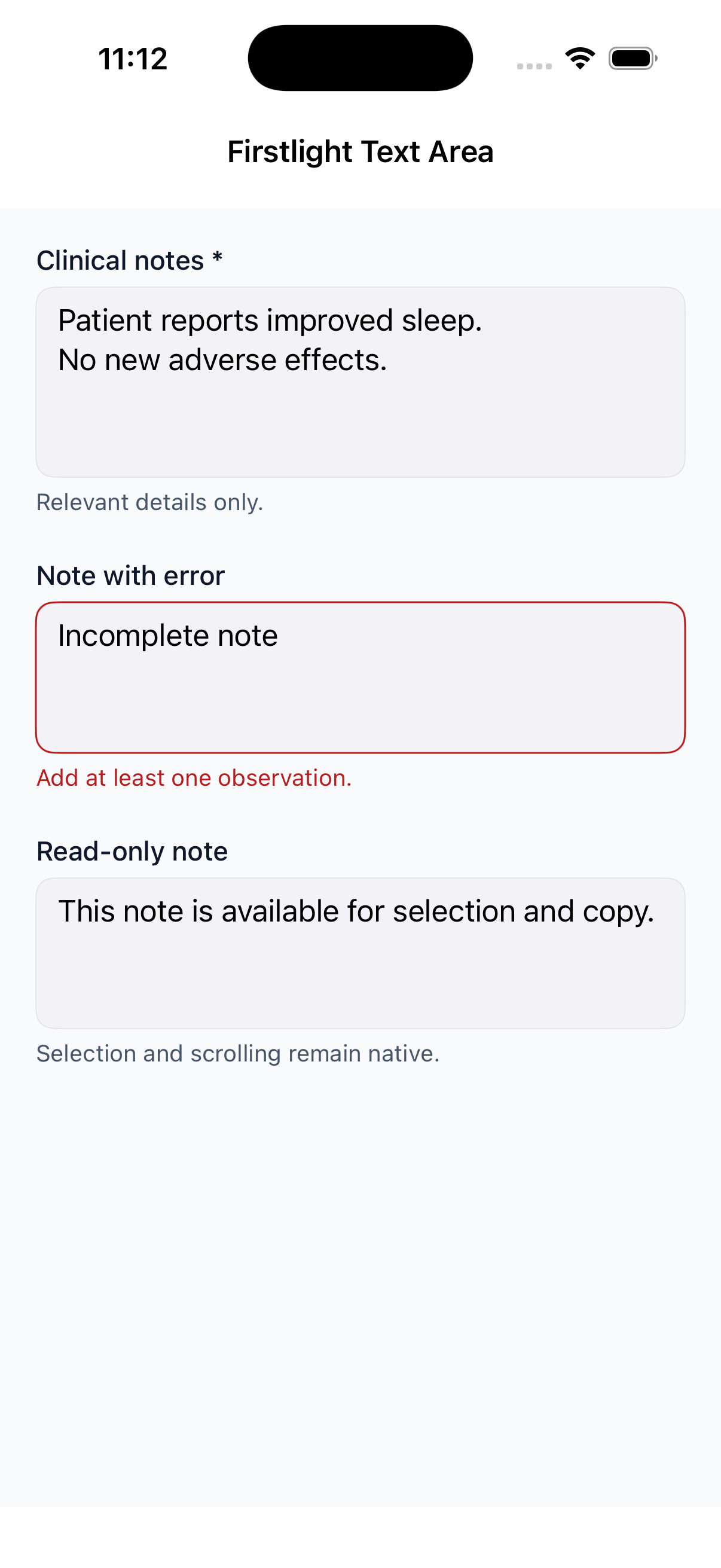
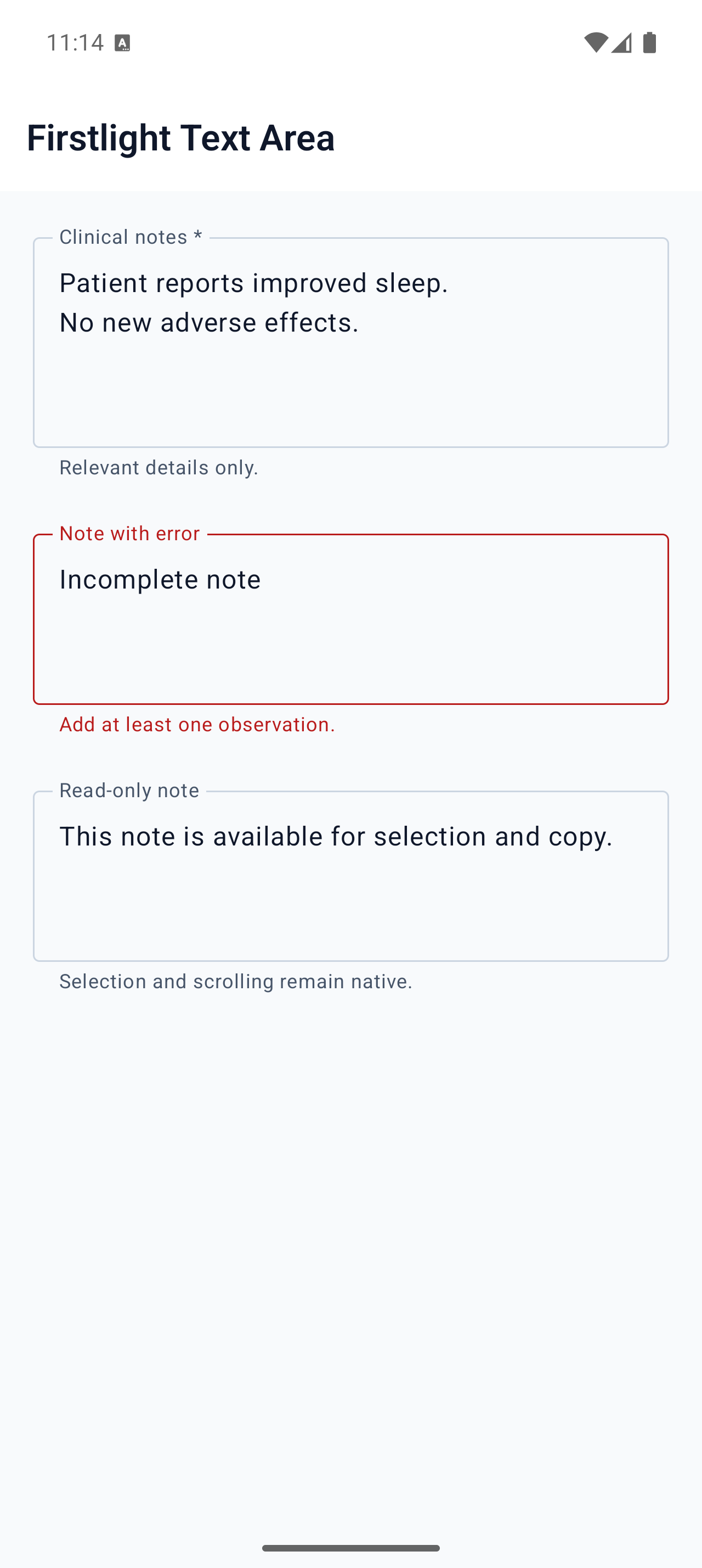
Edit multiline text with native selection, composition, focus, scrolling, and correction behaviour.
Read the docs
iOS Native
Firstlight Text Area rendered on iOS
Android Native
Firstlight Text Area rendered on Android

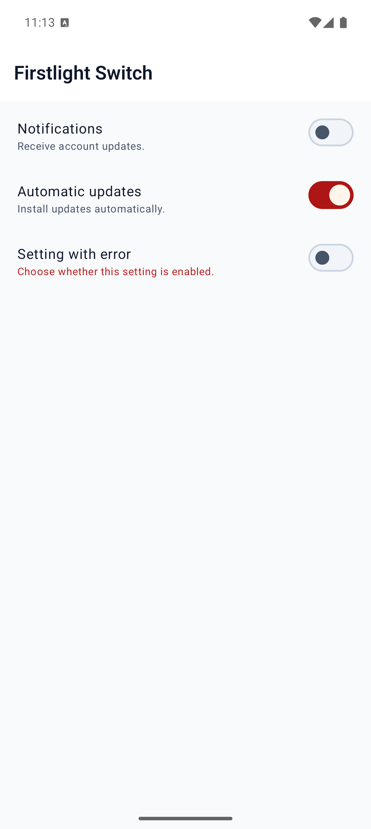
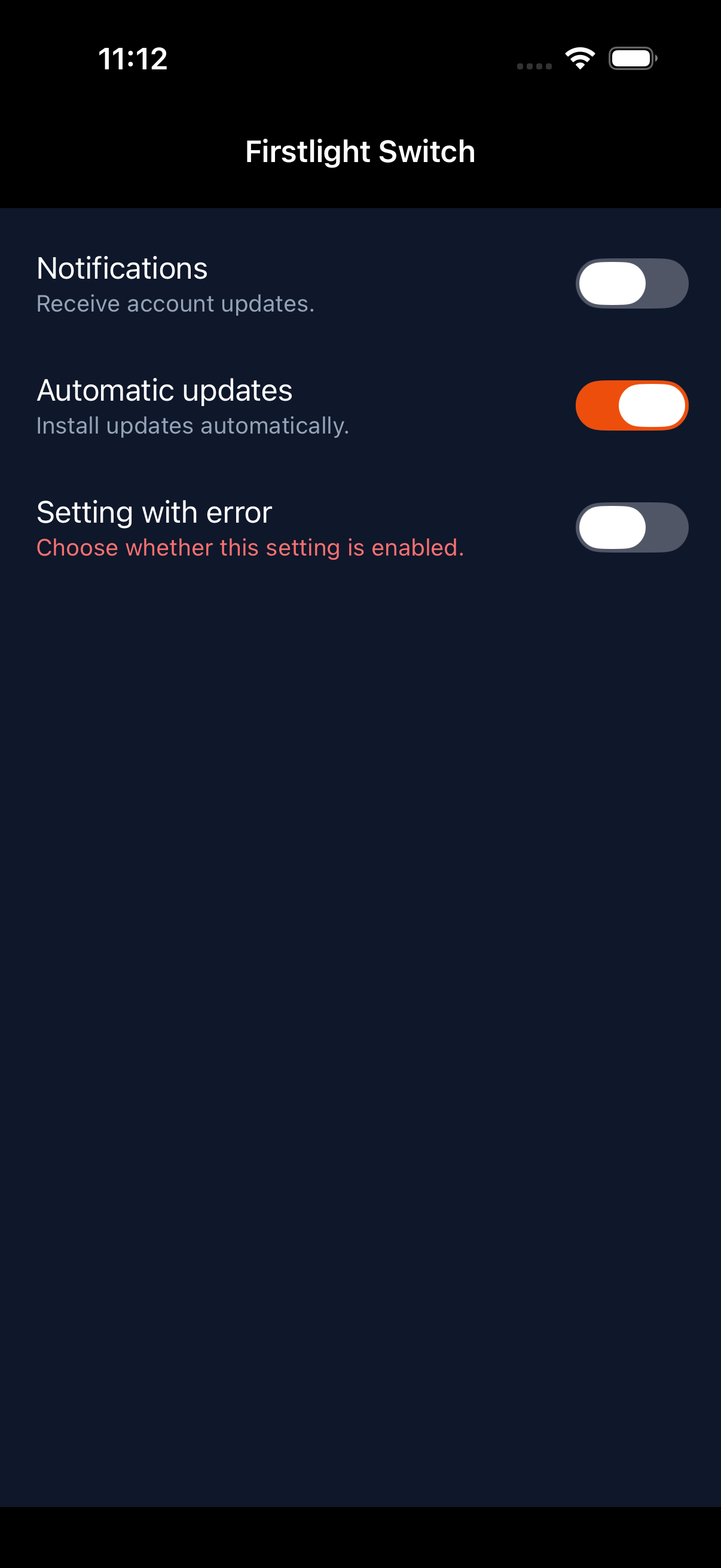
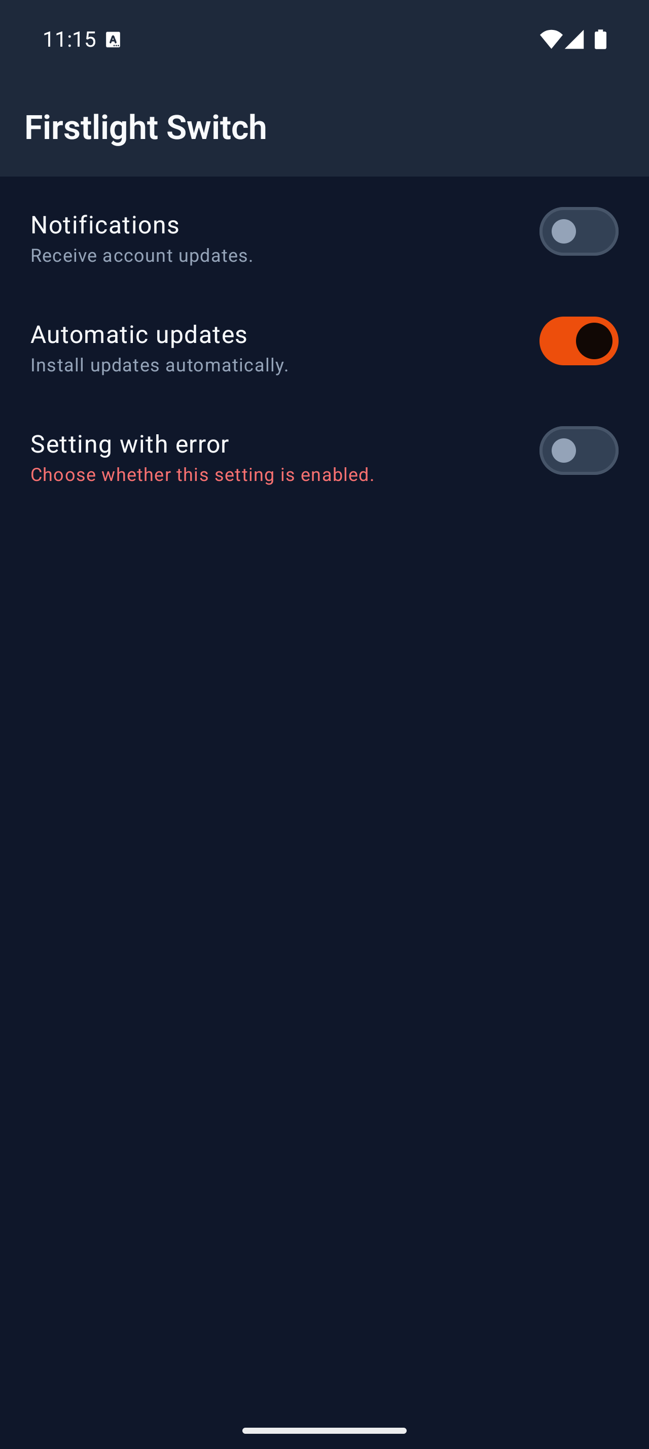
Switch

Available
firstlight:switch

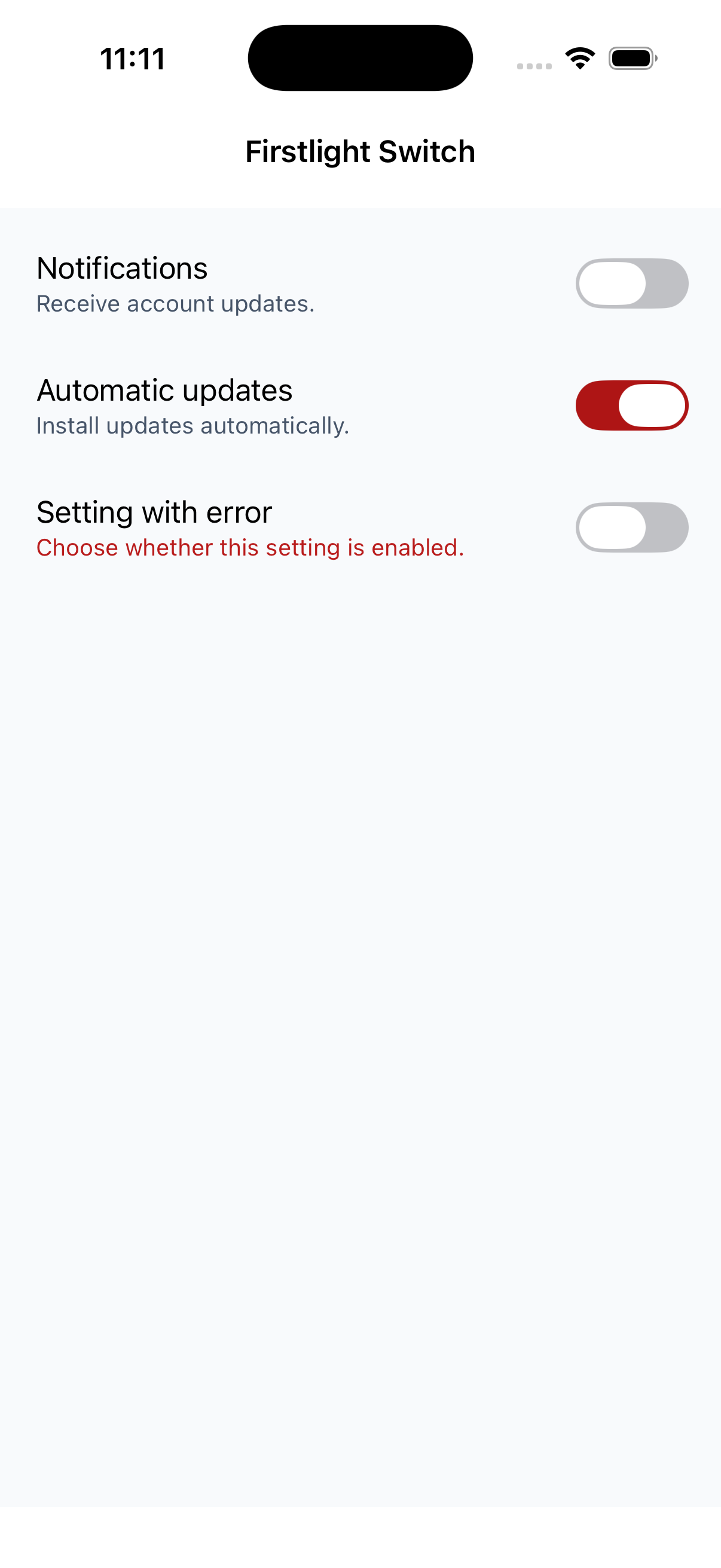
Present one boolean setting through each platform’s familiar native on/off control.
Read the docs
iOS Native
Firstlight Switch rendered on iOS
Android Native
Firstlight Switch rendered on Android

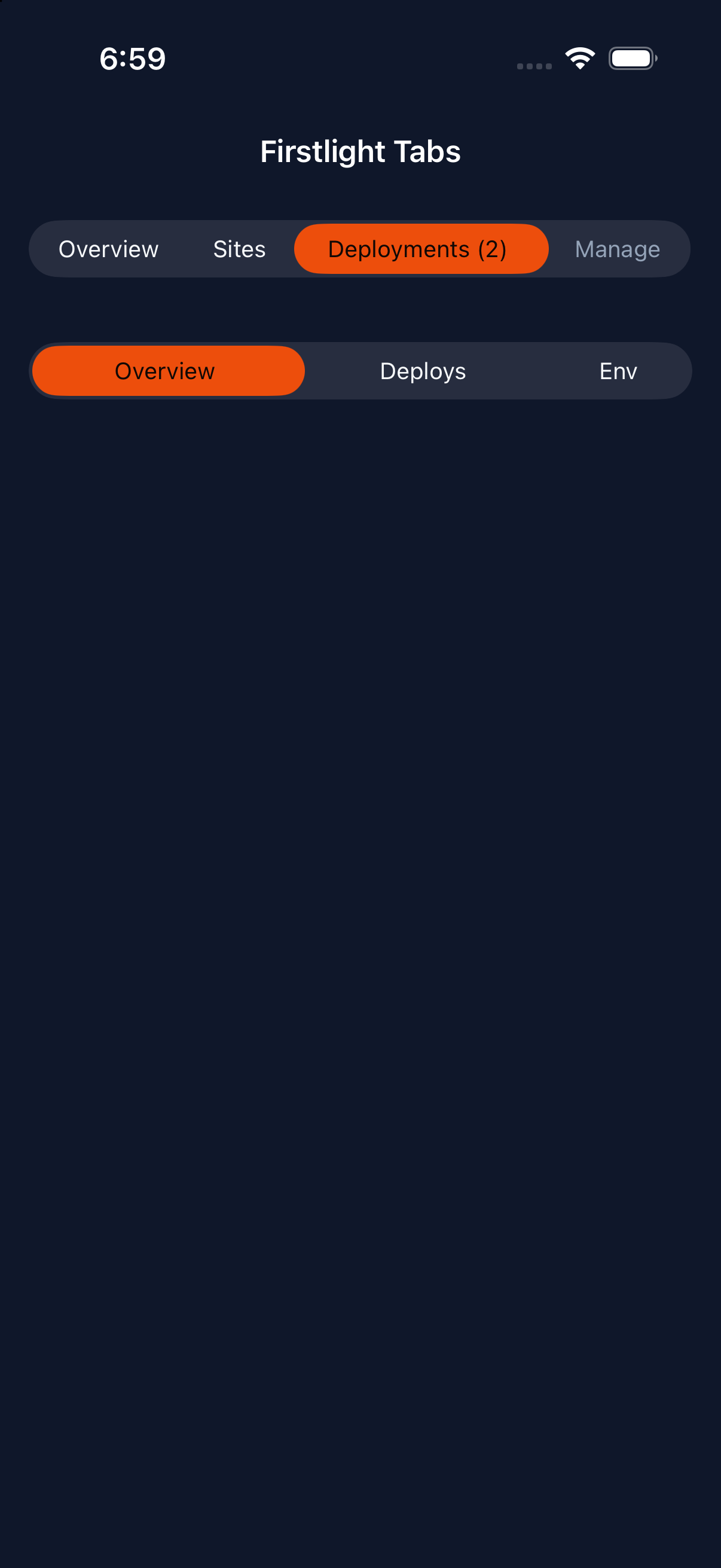
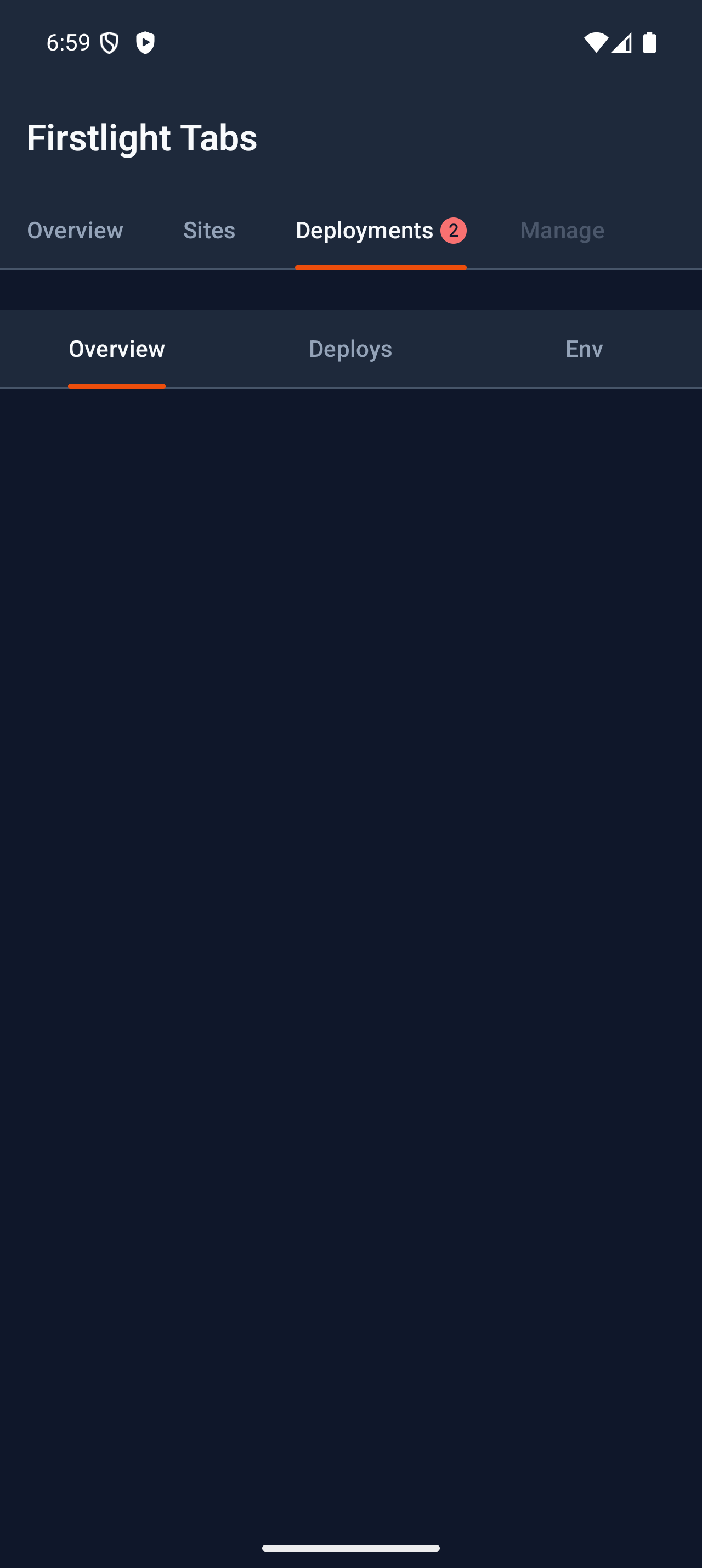
Tabs

Available
firstlight:tabs

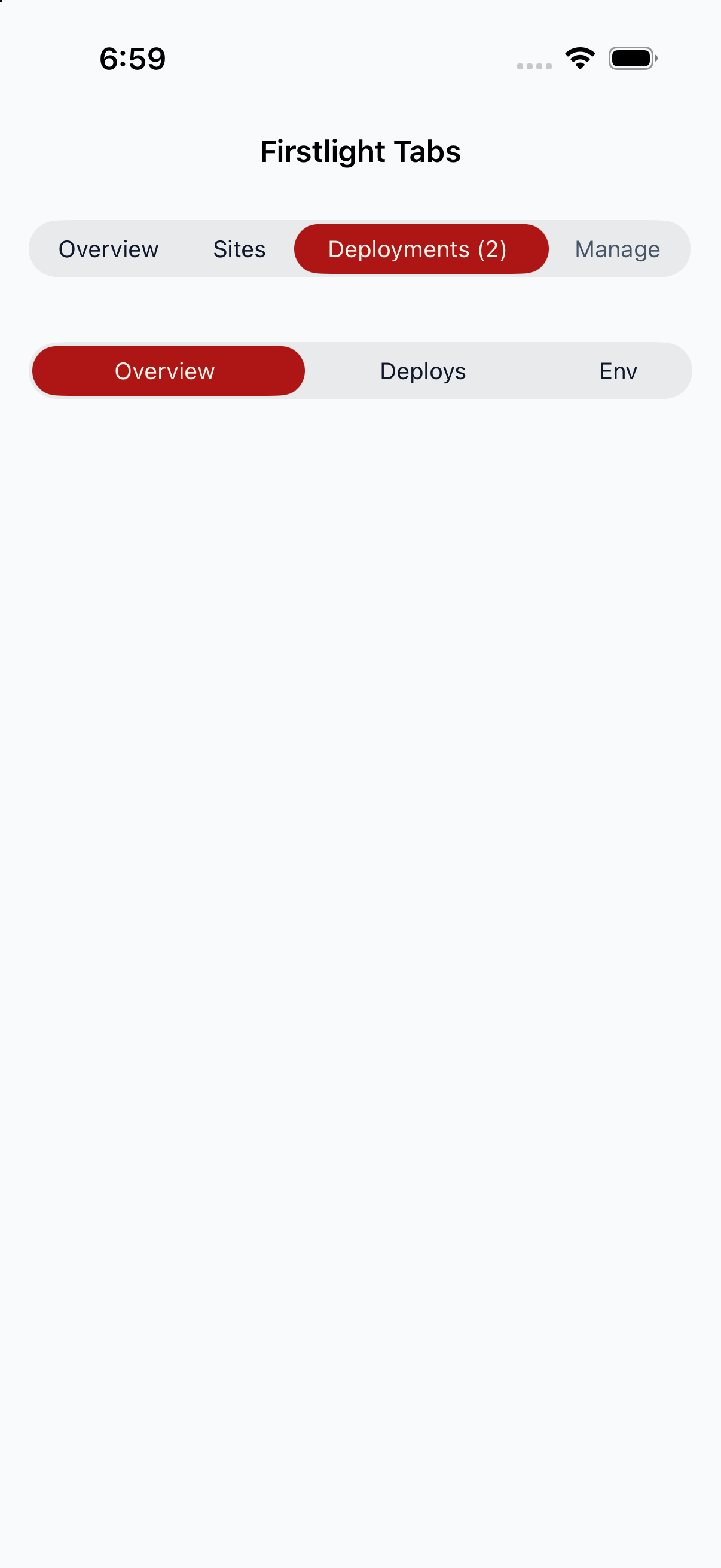
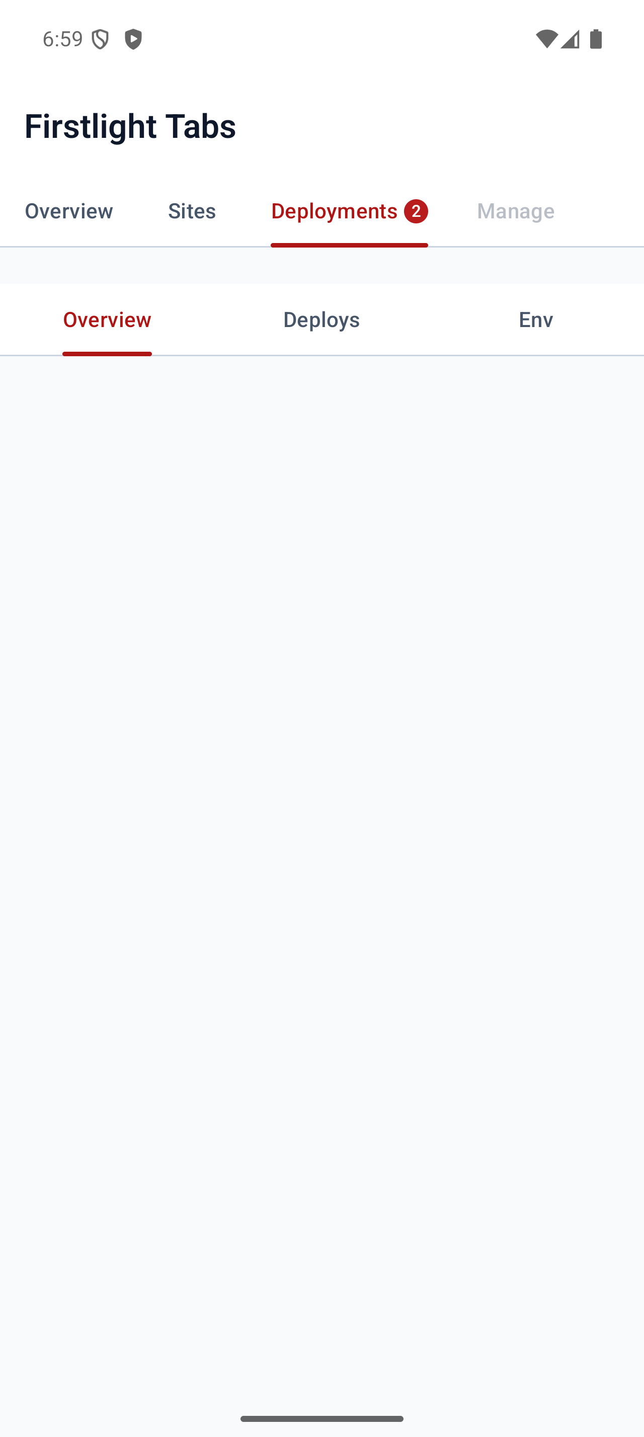
Switch between sections of one object with native tabs, counts, and selection your component controls.
Read the docs
iOS Native
Firstlight Tabs rendered on iOS
Android Native
Firstlight Tabs rendered on Android

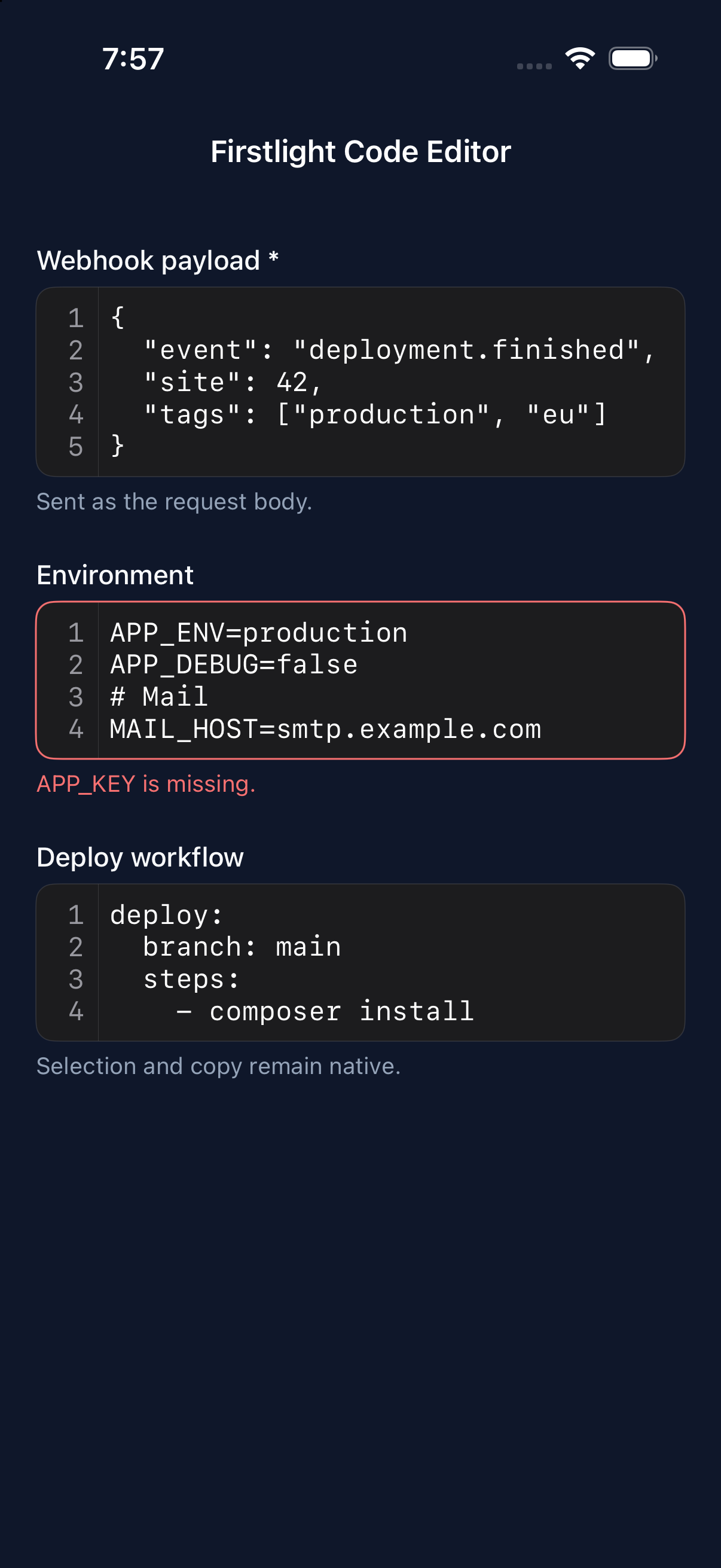
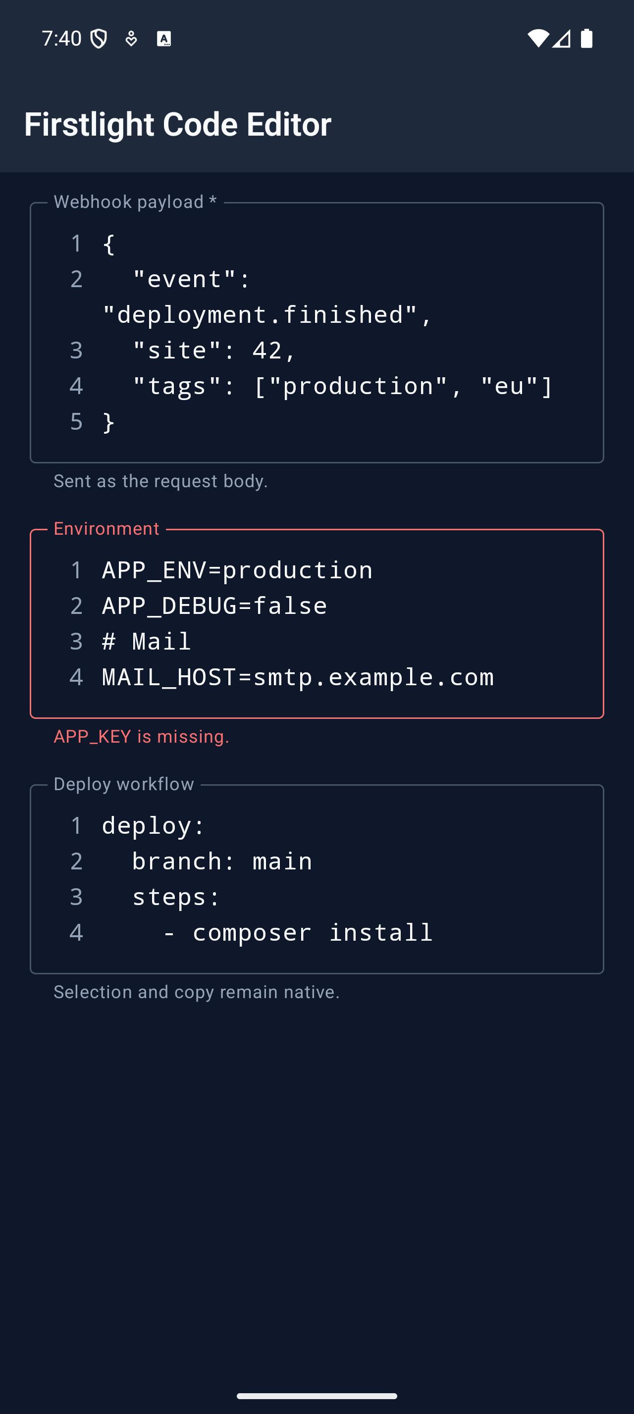
Code Editor

Available
firstlight:code-editor

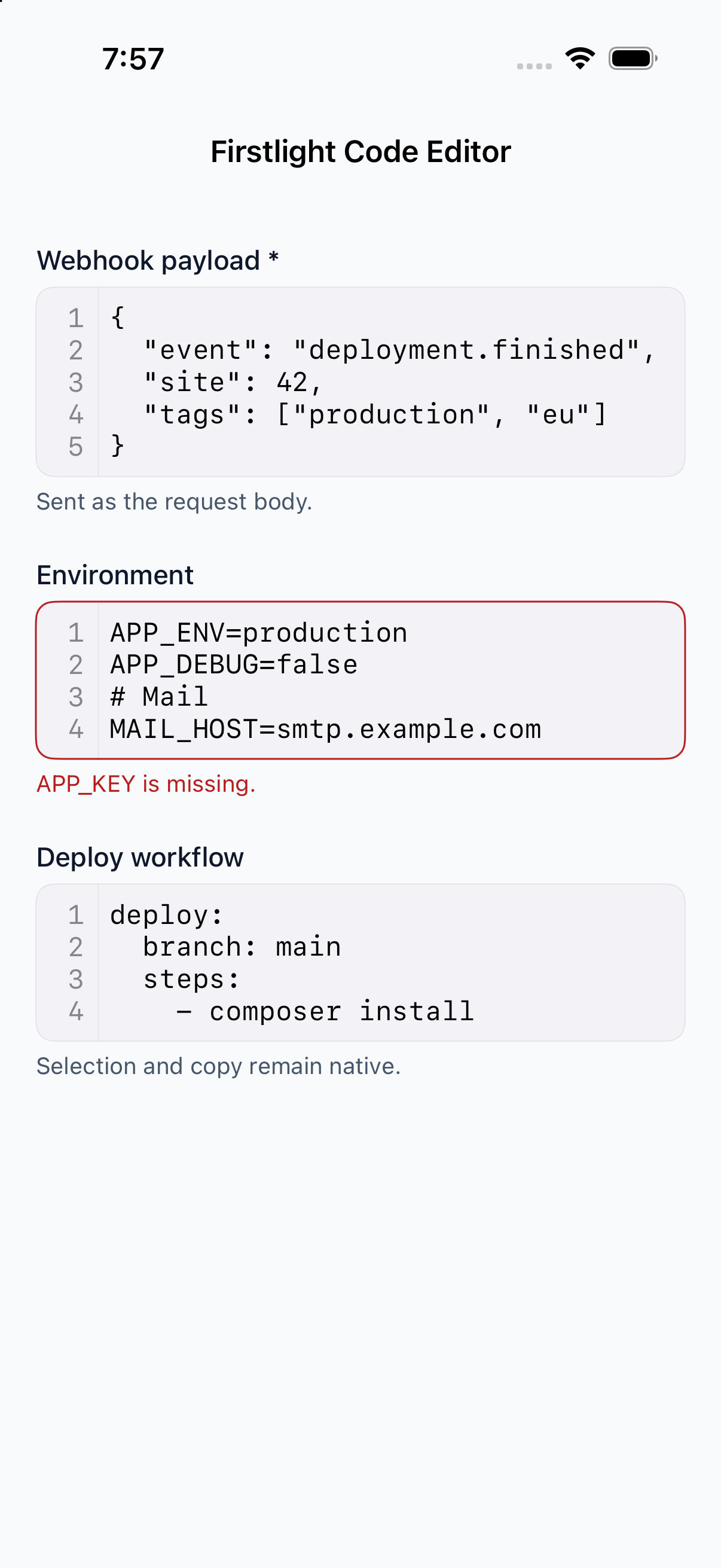
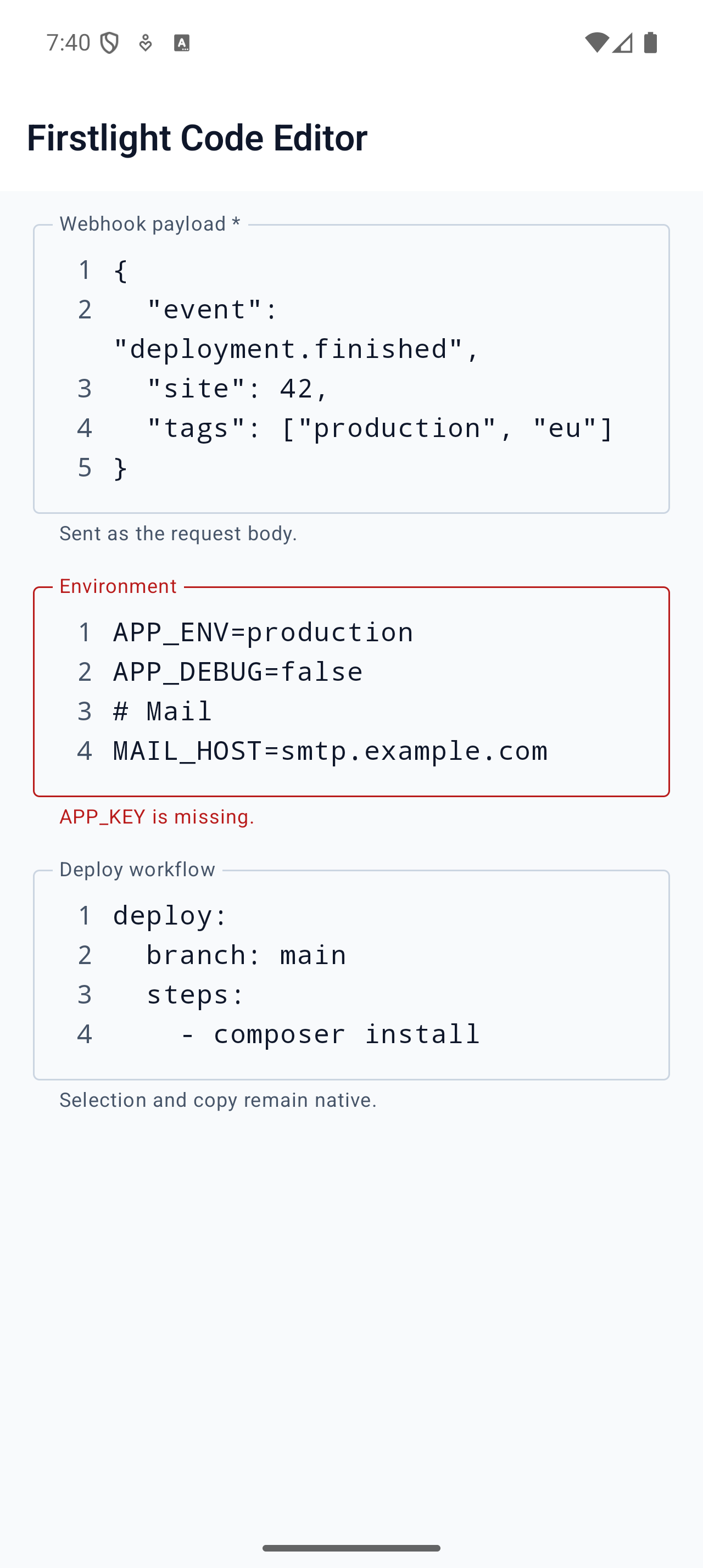
Edit JSON, YAML, env, and plain text with line numbers, native indentation, a key row, and follow mode for live logs.
Read the docs
iOS Native
Firstlight Code Editor rendered on iOS
Android Native
Firstlight Code Editor rendered on Android