Status Label
Status Label presents short display-only metadata or status text as a native capsule. Use an appropriate interactive control when the interface must respond to a press.
Complete example
<firstlight:status-label
    label="Awaiting review"
    tone="warning"
    a11y-label="Referral status: awaiting review"
    a11y-hint="Updated by the referrals team"
/>
The same authored tag renders on iOS and Android.
Props
| API | Accepted type | Purpose |
|---|---|---|
label |
non-empty string |
Visible status text. Required. |
tone |
neutral, info, success, warning, or danger |
Semantic colour intent. Defaults to neutral. |
a11y-label |
string |
Replaces the visible text as the accessible name. |
a11y-hint |
string |
Adds supplementary VoiceOver or TalkBack context. |
class |
string |
External EDGE layout utilities. |
Events and values
Status Label has no value, options, model binding, or events. It is static text from the user's perspective. A later server publication may replace its label, tone, or accessibility metadata without producing a callback.
Do not use native:model, @change, @press, value, disabled, loading, error, required, or helper. Firstlight rejects those attributes instead of silently adding interactive or field semantics.
State timing
The component renders the latest published Element Tree metadata. It keeps no native selection, editing buffer, pending proposal, or animation state. Programmatic updates reconcile by the element's stable node ID and do not emit events.
Disabled, loading, and error behaviour
Disabled, loading, and validation states do not apply to display-only status text. Choose the semantic tone that describes the current metadata and publish a new label or tone when that status changes.
Accessibility
The visible label is the accessible name by default. a11y-label replaces that name, and a11y-hint adds context. Both renderers expose static text semantics without a button, selected, disabled, or live-region role.
Text follows Dynamic Type on iOS and system font scaling on Android. Long labels and accessibility sizes expand or wrap rather than truncating their meaning. Semantic theme colours are checked at render time; when a customised foreground and background are below 4.5:1 contrast, Firstlight uses whichever of black or white has the stronger ratio.
Validation and failure behaviour
A missing, null, empty, or whitespace-only label throws an InvalidArgumentException. An unsupported tone also throws and lists the accepted values. Malformed tone data that reaches a native renderer unexpectedly falls back defensively to neutral instead of crashing the host.
Platform behaviour
iOS composes SwiftUI Text with a Capsule background and native text accessibility. Android composes Material 3 Text in a capsule-shaped Surface with merged TalkBack semantics. Both use NativePHP semantic theme tokens while retaining platform-native typography, scaling, colour-scheme, and layout behaviour.
Compatibility
Status Label supports the versions listed in the current compatibility reference and requires both native renderers to be compiled into the host application.
Screenshots
| Platform | Light | Dark |
|---|---|---|
| iOS | 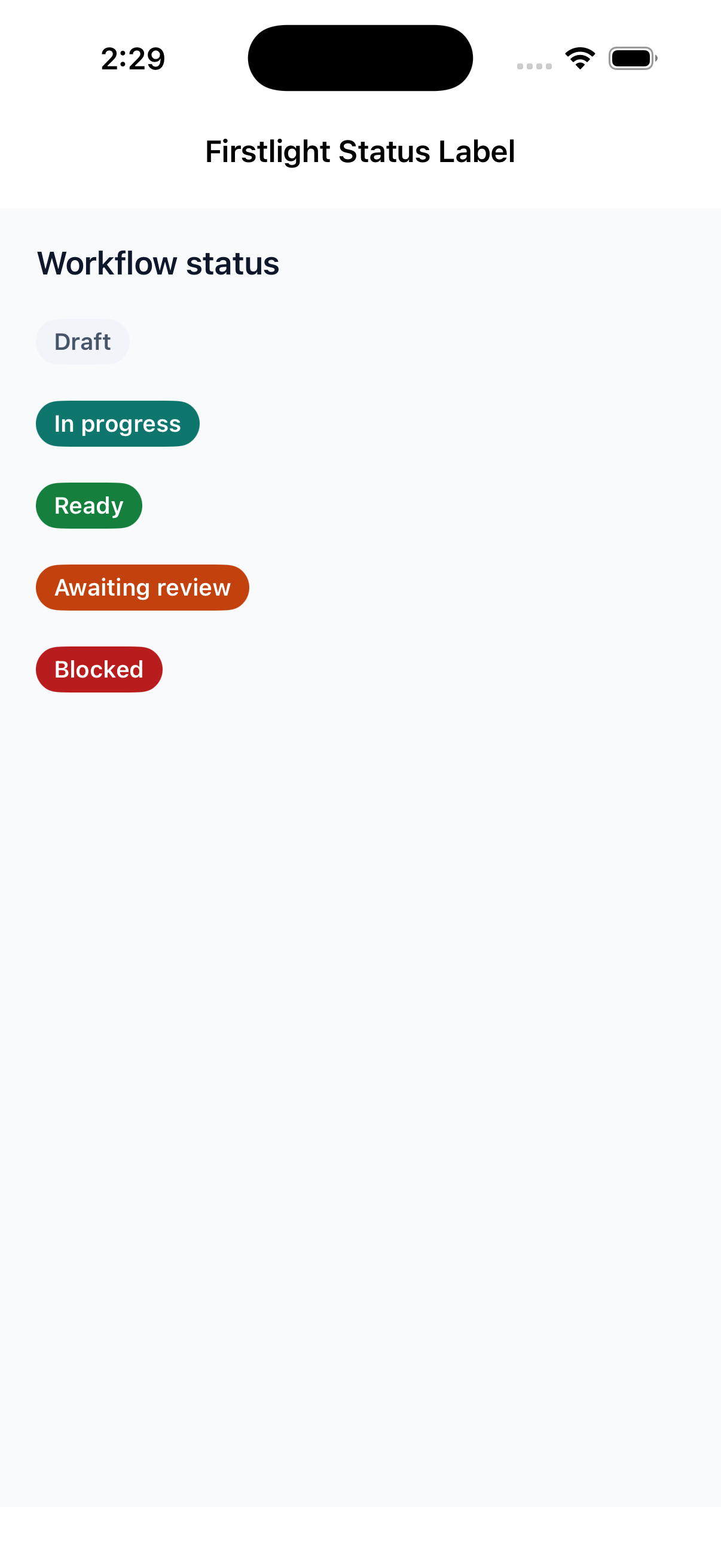 |
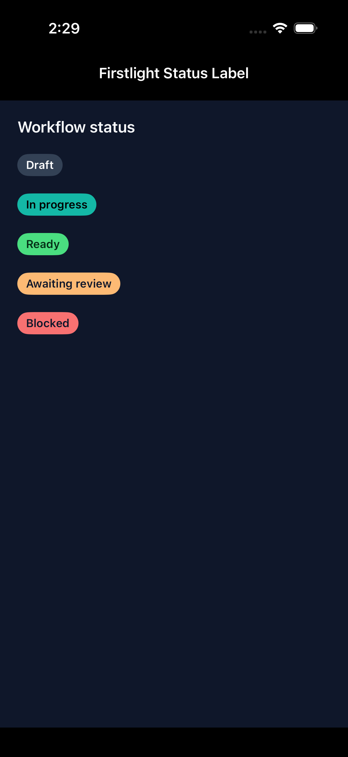 |
| Android | 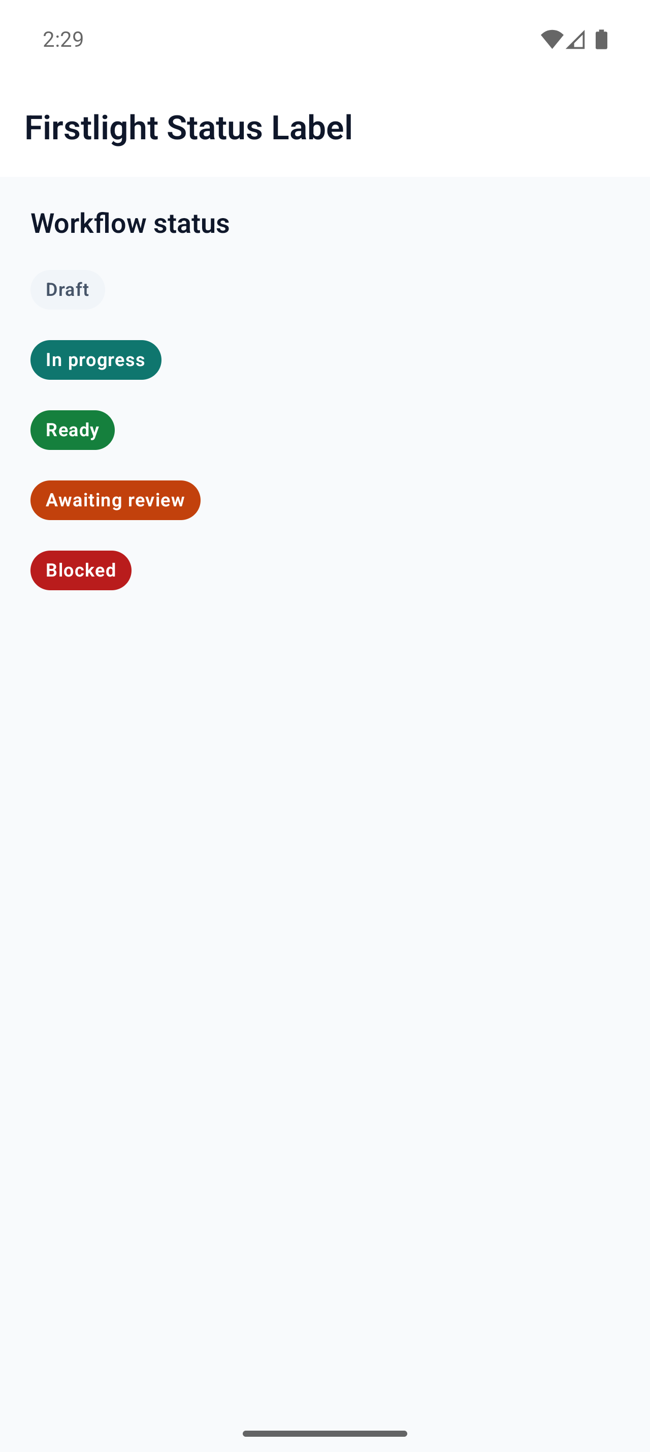 |
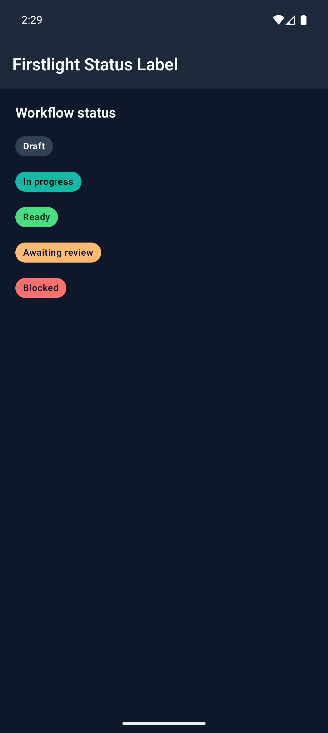 |