Checkbox
Checkbox represents one Boolean form or checklist value. Use it for explicit acknowledgements and selections that are normally saved with a form. Use Switch for a setting that takes effect immediately, or Choice Group for selection from a visible collection.
Complete example
Declare a Boolean property on the native component, then bind it with
native:model:
<?php

namespace App\NativeComponents;

use Illuminate\View\View;
use Native\Mobile\Edge\NativeComponent;

class Registration extends NativeComponent
{
    public bool $acceptedTerms = false;

    public function render(): View
    {
        return view('native.registration');
    }
}
<firstlight:checkbox
    native:model="acceptedTerms"
    label="I agree to the terms"
    helper="Required before continuing."
    required
    a11y-hint="Required before creating your account"
/>
Props
| API | Accepted type | Purpose |
|---|---|---|
value |
bool |
Accepted value. Defaults to false when omitted. |
native:model |
a Boolean component property | Synchronises the accepted value through NativePHP. native:model.live is also accepted. |
label |
string |
Visible checkbox label. |
helper |
string |
Supporting text below the label. |
error |
string |
Validation text and error semantics; shown instead of helper when non-empty. |
required |
bool |
Marks the field as required visually and for assistive technology. |
disabled |
bool |
Prevents proposals and change events while retaining the accepted value. |
a11y-label |
string |
Explicit accessible name when a visible label is inappropriate. |
a11y-hint |
string |
Additional VoiceOver and TalkBack guidance. |
class |
string |
External EDGE layout utilities. |
The camel-case authoring aliases a11yLabel and a11yHint are accepted and
publish the same native props.
Events
@change receives the proposed Boolean value. Use it when PHP decides whether
to accept a change:
public bool $acceptedTerms = false;

public function updateAcceptedTerms(bool $value): void
{
    $this->acceptedTerms = $value;
}
<firstlight:checkbox
    :value="$acceptedTerms"
    @change="updateAcceptedTerms"
    label="I agree to the terms"
/>
native:model normally supplies the same callback for property
synchronisation.
Accepted values
Checkbox accepts only strict PHP booleans: true and false. Bind a literal
Boolean with ::
<firstlight:checkbox :value="false" label="I agree to the terms" />
value="false" is invalid because Blade passes it as a string. null,
integers, string booleans, arrays, and objects are also rejected. Checkbox has
no nullable or indeterminate state.
State timing
Checkbox is server-authoritative.
A tap emits the inverse Boolean as one proposal, but the visible checkmark
remains at the last value published by PHP. An accepted response changes the
visible state; a rejected response republishes the previous state. Either
response clears the pending proposal guard. Programmatic publications update
the checkmark without emitting @change.
Use native:model or native:model.live. Deferred blur, lazy, and
debounce synchronisation modes are rejected.
Disabled behaviour
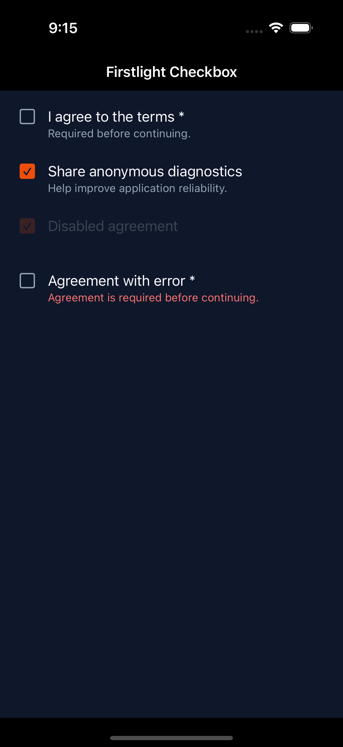
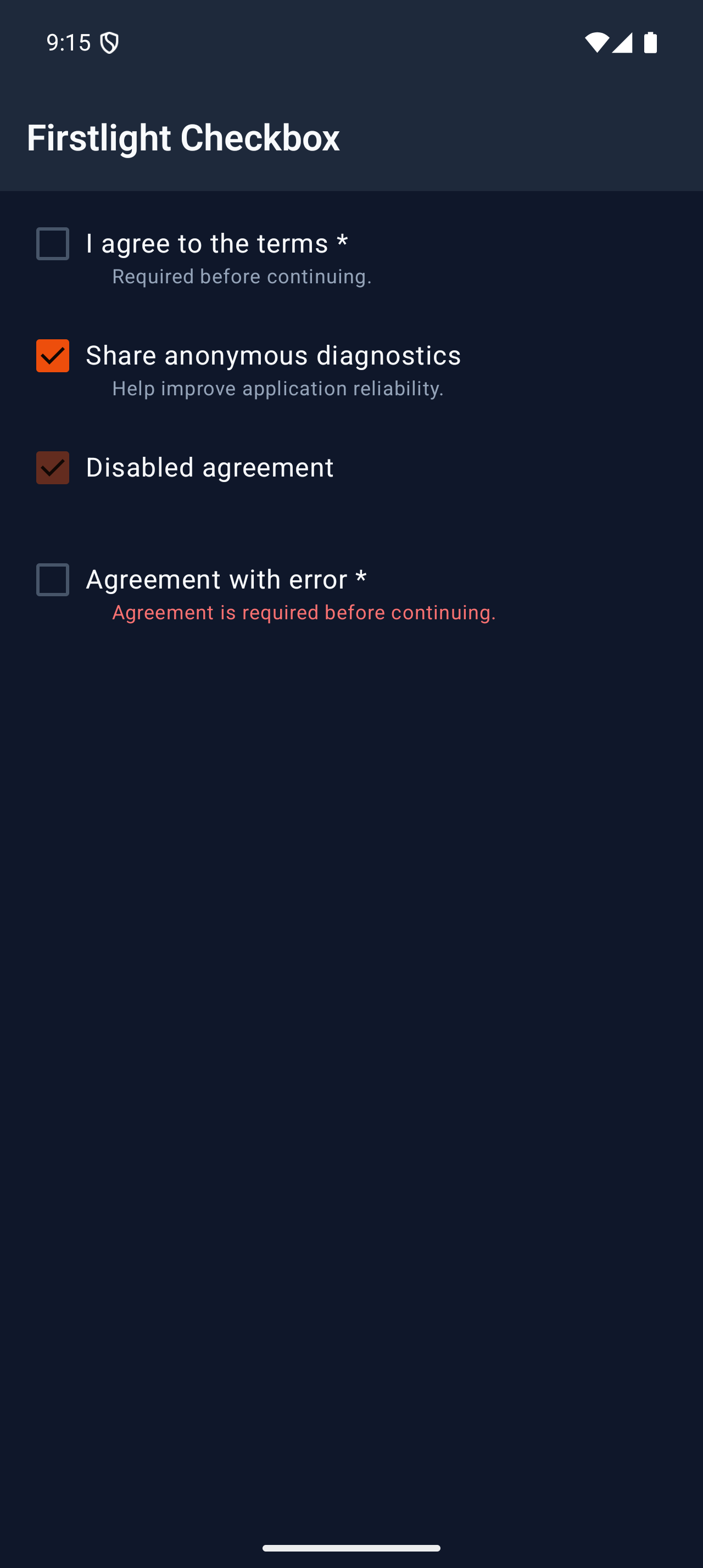
When disabled is true, Checkbox stays visible with its accepted checked or
unchecked state. It cannot emit a proposal or @change event.
Accessibility
Provide a visible label or an explicit a11y-label; Firstlight warns during
development when both are blank. Label, value, required state, hint, helper or
error feedback, and the native checkbox role form one accessibility target.
The visual checkmark is decorative to avoid a second focus stop.
iOS provides a minimum 44-point target and exposes a toggle trait with checked
state. Android provides a minimum 48-dp target with Role.Checkbox and one
TalkBack focus stop. Both platforms support wrapping text and system text
scaling.
Validation and failure behaviour
Contract exceptions still reject non-Boolean props and unsupported attributes
before publication. User validation is separate: screens that
use ValidatesFields auto-bind the first MessageBag message for the field's
native:model or error-for name. An authored error wins. required is
display metadata and does not run Laravel rules. See
Validate fields. Error text replaces helper
text and is included in accessibility semantics.
Platform behaviour
iOS uses an idiomatic SwiftUI checkmarked row built from a native Button and
SF Symbol state affordance. Android uses a genuine Material 3 Checkbox inside
a row-owned checkbox target. The public EDGE API and server-authoritative state
contract are shared, while geometry and interaction presentation remain native
to each platform.
Compatibility
Checkbox supports the versions listed in the current compatibility reference. The host application must compile both Firstlight-owned native renderers declared by the package manifest.
Screenshots
| Platform | Light | Dark |
|---|---|---|
| iOS | 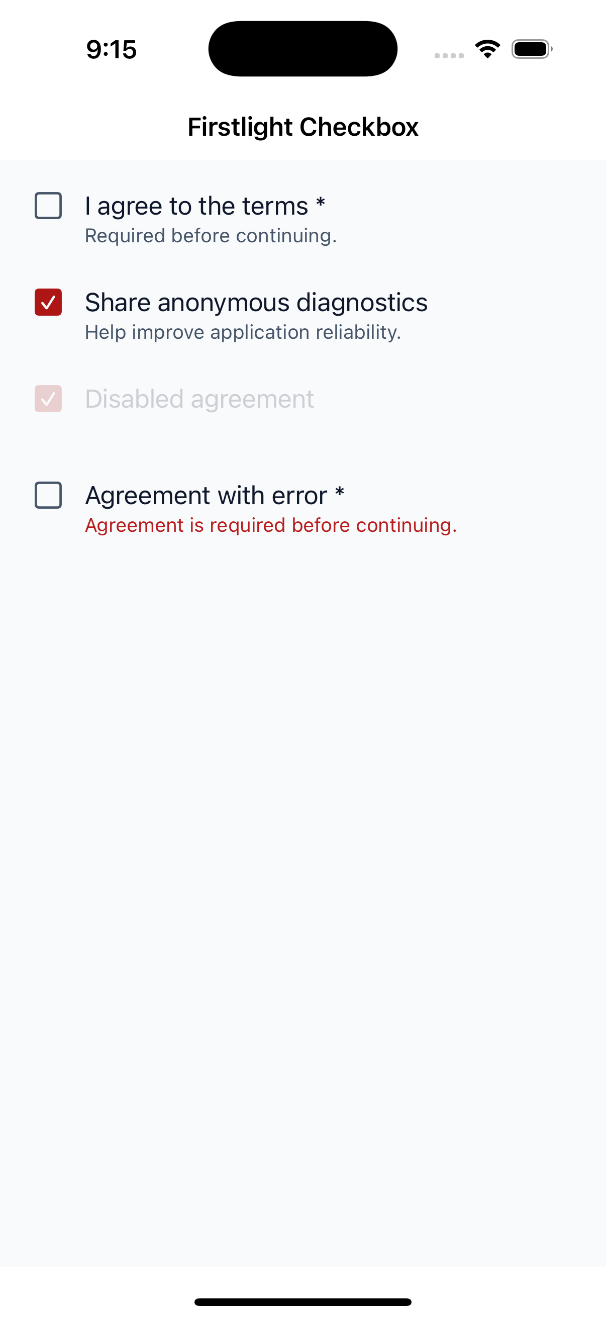 |
 |
| Android | 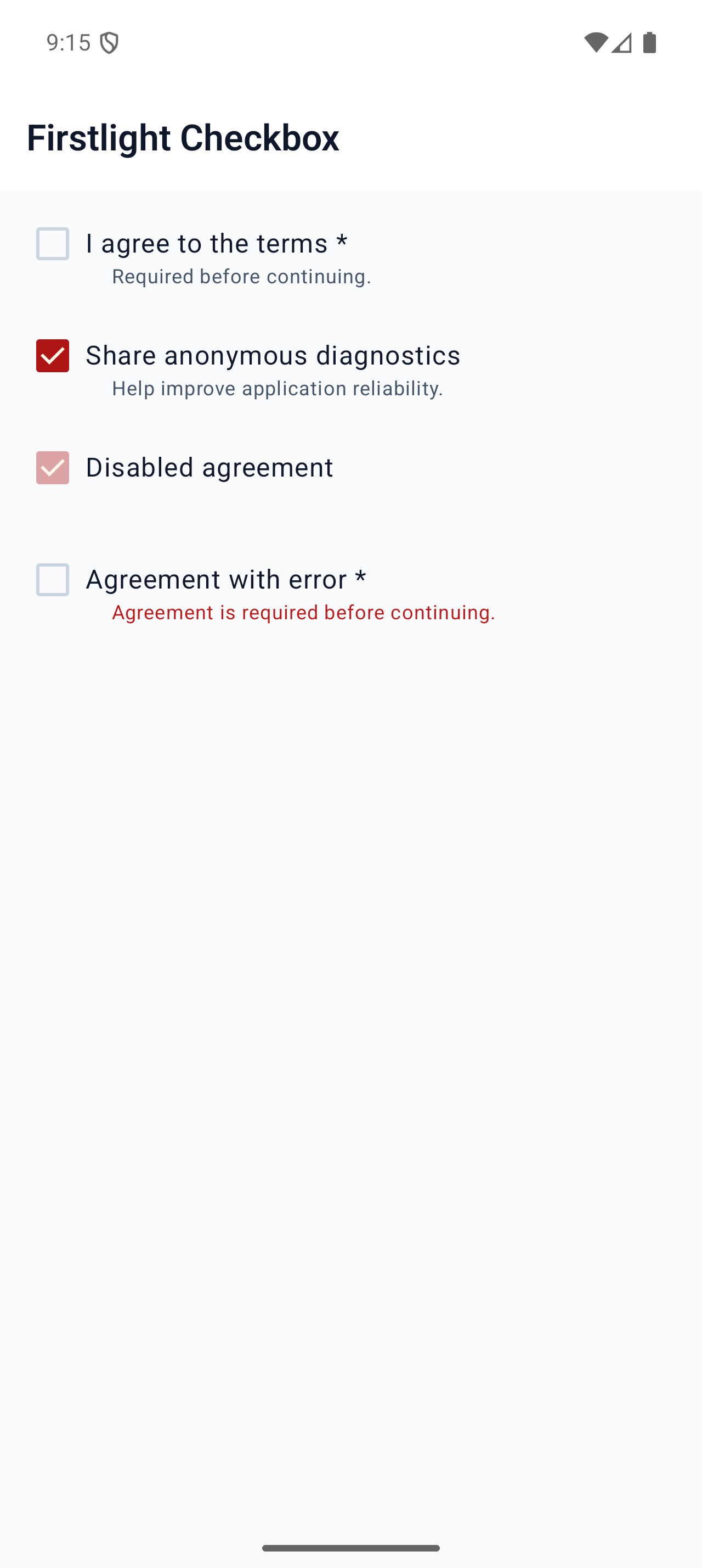 |
 |