Date Picker
Date Picker chooses one calendar date with the native date picker on each platform. PHP remains authoritative: the closed field always shows the value PHP most recently published.
Complete example
<firstlight:date-picker
    label="Appointment date"
    placeholder="Choose a date"
    helper="Dates use the clinic's local calendar."
    min="2026-01-01"
    max="2026-12-31"
    locale="en-AU"
    timezone="Australia/Sydney"
    required
    native:model="appointmentDate"
/>
The bound property must contain a canonical YYYY-MM-DD string or null:
public ?string $appointmentDate = null;
Props
| API | Accepted type | Purpose |
|---|---|---|
value / native:model |
`string | null` |
min |
`string | null` |
max |
`string | null` |
label |
string |
Visible field label and accessibility-name fallback. |
placeholder |
string |
Field text while the accepted value is null. |
helper |
string |
Supporting guidance below the field. |
error |
string |
Validation feedback that replaces helper text. |
required |
bool |
Communicates required metadata; validation remains in PHP. |
disabled |
bool |
Prevents opening and confirmation. |
locale |
BCP-47 string | Formats the field and native calendar without changing the wire date. Omission inherits the application translator locale. |
timezone |
IANA timezone string | Determines today and Swift date mapping without shifting the wire date. Omission inherits config('app.timezone') when it is a valid IANA identifier. |
a11y-label |
string |
Explicit accessible name when no visible label is appropriate. |
a11y-hint |
string |
Additional VoiceOver and TalkBack guidance. |
class |
string |
External EDGE layout for the complete field. |
Omitted value and explicit null publish the same empty state. The component does not accept
DateTimeInterface, timestamps, whitespace, unpadded dates, or year zero.
Years 0001 through 9999 use proleptic Gregorian leap-year rules.
min and max are inclusive, must be ordered, and must contain an accepted
non-null value. Null bounds are omitted. Firstlight never silently clamps an
authored value.
Events and synchronisation
@change receives a canonical date string only after the user confirms the
native presentation. In normal use, native:model registers this callback and
updates the bound property.
Plain native:model and native:model.live are equivalent because a date is
a discrete choice. Blur, lazy, and debounce modifiers are rejected.
Opening the picker, moving its draft, cancelling, confirming the already accepted date, and programmatic PHP updates emit nothing. The trigger never shows a draft optimistically. PHP may accept, reject, or replace a proposal; the next tree publication remains the source of truth.
If accepted value, bounds, locale, timezone, or disabled state changes while
the picker is open, Firstlight dismisses it and discards its draft. A null
value initially drafts today in timezone, clamped to the nearest bound when
necessary, but does not publish until confirmation.
Validation and accessibility
Invalid inherited application locale or timezone is omitted so the device calendar is used. Authored malformed locale or timezone still fail before publication. Sheet Confirm and Cancel labels are package chrome, not Blade attributes; see Localize chrome.
User validation is separate: screens that use ValidatesFields
auto-bind the first MessageBag message for the field's native:model or
error-for name. An authored error wins. required is display metadata
and does not run Laravel rules. See
Validate fields.
A visible label or explicit a11y-label is required during development.
Error text replaces helper text without replacing the control's accessible
name or value. The field exposes its accepted localized value or placeholder,
hint, disabled state, and platform error semantics.
The calendar keeps native traversal, focus, selection, today, cancel, and confirm behaviour. The field and actions retain at least a 44-point target on iOS and 48-dp target on Android, and support Dynamic Type or font scaling, dark mode, increased contrast, and right-to-left layout.
Platform behaviour
iOS presents an adaptive popover or sheet containing a genuine graphical
SwiftUI DatePicker restricted to calendar dates, with explicit Cancel and
Confirm actions. Android presents the Material 3 DatePickerDialog from a
read-only Material field. Android maps Material's selected UTC-midnight cell
back to the same canonical date rather than treating it as a local instant.
Date Picker deliberately has no time or datetime mode, picker-style override, hour format, clear action, custom presentation labels or icons, range mode, or visual variant props.
Screenshots
| Platform | Light | Dark |
|---|---|---|
| iOS | 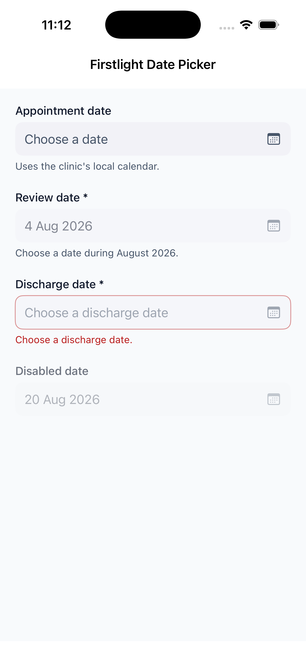 |
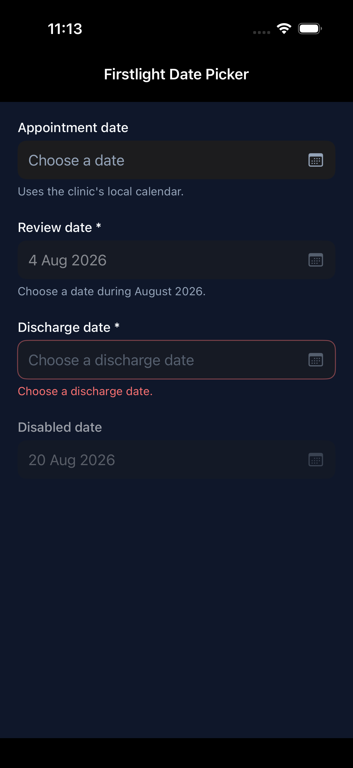 |
| Android | 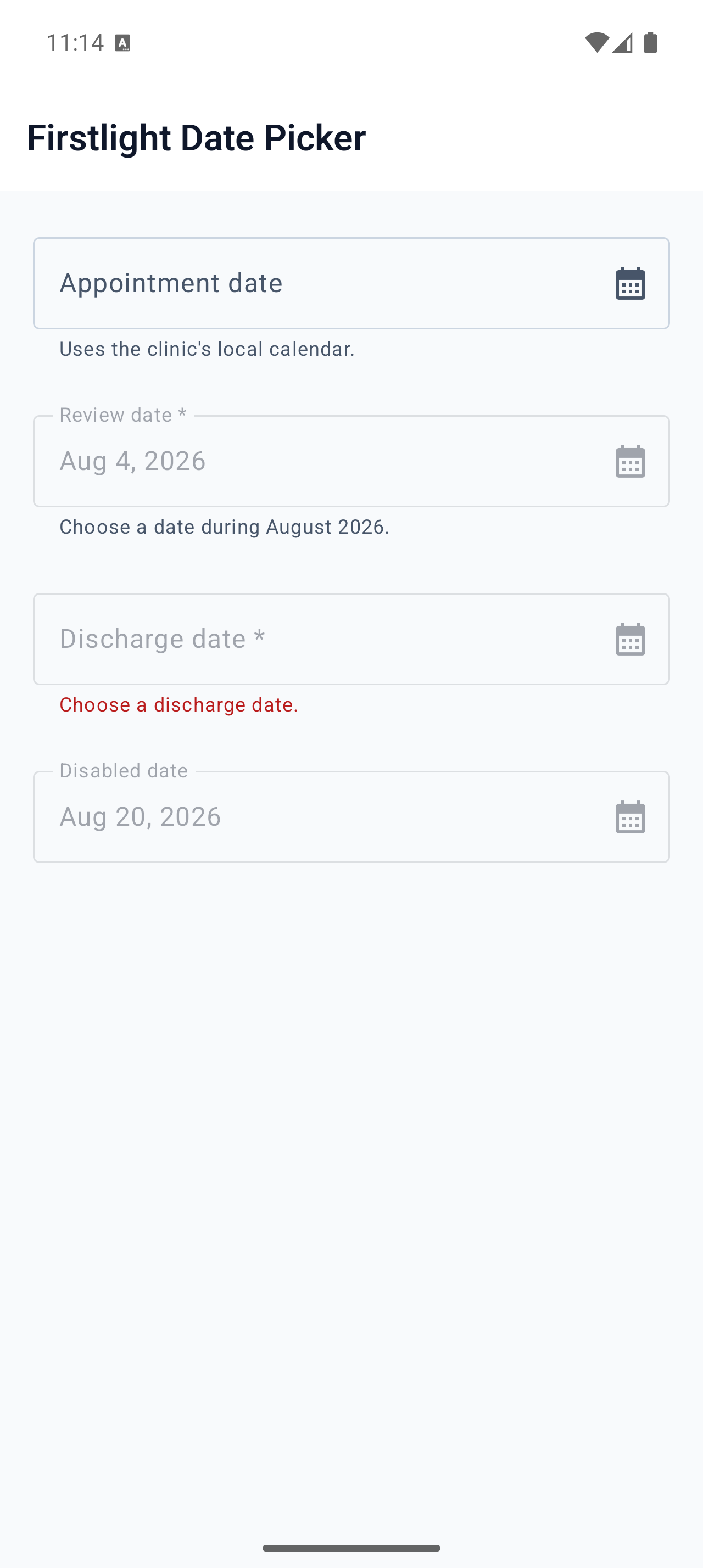 |
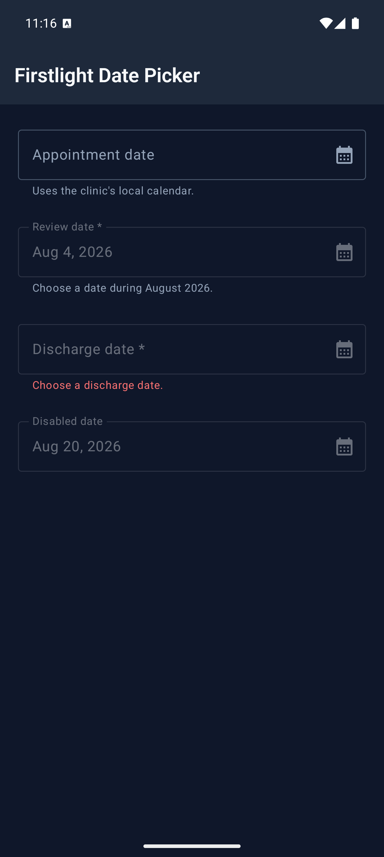 |