Segmented
Segmented presents a small set of mutually exclusive choices as a native segmented control.
Complete example
public int $priority = 10;

public array $priorityOptions = [
    ['value' => 10, 'label' => 'Routine'],
    ['value' => 20, 'label' => 'Urgent', 'disabled' => true],
];
<firstlight:segmented
    :options="$priorityOptions"
    native:model="priority"
    label="Priority"
    helper="Choose a response priority."
    a11y-hint="Urgent may be unavailable."
/>
Props
| API | Accepted type | Purpose |
|---|---|---|
options |
array |
Simple strings, a value-to-label map, or rich option arrays. |
value / native:model |
string, int, or null |
Stable selected value. Its type must match the option values. |
label |
string |
Visible field label. |
helper |
string |
Supporting text below the control. |
error |
string |
Error text and error semantics. |
required |
bool |
Marks the field as required. |
disabled |
bool |
Disables the complete control. |
a11y-label |
string |
Explicit accessibility label when a visible label is inappropriate. |
a11y-hint |
string |
Additional VoiceOver and TalkBack guidance. |
class |
string |
External EDGE layout utilities. |
Events
@change receives the selected stable value. native:model normally generates this callback for property synchronisation. A user selection emits immediately; server reconciliation and programmatic updates do not emit.
Options and accepted values
Simple string options use the same value and label:
['Mine', 'All']
A map separates stable values from labels and may use all-string or all-integer keys:
['mine' => 'Mine', 'all' => 'All']
Rich options accept only value, label, and optional disabled fields:
[
    ['value' => 'mine', 'label' => 'Mine'],
    ['value' => 'all', 'label' => 'All', 'disabled' => true],
]
All values in one control must be uniquely typed strings or uniquely typed integers. null represents no selection; an empty string remains a distinct string value.
State timing
Segmented is server-authoritative. A tap emits immediately, while PHP's next published value determines the visible selection. Use plain native:model or native:model.live; deferred blur and debounce modes are rejected.
Disabled behaviour
disabled prevents every choice from emitting. A rich option's disabled: true prevents only that option from emitting. An empty option set becomes an inert disabled control. A disabled or already-selected choice does not emit a new change.
Accessibility
Provide either a visible label or an explicit a11y-label. Firstlight warns during development when both are blank. The renderers expose the label or explicit accessibility label, optional hint, selected state, disabled state, required indication, helper text, and error text through native platform semantics.
Validation and failure behaviour
Contract exceptions still reject mixed or duplicate option values and
unsupported types before publication. User validation is separate: screens
that use ValidatesFields auto-bind the first MessageBag message for the
field's native:model or error-for name. An authored error wins.
required is display metadata and does not run Laravel rules. See
Validate fields. A same-typed value absent
from options remains visibly unselected rather than selecting the first
option.
Platform behaviour
iOS uses a native SwiftUI field backed by UISegmentedControl. Android uses Material 3 SingleChoiceSegmentedButtonRow and SegmentedButton. The controls share behaviour and authored API while retaining platform-native styling, layout, and interaction.
Compatibility
Segmented supports the versions listed in the current compatibility reference and requires both native renderers to be compiled into the host application.
Screenshots
| Platform | Light | Dark |
|---|---|---|
| iOS | 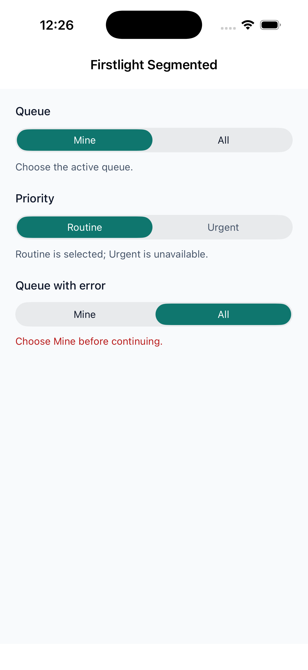 |
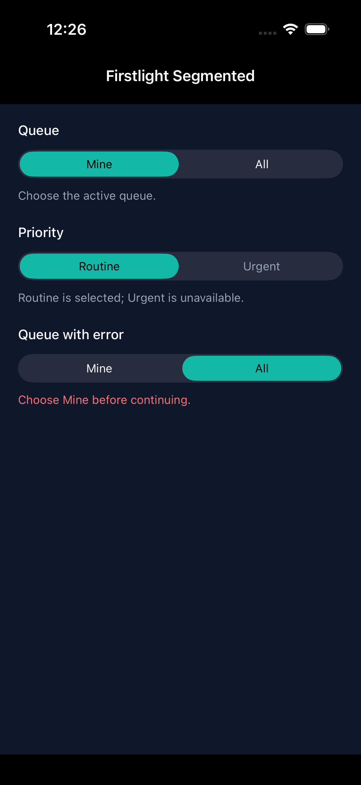 |
| Android | 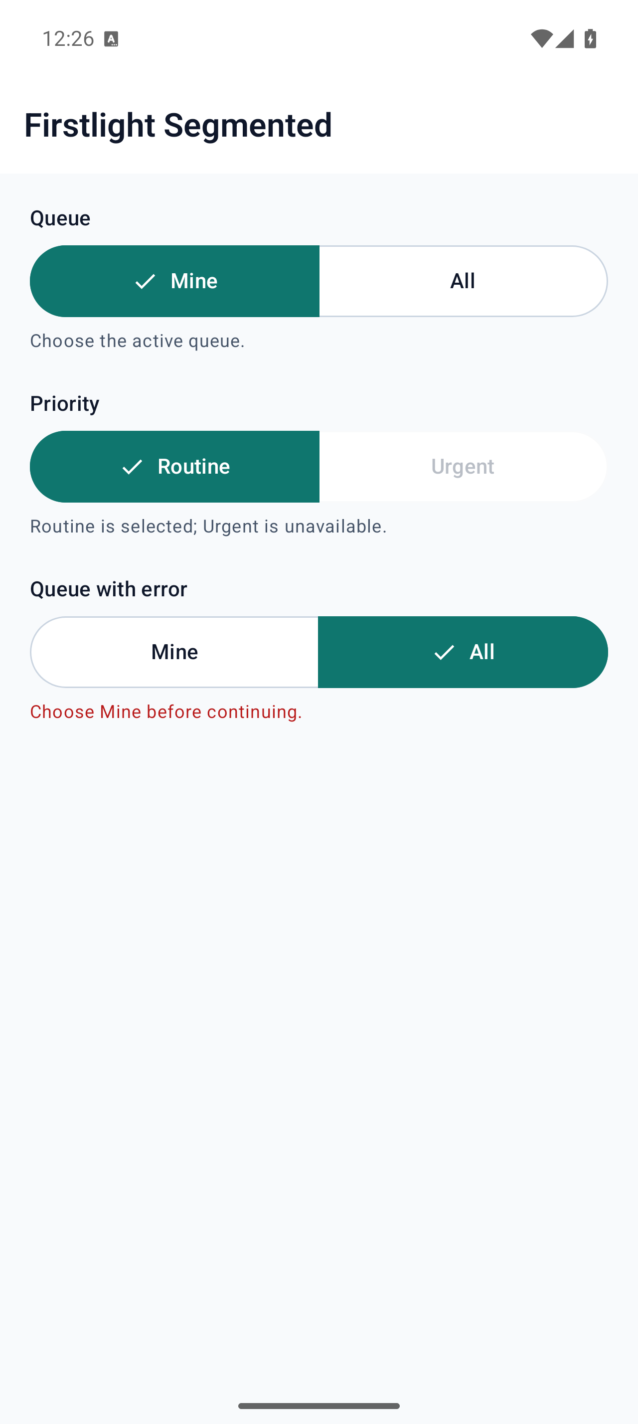 |
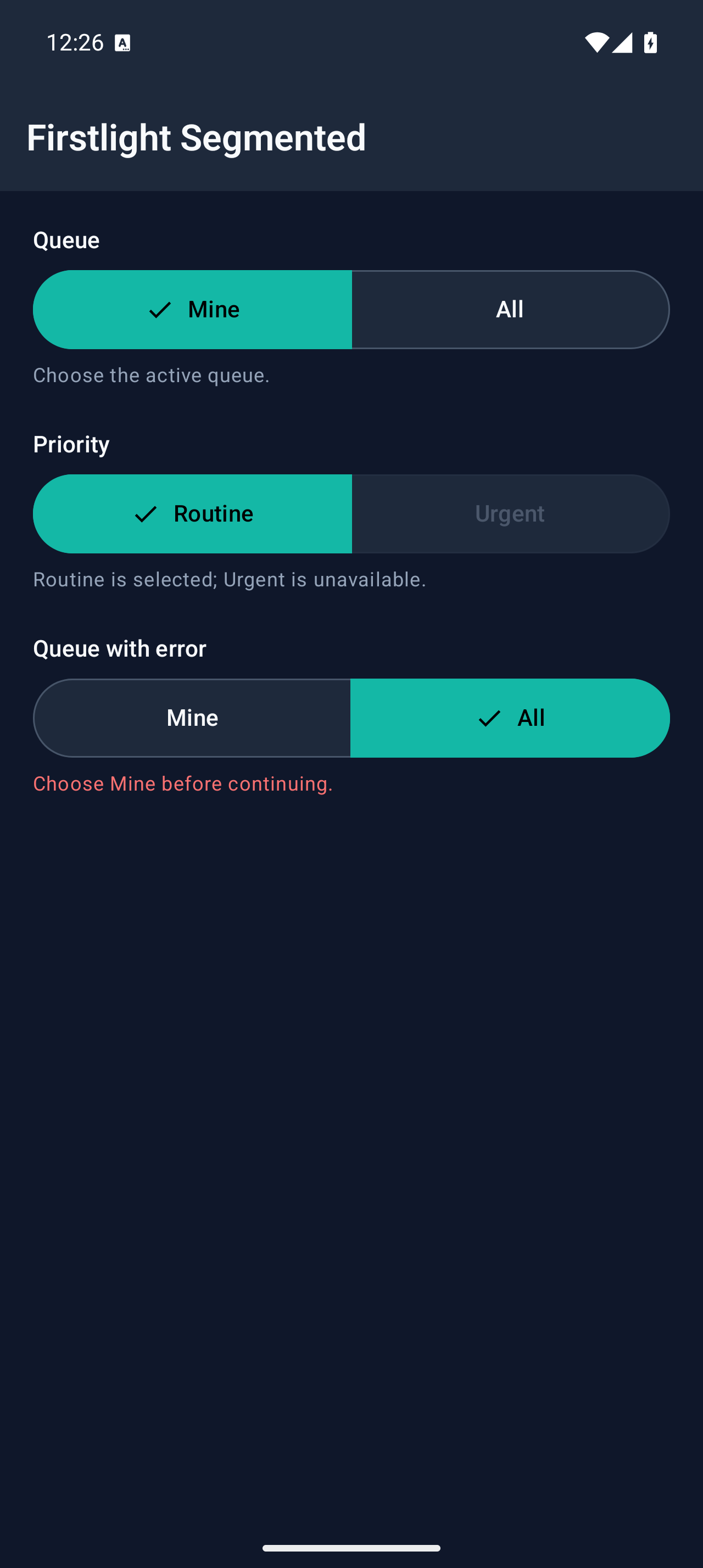 |