Badge
Badge presents a compact display-only count or short marker. Use Status Label for longer status text and an interactive control when the interface must respond to a press.
Complete examples
<firstlight:badge
    :count="$unreadCount"
    tone="danger"
    a11y-label="{{ $unreadCount }} unread messages"
    a11y-hint="Open the inbox to review them"
/>

<firstlight:badge label="New" tone="info" />
The same authored tags render on iOS and Android.
Props
| API | Accepted type | Purpose |
|---|---|---|
count |
non-negative int |
Numeric marker. Counts above 99 display as 99+; zero is hidden. Exactly one of count or label is required. |
label |
non-empty string |
Short visible marker text. Exactly one of count or label is required. |
tone |
neutral, info, success, warning, or danger |
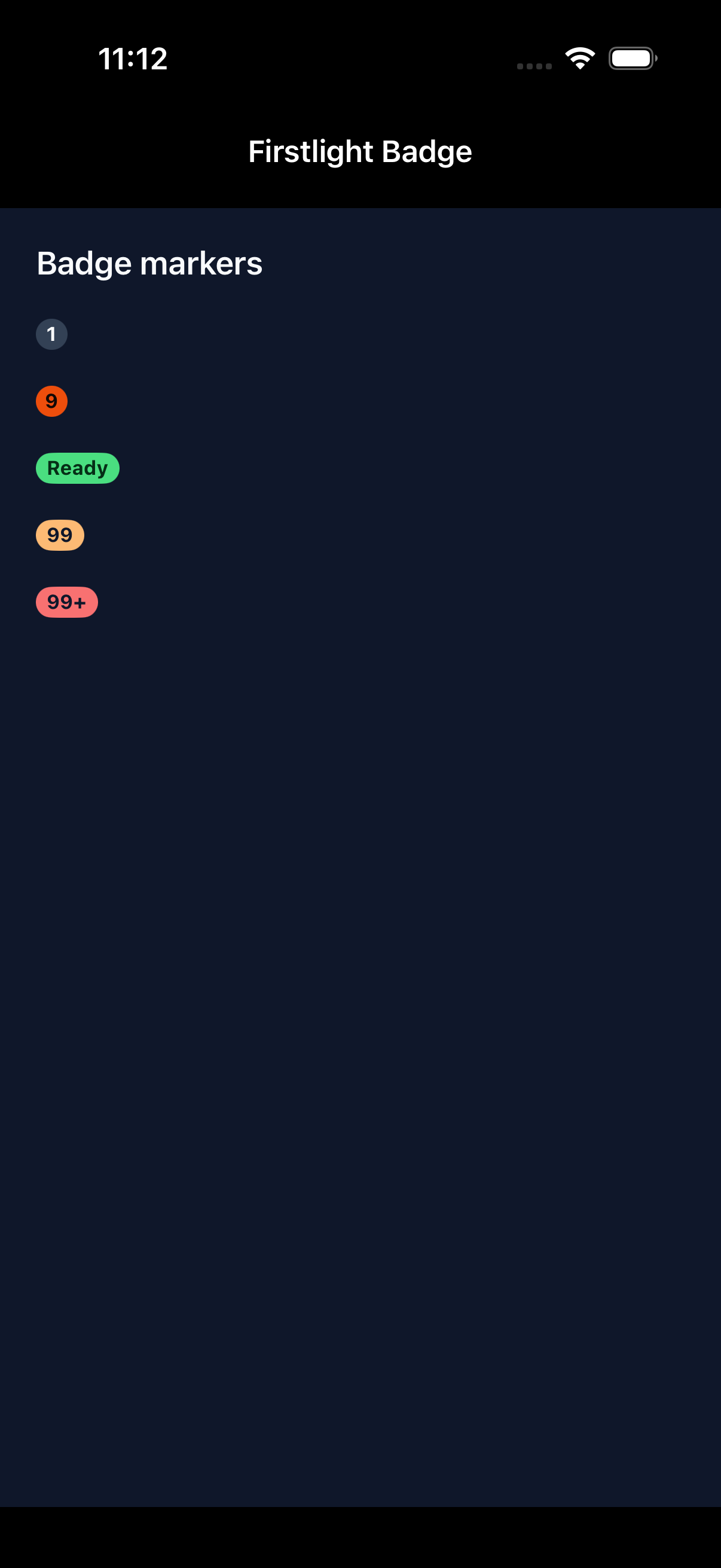
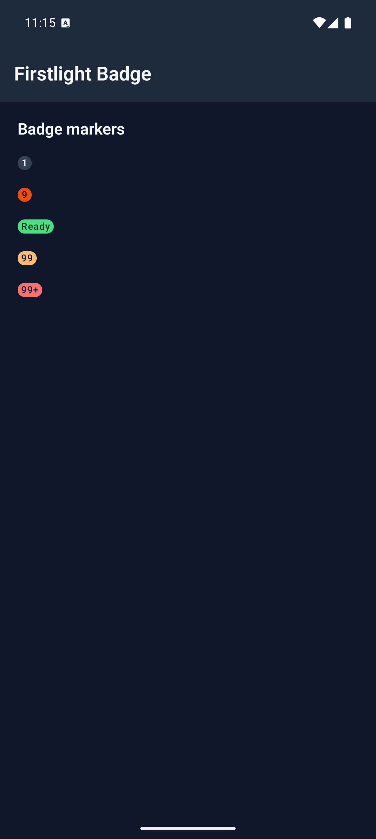
Semantic colour intent. Defaults to neutral. |
a11y-label |
string |
Accessible name. Required and non-empty for count badges; replaces the visible label for text badges. |
a11y-hint |
string |
Supplementary VoiceOver or TalkBack context. |
class |
string |
External EDGE layout utilities. |
Events and values
Badge has no model binding or events. A later server publication may replace its count, label, tone, or accessibility metadata without producing a callback.
Do not use native:model, @change, @press, value, disabled, loading, helper, error, required, icons, variants, or colour escape props. Firstlight rejects those attributes instead of silently adding interactive or field semantics.
Count behaviour
Firstlight formats the visible count once in PHP so both platforms publish and render the same label:
0publishes an empty display label and renders no badge.1through99display the complete decimal count.100and above display99+.
A count badge always requires a contextual a11y-label; the formatted visual text alone is not a useful accessible name. A text badge uses its visible label as the accessible name unless a11y-label replaces it.
State timing
Badge renders the latest published Element Tree metadata. It keeps no native selection, editing buffer, pending proposal, or animation state. Programmatic updates reconcile by the element's stable node ID and emit nothing.
Accessibility
Both platforms expose static-text semantics without button, selected, disabled, or live-region traits. Hidden zero badges expose no element. Text follows Dynamic Type on iOS and system font scaling on Android.
Semantic theme colours are checked at render time. When a customised foreground and background are below 4.5:1 contrast, Firstlight uses whichever of black or white provides the stronger contrast.
Validation and failure behaviour
Missing both display sources, providing both, a negative or non-integer count, an empty label, or an unsupported tone throws an InvalidArgumentException before publication. Malformed tone data that unexpectedly reaches a native renderer falls back defensively to neutral rather than crashing the host.
Platform behaviour
iOS composes SwiftUI Text in a native capsule-style marker. Android composes Material 3 Badge. Both inherit NativePHP semantic theme tokens while retaining platform-native typography, scaling, colour-scheme, and layout behaviour.
Compatibility
Badge supports the versions listed in the current compatibility reference and requires both native renderers to be compiled into the host application.
Screenshots
| Platform | Light | Dark |
|---|---|---|
| iOS | 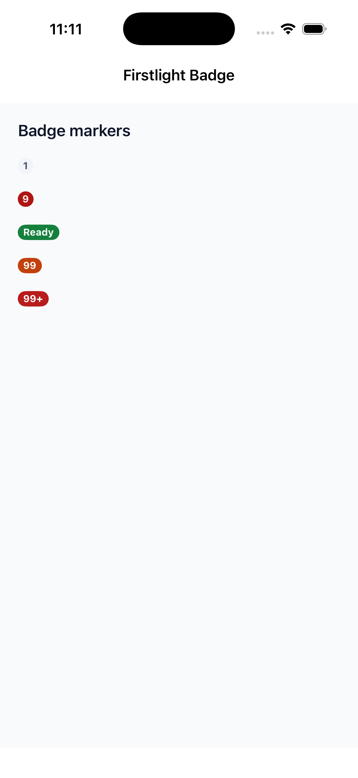 |
 |
| Android | 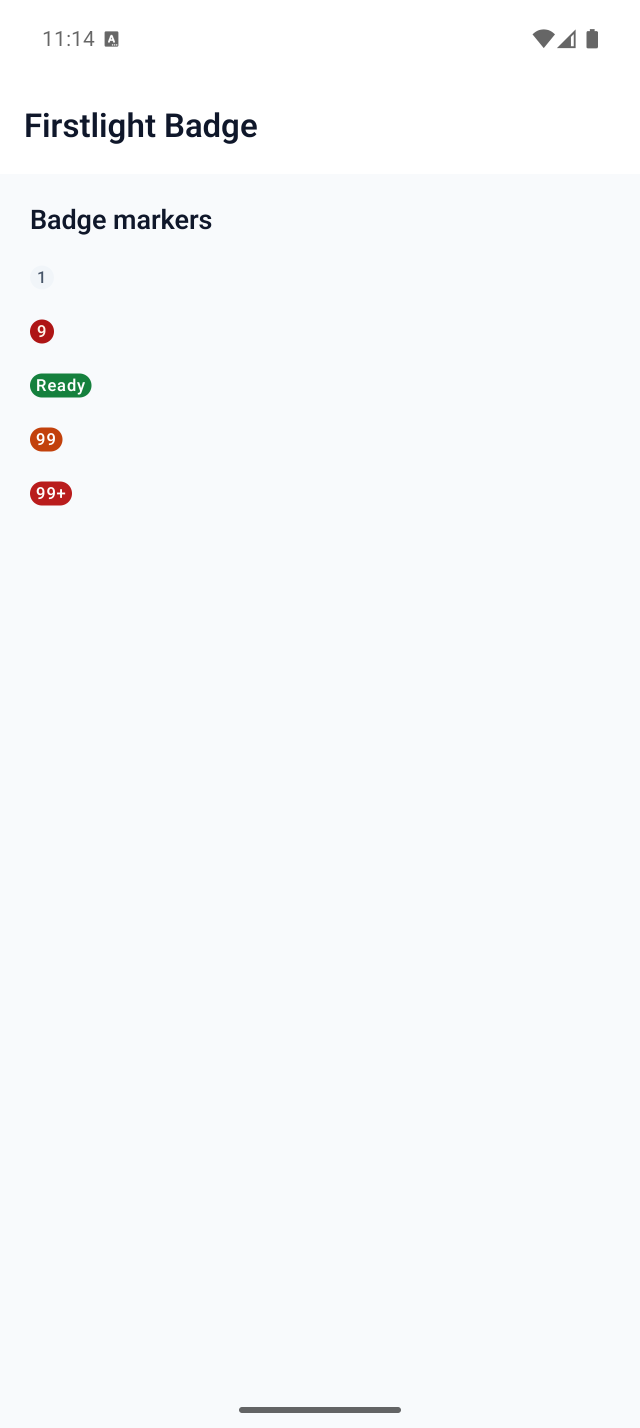 |
 |