Activity Indicator
Activity Indicator communicates that work is active when no meaningful completion value is available. It renders a circular, indeterminate native indicator with no visible text inside the component.
Complete example
Render the component only while the work is active:
@if ($loading)
    <firstlight:activity-indicator
        size="md"
        a11y-label="Loading appointments"
    />
@endif
Presence is the activity state. Removing the element stops the presentation;
the component has no separate loading, active, or visible prop. Use the
same conditional server state that decides whether the work is active rather
than attaching wire:loading to this native element.
Props
| API | Accepted type | Purpose |
|---|---|---|
size |
sm, md, or lg |
Semantic native size. Defaults to md. |
a11y-label |
non-empty string |
Required accessible name describing the active work. The a11yLabel authoring alias is also accepted. |
class |
string |
External EDGE layout utilities. |
Size is semantic, not a shared point or dp measurement. Firstlight maps each value to an appropriate native size on each platform.
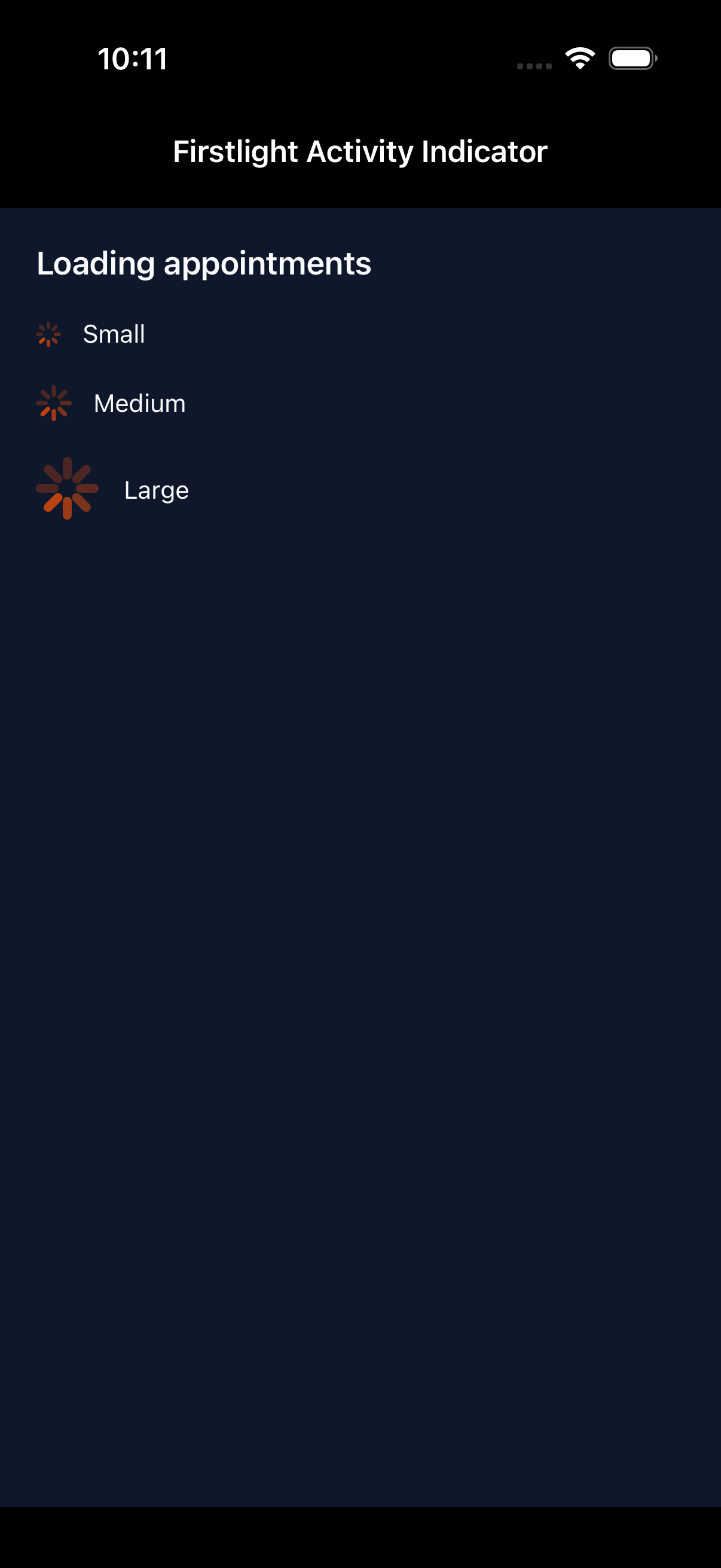
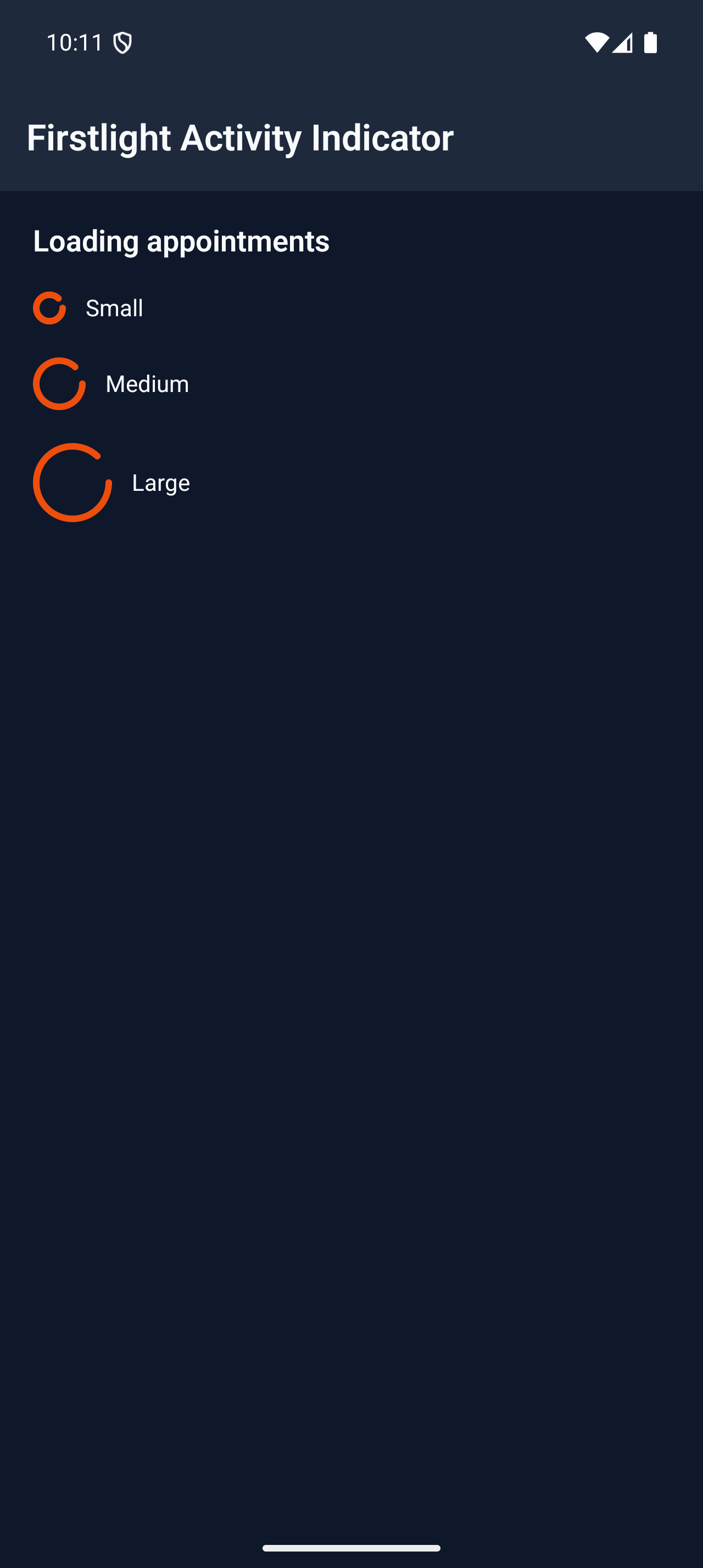
Colour comes from the host NativePHP theme's primary token. Activity Indicator
has no color, tone, or variant escape prop.
Visible text
a11y-label is not displayed. Compose separate visible text when sighted users
also need context:
<native:row class="items-center gap-3">
    <firstlight:activity-indicator
        size="sm"
        a11y-label="Refreshing appointments"
    />

    <native:text>Refreshing appointments…</native:text>
</native:row>
The visible text and accessible name may use the same wording, but they remain separate responsibilities. Activity Indicator is self-closing and has no label or content slot.
Events and state timing
Activity Indicator has no event, callback, or model binding. PHP publishes the element while work is active, and the native control owns its indeterminate animation without timer callbacks or animation frames crossing the bridge.
On a new mount, assistive technology receives one polite announcement using
the authored a11y-label. Ordinary server reconciliation, size changes, label
changes, and body recomputation do not repeat that announcement. Removing the
element and later adding a new mounted element begins a new appearance.
Disabled, loading, and failure behaviour
The component is display-only, so disabled, selected, pressed, error, helper, required, and validation states do not apply. Its presence already means loading; a second loading flag would create contradictory state.
A missing, empty, whitespace-only, or non-string a11y-label throws an
InvalidArgumentException. Unsupported sizes and content, state, event,
styling, hint, value, or synchronization attributes also fail before the
Element Tree is published. Firstlight does not silently coerce small,
large, xs, xl, integers, booleans, arrays, or null into a size.
Accessibility
The required label names the work rather than the generic visual, for example
Loading appointments instead of Spinner. The indicator has no accessibility
hint, percentage, click action, or interactive role. The polite appearance
announcement does not move screen-reader focus.
VoiceOver receives the SwiftUI control's accessible label plus one guarded appearance announcement. TalkBack receives the label as its content description and the indicator as a polite live region. Both retain native contrast, right-to-left behaviour, Increased Contrast, and Reduced Motion or system animation policy.
Platform behaviour
iOS uses a genuine circular SwiftUI ProgressView, native ControlSize
mapping, and the host theme's primary colour. Android uses Material 3
CircularProgressIndicator at Material-appropriate 20.dp, 32.dp, and
48.dp dimensions for sm, md, and lg.
The platforms retain their own geometry and animation. The shared guarantee is purpose, semantic size order, theme intent, accessibility, and lifecycle—not pixel parity.
Activity Indicator or Progress?
Use Activity Indicator for circular, indeterminate activity whose completion
cannot be measured. Use Progress when you have a fraction from
0.0 through 1.0, or when a linear progress treatment better communicates
the task. Neither component starts or controls the underlying work.
Compatibility
Activity Indicator supports the versions listed in the current compatibility reference. The host application must compile both Firstlight-owned native renderers declared by the package manifest.
Screenshots
| Platform | Light | Dark |
|---|---|---|
| iOS | 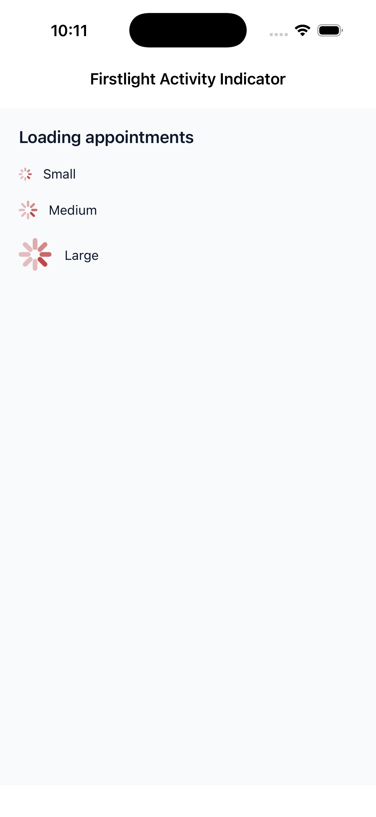 |
 |
| Android | 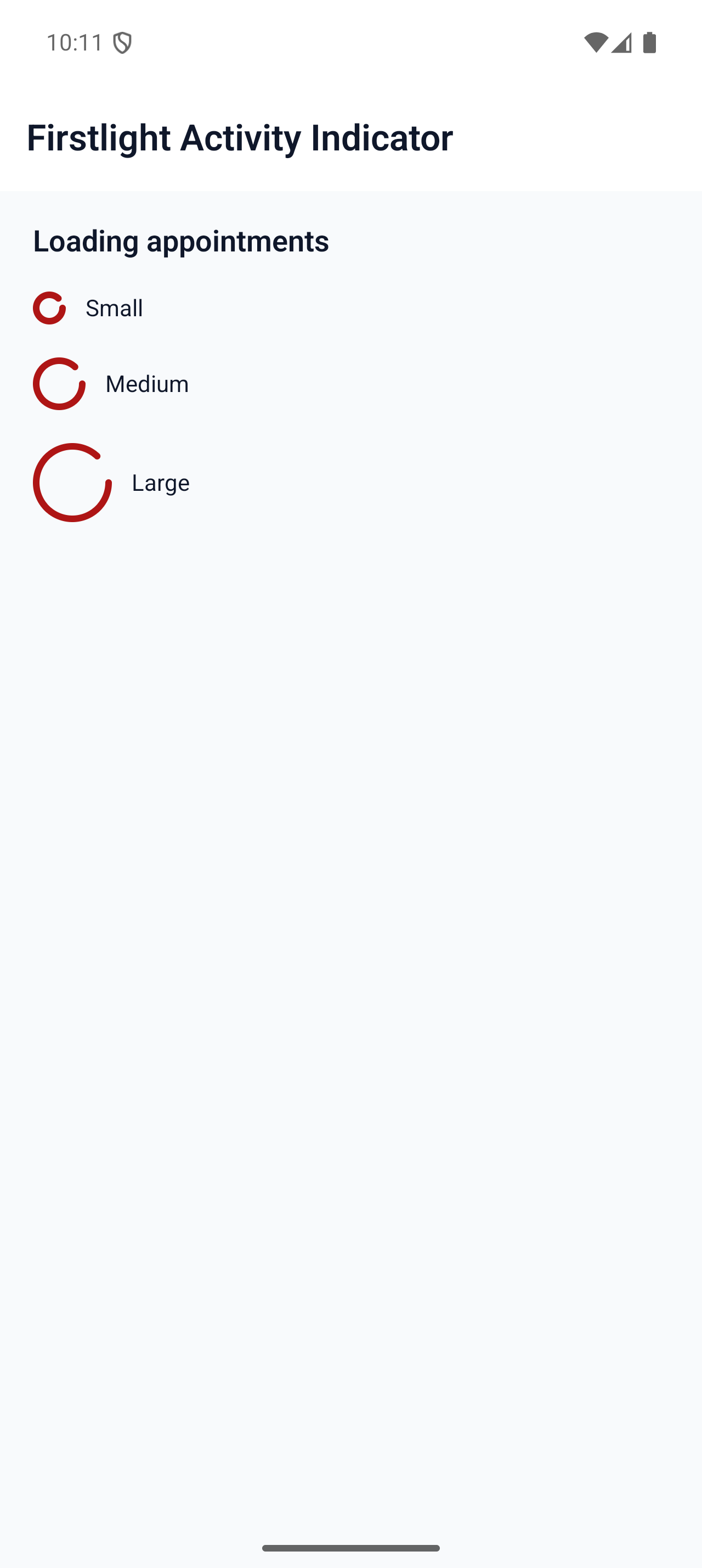 |
 |