Modal
Modal presents authored content in a full-screen native overlay. PHP owns whether the overlay is requested; each platform owns cover or dialog chrome and motion.
Use Alert Dialog for a single acknowledgement. Use Confirmation Dialog for a confirm/cancel decision. Use Bottom Sheet for a panel that slides up from the bottom.
Complete example
<firstlight:modal
    :visible="$showingAccount"
    a11y-label="Account details"
    @dismiss="closeAccount"
>
    <firstlight:status-label label="Account details" />
</firstlight:modal>
The dismiss handler should set $showingAccount to false.
Props
| API | Accepted type | Purpose |
|---|---|---|
visible |
bool |
Server-controlled presentation request. Defaults to closed. |
dismissible |
bool |
When true, native close, back, and outside dismissal are enabled. Defaults to the upstream native default of true. The dismissable alias is accepted. |
a11y-label |
non-empty string |
Accessible name for the presented surface. |
a11y-hint |
non-empty string |
Supplementary screen-reader guidance. |
class |
string |
External EDGE layout utilities. |
Events
@dismiss is required. It runs when the user closes the overlay. Set the
bound visibility property to false in that handler. Dismiss handlers must
be safe to run more than once because the delegated iOS cover can also notify
PHP when a programmatic close is published.
There is no overlay @press, native:model, or detent API. Actions belong
on child controls.
Platform expression
Modal is an adapter over Mobile UI modal. iOS uses SwiftUI
.fullScreenCover; Android uses a Material full-screen dialog. Theme tokens
own surface colour. Close controls, when shown, use the native Close name.
Screenshots
| Platform | Light | Dark |
|---|---|---|
| iOS | 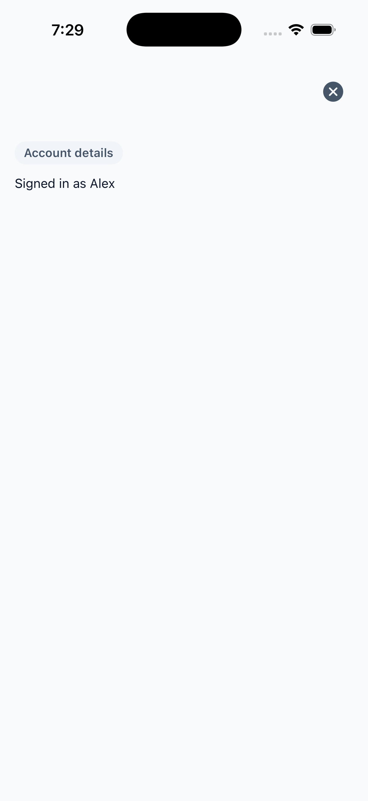 |
 |
| Android | 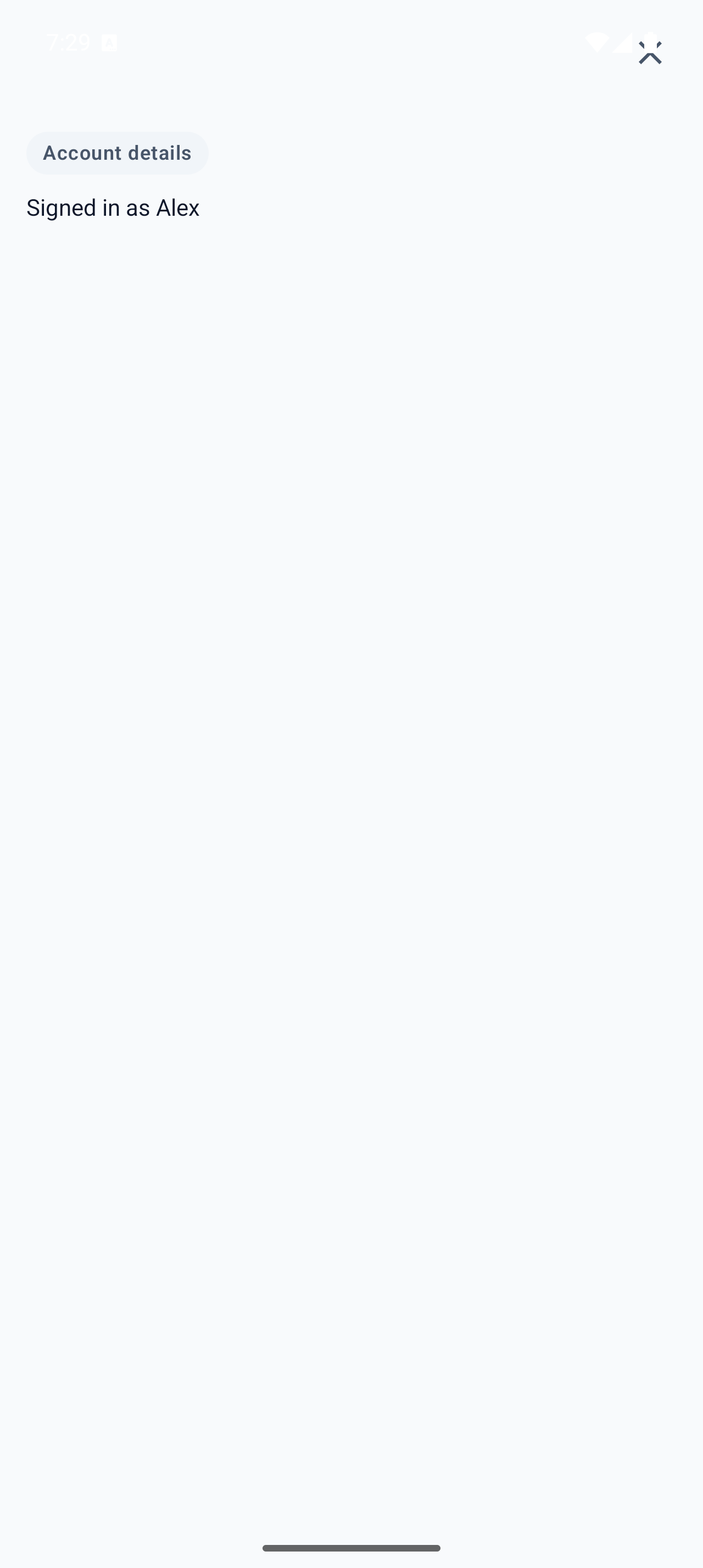 |
 |