Alert Dialog
Alert Dialog tells the user one fact they must acknowledge. It uses the platform's native one-button alert, not a custom full-screen overlay.
Use Confirmation Dialog when the user must choose between confirm and cancel. Use Transient Feedback for a non-blocking toast. Use Modal only when the surface needs authored child content.
<firstlight:alert-dialog
    :visible="$showingSaved"
    title="Changes saved"
    message="Your profile was updated."
    action-label="OK"
    @dismiss="acknowledgeSaved"
/>
The dismiss handler should set $showingSaved to false. The same handler
runs for the action button, back, and outside dismissal.
Props and events
visible: server-controlled presentation request; defaults tofalse.title: required visible heading and accessible dialog name.message: required explanation.action-label: acknowledgement action text; defaults to the package chrome stringOK. TheactionLabelalias is accepted. See Localize chrome.@dismiss: required callback for the action, back, or outside dismissal.class: external EDGE layout only.
The component always presents one action. It does not support @press, a
cancel action, tones, icons, loading or disabled states, native:model,
authored children, or an undismissable mode.
Behavior and accessibility
One user acknowledgement produces one @dismiss callback. Programmatic
closure produces none. After the user dismisses the dialog, copy-only
publications do not reopen it; a later server transition from false to
true presents it again.
iOS uses SwiftUI alert. Android uses Material 3 AlertDialog with a single
confirm button. Native chrome owns modal focus, action placement, Dynamic Type
or font scaling, dark appearance, contrast, reduced motion, and right-to-left
behavior. The title is the accessible name.
Screenshots
| Platform | Light | Dark |
|---|---|---|
| iOS | 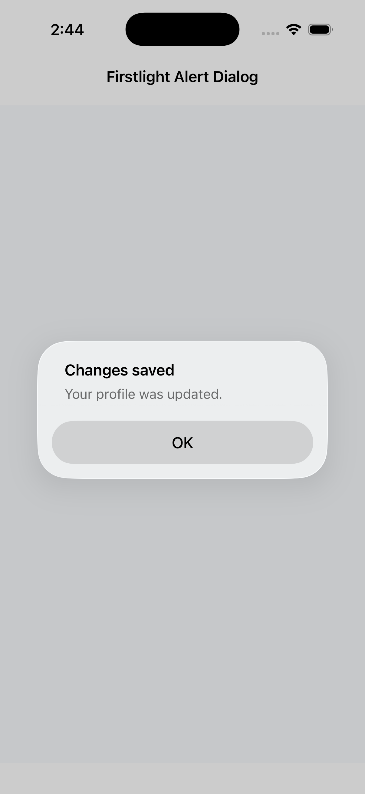 |
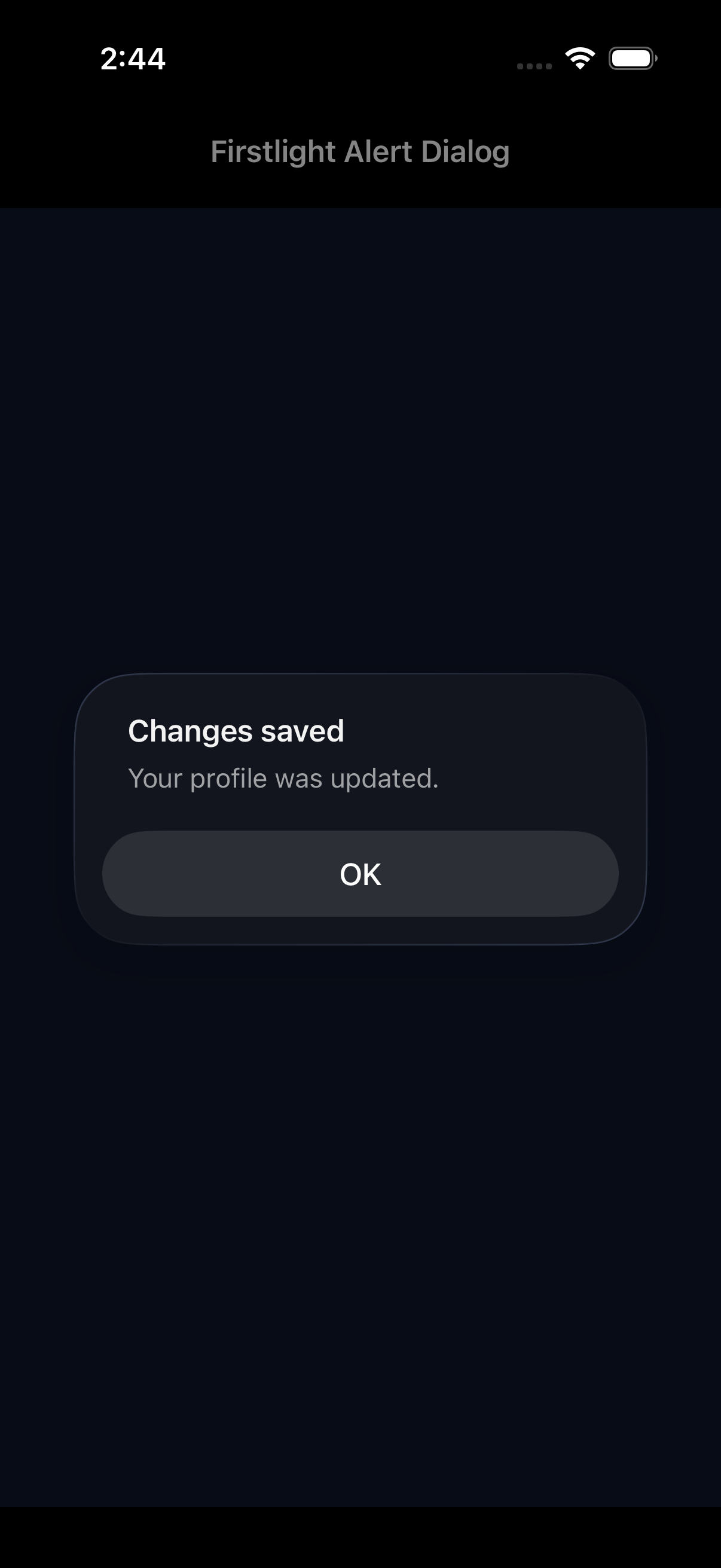 |
| Android | 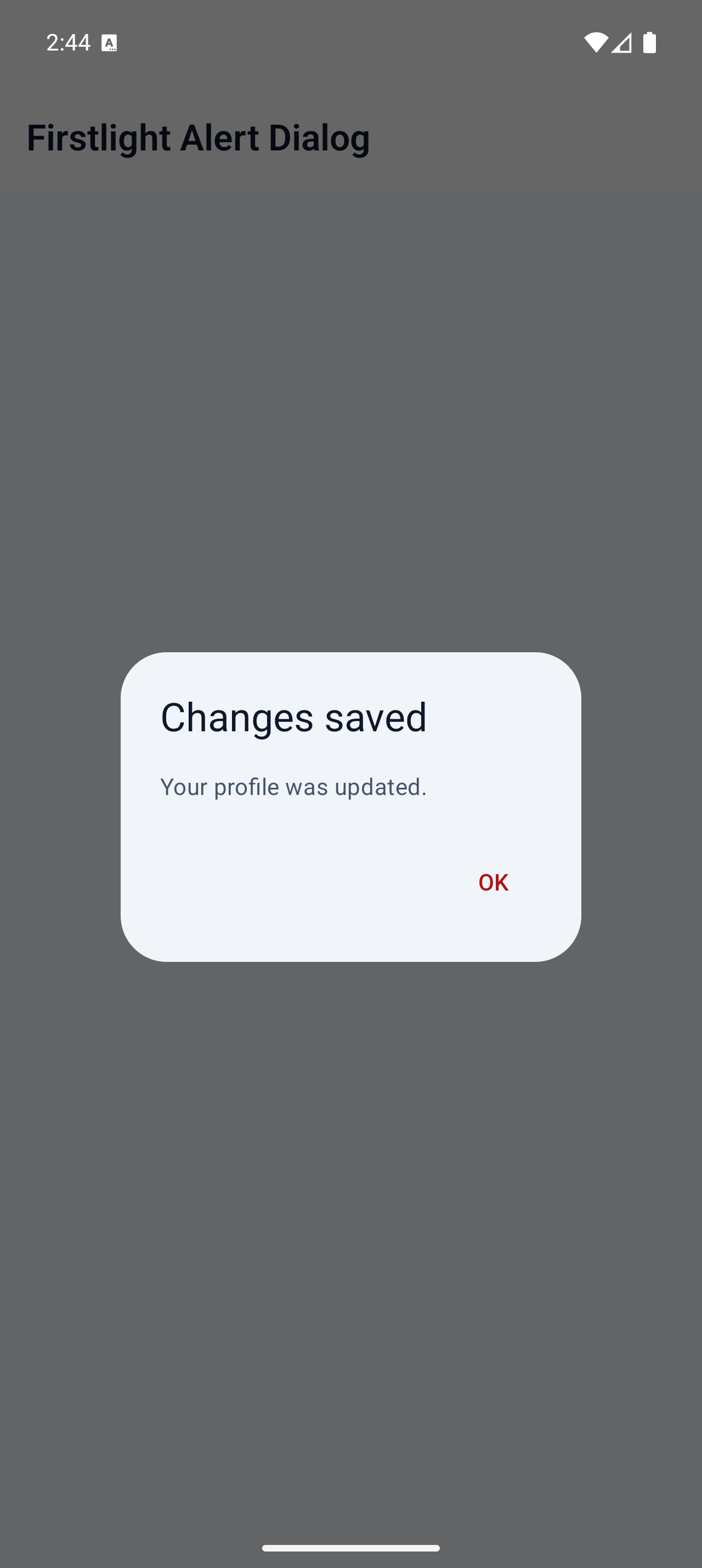 |
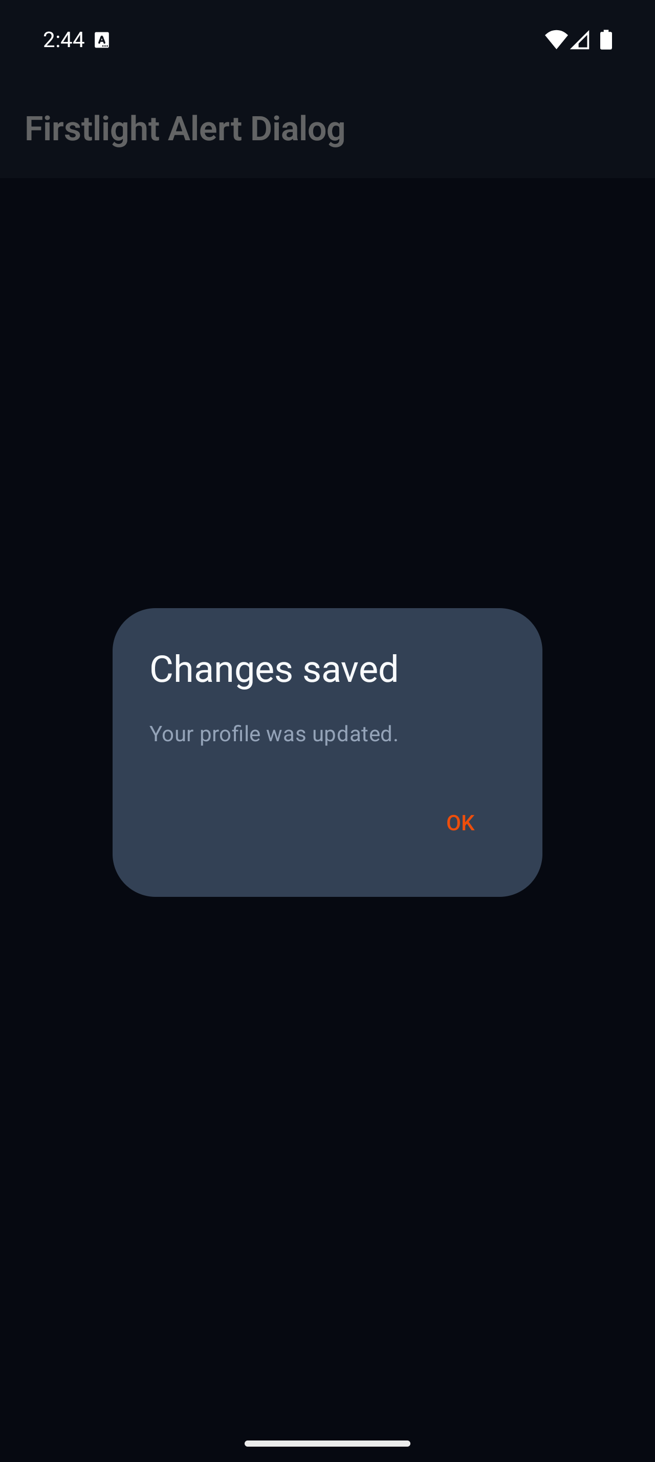 |